Most button copy is either too vague to click or so pushy it feels like it was written by a funnel gremlin in a blazer.
Creators do this all the time. They spend hours on the offer, the landing page, the lead magnet, the booking flow, then slap Submit or Learn More on the button and hope the rest of the page carries it. Sometimes it does. Usually it does not.
Good CTA button copy is not about sounding clever. It is about reducing friction, making the next step feel obvious, and matching the level of commitment you are actually asking for. That is the difference between a button people skim past and a button they click without needing a pep talk.
This guide gives you CTA button copy examples creators can adapt fast, plus the logic behind them, so you can stop defaulting to dead buttons and start using language that actually moves people forward.
If you want the bigger picture, start with the parent guide.
Why most CTA buttons underperform
The problem usually is not the button itself. The problem is the button is doing one of three annoying things:
- It is vague
- It asks for too much too soon
- It does not match what the user thinks happens next
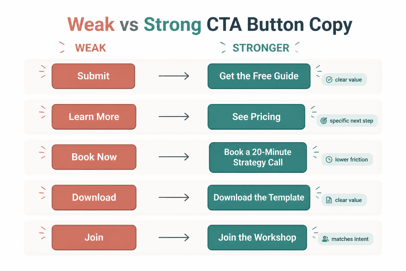
Download can work. Get the Free Guide is usually better. Book Now can work. Book a 20-Minute Strategy Call is clearer. The point is not that every button needs to be long. The point is that generic labels hide the value and increase hesitation.
People do not click because a button is technically present. They click because the next step feels relevant, low-friction, and worth it.
What good CTA button copy actually does
Before the examples, here is the useful filter: strong CTA button copy usually does at least one of these well.
- Names the action clearly: what happens when I click?
- Hints at the value: what do I get?
- Matches the stage of intent: is this a soft next step or a hard ask?
- Reduces risk: does this feel easy, reversible, or lightweight?
- Fits the page context: does it sound like the natural next move here?
That is why See Pricing often beats Get Started on a sales page. One helps the visitor continue evaluating. The other jumps ahead and assumes a yes that has not happened yet.
A CTA button should not try to close emotional distance with wishful thinking.
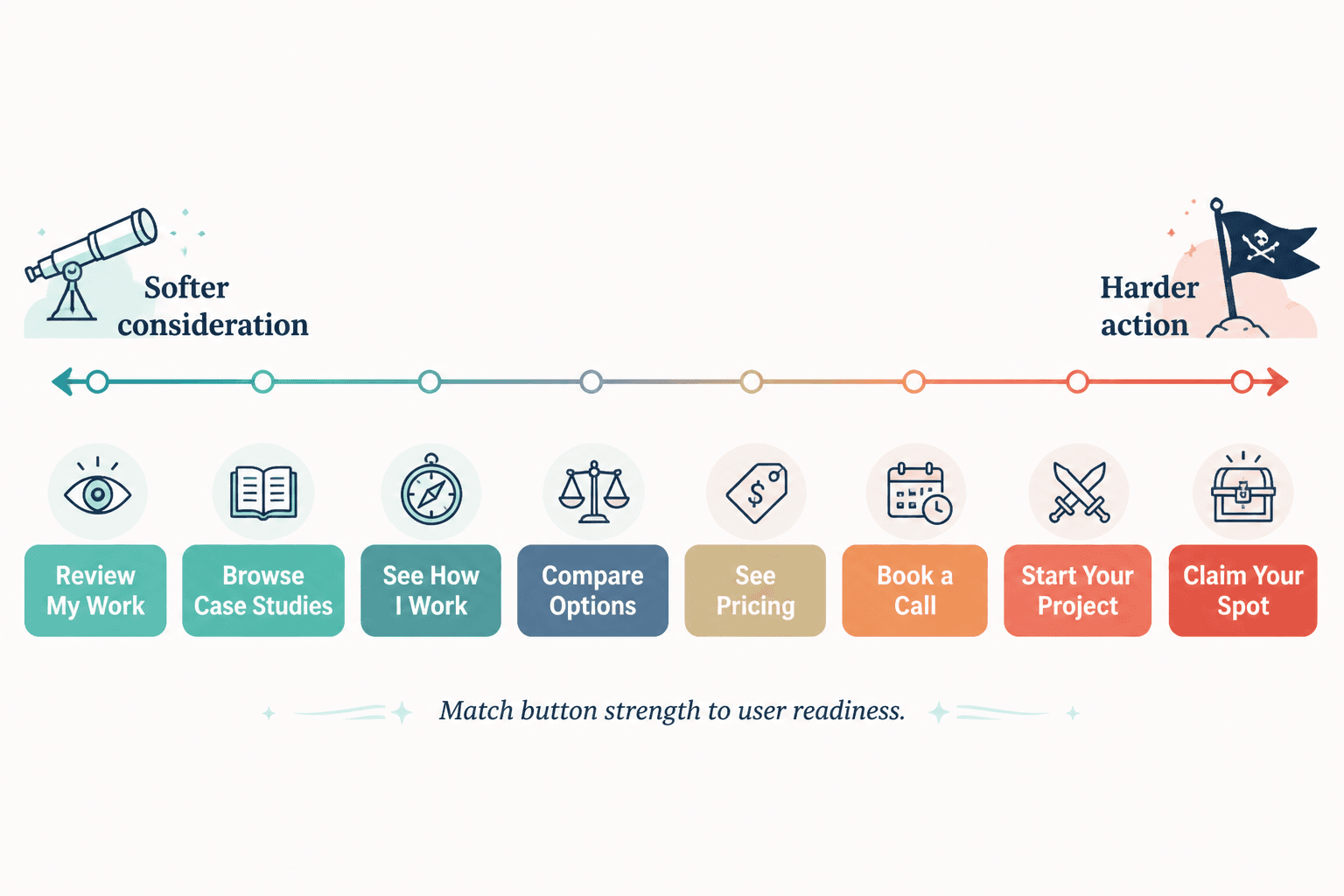
How to choose the right CTA type before you write the button
If you want better CTA writing, start by identifying what kind of click you are asking for. A newsletter button should not sound like a sales call button. A free resource button should not sound like a contract.
Here is the simplest way to think about it.
| CTA type | Best for | Typical intent level | Button style |
|---|---|---|---|
| Soft CTA | Newsletter, resource, article, free tool | Low | Easy, specific, low-pressure |
| Consideration CTA | Pricing, portfolio, case studies, services | Medium | Clear, practical, decision-friendly |
| Hard CTA | Booking, buying, applying, starting trial | High | Direct, confident, commitment-aware |
If the page is asking for a small commitment, write a small-commitment button. If the page is asking for a bigger step, the wording needs to make the payoff and the process feel clear enough to justify it.
CTA button copy examples creators can adapt fast
Here is the part you actually came for. These examples are grouped by use case so you can steal the structure, not blindly copy the exact wording.
Newsletter and email signup buttons
These work best when they feel easy and concrete. Nobody wakes up wanting to “submit.” They might, however, want useful emails.
- Get the Weekly Emails
- Send Me the Newsletter
- Join the List
- Get New Posts by Email
- Send Me Content Ideas
- Subscribe for Sharp Updates
- Get the Next Issue
- Join for Practical Tips
- Keep Me Posted
- Send Me the Good Stuff
Best when your page already explains what the reader gets and how often. If you have not done that, the button cannot save you.
Lead magnet and free resource buttons
These should make the reward obvious. If the thing is free, useful, and specific, say so plainly.
- Get the Free Guide
- Download the Template
- Send Me the Checklist
- Get the Swipe File
- Grab the Resource
- Access the Framework
- Get the Workbook
- Download the Examples
- Send Me the PDF
- Get Instant Access
Get Instant Access works best when the page already made clear what “it” is. On its own, it can be a little vague. Context matters more than copy nerds like to admit.
Contact and inquiry form buttons
This is where people ruin trust by sounding weirdly intense. Not every inquiry needs to feel like a high-stakes application to a secret society.
- Send Your Inquiry
- Get in Touch
- Send the Message
- Ask About Working Together
- Start the Conversation
- Tell Me What You Need
- Send Your Project Details
- Contact Me
- Let’s Talk Details
- Ask a Question
If your contact form is for warm leads, use language that feels human and clear. If it is for filtering serious inquiries, a more qualifying button like Apply to Work Together can make sense. Just do not add fake prestige where none is needed.
Booking call buttons
For service providers, coaches, consultants, and solo operators, this is one of the highest-stakes buttons on the site. Clarity beats swagger.
- Book a Call
- Schedule a Consultation
- Book Your Strategy Call
- Reserve a Discovery Call
- Book a 20-Minute Call
- Choose a Time
- Schedule Time to Talk
- Book Your Intro Call
- Request a Consultation
- See Available Times
See Available Times is especially useful when visitors are interested but not ready for a psychologically heavy “book now.” It keeps momentum without sounding like a marriage proposal.
Sales page and purchase buttons
If someone is ready to buy, the button should help them buy. Not make them decode your branding.
- Buy Now
- Get the Course
- Enroll Today
- Start Learning
- Get Access
- Join the Program
- Purchase the Template Pack
- Choose Your Plan
- Start Your Subscription
- Claim Your Spot
Use urgency carefully. Claim Your Spot works if there is a real seat limit, cohort, or deadline. If not, it starts smelling like internet nonsense.
Portfolio, service, and pricing page buttons
These are consideration CTAs. The visitor often is not ready to commit. They are still evaluating fit.
- See Pricing
- View Services
- Explore Packages
- See What’s Included
- Review My Work
- Browse Case Studies
- See How I Work
- View the Portfolio
- Compare Options
- See the Details
These buttons convert better than hard-sell copy when the visitor still needs evidence. You are not lowering ambition. You are matching reality.
Before-and-after CTA button rewrites
Sometimes the easiest way to improve button copy is to stop using labels that could belong on literally any website.
Rewrite 1: generic signup
- Before: Submit
- After: Get the Weekly Emails
Why it is better: it tells the user what they are getting, not just that a form technically exists.
Rewrite 2: vague resource CTA
- Before: Download
- After: Download the Content Template
Why it is better: the button carries more meaning on its own and reinforces the page value.
Rewrite 3: premature sales ask
- Before: Get Started
- After: See Pricing
Why it is better: it meets the visitor at the evaluation stage instead of pretending they are already sold.
Rewrite 4: intimidating booking CTA
- Before: Book Now
- After: See Available Times
Why it is better: it lowers friction and feels easier for a cautious lead.
Rewrite 5: overhyped purchase button
- Before: Unlock Your Success
- After: Get the Course
Why it is better: because people buy offers, not inspirational fog.
A simple formula for writing stronger button copy fast
If you need a repeatable shortcut, use this:
- Name the action
- Add the value or destination
- Match the commitment level
That gives you simple patterns like:
- Get + thing = Get the Guide
- Book + specific call = Book a Strategy Call
- See + decision info = See Pricing
- Join + offer = Join the Program
- Download + asset = Download the Template
You do not need a poetry degree for this. You need clean intent.
When short CTA buttons work, and when they absolutely do not
Short button copy can work beautifully when the surrounding page does the heavy lifting. If the offer is obvious, the form context is clear, and the next step is low-risk, something like Join or Download can be enough.
But a lot of creators use short buttons on weak pages, then blame traffic or design or “the algorithm” for low conversions. The issue is usually simpler. The button is vague because the page is vague. Tightening the button helps. Clarifying the offer helps more.
So yes, short buttons can work. No, brevity is not a conversion strategy by itself.
Common CTA button mistakes creators keep making
- Using “Submit” by default
It is functional, lifeless, and says nothing about value. - Writing buttons that are too clever
Brand voice is nice. Confusion is not. - Asking for a huge commitment too early
Apply Now on a lightly informative page is a lot. - Mismatching button copy and destination
If the button says Get the Guide, do not send people to a generic newsletter signup page. - Using the same CTA everywhere
Your homepage, sales page, blog sidebar, and contact page do not all need Get Started. - Ignoring mobile clarity
If the button is the only thing a mobile user sees before deciding, it needs to stand on its own.
A lot of CTA writing problems are really empathy problems. The creator knows what the page is for, so they assume the visitor knows too. The visitor does not. The visitor is skimming, distracted, and mildly suspicious. Write for that person.
Quick CTA button templates by creator use case
For coaches
- Book a Coaching Call
- Apply for Coaching
- See Coaching Options
- Book Your Intro Session
For consultants
- Request a Consultation
- See How I Can Help
- Book a Discovery Call
- View Consulting Services
For writers and service providers
- View My Services
- Ask About Your Project
- See Writing Packages
- Get in Touch
For course and digital product creators
- Get the Course
- Download the Bundle
- See What’s Inside
- Start Learning
For newsletter-first creators
- Join the Newsletter
- Get Weekly Insights
- Send Me the Next Issue
- Subscribe for New Essays
If you want more angle-specific CTA examples, it is worth pairing this guide with best CTA writing ideas and examples for creators, CTA writing examples for coaches, consultants, and personal brands, and simple CTA writing hard CTAs templates for busy creators.
How to test CTA button copy without turning your site into a lab experiment
You do not need twenty-six variants and a spreadsheet that looks like it belongs to a performance marketing cult. Start with the obvious friction points.
- Identify the page where the CTA matters most
- Replace one weak button with a clearer version
- Test one variable at a time: specificity, softness, or value framing
- Watch for practical signals like clicks, form starts, bookings, or purchases
- Keep the winner and move on
The bigger point is simple: clearer structure and clearer writing make the piece more useful. That is usually what makes the ending land better too.