
Most weak CTAs are not failing because they are too short.
They fail because they ask for the wrong thing, at the wrong time, in the blandest possible way.
A coach writes a thoughtful post, then ends with “DM me if this resonated.” A consultant has a solid service page, then uses “Contact us” like that means anything. A personal brand spends three paragraphs building trust and then closes with a button that sounds like it came free with a website theme.
That is the real problem with CTA writing. Not length. Not button color. Not some fake “high-converting secret.” It is mismatch. The call to action does not fit the reader’s level of trust, intent, or actual next step.
This guide gives you CTA examples for coaches, consultants, and personal brands that are clearer, more useful, and much less likely to sound like recycled funnel paste. You will get examples for posts, buttons, lead magnets, booking pages, newsletters, and softer trust-building asks, plus how to choose the right CTA instead of stapling “book a call” onto everything with a pulse.
If you want the broader foundation first, start with CTA writing and then come back here for the examples.
Want the broader roadmap? Start with the parent guide.
Why most CTA writing examples are weirdly unhelpful
A lot of CTA advice is suspiciously detached from reality.
It tells you to “create urgency,” “drive action,” and “maximize conversions” as if your audience is a row of lab mice and not actual people trying to decide whether they trust you. Then it gives examples like “Act now” or “Claim your spot today,” which might work in some contexts, but usually just make thoughtful service businesses sound like they are selling discount patio furniture.
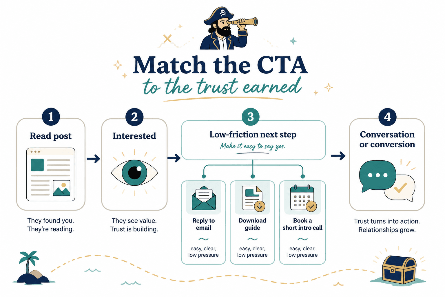
For coaches, consultants, and personal brands, the CTA usually needs to do one of three things:
- Move the reader to a sensible next step
- Lower friction
- Match the level of trust already earned
That is it. Not every CTA needs to close a sale. Sometimes it should start a conversation. Sometimes it should move someone to a helpful resource. Sometimes it should simply get the right person to raise a hand.
Good CTA writing feels specific. It sounds human. It makes the next step obvious without sounding needy or pushy.
What a strong CTA actually does
Before the examples, here is the filter.
A strong CTA usually answers at least one of these questions fast:
- What should I do next?
- Why this next step, specifically?
- What happens if I click, reply, or opt in?
- Is this for me?
- How much effort will this take?
The best ones also reduce vague risk. They do not make the reader wonder if clicking a button means entering a 14-email funnel dungeon or landing in a hard-sell call they did not ask for.
Clarity beats theatrics here. Every time.
CTA examples for coaches, consultants, and personal brands by goal
The easiest way to write better CTAs is to stop treating them like one category. A CTA for a discovery call is not the same as a CTA for a post. A CTA for a free guide is not the same as a CTA for a warm reader already on your services page.
So instead of one giant soup of examples, here are the useful categories.
1. Soft CTAs for posts that build conversation
These are for social posts where the goal is comments, replies, DMs, or light interest. Not every post needs to drag people to a booking link.
Good examples:
- What part of this are you seeing in your own business right now?
- If you are dealing with this too, reply with “stuck” and I will send the framework.
- Curious if others have noticed the same pattern.
- If this is where your messaging keeps falling apart, send me “messaging” and I will point you to the right resource.
- What would you add to this?
- If you want part two, tell me where this gets messy for you.
Why these work: They fit the context. They ask for a small action. They do not force fake intensity.
If you want more post-specific ideas, these post CTA examples for personal brands pair well with this article.
2. Lead magnet CTAs that do not sound like bait
Lead magnet CTAs work best when they sell the usefulness of the thing, not the existence of the thing.
Weak:
- Download now
- Get instant access
- Grab your freebie
Better:
- Get the 10-question messaging audit
- Send me the client onboarding checklist
- See the exact CTA templates I use
- Get the short guide
- Steal the framework
- Read the checklist before you rewrite your page
The pattern is simple: name the asset, hint at the benefit, and keep it concrete.
“Get instant access” tells me nothing. “Get the 10-question messaging audit” tells me what I am getting and why I may care. One is generic button mush. The other is actual information.
3. Booking CTAs for warm leads
This is where many service businesses get too aggressive or too vague.
“Book a call” is not terrible. It is just lazy. It puts all the burden on the reader to guess what kind of call, who it is for, and whether clicking means getting pitched into another dimension.
Better booking CTAs:
- Book a strategy call
- See if we are a fit
- Talk through your funnel
- Book a messaging review
- Apply for coaching
- Schedule a consult
- Bring me your messy draft
- Let’s review your website copy
These are stronger because they imply a purpose. They give shape to the next step.
In some cases, adding a line beneath the button helps even more:
- 30 minutes. No hard pitch. We will figure out whether this is the right next move.
- Best for service businesses already selling a proven offer.
- Use this if you want direct feedback on your positioning, CTA flow, or conversion copy.
That extra context can do more for conversion than another hour spent debating whether the button should be green.
4. Sales page CTAs that sound confident, not pushy
On sales pages, your CTA can be more direct. The reader is already in decision mode. Still, direct does not mean loud.
Examples:
- Start your project
- Apply to work together
- Get the full program details
- Reserve your spot
- Choose your package
- Start the audit
- Join the workshop
- Work with me
Use with caution:
- Act now
- Buy now
- Don’t miss out
- Claim your transformation
Sometimes those can fit, especially for a launch or limited-seat offer. But most of the time they sound inflated, especially if the page itself has not earned that energy.
5. Newsletter and nurture CTAs
Email sign-up CTAs should make the value of subscribing feel obvious. Not mystical. Not “join my world.” You are not a minor royal.
Better examples:
- Get weekly conversion copy notes
- Subscribe for sharper content and better CTAs
- Get the newsletter for practical positioning advice
- Send me the weekly memo
- Join for useful ideas, not inbox wallpaper
A little personality is fine. Actually, it helps. Just keep it grounded in what the reader gets.
6. CTAs for profile pages and bio links
Profile CTAs should be painfully clear because the reader is moving fast. This is not the place for poetic mystery.
Examples:
- Start here
- Read the guide
- See how I help
- Book a consult
- Get the templates
- Join the newsletter
- Browse free resources
Short is fine here, as long as the destination is obvious and useful.
If you need a broader swipe file, these CTA writing ideas and examples for creators can help you expand your options.
Before-and-after CTA rewrites
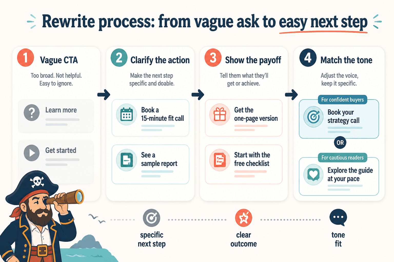
Examples are nice. Rewrites are better. They show what is actually changing.
Example 1: Generic service page CTA
Before: Contact Us
After: Book a messaging consult
Why it is better: It tells the visitor what kind of action this is and what they are getting.
Example 2: Weak post CTA
Before: DM me if this resonated.
After: If your homepage is saying everything and nothing at the same time, send me “homepage” and I will send the fix.
Why it is better: It targets a specific problem and gives the reader a reason to act.
Example 3: Vague newsletter CTA
Before: Join my newsletter
After: Get one sharp email a week on content, positioning, and CTA writing
Why it is better: It explains frequency, topic, and value without wandering off into fluff.
Example 4: Overhyped lead magnet CTA
Before: Unlock your free resource
After: Get the 15 CTA prompts for coaches and consultants
Why it is better: The reader can judge the offer instantly. No dramatic fog required.
How to choose the right CTA instead of using the same one everywhere
If your CTA writing feels off, the issue is often not the wording. It is the stage.
People at different trust levels need different next steps. Someone reading a first post from you is not in the same place as someone reading your service page for the third time.
Here is a simple way to think about it:
| Reader stage | Best CTA style | Example |
|---|---|---|
| Cold | Low-friction, curiosity, conversation | Reply “audit” and I’ll send the checklist |
| Warm | Useful next step, resource, soft consult | Read the guide or book a messaging review |
| Hot | Direct action, clear decision CTA | Apply to work together |
That is why “book a call” under every post often falls flat. It asks for too much too soon. It is not bold. It is just badly timed.
If you want a stronger process for this, this CTA writing guide for creators who want better results is a useful companion.
Button copy examples that do not waste the click
Button copy lives in a tight space, so every word has to carry more weight.
Good button CTAs are usually one of these:
- Action + outcome
- Action + asset
- Action + purpose
Examples:
- Get the guide
- Book a consult
- See pricing
- Apply now
- Read the framework
- Start the audit
- Get the templates
- View packages
- Join the workshop
- See how it works
Notice what is missing: filler words, fake urgency, and random enthusiasm.
For a deeper list, these button copy examples creators can adapt fast are handy.
Common CTA mistakes coaches, consultants, and personal brands keep making
Some mistakes show up everywhere because they feel harmless. They are not.
Using vague language
“Learn more.” “Get started.” “Contact us.” Fine as defaults. Weak as strategy.
If the CTA could belong on literally any website, it is probably too vague for yours.
Asking for too much, too early
Not every reader is ready to book, buy, apply, commit, join, schedule, and spiritually align by paragraph four.
Give people a smaller next step when trust is still forming.
Writing the CTA in a totally different voice
Your page sounds smart and grounded, then suddenly the CTA says “Unlock explosive growth now.”
That kind of tonal whiplash kills trust fast.
Using one CTA for every context
The best CTA on your homepage may be the wrong CTA for your newsletter, post, article, lead magnet, or about page. Context matters more than people want it to because context requires thought.
Burying the payoff
If the reader cannot tell what happens next, they are more likely to do nothing. Friction loves ambiguity.
A simple formula for writing better CTAs
If you want a practical shortcut, use this:
Action + specific value + right level of commitment
That formula gives you plenty to work with.
The bigger point is simple: clearer structure and clearer writing make the piece more useful. That is usually what makes the ending land better too.