
Most AI image tool comparisons are weirdly bad at helping people choose.
They dump a pile of features on the page, toss in a few sample images, maybe mention price, and then act like the reader now has clarity. They do not. They have tabs open, mild annoyance, and a growing suspicion that every tool review was written by someone who never had to use the tool for actual work.
If you want What to Show in AI Image Tool Comparisons So Readers Can Decide Faster to land, the job is not to show everything. The job is to show the right things in the right order so the reader can quickly answer a practical question: “Which one fits what I need without wasting my time, money, or patience?”
That means less feature soup. More decision help. More context. More side-by-side proof. More honesty about tradeoffs. Because most readers are not hunting for the “best” AI image tool in some grand universal sense. They are trying to find the right fit for product mockups, social graphics, blog visuals, ad creatives, concept art, client work, or fast ideation without signing up for a fresh headache.
To see how this fits into the wider strategy, open the parent guide.
Start with the actual decision, not the feature list
The fastest way to make an AI image comparison useful is to begin with the buying decision the reader is trying to make.
Not “Here are 11 tools with text-to-image generation.”
More like:
- Best for fast marketing visuals
- Best for realistic image quality
- Best for style control
- Best for beginners who do not want to wrestle with prompts
- Best for commercial workflow reliability
- Best for budget-conscious solo creators
That framing helps the reader sort the field immediately. It also stops the article from becoming a giant beige spreadsheet in paragraph form.
If you need a broader structure first, it helps to connect the piece to your main comparison hub and category pages, especially if you publish more than one angle on these tools. For example, you can naturally point readers to the broader AI image tool comparisons section or the larger AI writing tools and workflows / AI image tools comparison cluster when the reader needs more than one article to decide.
Show the criteria that actually change the decision
Not every comparison category deserves equal space. Some matter a lot. Some are filler people include because comparison articles are apparently contractually obligated to mention “user interface” and “innovation.”
Here are the factors worth showing if you want readers to decide faster.
1. Output quality, but broken into useful subtypes
“Image quality” is too vague to be helpful on its own. Show what kind of quality you mean.
- Realism
- Illustration quality
- Typography handling
- Hands and faces
- Consistency across generations
- Prompt accuracy
- Composition strength
- Style control
A tool can produce beautiful images and still be a terrible fit for someone who needs accurate brand-style social graphics or editable ad concepts. Pretty is not the same as useful.
2. Speed to acceptable result
This one gets skipped all the time, which is ridiculous, because speed is half the buying decision for working creators.
Do not just note generation speed. Show time to a usable output.
Those are not the same. A tool that renders quickly but needs twelve retries is slower in real life than a tool that takes a bit longer and gets close in two rounds.
3. Prompt difficulty
Readers need to know whether the tool rewards normal human prompts or expects them to write like a stressed-out art director wrestling a command line from 2042.
Show how much prompt precision the tool needs:
- Beginner-friendly
- Moderate learning curve
- High control, but fussy
This matters a lot for solo creators who want speed over prompt gymnastics.
4. Editing and iteration tools
Generation is only part of the workflow. Readers should know what happens after the first image.
- Can you edit specific areas?
- Can you expand the canvas?
- Can you keep a character or style consistent?
- Can you revise without rebuilding from scratch?
- Can you create multiple variations worth comparing?
A tool with decent generation and strong editing often beats a tool with flashy first outputs but weak iteration controls.
That point usually deserves a little more explanation because a lot of readers do not realize they are evaluating the wrong stage. The first image is rarely the whole job. If someone is making client assets, thumbnails, lead magnets, ad experiments, or article visuals, they need revision control more than one lucky result. A comparison that only celebrates “wow” images without talking about editability is basically judging kitchen equipment by the box design.
5. Commercial-use clarity
Readers do not want vague hand-waving here. If commercial rights or usage terms are messy, say so plainly.
Show:
- Whether commercial use is allowed
- Whether paid plans are required for commercial rights
- Whether attribution is needed
- Whether outputs have licensing caveats
- Whether the terms are clear or annoyingly murky
If your content leans practical, this is a strong place to point readers toward a simple commercial-use framework so they can evaluate licensing without needing a law degree and three coffees.
6. Cost in a way normal people can understand
Do not just show monthly pricing. That is lazy and often misleading.
Show cost like this instead:
- Entry price
- What the entry plan realistically allows
- Whether credits disappear fast
- Whether paid tiers unlock the features that actually matter
- Whether the tool becomes expensive under regular use
There is a big difference between “starts at $10” and “starts at $10, but you burn through that in one decent brainstorm session.”
Use side-by-side evidence, not just opinions
Readers decide faster when they can see the tradeoffs.
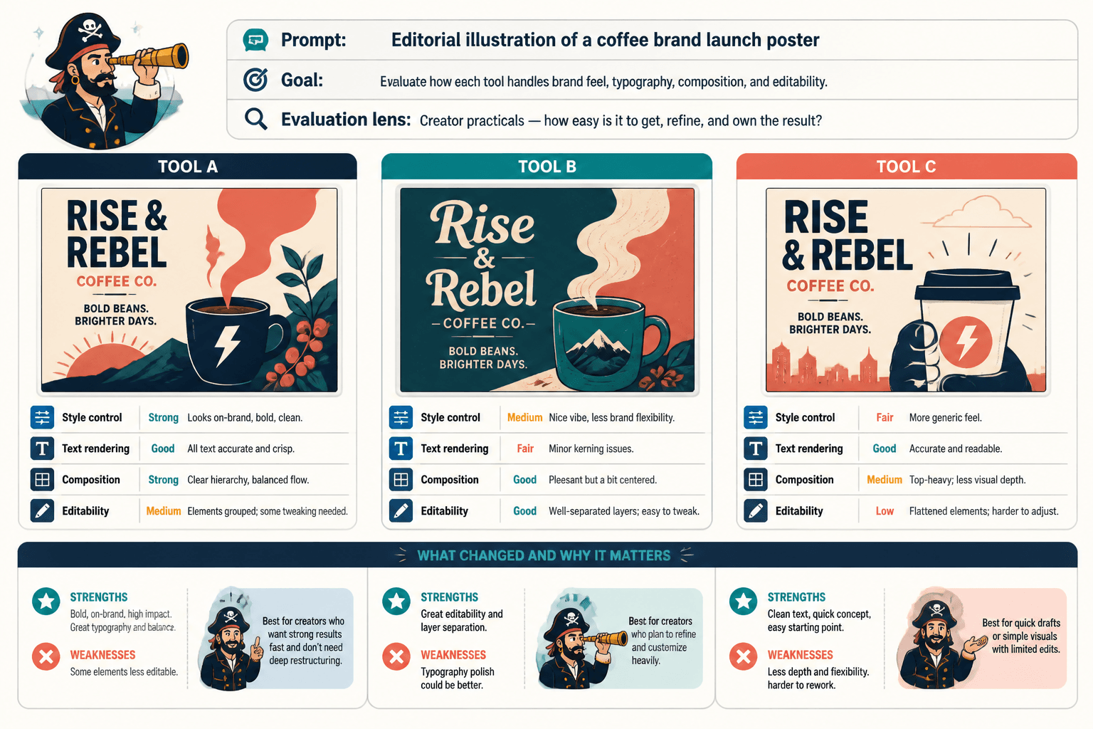
That means your comparison should include consistent side-by-side examples using the same prompt or same use case across tools. Otherwise the review turns into vibes dressed as analysis.
Use one prompt, one goal, and one evaluation lens at a time.
- Same prompt across three tools
- Same brand-style visual brief across three tools
- Same product-ad concept across three tools
- Same editorial illustration prompt across three tools
Then explain what changed and why it matters.
Do not assume the image “speaks for itself.” It usually does not. The reader may not know whether a weird output reflects bad prompting, weak style control, poor text rendering, or a tool that simply is not built for that use case.
Organize the comparison around real use cases
One of the smartest things you can show in AI image tool comparisons is which tool suits which job.
That means moving beyond generic rankings and grouping the tools by use case. This is what helps readers decide faster because they can skip straight to the section that matches what they actually need.
| Use case | What to show | What the reader wants to know |
|---|---|---|
| Blog graphics | Speed, style consistency, ease of editing | Can I make decent visuals fast without overworking prompts? |
| Social media creatives | Text handling, composition, brand control | Will this help me make on-brand images that do not look weird? |
| Concept art | Style range, prompt flexibility, iteration depth | Can I explore visual directions without fighting the tool? |
| Client work | Licensing, reliability, revision tools | Can I use this professionally without awkward surprises? |
| Ads and thumbnails | Clarity, visual impact, speed to usable result | Can this produce strong attention-grabbing visuals quickly? |
Use-case framing also makes your article more trustworthy. It tells the reader you understand that “best” depends on context. Which, yes, sounds obvious, but the internet keeps forgetting.
If you want to support that angle further, it makes sense to link to best AI image tool comparisons for creators who need the right fit rather than pretending one winner magically serves everyone equally well.
Include a quick-scan summary near the top
Readers who search for comparison content are often in decision mode, not reading-for-fun mode. They want orientation fast.
A quick-scan section near the top can do a lot of work:
- Best for beginners
- Best for realistic images
- Best for creative control
- Best for commercial workflows
- Best budget option
- Best all-around balance
This should not replace the full comparison. It should act like a map.
Think of it as reducing friction. The reader can get a probable shortlist in under a minute, then scroll down for evidence. That is how you help people decide faster without dumbing the article down.
Be honest about tradeoffs instead of forcing a fake winner
A lot of comparison content gets mushy here. The writer wants to sound balanced, so every tool becomes “great for different needs.” Helpful in theory. Useless in practice.
You do not need fake neutrality. You need clear tradeoffs.
- Tool A gives better realism, but costs more and needs better prompts
- Tool B is easier to use, but the outputs can feel more generic
- Tool C has stronger editing controls, but a steeper learning curve
- Tool D is cheap to test, but not reliable enough for client deliverables
That kind of writing respects the reader. It also makes your recommendation stronger because it sounds like someone who has actually used the tools instead of petting all of them equally to avoid offending the software.
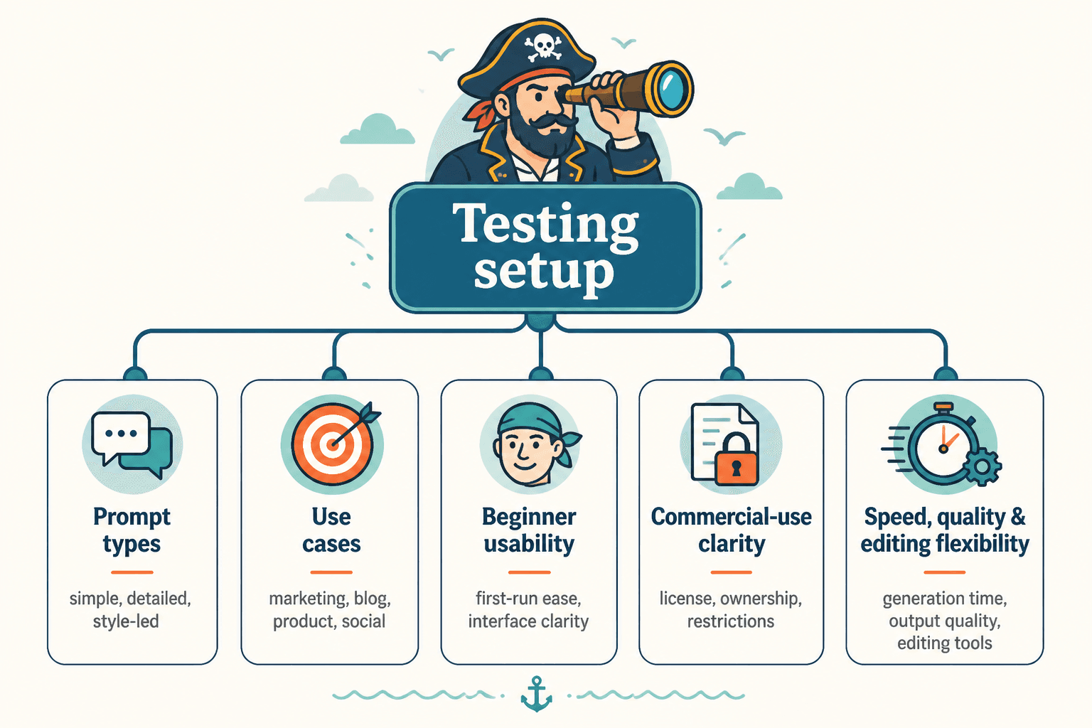
Show your testing setup so the comparison feels credible
If readers cannot tell how you compared the tools, they have to trust your judgment blindly. That is not ideal.
You do not need a giant methodology manifesto. Just give enough context to make the comparison feel grounded.
- What kind of prompts you used
- What use cases you tested
- Whether you evaluated beginner usability
- Whether you included commercial-use checks
- How you judged speed, quality, and editing flexibility
This can be one short section. But it matters. A little transparency makes the whole article more believable.
Use a table, but do not make the table do all the work
Tables are useful for quick comparison. They are not enough on their own.
A solid table can help readers narrow the field quickly, especially if it includes practical criteria rather than bloated checkmarks for every feature under the sun.
| Tool | Best for | Ease of use | Output quality | Editing strength | Commercial clarity | Value |
|---|---|---|---|---|---|---|
| Tool A | Fast marketing visuals | High | Good | Moderate | Clear | Strong |
| Tool B | Realistic images | Medium | Excellent | Moderate | Mostly clear | Medium |
| Tool C | Advanced creative control | Lower | Very good | Strong | Clear | Good for power users |
Then expand with short commentary underneath. Why is a rating “good” instead of “excellent”? What kind of user would care? Where does the tool start to become annoying?
That commentary is where the article becomes useful instead of just tidy.
Include “who should use this” and “who should skip this”
This is one of the fastest ways to improve comparison writing.
For each tool, give the reader a quick fit check:
- Use this if: you need speed, simple prompts, and decent visuals for content marketing
- Skip this if: you need tight brand control or highly polished client-facing outputs
That format cuts through indecision because it translates features into actual choices. Readers can often rule tools out faster from one “skip this if” line than from an entire paragraph of praise.
If you want examples of this done well, a useful companion would be AI image tool comparisons examples for creators who need a clear winner. Concrete examples usually reveal pretty quickly where a comparison is helping and where it is just producing decorative content.
Do not ignore workflow friction
The bigger point is simple: clearer structure and clearer writing make the piece more useful. That is usually what makes the ending land better too.
The bigger point is simple: clearer structure and clearer writing make the piece more useful. That is usually what makes the ending land better too.