
Most AI image tool comparisons feel biased for one simple reason: they are written backwards.
The writer already has a favorite, already has a narrative, and then goes shopping for proof. That is not a comparison. That is a dressed-up preference with a table.
If you want to write AI image tool comparisons that readers actually trust, you need a method that makes your judgment visible. Not neutral in a fake, robotic way. Just clear, fair, and specific enough that people can see how you got there.
This is especially important with AI image tools because the category is messy. Different tools are better at different things. Some are stronger for concept art, some for product mockups, some for fast ideation, some for editing, and some are mostly good at producing weirdly shiny nonsense that looks impressive for six seconds. A useful comparison helps the reader choose based on their use case, not your mood.
Here is how to write AI image tool comparisons that do not feel biased, even when you do have opinions. And yes, you should have opinions. You just need to earn them properly.
For the main guide behind this topic, visit the parent guide.
Start by admitting one annoying truth: there is no best AI image tool
A lot of comparison content collapses because it chases a fake universal winner.
Readers are not all trying to do the same thing. A YouTuber making thumbnail concepts, an ecommerce founder generating lifestyle shots, and a designer testing visual directions do not need the same tool. So if your comparison acts like one tool is simply “the best,” it immediately starts smelling like affiliate content in a cheap blazer.
The better framing is this:
- Best for fast ideation
- Best for photorealistic outputs
- Best for style control
- Best for editing and iteration
- Best for beginners
- Best for teams or workflow fit
- Best for a specific budget range
That one shift makes your piece more credible because it matches reality. It also helps readers decide faster, which is the whole point.
If you need a stronger evaluation process before you even start writing, read how to compare AI image tool comparisons without guessing. It pairs well with everything in this article.
Pick the criteria before you test anything
If your criteria change halfway through because one tool surprised you, your comparison gets squishy fast.
Set the judging categories up front. Not fifty of them. Just the ones that actually matter to the reader. Otherwise you end up comparing menu clutter, niche settings, and other things nobody cared about until content marketers needed more rows in a chart.
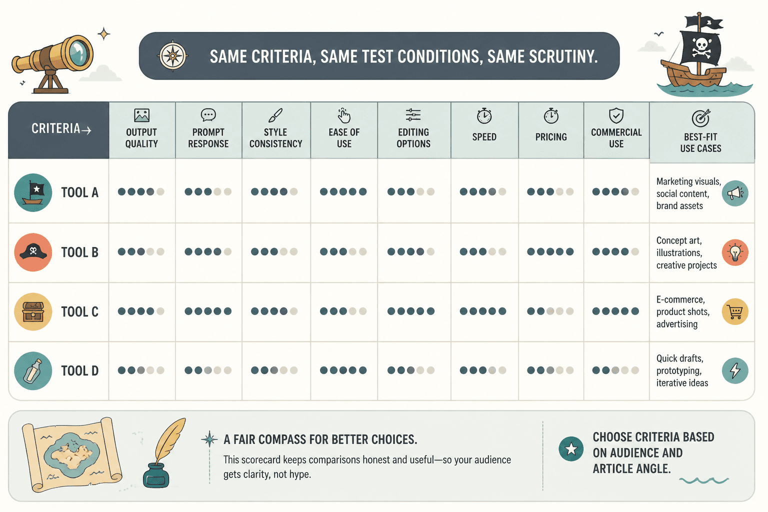
Good criteria for AI image tool comparisons usually include:
- Output quality
- Prompt responsiveness
- Style consistency
- Ease of use
- Editing or iteration options
- Speed
- Pricing and credit model
- Commercial usefulness
- Best-fit use cases
Not every article needs all of those. Choose based on the angle. If you are comparing tools for creators, workflow and speed might matter more than deep technical controls. If you are writing for designers, style control and iteration matter more.
The key is consistency. Every tool gets judged against the same set of criteria. Same test conditions. Same categories. Same level of scrutiny. That is what keeps the piece from feeling like a rigged talent show.
State your criteria in the article
Do not keep the framework hidden in your head.
Tell readers what you measured and why. A short paragraph near the top works well:
I compared these tools on output quality, ease of use, style control, editing flexibility, and value for money. Those are the areas most likely to affect whether a creator can actually use the tool without wasting hours or credits.
That small bit of transparency does a lot of trust work. It tells the reader you are not just vibing your way toward a conclusion.
Use the same prompts and test conditions
This should be obvious, but plenty of comparisons still get this wrong.
If one tool gets a clean, detailed prompt and another gets a lazy one-liner, your results are worthless. If one tool is tested on character design and another is judged on product imagery, you are not comparing tools. You are comparing random moments.
At minimum, use the same or equivalent test prompts across tools. Better yet, use a small set of prompts covering different needs.
- A photorealistic prompt
- An illustration or stylized concept prompt
- A product or brand asset prompt
- An editing or variation task if the tool supports it
This gives the reader a broader view of performance and helps avoid overrating a tool that is only good in one lane.
If your article is focused on use-case fit, make that explicit. For example, if the comparison is for marketers creating ad concepts, test ad concepts across every tool. Do not sneak in fantasy landscapes because they look cooler in screenshots.
And yes, mention where some tools required prompt adjustments to get reasonable outputs. That is useful information, not a flaw in your methodology. The friction of getting a good result is part of the result.
Separate facts, judgments, and preferences
This is where a lot of writers lose credibility without realizing it.
Readers can handle your opinion. What they do not like is when your opinion is smuggled in as objective truth.
A simple fix is to separate three layers clearly:
- Facts: pricing model, export limits, editing features, speed, available controls
- Judgments: easier to use, more consistent, weaker at anatomy, stronger for product visuals
- Preferences: I prefer this style, this interface clicks better for me, I would personally use this one more often
That distinction matters because it keeps the article intellectually clean. You are not pretending your taste is universal. You are showing where evidence ends and preference begins.
For example:
Tool A gives you more direct control over composition and style references. I found Tool B faster for rough idea generation, but that is partly a workflow preference. If you care more about precision than speed, Tool A will probably fit better.
That feels fair because it is fair. It also sounds more human than the usual “Tool B is superior” chest-thumping.
Show the tradeoffs, not just the winners
Every strong comparison article includes friction.
If each tool gets a glowing mini-review and one conveniently shines a little brighter, readers will assume you are steering them. Probably because you are.
Instead, show what each tool does well and where it falls short. Not with fake balance. With actual tradeoffs.
| Tool angle | What to include |
|---|---|
| Strengths | Where the tool performed clearly well |
| Weaknesses | Where outputs, controls, speed, or workflow fell short |
| Best for | The user or task that gets the most value from it |
| Not ideal for | The reader who will likely get annoyed or outgrow it fast |
This structure works because it avoids flattening the tools into generic blur. It helps the reader self-sort. And that is what good comparison writing should do.
If you want help deciding what evidence belongs in the article so the reader can make a fast call, read what to show in AI image tool comparisons so the reader can decide faster.
Bad comparison writing vs better comparison writing
Weak: Tool X is the best AI image generator for most people.
Better: Tool X was the easiest to get usable results from quickly, which makes it a strong pick for creators who care more about speed than granular control.
Weak: Tool Y struggled compared to the competition.
Better: Tool Y produced decent stylized images, but it was less consistent on photoreal prompts and needed more prompt tweaking to get clean outputs.
Specificity feels less biased because it gives the reader something to inspect.
Write for a use case, not an abstract category
“Best AI image tools” is broad enough to become mush.
The most trustworthy comparisons narrow the lens. They compare tools for a real scenario. That instantly improves relevance and lowers the chance that the article feels slanted.
Better angles look like this:
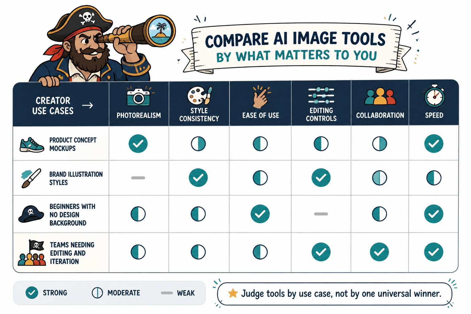
- Best AI image tools for content creators who need social visuals fast
- Best AI image tools for product concept mockups
- Best AI image tools for brand illustration styles
- Best AI image tools for beginners with no design background
- Best AI image tools for teams that need editing and iteration
Once you define the use case, your judgment gets sharper. The reader also knows whether your comparison applies to them. That means less suspicion, less generic scoring, and less “this tool won because the writer likes cinematic portraits of moody robots.”
If you are struggling to rank tools by use case without drowning in feature lists, how to judge AI image tool comparisons best for cases without getting lost in features will help.
Make your scoring system simple enough to trust
Scoring can help. It can also make the article look hilariously fake.
If every tool gets a decimal score like 8.7, 8.4, and 8.2, readers will rightly wonder how much of that precision came from rigorous testing and how much came from your spreadsheet cosplay.
Use scoring only if it clarifies. Keep it broad and understandable.
- Excellent
- Good
- Mixed
- Weak
Or use a five-point scale if you really need a quick visual. Then explain the score with one sentence of context. Numbers alone are not evidence.
A fair score should be traceable back to visible criteria. If the reader cannot understand why Tool A beat Tool B, the score just becomes decoration.
Disclose your angle before readers have to guess it
Bias feels worse when it is hidden.
If you are writing as a creator, say so. If your review prioritizes speed over technical depth, say that too. If you tested the tools primarily for marketing visuals rather than concept art, that belongs near the top.
This is not a weakness. It is context. And context makes your article more trustworthy because readers understand the lens.
Try language like:
This comparison is written from the perspective of a creator or marketer who needs usable visuals quickly, not a technical artist optimizing for maximum control.
That one sentence prevents a lot of pointless friction. It also filters in the right readers and filters out the ones looking for a different kind of comparison.
Use examples and screenshots as evidence, not decoration
In AI image tool comparisons, visuals are not optional fluff. They are the proof.
If you make claims about output quality, style consistency, prompt handling, or editing flexibility, show examples that support the claim. Readers should be able to inspect what you are talking about instead of taking your word for it.
What matters is not just showing pretty outputs. It is showing comparable outputs under comparable conditions.
Good evidence includes:
- Same prompt across tools
- Side-by-side outputs for a clear task
- Brief notes on what worked and what did not
- Examples of revisions or retries if relevant
- Any important limitations the screenshot does not show, like slow generation or confusing controls
What you want to avoid is the classic comparison crime: choosing one flattering output from your favorite tool and one mediocre output from the rest. Readers may not know exactly why it feels off, but they will feel it.
If you want examples of comparison structures that make a clear winner easier to understand without feeling forced, see AI image tool comparisons examples for creators who need a clear winner.
Do not hide the loser logic
A comparison should not just explain why the winner won. It should explain why the others did not.
That does not mean trashing them. It means showing the decision logic clearly enough that the reader can follow it.
For example:
- Tool A won on speed and ease of use
- Tool B had stronger controls but took longer to get reliable outputs
- Tool C was affordable but less consistent for commercial-quality images
The bigger point is simple: clearer structure and clearer writing make the piece more useful. That is usually what makes the ending land better too.