Most AI image tool comparison articles make one basic mistake: they compare features like a bored software catalog instead of helping you pick a winner for the work you actually do.
That is how creators end up reading 2,000 words about model options, style presets, and export settings, then somehow feeling less sure than when they started. More choice, less clarity. Classic.
If you need AI Image Tool Comparison Examples for Creators Who Need a Clear Winner, you probably do not want a giant spreadsheet of tiny differences. You want to know which tool is best for fast social graphics, which one is better for polished brand visuals, which one is easiest for non-designers, and which one is going to waste your time with pretty nonsense.
So that is what this article does. Not “every tool ranked for every human on earth.” Just practical comparison examples, clear use cases, and a simple way to choose without spiraling into feature-overload nonsense.
For the broader learning path, visit our parent guide.
What actually matters in AI image tool comparisons
Before comparing tools, it helps to stop asking the wrong question.
The wrong question is: “Which AI image tool has the most features?”
The better question is: “Which tool gives me the best result for my kind of work, with the least amount of friction?”
That sounds obvious, but a lot of creators still get pulled in by shiny extras they will never use. If you make carousels, lead magnets, thumbnails, mockups, blog visuals, social promos, or brand assets, you do not need a tool that can generate twelve obscure rendering modes for fantasy jellyfish architecture. You need speed, control, decent consistency, and outputs that do not look like melted stock photography.
- Image quality: Does the output actually look good?
- Prompt control: Can you steer the result without fighting the tool?
- Consistency: Can you get a repeatable visual style, or is every result a random mood swing?
- Editability: Can you refine, regenerate, expand, or tweak without starting from scratch?
- Ease of use: Does it help non-designers, or does it expect you to enjoy prompt archaeology?
- Workflow fit: Is it good for social content, branding, blog images, ads, or concept art?
- Speed: How quickly can you go from idea to usable asset?
- Cost sanity: Is the result worth the pricing, or are you paying premium rates to babysit weird outputs?
If you want a broader framework before choosing, it is worth reading what really matters in AI image tool comparisons for solo creators. It will save you from choosing based on flashy demos and regret.
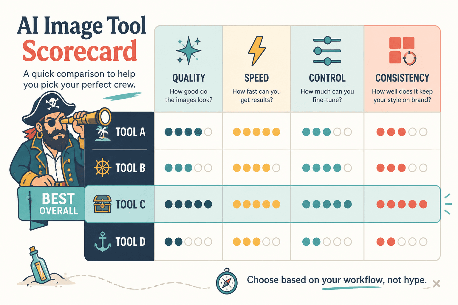
The fastest way to pick a clear winner
If you need a fast decision, use this rule:
- Pick the tool with the best default outputs if you hate tweaking.
- Pick the tool with the best editing and iteration controls if you care about refining details.
- Pick the tool with the best workflow integration if you publish often and need volume.
- Pick the tool with the best brand consistency potential if you are building a recognizable visual identity.
That is the whole game. Not “Which tool wins the internet?” More “Which tool helps me stop fiddling and finish the asset?”
AI image tool comparison examples by creator use case
Here is where most comparisons should start: with the job, not the tool.
Example 1: A coach needs clean social graphics fast
Let’s say a coach wants branded quote cards, simple promo graphics, webinar visuals, and decent article images without spending half the day tweaking prompts.
In that case, the winner is usually the easiest tool with the best usable defaults, not the one with the deepest creative controls.
| What matters | Best type of tool | Why |
|---|---|---|
| Fast output | Beginner-friendly AI image generator | Less prompt fuss, faster publishing |
| Simple branding | Tool with reusable styles or templates | Helps visuals feel more consistent |
| Low learning curve | Integrated design + AI tool | Better for creators who are not designers |
| Minor edits | Tool with quick in-app refinement | Fixes mistakes without a total reset |
Clear winner: the tool that gets you to “good enough and on-brand” fastest.
Not the winner: the tool that produces astonishing art but needs seven retries, manual prompt tuning, and a small prayer circle before anything becomes usable for business content.
Example 2: A course creator needs polished lead magnet and sales page visuals
This creator needs ebook covers, mockups, section graphics, lesson visuals, and promo assets that look more premium than random.
Now the comparison changes. Speed still matters, but control and polish matter more. You want a tool that can generate better composition, cleaner detail, and maybe support editing, upscaling, or style consistency.
- If one tool gives prettier outputs but weak consistency, it is less useful for a branded product launch.
- If another gives slightly less dramatic outputs but stronger repeatability, that one often wins.
- If a design platform includes AI generation plus layout tools, it may beat a pure generator because the workflow is tighter.
Clear winner: the tool that helps you create a full visual set, not just one good-looking image.
Example 3: A blogger wants featured images that do not look like stock sludge
This is a common one. A writer or consultant wants article visuals that feel more original than stock photos, but still professional enough not to look like the blog is being run by an overcaffeinated robot.
For this use case, the best tool is often the one with the strongest balance of:
- realistic or semi-stylized image quality
- predictable prompt interpretation
- easy aspect ratio handling
- quick variations for testing different article angles
If the article is about business, marketing, personal brand building, or creator workflows, you usually want visuals that feel clean, conceptual, and editorial. Not fantasy art. Not surreal chrome fruit levitating in a boardroom. Unless that is your thing, in which case, sure, be weird on purpose.
Clear winner: the tool that generates useful conceptual images with the least visual nonsense.
Example 4: A personal brand wants a consistent visual identity
This is where many tools fall apart. They can generate one nice image. They cannot reliably generate a recognizable series.
If you are building a personal brand, consistency matters more than occasional brilliance. One incredible image and nine off-brand weird ones is not a system. It is a mood board having a crisis.
Here the winning tool is usually the one that supports some combination of:
- reference images
- repeatable style settings
- strong prompt adherence
- editing and variation controls
- easy export into the rest of your content workflow
This use case often rewards the “less magical, more controllable” option.
If you need more category-level guidance, start with this AI image tool comparisons hub and then read best AI image tool comparisons for creators who need the right fit for a broader shortlist view.
How to compare AI image tools without getting distracted by shiny nonsense
You do not need to test every feature. You need to test the right tasks.
Here is a simple comparison method that works much better than reading fifty reviews from people making cyberpunk owls.
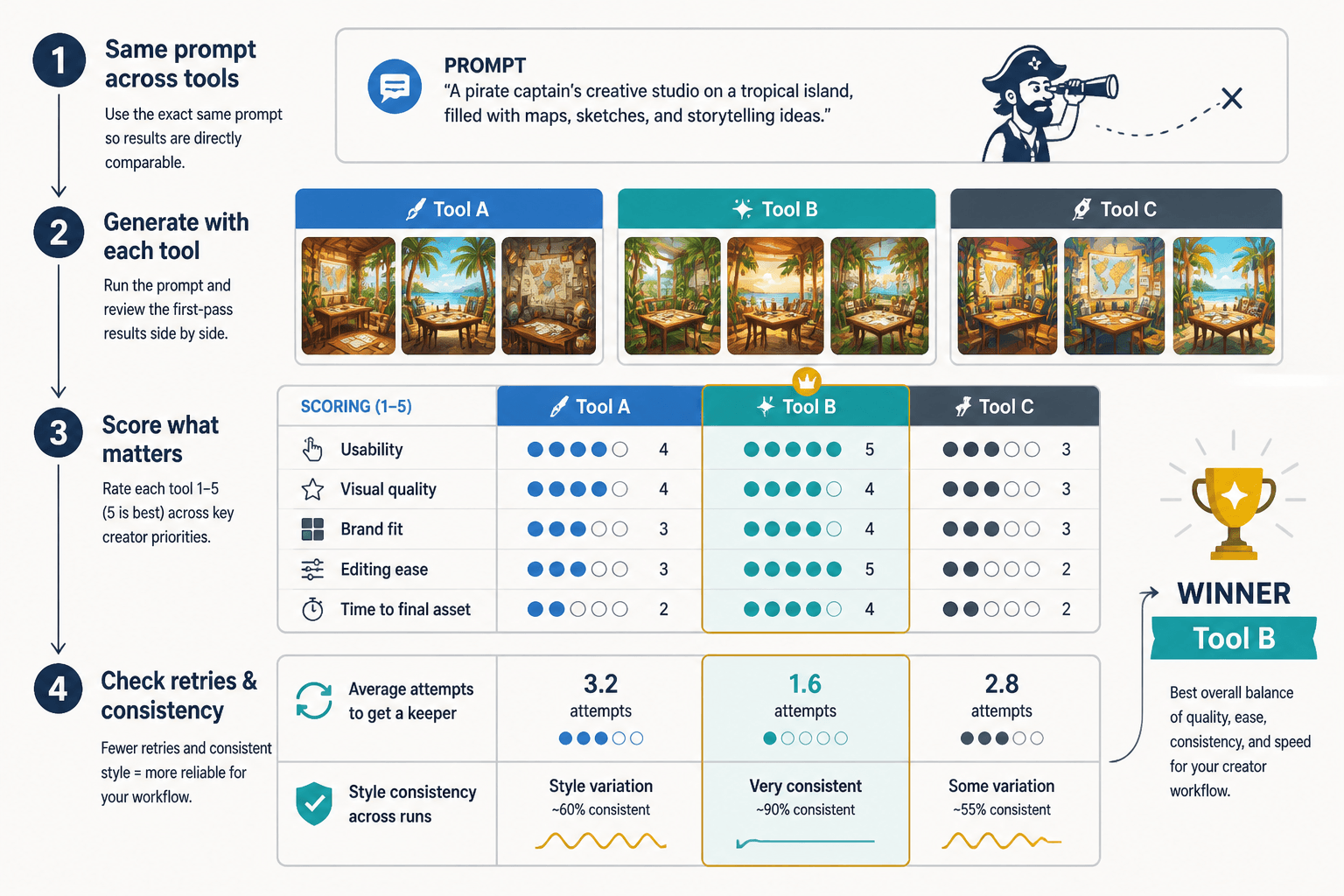
1. Pick 3 real tasks from your workflow
- Create a blog featured image
- Make a social post visual
- Build a lead magnet cover or promo graphic
Use tasks you actually repeat. Not random tests you saw on YouTube.
2. Use the same prompt goal across tools
Do not make the comparison messy. If one prompt asks for “clean editorial business illustration” and the other asks for “cinematic future marketing scene,” you are not comparing tools. You are comparing your own inconsistency.
3. Score the output on 5 practical factors
- Usability
- Visual quality
- Brand fit
- Editing ease
- Time to final asset
4. Count retries
This matters more than people admit. A tool that gives you a good result in two tries often beats a “higher quality” tool that needs nine rounds of coaxing and disappointment.
5. Check consistency, not just one lucky result
Run the same style request across several outputs. If the tool keeps drifting into visual chaos, it is less useful for creators who publish regularly.
A simple winner matrix for creators
If you just want a quick decision framework, use this.
| If you care most about… | Your likely winner | Why |
|---|---|---|
| Fast, usable visuals | Beginner-friendly tool | Less learning, faster output |
| Better-looking polished images | Quality-first generator | Stronger image aesthetics |
| Brand consistency | Tool with references and style control | More repeatable identity |
| Content workflow efficiency | AI tool inside design platform | Less switching between apps |
| Heavy customization | Advanced generator with editing tools | More control after generation |
| Low overwhelm | Simpler all-in-one option | Better for solo creators moving fast |
That “likely winner” language matters. There is no permanent universal champion here. The best tool for a YouTube thumbnail designer is not automatically the best tool for a consultant making LinkedIn carousels and article graphics.
What most creators get wrong when comparing AI image tools
A few mistakes show up constantly.
They compare creativity instead of usefulness
A tool can be wildly creative and still bad for creator workflows. If the output is beautiful but unusable for your brand, your funnel, your article, or your social content, it does not win. It just shows off.
They ignore editing friction
Generation is only part of the job. If fixing hands, text areas, composition, or brand details becomes a whole second project, the tool is costing you more than it appears.
They choose based on one viral example
This one is especially common. Somebody sees an incredible showcase post and assumes the tool always performs like that. It does not. A lot of those examples come from skilled prompt users, careful curation, and selective posting. Funny how nobody goes viral with the sixteen cursed drafts before the decent one.
They forget where the image actually goes
A thumbnail, article image, PDF cover, carousel visual, and sales page header do not need the same thing. Context changes the winner.
They expect the tool to provide taste
No tool fixes weak visual judgment. It can speed you up. It can offer options. It can help you produce more. But if your prompts are vague and your standards are “well, I guess this exists,” the result will reflect that.
If you are still narrowing your options, this guide for beginners who hate feature overload is a much saner starting point than trying to master every tool category at once.
How solo creators should choose a winner
If you are a solo creator, consultant, coach, or small brand, your best choice is usually not the most advanced tool. It is the one you will actually use consistently.
That means the winner should probably do at least three things well:
- produce good outputs without heroic prompting
- fit easily into your current content workflow
- help you maintain a reasonably consistent visual style
That is enough for a lot of creators. You do not need the image-generation equivalent of a spaceship when what you really need is a reliable kitchen knife.
For a broader map of the category, you can also explore this AI image tool comparisons guide for creators who want better tools and the wider AI writing tools and workflows section if you are building a fuller content system around your visuals.
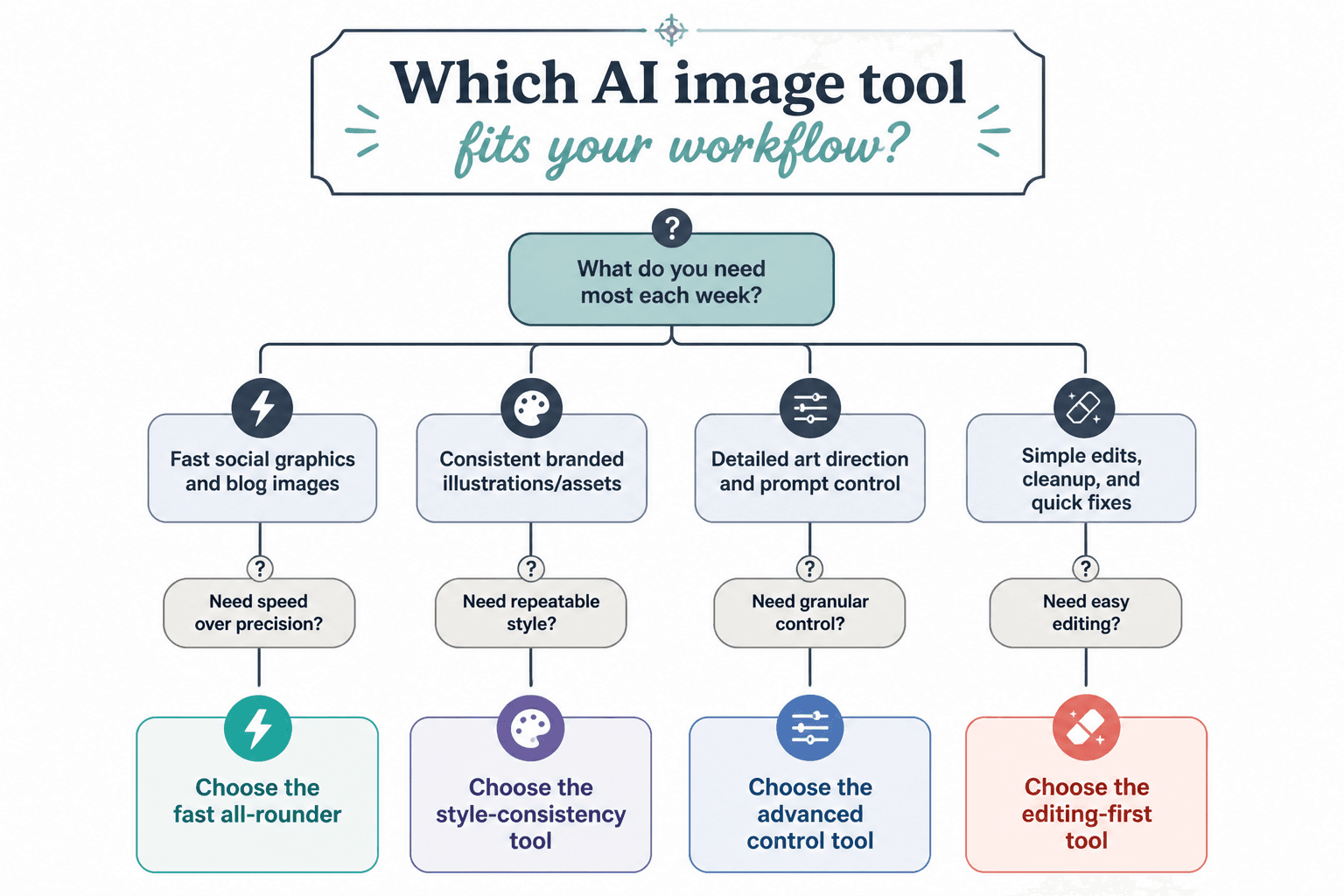
Quick comparison checklist before you commit
- Can it create the kinds of visuals you publish every week?
- Do the results look good without endless retries?
- Can you keep a consistent style across multiple assets?
- Is editing easy enough to fix obvious mistakes fast?
- Does it fit your actual workflow, not your imaginary future workflow?
- Will you still like using it after the novelty wears off?
If the answer to most of those is yes, you probably have your winner.
The bigger point is simple: clearer structure and clearer writing make the piece more useful. That is usually what makes the ending land better too.