
Most AI image tool comparisons are weirdly bad at helping solo creators choose anything.
They obsess over giant feature grids, cinematic prompt tests, and side-by-side image showdowns that look impressive but answer the wrong question. A solo creator usually does not need the “most advanced” tool. They need the tool that fits their actual work without turning every thumbnail, lead magnet, mockup, or social graphic into a fiddly little production.
That is what really matters in AI image tool comparisons for solo creators: not who wins in a lab, but who saves time, gives enough control, and produces usable visuals without making you want to throw your laptop into a hedge.
If you are comparing tools for content, offers, social posts, blog visuals, simple brand graphics, or client-facing assets, this is the filter that matters. We are going to strip away the shiny nonsense and focus on the things that actually affect speed, quality, consistency, cost, and sanity.
Want the broader roadmap? Start with the parent guide.
Start with the job, not the tool
The biggest mistake in AI image tool comparisons is treating all image generation like one job.
It is not one job. “I need visuals” can mean wildly different things:
- Blog header images
- Social post graphics
- Lead magnet illustrations
- Product mockups
- Ad creatives
- YouTube thumbnail concepts
- Brand moodboards
- Presentation visuals
- Course graphics
- Client concept boards
A tool that is great for moody concept art may be annoyingly bad for clean marketing assets. A tool that makes polished stock-style scenes fast may be too stiff if you want a distinct visual style. A tool with endless controls may sound exciting until you realize you just needed six decent article images before lunch.
So before you compare anything, define the real job.
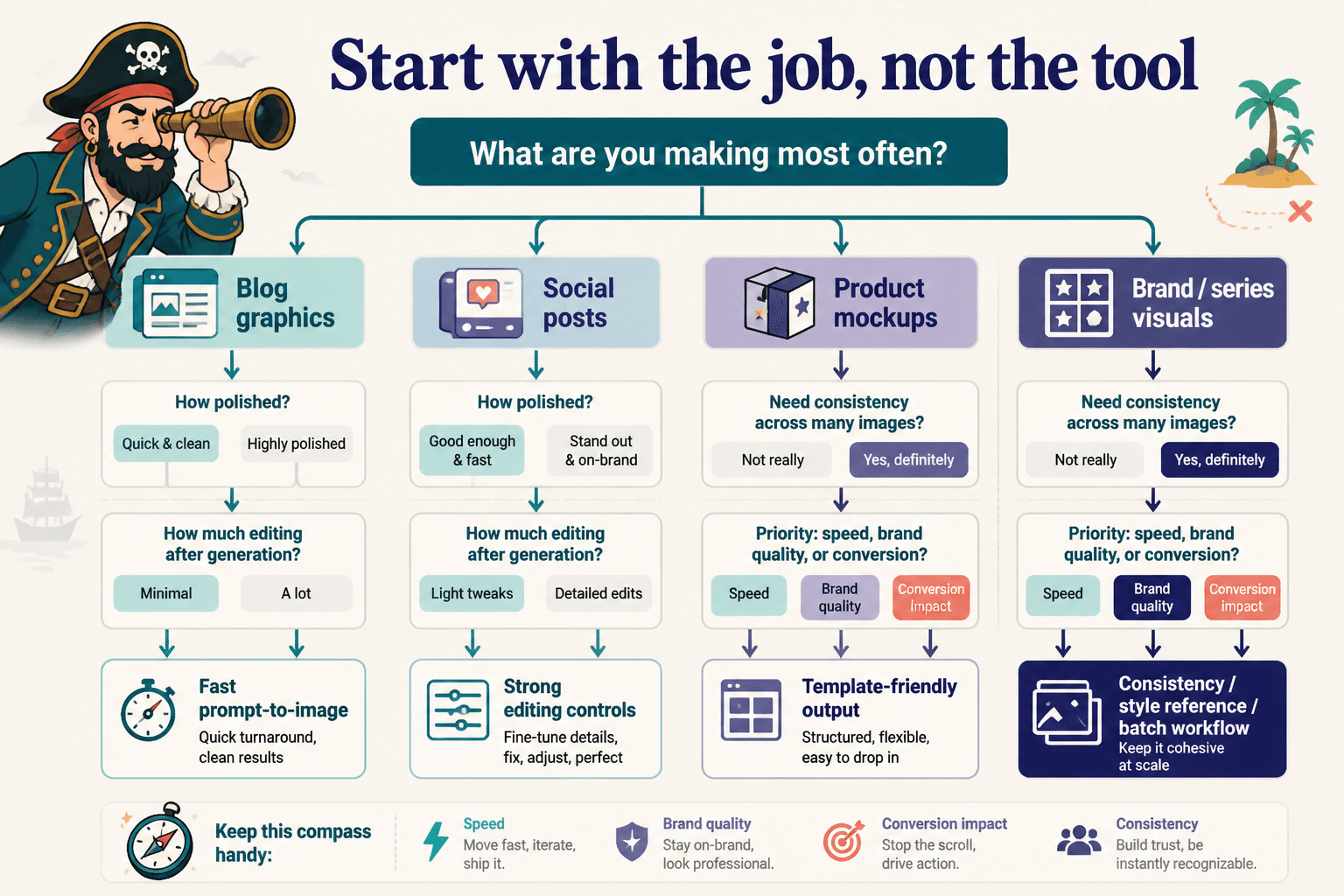
- What are you making most often?
- How polished does it need to be?
- How much editing are you willing to do after generation?
- Do you need consistency across many images?
- Are these images for speed, brand quality, or direct conversion?
If the comparison does not start there, it is mostly content theater.
For a broader look at this category, you can browse the AI writing tools and workflows hub, the AI image tools section, and the main AI image tool comparisons page.
What really matters in AI image tool comparisons for solo creators
Here are the criteria that deserve most of your attention.
1. Usable output, not just impressive output
A comparison should not only ask, “Can this tool make a beautiful image?” It should ask, “Can this tool make an image I can actually use for my business?”
Those are not the same thing. Plenty of tools can make gorgeous, dramatic visuals that fall apart the second you need readable composition, on-brand colors, clean object placement, or enough white space to add text.
For solo creators, usable usually means:
- The image fits common content formats
- The style does not look painfully generic
- The subject is clear fast
- The image can support text overlays if needed
- You are not fixing obvious weirdness every single time
- The result looks credible enough for your audience and offer
If a comparison only shows “best looking” outputs without asking whether they work inside real creator workflows, it is missing the point.
2. Speed from prompt to finished asset
Time matters more than a lot of reviews admit.
Solo creators are not usually sitting around running fifty prompt experiments for sport. They are trying to publish. If one tool creates slightly nicer images but takes three times longer to get to something usable, that is not a small detail. That is the decision.
Look at total workflow speed:
- How easy is prompting?
- How many retries do you need?
- How often do you get near-usable outputs?
- Can you edit inside the same tool?
- Can you resize or adapt for multiple formats?
- Does it slow you down with credits, queues, or clunky navigation?
The “best” tool on paper can be a terrible choice if it keeps introducing friction into small recurring tasks.
3. Control level that matches your patience
More control is not automatically better. This is one of those things people say as if nuance died in the hallway.
If you are a designer or a very visual creator, deep control may be worth it. If you are a coach, consultant, writer, or solo founder who needs fast image support for content and offers, too much control can become a tax. You will spend half your afternoon tweaking settings you did not need in the first place.
A good comparison should tell you where a tool sits on the spectrum:
- Fast and guided: easier for non-designers, less flexible
- Balanced: decent defaults with some control
- Power-user heavy: more customization, more learning curve
The right answer depends on your workflow, not your ego. You do not get bonus points for using the complicated one.
4. Style consistency across multiple images
This one gets overlooked constantly, and it matters a lot once you move past playing with prompts.
Solo creators often need a set of visuals that feel like they belong together: a content series, a sales page, a deck, a PDF guide, a carousel, a workshop handout. One pretty image is nice. A reliable style system is better.
Look for comparisons that test whether the tool can help you maintain:
- Similar lighting and mood
- Consistent composition style
- Repeatable brand-adjacent aesthetics
- Visual coherence across batches
- Character or scene continuity when needed
If every result feels like it came from a different universe, your content starts looking patched together. That can work for experimentation. It is less helpful for a brand trying to look deliberate.
5. Editing and iteration inside the tool
Generation is only half the story. What happens after the first draft matters just as much.
The useful question is not “Can it generate?” The useful question is “Can I fix the thing that is almost right without starting over from scratch?”
That includes things like:
- Inpainting specific areas
- Expanding backgrounds
- Removing awkward details
- Adjusting aspect ratios
- Creating variations from a strong base image
- Keeping most of the image while changing one element
For solo creators, strong iteration tools often matter more than flashy generation demos. Because in real life, “close enough, now fix this part” is a much more common workflow than “nail it perfectly in one prompt and ride into the sunset.”
6. Fit for your brand, not just general quality
Some tools have a distinctive visual fingerprint. Sometimes that is useful. Sometimes it makes your brand look like everybody else using the same presets.
When comparing tools, ask:
- Can this tool support the tone of my brand?
- Does it lean too glossy, too surreal, too stock-like, or too artificial?
- Can I get results that feel modern without feeling machine-made?
- Will these visuals help build trust, or just look novel?
Trust matters. If you are selling expertise, premium services, or thoughtful educational products, your visuals should support credibility. Not scream, “I found a toy and got carried away.”
7. Pricing that matches frequency of use
Pricing is not just monthly cost. It is cost relative to how often you use the tool and how much value it saves or creates.
A cheap tool can be expensive if it wastes your time. An expensive tool can be sensible if it supports a weekly workflow that would otherwise require stock image hunting, design hours, or constant outsourcing.
Look beyond headline pricing and compare:
- Credit limits
- Commercial usage terms
- Export quality
- Editing access
- Team or client use if relevant
- Whether better features are locked behind higher tiers
If you want more detail on this angle, read AI image tool comparisons pricing fit mistakes that lead to bad tool picks.
8. Learning curve versus repeatability
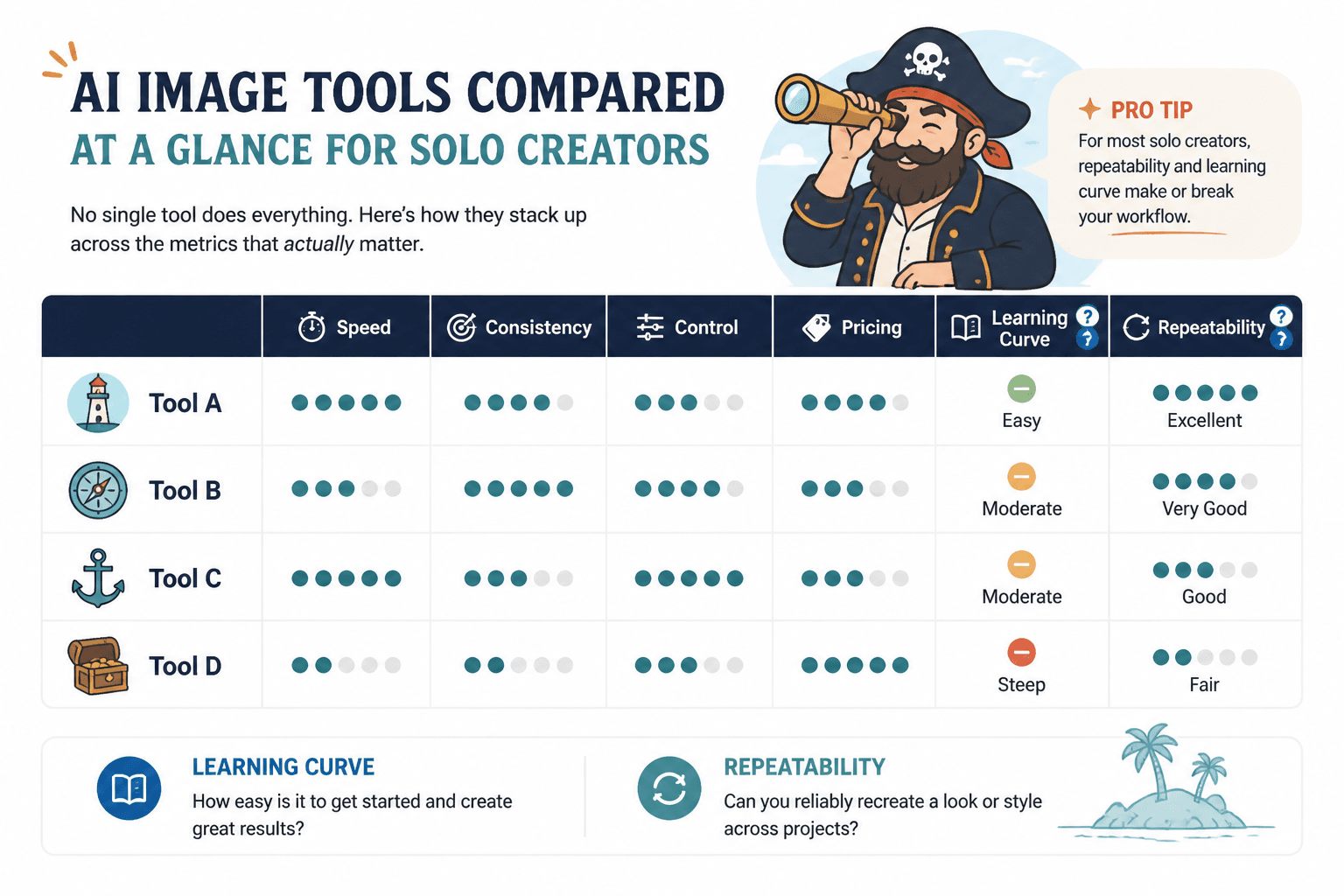
Some tools are easy to start and hard to master. Others are easy enough all the way through. What matters is not just your first impression, but whether you can get repeatable outcomes after a week or two of use.
A proper comparison should ask:
- Can a non-designer get usable results quickly?
- Does the tool reward better prompting over time?
- Can you build a repeatable process, or is it random every time?
- Will future-you remember how to get good outputs again?
That last one matters more than people think. A lot of “powerful” tools are really just chaotic unless you are using them constantly.
What matters less than people pretend
Not everything deserves equal weight. Some comparison points are overvalued because they look neat in reviews.
Huge feature lists
If you will only use 20 percent of the tool, the other 80 percent is not a benefit. It is decoration.
One-off “best image” contests
One stunning result proves very little. You need to know average output quality and how much work it takes to get there.
Wildly technical settings if your workflow is simple
If your main job is making article visuals, promo graphics, or educational assets, advanced controls are only useful if they improve your actual results without slowing you down.
Trendiness
The tool everybody is posting about is not automatically the right one for your business. Social buzz is a terrible procurement strategy.
A better way to compare AI image tools as a solo creator
If you are trying to choose sanely, use a short scorecard based on your real work.
| Criteria | Question to ask | Why it matters |
|---|---|---|
| Output usability | Can I publish or adapt this easily? | Saves editing time |
| Speed | How long from prompt to usable asset? | Protects workflow |
| Control fit | Is this simpler or fussier than I need? | Prevents tool fatigue |
| Consistency | Can I create a cohesive set of visuals? | Supports branding |
| Editing | Can I refine without restarting? | Makes near-misses useful |
| Brand fit | Does the style help trust? | Improves audience response |
| Pricing fit | Is the cost sensible for my usage? | Avoids waste |
| Repeatability | Can I get good results consistently? | Builds a usable system |
Then test each tool using the same three or four tasks you actually do.
- Create a blog header image
- Make a square social graphic concept
- Generate a lead magnet illustration
- Adapt one image into another format
That tells you more than an hour of reading dramatic online opinions.
If you want a clearer framework for this, read how to judge AI image tool comparisons best for cases without getting lost in features and what to show in AI image tool comparisons so the reader can decide faster.
Common bad picks solo creators make
Picking for maximum power instead of minimum friction
You do not need a spaceship to go buy groceries. A lot of solo creators buy the spaceship anyway.
Picking based on image beauty alone
Pretty outputs can still be awkward for real content formats, weird for trust-based businesses, or impossible to reproduce consistently.
Ignoring editing tools
If a tool gets you 80 percent there but gives you no clean way to fix the last 20 percent, it may be less useful than a “weaker” tool with better editing controls.
The bigger point is simple: clearer structure and clearer writing make the piece more useful. That is usually what makes the ending land better too.