
Most people do not overspend on AI image tools because they picked the “wrong” tool. They overspend because they compare them badly.
They test too many platforms at once, get distracted by flashy styles, ignore usage limits, and end up paying for features they do not need. Then they tell themselves they are “still evaluating.” That usually means they are renting confusion monthly.
If you want to know how to compare AI image tools on a small budget, the goal is not to find the perfect tool. It is to find the best fit for your actual work without burning cash on vague experimentation. A solo creator does not need a cinematic laboratory. You need a way to test quality, speed, control, and pricing without making this a part-time research project.
This guide will help you compare tools in a way that is cheaper, cleaner, and much more honest. You will end up with a short list, a simple testing method, and a better shot at picking something you will still like after the novelty wears off.
For the full path around this topic, head to the parent guide.
Start with the job, not the tool
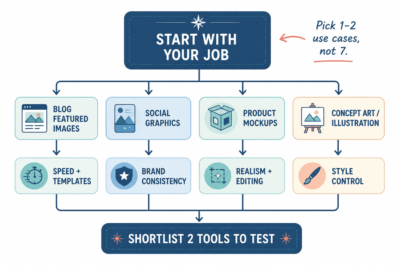
The biggest mistake in AI image tool comparisons is starting with brand names instead of use cases.
If you compare tools without knowing what you need them for, every result looks “pretty good” and every pricing page looks “not that bad.” That is how people end up spending $20 here, $30 there, and somehow needing a spreadsheet just to remember what they subscribed to.
Before you test anything, get specific about the job:
- Social post graphics
- Blog feature images
- Product mockups
- Brand-style illustrations
- Ad creatives
- YouTube thumbnails
- Lead magnet visuals
- Client concept images
Those are not the same job. A tool that is fine for fast blog images may be terrible for brand consistency. A tool that creates gorgeous art may be annoyingly slow for routine content production.
So define your top one or two use cases first. Not seven. Two is enough.
If your use case is fuzzy, your comparison will be fuzzy too.
For a broader look at the category, you can explore the main AI image tool comparisons hub and the related AI writing tools and workflows section if you are building a wider content system around these tools.
Pick comparison criteria before you open any free trial
Do not open five tabs and freestyle your way into a decision. That is not testing. That is digital wandering.
A small-budget comparison works best when you decide in advance what matters. Otherwise the loudest feature wins, and the loudest feature is often not the one you will use most.
For most solo creators, these are the criteria that matter:
- Image quality: Does it look good enough for your use case?
- Prompt responsiveness: Does the tool actually follow instructions well?
- Style consistency: Can you get similar-looking outputs across multiple generations?
- Ease of use: Can you get useful results without ritual sacrifice?
- Editing control: Can you refine, remix, resize, or tweak images without starting over?
- Speed: Does it fit your workflow, or does it feel like waiting for a bus that may not come?
- Commercial usefulness: Are the results usable for your brand, client work, or offers?
- Pricing fit: Does the plan structure match your actual usage?
You do not need to weight every category equally. If you need fast visual drafts for articles, speed and cost may matter more than artistic depth. If you need branded campaign visuals, consistency and control matter more than novelty.
If you want a cleaner evaluation framework first, read How to Compare AI Image Tool Comparisons Without Guessing. It pairs well with this article because guessing is expensive in very boring ways.
Use a small-budget testing method that does not waste credits
The cheap way to compare tools is not to test everything. It is to test a few tools with the same prompts, the same goals, and the same standards.
The practical three-tool rule
Start with three tools max.
More than that and your test quality drops. You forget what each tool did well, your prompts drift, and your notes get sloppy. Suddenly the “comparison” is just vibes dressed as research.
Pick:
- One tool that is known for strong quality
- One tool that is known for good value
- One tool that seems especially suited to your use case
Use one prompt pack for all tools
Create a short set of 5 to 8 prompts based on your real work. Not fantasy art prompts you found on Reddit. Your actual work.
Example prompt pack for a solo creator making content visuals:
- A clean feature image for an article about email marketing mistakes
- A branded social graphic with a modern editorial feel
- A thumbnail-style image with strong contrast and simple focal point
- A conceptual illustration for a post about creator burnout
- A product-style mockup for a digital template bundle
Run the same prompt pack in each tool. If a tool needs slightly different prompt formatting, adjust carefully, but do not rewrite the whole idea just to make one tool look smarter than it is.
Set a credit cap
This part matters more than people think.
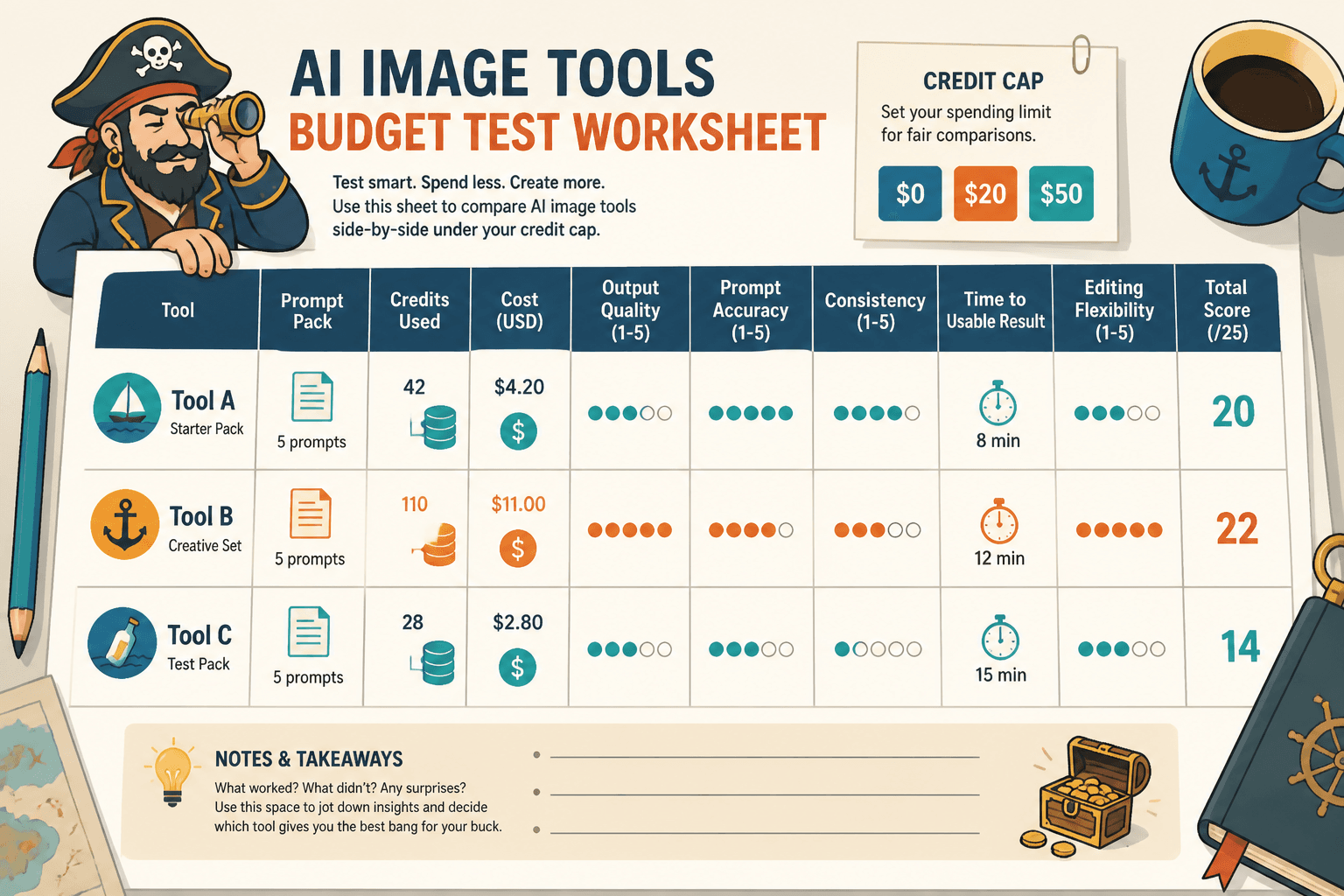
Give yourself a hard budget for testing. Something like:
- $0 if you are only using free tiers
- $20 total for a basic first round
- $50 total if this decision affects client delivery or high-volume output
When the budget is fixed, your testing gets sharper. You stop generating 47 versions of a neon astronaut that has nothing to do with your business.
What to track in your comparison notes
You do not need a giant dashboard. You need notes that help you make a sane decision later.
Track each tool across a few simple categories:
| Category | What to note |
|---|---|
| Output quality | Did the image look usable, polished, and relevant? |
| Prompt accuracy | Did it follow your instructions or wander off creatively? |
| Consistency | Could you reproduce a similar style more than once? |
| Time to usable result | How many tries before you got something worth keeping? |
| Editing flexibility | Could you improve a good image without rebuilding it? |
| Credit efficiency | How many generations did one decent result cost you? |
| Workflow fit | Did the interface help or annoy you? |
| Price logic | Does the pricing model make sense for your volume? |
One extra note worth adding: would you actually want to use this again next week?
That sounds obvious, but it catches something important. A tool can be technically impressive and still be a pain to work with. If using it feels fiddly, slow, or weirdly fragile, that matters. A lot.
Compare pricing the way small-budget users actually experience it
Sticker price is not the whole story. The cheap plan is not cheap if you burn through credits in one afternoon. And the expensive plan is not expensive if it gets you usable images in half the time.
When you compare pricing, look at cost through these questions:
- How many useful images can you realistically get per month?
- Do failed generations still cost credits?
- Is there a watermark or export restriction?
- Can you upscale, edit, or rework images within the same plan?
- Does the tool push you into higher tiers too quickly?
- Will occasional use make the subscription wasteful?
This is where many tool comparisons go wrong. They compare list prices instead of effective cost per usable output.
That metric is less glamorous, but much more useful. If one tool gives you 20 usable images from a month’s credits and another gives you 80, you do not really need a TED Talk about pricing strategy to know which one is treating your wallet better.
For more on this side of the decision, read AI Image Tool Comparisons: Pricing Fit Mistakes That Lead to Bad Tool Picks. It will save you from the classic move of buying for “potential” instead of actual usage.
Do not confuse style quality with tool quality
This one trips people up fast.
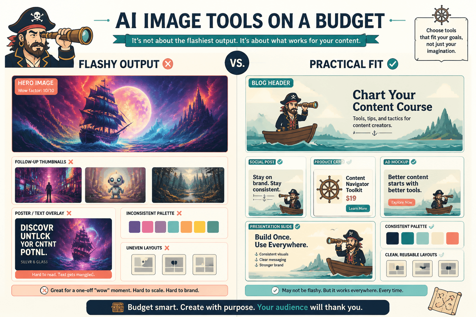
If one tool produces dramatic, eye-catching results out of the box, it can feel better immediately. But bold style is not the same thing as broad usefulness. Sometimes a tool is just very good at one look. That is nice. It is not the same as being the right fit for your workflow.
What you want to compare is not just “Which image looks coolest?” but things like:
- Can it handle different visual moods?
- Can it produce clean, simple compositions?
- Does it break when you ask for text, layouts, or brand-like consistency?
- Can it work for business content, not just aesthetic experiments?
Style quality matters, obviously. But if your use case is commercial or content-driven, reliability matters more than occasional visual fireworks.
If that is the part you are stuck on, AI Image Tool Comparisons: How to Compare Style Quality the Smart Way digs deeper into how to judge style without getting hypnotized by shiny outputs.
A simple scorecard you can actually use
You do not need a laboratory-grade system. A lightweight scorecard is enough.
Rate each tool from 1 to 5 on these categories:
- Quality
- Prompt accuracy
- Consistency
- Ease of use
- Editing features
- Speed
- Credit efficiency
- Price fit
Then add one short written note under each tool:
- Best for: what kind of work it seems strongest at
- Annoying limitation: the main downside you noticed
- Would I pay for this? yes, no, or only for a specific project
That last line is useful because it forces clarity. Some tools are worth paying for permanently. Some are worth paying for once, when you need a specific result. Big difference.
How to compare AI image tools on a small budget without falling for free-trial nonsense
Free trials are helpful, but they can also be a bit sneaky.
Some tools give you just enough generations to feel intrigued, not enough to understand the workflow. Others are generous on generation count but hide the better controls, export options, or editing tools behind paid tiers. So if you are comparing based on a free plan alone, be careful what you are actually learning.
Use free trials to answer these questions:
- Do I like the interface?
- Can I get one or two genuinely useful outputs?
- Does the tool seem aligned with my type of work?
- Is prompt control decent enough to justify a paid test?
Do not use free trials to decide every fine detail. Sometimes you need a low-cost paid month to judge the tool properly. The trick is making that paid test deliberate, not accidental.
A good rule: only move to paid testing if a tool already showed promise in your first prompt pack. If it looked messy, inconsistent, or awkward in the free tier, stop. You are not obligated to continue the relationship.
Common small-budget comparison mistakes
Most bad picks come from a handful of very repeatable mistakes.
- Testing too many tools at once: You get overwhelmed and compare nothing properly.
- Using random prompts: You learn what the tool does for fun, not for your work.
- Judging on first-image wow factor: Flashy is not always useful.
- Ignoring editing workflow: Generation is only half the job.
- Buying annual too early: Calm down. You have known this tool for 45 minutes.
- Comparing list price only: Cheap monthly pricing can still produce expensive results.
- Not tracking usable outputs: This is the metric that actually affects value.
The broader lesson is simple: compare tools based on repeatable usefulness, not isolated novelty.
What actually matters most for solo creators
If you are a solo creator, coach, consultant, writer, or small business owner, you probably do not need the most advanced tool on the market. You need the one that helps you publish, market, explain, and sell more efficiently.
That usually means the winner is not the tool with the wildest gallery. It is the tool that gives you a reliable path to usable visuals with acceptable cost and low friction.
In plain English:
The bigger point is simple: clearer structure and clearer writing make the piece more useful. That is usually what makes the ending land better too.