Most AI image tool comparisons fall into the same trap: they hand you a bloated feature checklist, sprinkle in some sample outputs, then act like you now have clarity. You do not. You have tabs open, a slightly worse mood, and a growing suspicion that every tool “works great for creators” somehow means absolutely nothing.
If you are trying to figure out which tool is actually best for your work, the phrase best for matters a lot more than the feature grid. Because “has inpainting, upscaling, style presets, editing controls, API access, and team collaboration” is not a decision. It is a pile.
This is how to judge AI image tool best-for cases without getting lost in features: stop asking which tool has the most stuff, and start asking which tool fits your output, speed, control needs, quality bar, and workflow friction. That is where the real decision lives.
If you want a broader comparison process first, read How to Compare AI Image Tool Comparisons Without Guessing. If you are still narrowing your shortlist, Best AI Image Tool Comparisons for Creators Who Need the Right Fit will help. And if commercial use is part of the decision, Simple AI Image Tool Comparisons Commercial Use Framework for Faster Decisions is worth your time.
To see how this fits into the wider strategy, open the parent guide.
Why feature-heavy comparisons keep making simple decisions harder
Features feel objective, so people cling to them. That is understandable. It is easier to compare “number of editing tools” than “which one helps me make decent ad creatives in 15 minutes without wanting to throw my laptop into a hedge.”
But features only matter inside a use case. A tool having more controls is useful if you need more control. If you need quick concept visuals for client pitches, extra complexity can actually make the tool worse for you. More settings are not automatically more value. Sometimes they are just more places to get stuck.
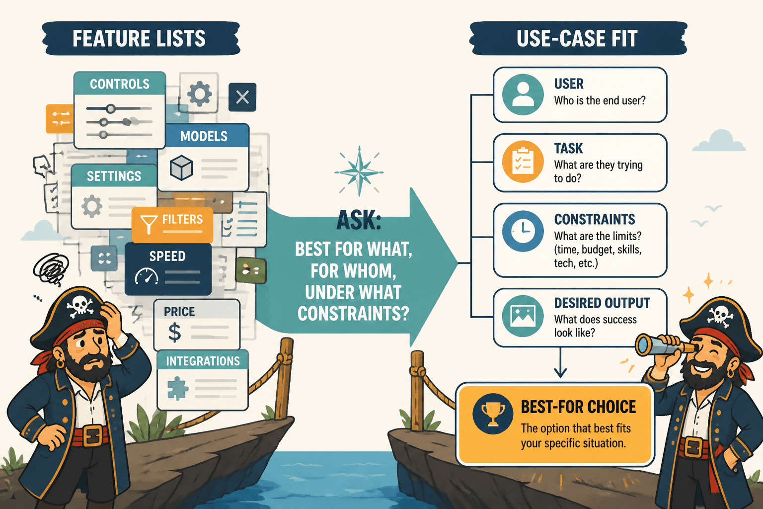
This is the core mistake: people compare AI image tools as products instead of comparing them as fits for a job.
A good comparison does not ask, “Which tool is strongest?” It asks, “Strongest for what, for whom, under what constraints?”
That shift sounds small. It is not. It is the difference between buying based on software trivia and choosing based on actual output.
What “best-for” cases actually mean
When a comparison says a tool is “best for social media,” “best for designers,” or “best for beginners,” that can be useful. It can also be lazy filler dressed up as guidance. The phrase only helps if it is tied to a clear kind of user, a clear kind of task, and a clear reason.
A real best-for case sounds more like this:
- Best for fast concept generation when volume matters more than fine control
- Best for brand teams that need consistency across multiple image variations
- Best for solo creators who want usable social visuals without a design background
- Best for product marketers making polished campaign assets with editability
- Best for illustrators who care about style exploration more than photorealism
Notice the difference? Those are decisions you can work with. They are grounded in output, not fluff.
Start with the job, not the tool
Before you compare anything, define the job you need the tool to do. Not vaguely. Not “content creation.” That is not a job. That is a bucket where clarity goes to die.
Instead, write a sentence like this:
I need a tool that helps me create [type of image] for [platform or context] with [required level of quality/control/speed] so I can [business or creative outcome].
Examples:
- I need a tool that helps me create thumbnail concepts for YouTube quickly so I can test visual directions before sending anything to a designer.
- I need a tool that helps me create polished ad mockups with decent text handling and editing options so I can ship campaigns faster.
- I need a tool that helps me generate illustrative visuals for blog posts so I do not have to rely on generic stock images.
- I need a tool that helps me make consistent branded images for LinkedIn carousels and lead magnets.
Now you have something to compare against. Without that, every shiny capability will try to seduce you. And software marketing is very happy to help with that.
The five filters that matter more than raw features
When judging AI image tool best-for cases, run each tool through these five filters. They are much more useful than random feature accumulation.
1. Output fit
What kind of images does the tool reliably produce well enough for your actual use?
This comes first because “good” is contextual. A tool may be excellent at moody concept art and terrible at clean ecommerce-style product visuals. Another may handle polished marketing graphics better than experimental visual storytelling. You are not buying general intelligence. You are buying fit.
- Does it suit photorealistic, illustrative, graphic, branded, or experimental outputs?
- Can it produce the style you need consistently?
- Do the example outputs look usable for your context or just impressive in isolation?
2. Control level
How much steering do you need after the first generation?
Some tools are better for rough exploration. Others are better when you need to refine composition, preserve characters, maintain layout logic, or edit details. If your work needs iteration and precision, “easy to generate pretty stuff” is not enough.
- Can you revise intelligently, not just re-roll?
- Can you maintain consistency across versions?
- Can you edit parts of an image without wrecking the whole thing?
3. Speed to usable result
Not speed to first image. Speed to something you can actually use.
This is where a lot of comparisons get silly. A tool that generates in seconds but takes 40 minutes of cleanup is not “faster” for your workflow. A slightly slower tool that gives you cleaner first-pass outputs may save more time overall.
- How many attempts does it take to get a decent result?
- How much prompt wrangling is required?
- How often do you end up exporting to another tool to finish the job?
4. Workflow friction
This one gets ignored because it sounds less sexy than image quality. It should not.
A tool can be powerful and still be a bad fit if the workflow is clunky, the interface fights you, the asset organization is messy, or collaboration is annoying. If you use the tool often, friction compounds. Fast little annoyances become expensive little annoyances.
- Can you organize and revisit projects easily?
- Does the interface make iteration simple or fussy?
- Can the outputs move cleanly into your wider content or design workflow?
5. Reliability under repetition
One beautiful output proves almost nothing. You need to know how the tool behaves over repeated use.
This is where “best for” judgments should get stricter. Can the tool give you decent results regularly, or does it produce one great image followed by nine weird little disasters? Consistency matters more than demo magic, especially if you are using it for content, client work, brand assets, or repeatable production.
- Can you get similar quality across multiple prompts?
- Does it hold up across different use cases within your workflow?
- Does quality collapse when you try to be specific?
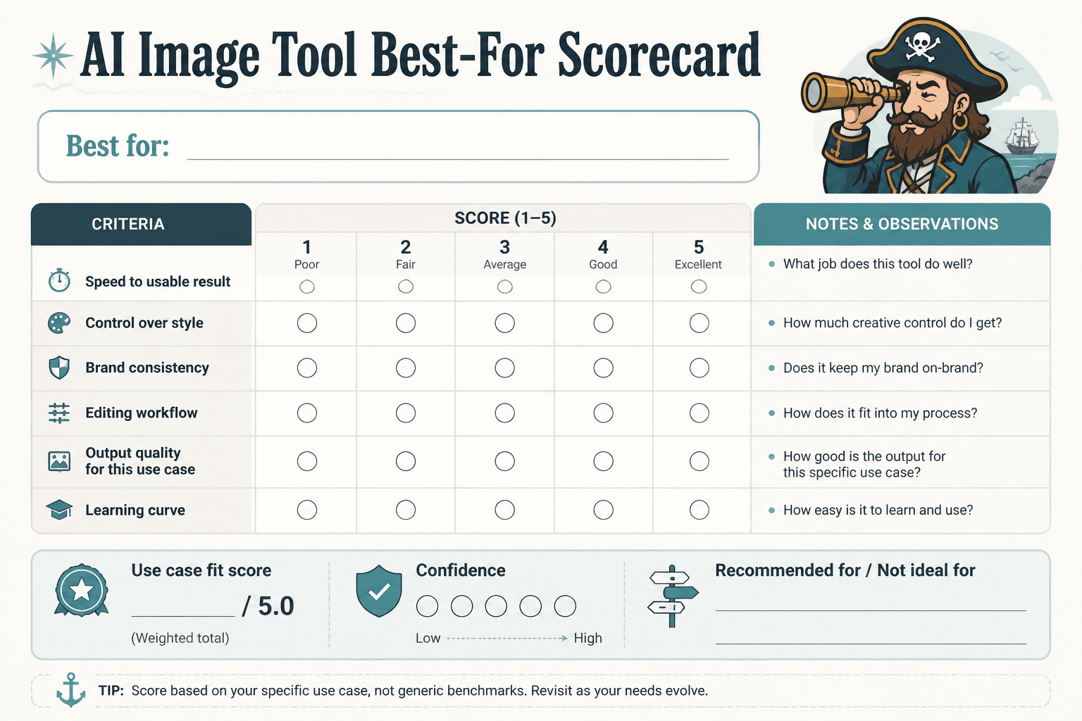
A simple way to score best-for cases
You do not need an absurd spreadsheet with 37 columns unless that is your idea of a nice afternoon. For most creators and small teams, a short scorecard is enough.
| Criteria | Question | Score 1–5 |
|---|---|---|
| Output fit | Does this tool create the kind of images I actually need? | |
| Control | Can I refine results to the level my work requires? | |
| Speed to usable | How quickly do I get something genuinely usable? | |
| Workflow friction | Is the process smooth enough for repeated use? | |
| Consistency | Can I get good results more than once by accident? | |
| Commercial practicality | Does this fit my usage rights, team needs, and budget? |
Then add one final line:
Best for: ______________________________
If you cannot finish that sentence clearly after testing a tool, you probably do not understand its fit well enough yet.
For a bigger-picture category view, you can also browse the AI image tool comparisons hub and the wider AI writing tools and workflows area if you are trying to map where image tools fit in a broader content system.
How to read “best for creators,” “best for marketers,” and other suspiciously broad labels
Broad labels are not useless. They are just usually incomplete.
Take “best for creators.” That could mean:
- best for creators who need quick visuals for social posts
- best for creators making thumbnails and promo assets
- best for creators selling digital products with branded graphics
- best for creators experimenting with visual storytelling
Those are not the same buyer. Their standards, needs, and workflows are different. So whenever you see a broad label, translate it into something more useful.
Ask:
- Best for which kind of creator?
- Best for which image type?
- Best for which stage of work: ideation, production, editing, or scaling?
- Best for which tradeoff: speed, quality, control, cost, or simplicity?
If the comparison does not answer those, it is not really comparing. It is labeling.
Watch the tradeoffs, because every tool has them
The right tool usually wins by making the right tradeoff for your needs. Not by being magically superior in every category.
Here are the most common tradeoffs to look for:
- Speed vs control: faster generation often means less precise refinement
- Simplicity vs flexibility: easier tools may be better for fast production but weaker for detailed work
- Visual polish vs consistency: a tool may produce striking one-offs but struggle with repeatable branded outputs
- Creative range vs reliability: broad stylistic exploration can come with more uneven results
- Low cost vs workflow depth: cheaper tools may be fine for occasional use but limited for serious production
This is why “Tool A has more features than Tool B” is often a pretty useless conclusion. If Tool B gets you to the finish line faster, cleaner, and with less fiddling, then Tool B may be the better professional choice for your case.
Test with scenarios, not random prompting
If you really want to judge best-for cases well, test tools using the same realistic scenario. Do not just throw random prompts at them and call it research.
Create 3 to 5 test tasks based on your real work. For example:
- Create a blog header image in a clean editorial style
- Generate a product promo visual with a clear marketing feel
- Make a square social graphic with brand-like consistency
- Create three variations of the same concept for campaign testing
- Edit one output to improve composition or replace a weak detail
Then compare what actually happened:
- Which tool got closest, fastest?
- Which tool needed the least prompt gymnastics?
- Which tool gave you the best balance of quality and control?
- Which one would you still want to use a month from now?
That last question matters. There is a big difference between a tool that impresses on day one and a tool that earns a place in your workflow.
Do not confuse image quality with business usefulness
This catches a lot of people. They choose the tool with the prettiest outputs, then realize it is annoying for the work they actually do.
Business usefulness includes things like consistency, editability, turnaround speed, licensing clarity, teamwork, and repeatability. The most cinematic image generator is not automatically the best option for a consultant who needs decent visuals for newsletters, lead magnets, and landing pages.
Pretty matters. Of course it does. But usable beats impressive if the goal is getting work done.
Red flags in AI image tool comparisons
Some comparison content is genuinely useful. Some is affiliate oatmeal with screenshots. A few red flags make the weaker stuff easy to spot.
- It praises every tool and criticizes none of them
- It focuses on long feature tables but not real-world tasks
- It uses vague labels like “best for professionals” without explaining why
- It shows one cherry-picked output per tool and treats that as proof
- It ignores workflow, pricing fit, or usage rights entirely
- It never mentions tradeoffs
- It sounds like the writer spent more time rearranging vendor copy than testing anything
A decent comparison should make some people slightly unhappy. Not because it is rude, but because real evaluation requires judgment. If every tool wins every category, the article is decoration.
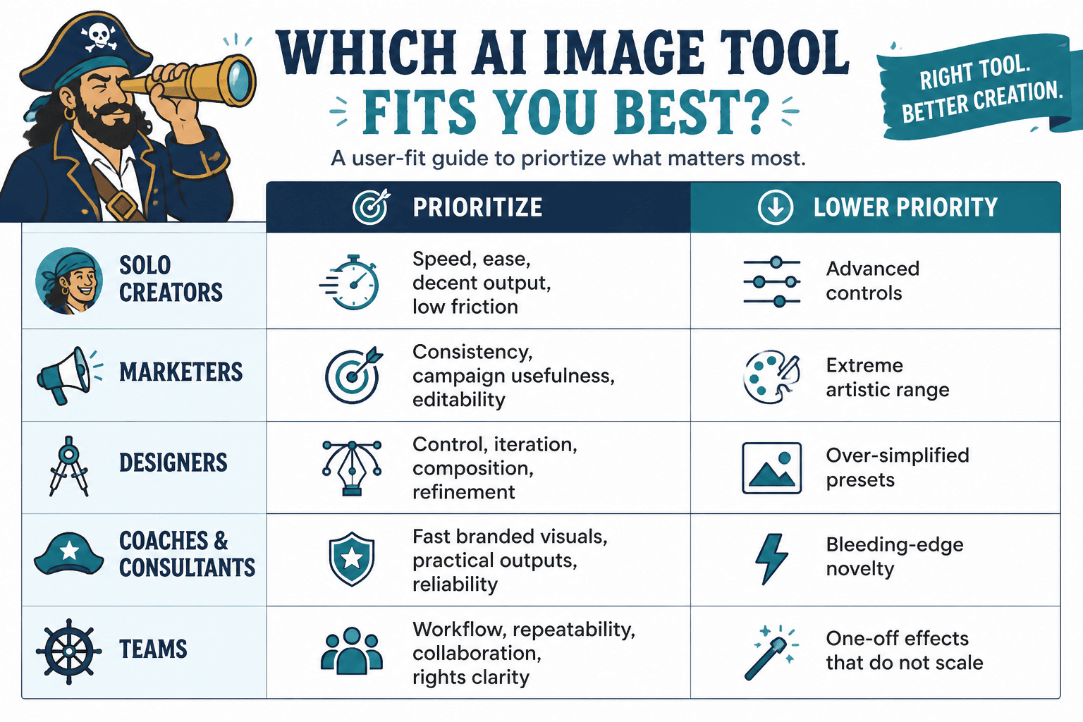
A practical framework for different kinds of users
Different buyers should weigh best-for cases differently. Here is a simple way to think about that.
| User type | What matters most | What to care less about |
|---|---|---|
| Solo creators | Speed, ease, decent output, low friction | Advanced controls you will never touch |
| Marketers | Consistency, campaign usefulness, editability | Extreme artistic range |
| Designers | Control, iteration, composition, refinement | Over-simplified presets |
| Coaches and consultants | Fast branded visuals, practical outputs, reliability | Bleeding-edge novelty for its own sake |
| Teams | Workflow, repeatability, collaboration, rights clarity | Fun one-off effects that do not scale |
This is also why one review saying a tool is “the best” should never settle the matter. Best for whom is doing a lot of heavy lifting there.