
Most giant AI image tool lists are trying to be helpful and ending up as digital aisle clutter.
You know the format: 27 tools, one paragraph each, a few recycled features, and some vague line about “best for creators.” By the time you finish reading, you do not feel informed. You feel slightly more tired and somehow less able to choose.
That is exactly why When Narrow AI Image Tool Comparisons Beat Giant Tool Lists is not just a catchy idea. It is a practical one. If you are a solo creator, consultant, marketer, or founder trying to pick the right tool, a focused comparison usually gives you better answers than a giant roundup ever will.
Because most people do not need “the top 35 AI image tools.” They need a clear answer to something smaller and much more useful, like:
- Which tool is better for clean brand graphics?
- Which one is easier for beginners?
- Which one gives stronger prompt control?
- Which one is less annoying for quick social content?
That is the real decision. Not the bloated shopping catalog version.
For the main guide behind this topic, visit the parent guide.
Why giant tool lists usually fail the reader
Giant tool lists are not useless. They can help someone discover what exists. They are decent for broad browsing, early research, or SEO coverage. Fair enough.
But they break down fast when the reader is trying to make an actual choice.
Here is the problem: most giant lists are built for completeness, not clarity. They try to cover everything, so they do not go deep enough on the differences that matter.
- They flatten important tradeoffs.
- They make every tool sound vaguely competent.
- They repeat the same feature language over and over.
- They rarely compare tools in the same use case.
- They leave the reader doing the hard part alone.
And that last point is the killer. A good comparison should reduce decision friction. A bad one hands you 14 tabs and wishes you luck.
If a list makes the reader do more sorting than before they clicked it, the list is not helping much.
Why narrow AI image tool comparisons work better
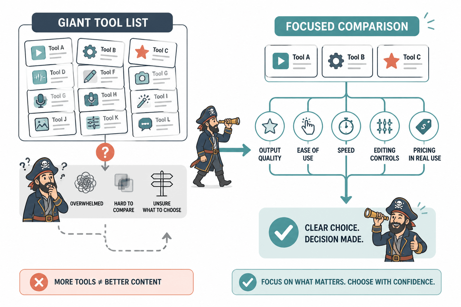
Narrow comparisons win because they match how people actually choose tools.
Most creators are not comparing 18 tools at once. They are choosing between two or three realistic options. They have a job to do, a budget they are side-eyeing, and a tolerance limit for bad interfaces. They want to know which tool fits their workflow without needing a minor research degree.
A narrow AI image tool comparison makes that possible because it can focus on things that giant lists usually blur:
- Output quality for a specific type of image
- Ease of use for a specific kind of user
- Speed inside a real workflow
- Prompt flexibility versus template convenience
- Editing controls, not just generation
- Pricing tradeoffs in actual use, not just on a pricing page
That kind of specificity is where good decisions happen.
It is also where trust happens. If you compare “Tool A vs Tool B for social graphics” or “Tool X vs Tool Y for non-designers,” the reader can tell you are trying to solve a real problem instead of just stuffing a roundup with every tool you have heard of since Tuesday.
The situations where narrow comparisons beat giant lists
Not every article needs to be tiny and hyper-focused. But narrow comparisons tend to beat giant tool lists in a few very specific situations.
1. When the reader already knows the category
If someone already knows they want an AI image tool, they usually do not need a giant introduction to the category. They need help separating the credible options from the noise.
At that point, a list of 20 tools is mostly a delay tactic disguised as content.
2. When the use case matters more than the feature count
A creator making thumbnail concepts, a coach creating quote graphics, and a founder mocking up ad ideas may all want an “AI image tool,” but they do not need the same thing.
That is why use-case-based comparisons are stronger. They compare tools by the job, not by who can list more features with shinier labels.
3. When beginners are overwhelmed
Beginners do not need maximum choice. They need reduced confusion.
Big lists often create feature overload. Narrow comparisons are better at saying, “Ignore the buffet. These two or three are the realistic starting points, and here is how to pick.”
If that is the reader you are writing for, articles like AI image tool comparisons for beginners who hate feature overload are naturally more useful than giant inventories.
4. When the audience needs a recommendation, not a museum tour
There is a difference between exploration content and decision content.
Exploration says, “Here is what exists.”
Decision content says, “Here is what is most likely to work for you, and why.”
That second one is usually more valuable. It is also harder to write because you have to judge, not just list.
What narrow comparisons can do that giant lists cannot
Once you reduce the scope, the quality of the advice can go up fast.
They show tradeoffs clearly
The best tool is usually not “best.” It is best for a certain person doing a certain thing under certain constraints.
A narrow comparison can say things like:
- Tool A gives you more control, but the learning curve is steeper.
- Tool B is faster for social graphics, but weaker for custom styling.
- Tool C is cleaner for beginners, but less flexible once your needs get more specific.
That is decision-grade information. Giant lists rarely get there.
They make room for real examples
When you are only comparing a few tools, you can actually show how they behave in similar tasks.
You can compare:
- Prompt consistency
- Editing controls
- Typography handling
- Brand-style adaptability
- Export quality
- Workflow speed
And you can do it without writing 4,000 words of mush.
They are more honest
A giant list often avoids strong opinions because it is trying to include everything. Narrow comparisons can be more direct.
That directness matters. Readers want a useful judgment, not content that politely refuses to choose anything in case a tool vendor gets moody.
How to structure a narrow AI image tool comparison well
If you are creating this kind of content yourself, the format matters. A narrow comparison is only helpful if it is actually built around the reader’s decision.
Here is a structure that works.
Start with the exact decision
Do not open with a history of AI image generation. Nobody asked for a documentary.
Open with the actual choice:
- Best AI image tool for brand graphics: Tool A vs Tool B
- Best AI image tool for fast social content: Tool C vs Tool D
- Best AI image tool for beginners: Tool E vs Tool F
The narrower the decision, the more useful the article tends to be.
Use criteria the reader actually cares about
This sounds obvious, but plenty of comparisons still focus on the wrong things.
Most readers care less about a giant feature inventory and more about questions like:
- Can I get good results without wrestling the tool?
- Will this fit my content workflow?
- Does it produce usable images for my type of work?
- How much control do I get when the first output is wrong?
- Is the price worth it for how often I will use it?
If you want a stronger foundation for those criteria, what really matters in AI image tool comparisons for solo creators is exactly the kind of angle worth building from.
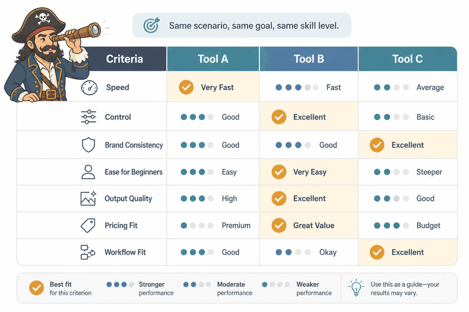
Compare in the same scenario
This is where many reviews get sloppy. They describe Tool A in one context and Tool B in another, then pretend the reader can compare them cleanly.
Use the same scenario for each tool. Same prompt goal. Same content purpose. Same level of user skill. That gives the reader a fair comparison instead of two disconnected mini-reviews taped together.
End with a clear winner by situation
You do not always need one universal winner. In fact, pretending there is one is often lazy.
But you should absolutely end with a clear recommendation by context.
- Best if you want speed
- Best if you want control
- Best if you are brand-focused
- Best if you are just starting
That gives the reader a practical way to decide without pretending all users are identical.
When giant lists still make sense
To be fair, giant lists are not always the villain.
They still work when the goal is category discovery, broad awareness, or top-of-funnel search intent. If someone is at the “What AI image tools are even out there?” stage, a wider roundup can help.
That is especially true if the list is organized well and does not pretend every tool deserves equal attention. A strong giant list can act like a map. It just should not pretend to be a buying decision.
For that broader context, content under the AI writing tools and workflows section and the AI image tool comparisons hub can support readers earlier in the research process before they narrow down.
If you are building a content library, this is usually the smart move:
- Use giant lists for discovery.
- Use narrow comparisons for decisions.
- Use examples and fit-based articles to bridge the gap.
That is a cleaner editorial system than publishing endless bloated roundups that all blur together.
A better content strategy for AI image tool comparison articles
If you publish tool content, there is a bigger lesson here.
You do not need one monster article trying to rank for every possible variation of “best AI image tools.” That usually creates broad, underpowered content that satisfies nobody particularly well.
A stronger strategy is a layered set of articles:
- A broad comparison hub for category overview
- Narrow comparison pages for specific matchups
- Beginner-focused pages for simpler decisions
- Use-case pages for creators with different goals
- Examples pages for readers who want a clear winner
That structure is better for readers and usually better for search intent too. Different readers are asking different questions. A giant list tries to answer all of them at once and usually waters down the answer.
For example, someone who wants direct examples should not be forced through a giant taxonomy post first. They would be better served by AI image tool comparisons examples for creators who need a clear winner or best AI image tool comparisons for creators who need the right fit.
See the difference? One is browsing. The other is choosing.
What to avoid when writing narrow comparisons
Narrow does not automatically mean useful. There are still a few easy ways to ruin it.
- Do not compare too many tools anyway. If your “narrow” article compares eight tools, you have simply built a smaller giant list wearing a fake mustache.
- Do not use vague criteria. “Powerful,” “innovative,” and “robust” tell the reader almost nothing.
- Do not avoid judgment. If every tool is “great depending on your needs,” you have chickened out.
- Do not skip workflow context. A tool is not good in the abstract. It is good or bad inside a use case.
- Do not overhype tools as magic. AI image tools can speed up ideation and production. They cannot replace taste, positioning, or brand judgment.
That last one matters more than people admit. Tools can help you produce assets faster. They cannot decide what your audience should care about, what your visual style should signal, or whether your content strategy has a pulse.
Software is not a substitute for taste. It is just software. A useful servant, not a creative messiah.
The bigger point is simple: clearer structure and clearer writing make the piece more useful. That is usually what makes the ending land better too.