
Most AI image tool comparison content gets traffic from curious people, not buyers. That is the problem.
It is easy to publish a post called “Midjourney vs DALL·E vs Stable Diffusion” and attract a pile of readers who want entertainment, surface-level features, or an excuse to procrastinate by comparing buttons. It is much harder to attract the person who is actually close to choosing a tool, paying for one, switching from one, or recommending one to a team.
If you want to turn AI image tool comparisons into buyer-intent traffic, you need to stop writing broad “which is best?” content for everyone and start building comparison pages around specific decisions. Price-sensitive buyers. Commercial-use buyers. speed-focused buyers. agency buyers. beginner buyers. consistency-obsessed brand buyers. Those people search differently, skim differently, and convert differently.
That is what this article will help you do: create comparison content that attracts people who are closer to action, not just closer to another tab.
To see how this fits into the wider strategy, open the parent guide.
Why most AI image tool comparisons bring weak traffic
Weak traffic usually starts with weak intent matching.
A lot of comparison content is written like a school project. It lists features, adds a table, throws in some screenshots, and ends with “it depends on your needs.” Which is technically true and commercially useless.
Buyer-intent traffic comes from people trying to reduce risk. They are not just asking, “What exists?” They are asking questions like:
- Which tool gives me usable commercial images fastest?
- Which one is worth paying for if I am a solo creator?
- Which tool will not wreck my workflow?
- Which option gives me more control over style consistency?
- Which tool is better for client work, not just pretty demos?
That is a different kind of search intent. More specific. More urgent. More valuable.
If your comparison does not help someone make an actual purchase decision, it will attract browsing behavior. Browsing traffic looks nice in analytics and then does absolutely nothing for revenue.
Start with decisions, not tools
The cleanest shift you can make is this: stop building content around tool names alone and start building it around decision scenarios.
Yes, people do search brand-vs-brand phrases. But the highest-value content usually sits one layer deeper, where the comparison is tied to a real use case or buying concern.
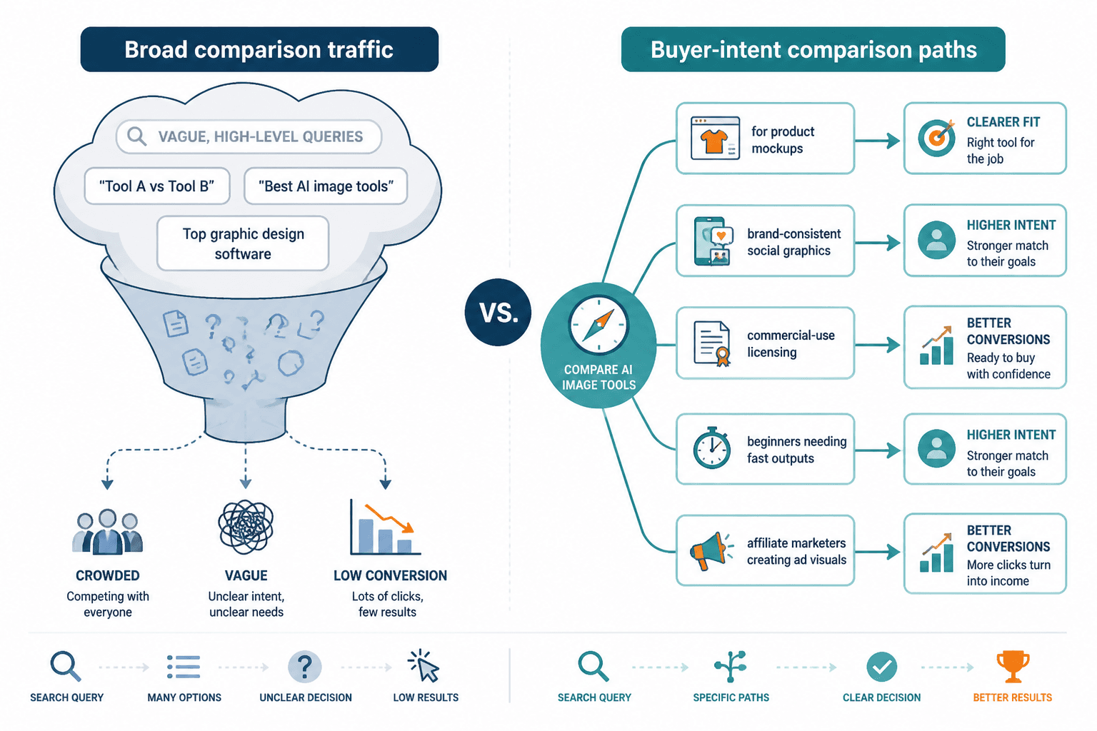
Weak comparison angle
- Tool A vs Tool B
- Best AI image generators
- Top 10 AI art tools
Stronger buyer-intent angle
- Tool A vs Tool B for product mockups
- Best AI image tool for brand-consistent social graphics
- Which AI image tool is best for commercial-use licensing?
- Tool A vs Tool B for beginners who need fast outputs
- Best AI image tools for affiliate marketers creating ad visuals
See the difference? The second group sounds less broad because it is. That is the point. Broad usually means crowded, vague, and conversion-light.
If you want useful support on the comparison structure side, the parent comparison hub at AI image tool comparisons is the natural place to connect these pages.
How to find buyer-intent comparison angles
You do not need a secret SEO ritual for this. You need to look for moments where a reader is trying to choose, justify, switch, or spend.
Here are the most useful buckets for AI image tool comparison content.
1. Use-case intent
- for YouTube thumbnails
- for blog featured images
- for ecommerce product concepts
- for print-on-demand designs
- for ad creatives
- for storyboards
- for game assets
Use-case intent is strong because the buyer already knows what they want the output to do.
2. Constraint intent
- best cheap AI image tool
- best AI image tool without prompt complexity
- best tool for commercial rights
- best tool for teams
- best tool for fast generations
Constraint searches are underrated. Buyers often care less about “best” and more about “best under this annoying limitation.”
3. Switching intent
- alternative to Midjourney for client work
- better than X for realistic product visuals
- AI image tools like Y but cheaper
This traffic can convert well because the user is dissatisfied already. They are not casually browsing. They are shopping with a grudge.
4. Comparison-plus-proof intent
- Tool A vs Tool B examples
- Tool A vs Tool B pricing and output quality
- Tool A vs Tool B for commercial use
These people want evidence, not just opinions. Good. Evidence converts better than vague confidence theater.
Build your comparison around the buying decision
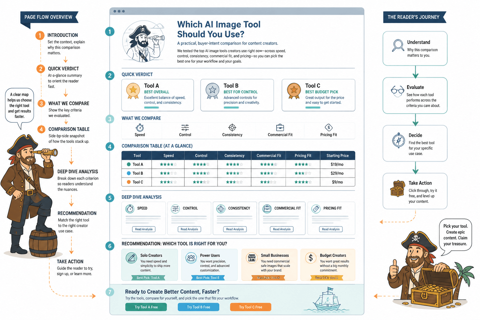
Once you have a solid angle, the structure matters more than people think. A buyer-intent comparison should reduce friction. It should help readers eliminate options, trust your judgment, and move toward a next step.
That means your structure should follow the actual decision, not the lazy writer template.
A practical structure that works
- State who the comparison is for
- Name the decision clearly
- Give the short verdict early
- Show the criteria that matter for this use case
- Compare tools through that lens
- Add examples or realistic scenario notes
- Call out tradeoffs honestly
- Give a clean recommendation by buyer type
- Offer the next action
That short verdict early is important. Buyers do not want to read 1,800 words before learning that Tool A is better for speed and Tool B is better for control. Put the answer near the top, then justify it.
A good comparison page does not hide the answer. It earns trust by making the answer easier to believe.
Use criteria buyers actually care about
Feature lists are often where comparison posts go to die. Buyers care about outcomes, friction, and fit. Not just feature counts.
For AI image tool comparisons, useful criteria often include:
- Output quality for the specific use case
- Consistency across prompts or styles
- Ease of learning and prompting
- Editing control and iteration options
- Commercial-use clarity
- Pricing relative to usage needs
- Speed and workflow fit
- Team or client usability
- Integration into a wider content process
If you are writing for buyers, stop pretending every criterion matters equally. It does not. A beginner creator may care about speed and simplicity far more than fine-grained controls. A designer handling client work may care deeply about consistency, editability, and rights. Context decides weight.
This is why niche comparison content beats generic roundup sludge so often. It knows what matters before the reader has to guess.
Write the intro like a buyer is reading, not a search engine intern
Your intro has one job: prove that this comparison understands the decision the reader is trying to make.
Bad intros waste time with broad statements about how AI image generation is growing rapidly. Yes, we know. So is mold. Keep moving.
Weak intro
AI image tools have become increasingly popular for creators and businesses. In this guide, we will compare several leading tools and help you choose the right one.
Better intro
If you need AI-generated visuals for commercial content, “best overall” is not a useful category. You need to know which tool gives you strong results fast, which one is easier to control, and which one is least likely to create workflow regret two weeks after you pay for it. This comparison looks at those tradeoffs directly.
That second version immediately signals judgment, context, and practical value. Much better.
Tables help, but they are not the whole job
A comparison table is useful because it helps scanners. It is not useful if it replaces analysis.
| Criterion | Tool A | Tool B | Why it matters |
|---|---|---|---|
| Ease of use | Fast to learn | Steeper learning curve | Important for beginners or fast-moving solo creators |
| Style consistency | Moderate | Strong | Useful for brand systems and repeatable visual output |
| Commercial fit | Good for simple content workflows | Better for controlled client work | Impacts confidence in real business use |
| Pricing fit | Better for lighter usage | Better if advanced control justifies cost | Prevents false “best” claims |
Then, after the table, explain the tradeoffs in plain English. That is where trust is built. A buyer does not just want rows. They want interpretation.
Use proof that lowers purchase anxiety
Buyer-intent traffic converts when the page reduces uncertainty. That means your comparison should include proof elements wherever possible.
- Side-by-side output examples for the same prompt
- Scenario-based recommendations
- Notes on where each tool struggles
- Pricing context, not just pricing screenshots
- Workflow notes for creators, teams, or client use
- Honest “this is overkill for you if…” sections
One of the strongest trust signals in comparison content is selective disqualification. If you can clearly say, “This tool is excellent, but not worth it for simple blog graphics,” readers stop seeing you as a hype machine.
And if monetization matters here, it should, that honesty is not a liability. It is usually the thing that makes affiliate content feel credible enough to earn the click. If you want to approach that side without sounding fake-neutral, read how to monetize AI image tool comparisons without fake neutrality.
Match the CTA to the buyer stage
A comparison page should not end with a random affiliate button slapped under a generic conclusion. That is lazy, and readers can smell it.
Your CTA should fit where the reader is in the decision.
For early comparison readers
- See the full comparison hub
- Read a more specific use-case comparison
- Check the best tools by buyer type
For mid-intent readers
- Review deeper affiliate angles
- Compare tool pages with examples and pricing context
- Visit a funnel page tied to their use case
For high-intent readers
- Try the recommended tool
- See your top pick for their use case
- Read the direct “best for X” page before choosing
This is where internal linking earns its keep. A comparison article should not sit there alone like a brochure nobody updates. It should lead readers deeper into your decision tree.
Useful next-click options here might include how to use AI image tool comparisons in a creator funnel, best affiliate angles for AI image tool comparisons, and best AI image tools and comparison-led affiliate pages for AI image tool comparisons.
Create comparison clusters, not isolated posts
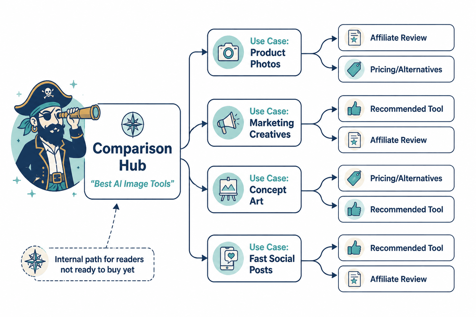
If you want sustained buyer-intent traffic, one comparison page will not do much on its own. You need a small content system.
Think in layers:
- Broad hub page for AI image tool comparisons
- Brand-vs-brand pages
- Use-case comparison pages
- Alternative and switching pages
- Commercial-intent and affiliate-support pages
- Funnel pages that catch people closer to action
This gives you multiple entry points while keeping the journey coherent. Someone might land on a broad comparison first, then click into a “best for commercial content” page, then a direct affiliate page. That is a much healthier path than hoping one generic article does all the work.
If you are building that broader system, connect back to your category structure where it makes sense. The wider AI writing tools and workflows / AI image tools / comparison content path can support that navigation if you are organizing a fuller content library.
Common mistakes that kill buyer intent
- Writing for “everyone.” This makes the page less useful to anyone making a real decision.
- Feature dumping. Buyers need interpretation, not a copied product page.
- Being fake-neutral. If you clearly have a recommendation, say it and explain why.
- Hiding the verdict. Nobody enjoys scrolling through suspense in a software comparison.
- No examples. Especially with AI image tools, output matters more than polished claims.
- Weak CTAs. “Learn more” is not a strategy.
- No internal path. If the reader is not ready now, show them the next relevant page.
A lot of creators confuse neutrality with trustworthiness. Not the same thing. Honest judgment builds trust. Pretending every tool is equally valid just makes your page sound afraid of commitment.
A simple workflow for turning AI image tool comparisons into buyer-intent traffic
- Pick one buyer scenario, not one giant audience.
- Find the specific decision behind the search.
- Create a comparison page with an early verdict.
- Use criteria tied to outcomes, not just features.
- Add proof, examples, tradeoffs, and disqualifiers.
- Link to the next best page based on buyer stage.
- Build related comparison pages around adjacent use cases.
- Refine pages based on what readers click and where they stall.
That workflow is not flashy. It is also how content actually starts pulling commercial weight.
FAQ
The bigger point is simple: clearer structure and clearer writing make the piece more useful. That is usually what makes the ending land better too.
The bigger point is simple: clearer structure and clearer writing make the piece more useful. That is usually what makes the ending land better too.