
Most creators treat AI image tool comparisons like content for clicks, not content for conversion. They publish “Tool A vs Tool B,” collect a little search traffic, maybe earn a few affiliate clicks, then wonder why none of it turns into leads, trust, or actual buyers.
That is the mistake.
If you know how to use AI image tool comparisons in a creator funnel, these pieces can do a lot more than rank. They can pull in high-intent readers, sort casual browsers from real buyers, move people toward the right offer, and make your recommendations feel useful instead of suspiciously convenient.
The good version is not just “here are some features.” It is a guided decision-making asset. It helps someone figure out what they need, what tradeoffs matter, and what to do next. That is funnel content. Not fluff wearing a comparison table.
Here’s how to build AI image tool comparison content that actually supports your creator funnel instead of just sitting there looking informative.
For the full path around this topic, head to the parent guide.
What AI image tool comparisons are actually good for
Comparison content works because it catches people at a useful stage: they already know the category, and now they are trying to choose. That is very different from someone casually reading “what is an AI image generator” while procrastinating through lunch.
A reader searching for comparisons usually has at least one of these intentions:
- They want to buy a tool soon
- They are testing options for a workflow
- They need a recommendation they can trust
- They are trying to avoid wasting time or money
- They need help matching a tool to a use case
That means comparison content sits naturally in the middle or lower part of a funnel. Not always bottom-of-funnel, but close enough that a smart next step matters.
If you are publishing these articles with no next step, no segmentation, and no offer path, you are leaving a lot on the table. You did the hard part by attracting buyer-ish attention. Then you just waved politely and let it leave.
How to use AI image tool comparisons in a creator funnel without making it weird
The basic job is simple: use the comparison to help the reader choose, then route them to the next best action based on what they need.
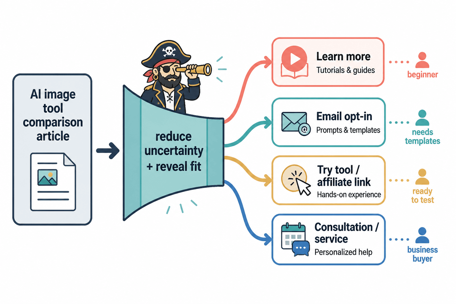
That next action could be:
- A deeper use-case guide
- A buyer’s guide
- A workflow tutorial
- An email opt-in with prompts, templates, or setup help
- A service offer
- An affiliate recommendation with honest context
- A consultation or audit if your audience is business-focused
The point is not to force every reader into the same CTA. The point is to match the CTA to their stage and intent.
That is where many creator funnels get clumsy. They write a useful comparison, then slap on a generic “book a call” button like everyone reading a Midjourney vs Ideogram breakdown is obviously dying to schedule a strategy session. They are not. Calm down.
Instead, think of comparison content as a bridge page. It should reduce uncertainty, reveal fit, and move the reader one step closer to action.
Start with the right funnel role for the comparison
Not every comparison article should do the same job. Before you write one, decide where it fits in your funnel.
1. Top-middle funnel: attract people evaluating the category
This is where broader comparison articles work well:
- Best AI image tools for creators
- Midjourney vs DALL·E vs Ideogram
- Best AI image generators for brand content
These pull in people who know they need a tool but have not chosen one yet. Your next step here should help them narrow their choice.
Good CTA examples:
- Read a use-case guide based on your content style
- Get a prompt pack for brand visuals
- See which tool fits social content, client work, or product mockups
2. Mid funnel: help readers choose based on use case
This is usually the sweet spot. The comparison is more specific, so the reader’s intent is stronger.
- Best AI image tools for course creators
- Which AI image tool is best for Pinterest graphics
- Canva AI vs Midjourney for personal brand content
Now your CTA can be more targeted:
- Download a visual content workflow
- Read a setup guide
- Join your newsletter for weekly creator tool breakdowns
- Explore related use-case content
3. Lower funnel: support buying or implementation
At this stage, readers are very close to action. They want confidence, not philosophy.
- Tool A vs Tool B pricing and output quality
- Which AI image tool is better for client deliverables
- The best paid AI image tool for creators who need commercial use
Lower-funnel CTAs can include:
- Your affiliate recommendation
- A tutorial showing how to set the tool up
- A service that helps implement the workflow
- A consultation for teams choosing tools
Notice the progression: broad comparison, use-case guidance, implementation help. That is a funnel. Not a pile of related blog posts with matching fonts.
Structure the comparison so it naturally moves people forward
If the article is meant to support a funnel, the structure has to do more than inform. It should help the reader decide.
A useful format looks like this:
- Clarify who the comparison is for
- Explain the decision criteria
- Compare tools around real use cases
- Name the tradeoffs honestly
- Recommend the best fit by reader type
- Offer the next step based on that fit
That last part matters more than most people think. If your conclusion is just “both are great depending on your needs,” you have technically avoided being wrong, but you have also been spectacularly unhelpful.
Give the reader a path. For example:
- If you want stylized, high-end visuals fast, pick this one
- If you need easier editing and simpler workflows, pick that one
- If you create social graphics daily, here is the setup guide you should read next
- If you want to monetize this kind of content, here is how to do it without fake neutrality
That kind of specificity is what turns comparison content into funnel content.
Match your CTA to reader intent, not your mood
A funnel breaks when the CTA ignores what the reader came for.
If someone lands on a comparison article, they are usually asking one of three questions:
- Which tool should I choose?
- How do I use the right one well?
- Can I trust this recommendation enough to act on it?
Your CTA should answer one of those.
Good CTA angles for comparison content
- Decision CTA: “See the best AI image tools by creator use case”
- Workflow CTA: “Get the simple visual-content workflow I’d use with this tool”
- Trust CTA: “Read how I monetize AI image tool comparisons without fake neutrality”
- Education CTA: “Learn how to turn AI image tool comparisons into buyer-intent traffic”
- Expansion CTA: “Explore more AI image tool comparisons”
Required internal links fit naturally here if you use them well. For readers who want to go deeper, link to more AI image tool comparisons. If they are still working through the bigger category, you can also point them toward the broader AI writing tools and workflows hub.
And if your goal is monetization or lead generation, direct them to the next practical piece, not a vague “work with me” shrug.
Use comparison content to segment your audience
One of the smartest uses of AI image tool comparisons in a creator funnel is segmentation.
Different readers want different things:
- Some care about image realism
- Some care about speed
- Some care about commercial rights
- Some care about editing control
- Some just need decent visuals without a learning curve
Those preferences tell you a lot about what to show them next.
For example:
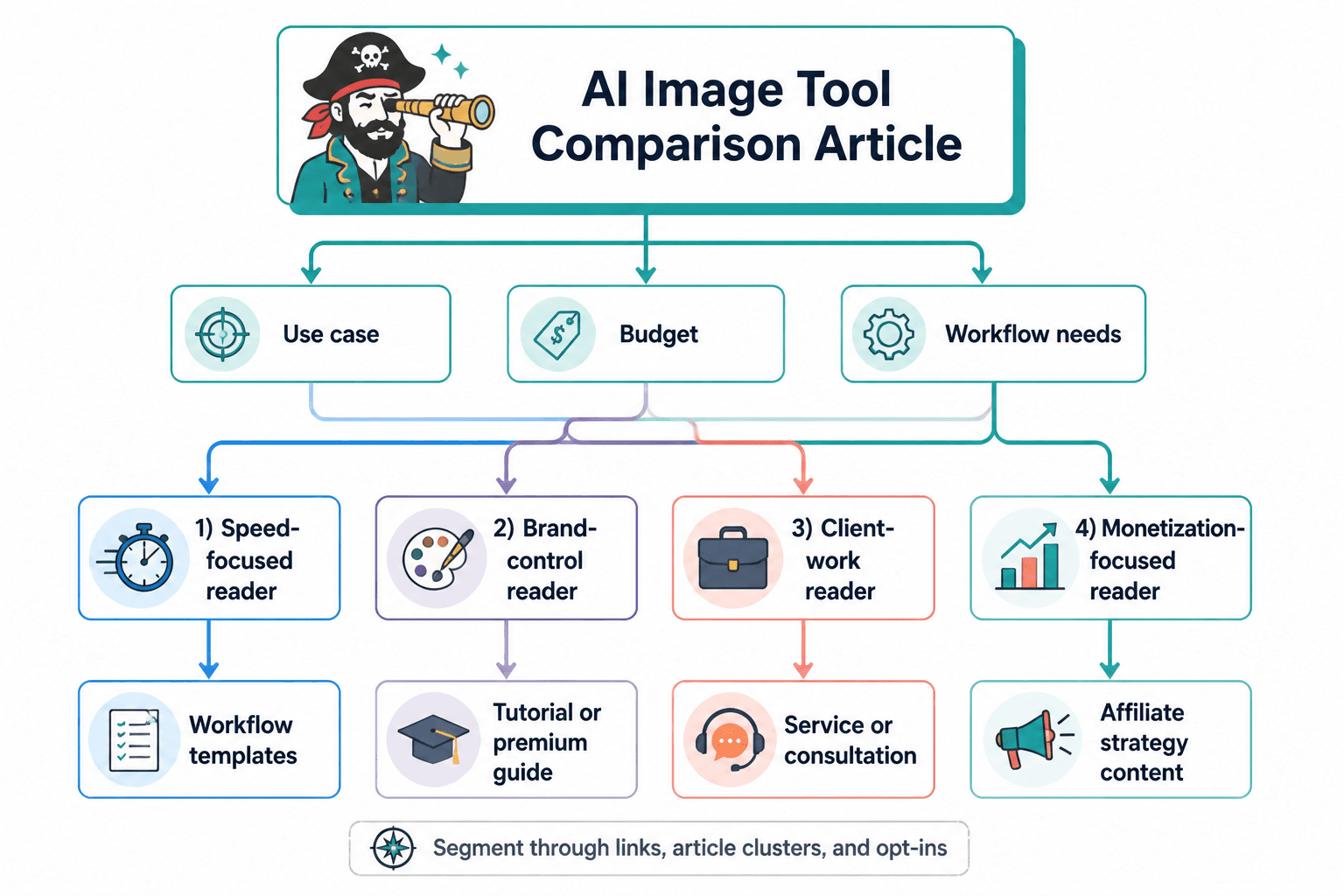
- A reader choosing based on speed may want workflow templates
- A reader choosing based on brand control may want a tutorial or premium guide
- A reader comparing tools for client work may be a good fit for a service or consultation
- A reader focused on monetization may want affiliate-friendly strategy content
This is why comparison articles should not end with one lazy CTA. Give readers pathways based on their likely decision logic.
Even if you do not have advanced email tagging or fancy automation, you can segment through links, article clusters, and opt-ins. The funnel does not need to be complicated. It needs to make sense.
What to include in the article if you want it to convert
Plenty of comparison posts are technically accurate and still poor funnel assets. Usually because they are missing the parts that build decision confidence.
Include these:
Clear buyer criteria
Tell the reader what actually matters when choosing. Not every feature matters equally. In fact, feature bloat is often what makes these articles annoying to read.
Useful criteria might include:
- Output quality
- Prompt responsiveness
- Ease of editing
- Commercial usability
- Speed
- Pricing structure
- Best-fit use cases
- Learning curve
Honest tradeoffs
Trust goes up when you say what a tool is bad at. Shocking, I know.
If every tool sounds excellent with “slight differences,” the article reads like it was trying not to upset affiliate links. Readers can smell that from orbit.
Use-case recommendations
Do not stop at “best overall.” That is often not useful.
Better:
- Best for quick social content
- Best for polished brand visuals
- Best for experimental art direction
- Best for non-designers
- Best for creators making lead magnets, thumbnails, or product mockups
A specific next step
This is where the funnel happens. After the recommendation, show them the next piece of content or offer that fits the choice.
For example, if your comparison article identifies the best tools by use case, send readers to best ways to use AI image use cases as a creator or best funnel ideas to pair with AI image use cases.
A simple creator funnel built around comparison content
You do not need some bloated funnel map with six automations, three quizzes, and a CRM that looks like cockpit software.
Here is a simple version that works:
- Search or social entry point: publish an AI image tool comparison article
- On-page trust: include real decision criteria, screenshots, examples, and clear recommendations
- Segmented CTA: point readers to the next guide based on use case or intent
- Lead capture: offer a prompt pack, workflow guide, or creator resource
- Nurture: send follow-up content about tools, workflows, and practical implementation
- Monetize: use affiliate recommendations, low-ticket resources, services, or consulting where relevant
This works especially well if your niche overlaps with design workflows, brand content, creator marketing, digital products, course visuals, or content systems.
And yes, affiliate monetization can fit here. Just do it cleanly. If you need that angle, link readers to how to monetize AI image tool comparisons without fake neutrality. If the traffic side matters more first, point them to how to turn AI image tool comparisons into buyer-intent traffic.
Common mistakes that quietly ruin the funnel
Most comparison-content funnels do not fail dramatically. They just leak everywhere.
Writing for volume instead of intent
A broad comparison may bring traffic, but a use-case comparison often brings better traffic. Ten relevant readers who are choosing a tool beat 500 vague browsers who are “exploring AI” while doing absolutely nothing with urgency.
No clear recommendation
If you refuse to make a call, the reader still has to do all the thinking. Which means your content did not reduce friction. It just organized it into subheadings.
Generic CTAs
“Subscribe for more tips” is not a funnel strategy. It is a polite shrug.
Your CTA should connect directly to the decision the reader is already making.
Fake neutrality
Readers do not need fake objectivity. They need informed judgment. You can disclose bias, explain criteria, and still make a recommendation. That is more credible than pretending every tool is equally wonderful in its own special little way.
No bridge into your ecosystem
If the article does not point to related guides, your email list, a buyer path, or a service, then it may rank well and still do very little for your business.
At minimum, comparison content should connect to your broader content ecosystem through relevant internal links. That includes category pages like AI image tool comparisons and adjacent guides around use cases, workflows, and monetization.
How to make the funnel feel helpful instead of salesy
This is the balance creators keep fumbling. They either avoid monetization completely, or they bolt on hard-sell tactics that make the whole article feel suspect.
The cleaner approach is this:
- Be clear about who each tool is for
- Be honest about limitations
- Recommend based on fit, not commission
- Give readers a logical next step
- Use offers that deepen the outcome instead of interrupting it
If your comparison helps the reader make a better decision, the funnel feels like service. If the comparison exists only to herd people toward a link, it feels like content cosplay.
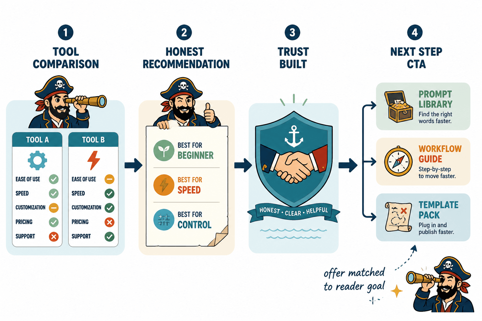
That is why useful next-step assets work so well here: prompt libraries, workflow guides, implementation articles, content systems, templates, audits. They continue the job the comparison started.
A practical template you can use
If you want a repeatable structure, use this:
The bigger point is simple: clearer structure and clearer writing make the piece more useful. That is usually what makes the ending land better too.
The bigger point is simple: clearer structure and clearer writing make the piece more useful. That is usually what makes the ending land better too.