
Most AI image tool comparisons fall apart long before the writing starts.
Not because the reviewer lacks opinions. Not because the tools are impossible to test. Usually it is because the stack behind the comparison is a mess. Prompts are scattered. outputs are mislabeled. notes live in three apps and one cursed desktop folder. By the time someone tries to compare quality, speed, style control, or usability, they are basically reconstructing a crime scene.
If you want to publish useful AI image tool comparisons, you need more than the image tools themselves. You need a support stack that helps you test consistently, capture evidence, organize outputs, write cleanly, and keep bias from sneaking in through the side door wearing a lab coat.
This article will help you build the best tool stack to support AI image tool comparisons without overcomplicating it. Not a fantasy setup. A practical one. One that lets creators, reviewers, and content teams run repeatable tests and actually trust their own findings.
If you are still figuring out the comparison process itself, it helps to pair this with how to compare AI image tool comparisons without guessing and how to write AI image tool comparisons that do not feel biased. The stack matters, but the method matters too.
To see how this fits into the wider strategy, open the parent guide.
The job of your support stack
A good support stack should do five things well:
- Keep tests consistent
- Store prompts, outputs, and notes in one usable system
- Make visual differences easy to review
- Help you write and publish faster
- Reduce avoidable bias and sloppy conclusions
That is it. You do not need seventeen apps and an “AI research operating system” built out of duct tape and optimism. You need a lean setup where each tool earns its place.
For most people, the best tool stack to support AI image tool comparisons has six layers: planning, prompt tracking, asset storage, side-by-side review, writing, and publishing workflow.
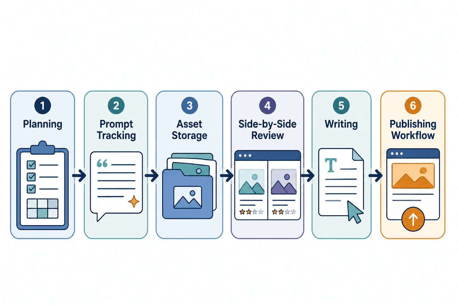
The six-part stack that actually works
1. A planning tool for test design
Before you generate a single image, decide what you are comparing.
This sounds obvious, yet plenty of comparisons quietly mix different goals together. One test measures photorealism. Another cares about text rendering. Then someone throws in anime styling, product mockups, and “overall creativity” and acts shocked when the conclusions get muddy.
Use a planning tool that makes test categories easy to define. A spreadsheet works. A project database works. A lightweight notes app works if you are disciplined. The point is not the brand name. The point is structure.
Your planning layer should track:
- Tools being compared
- Test categories
- Prompt sets
- Aspect ratios and settings
- Number of generations per tool
- Evaluation criteria
- Date of testing
- Any known limitations or tool updates
If a tool changes significantly next month, you will want that recorded. AI tools update fast. A comparison without timestamps ages like salad in a hot car.
2. A prompt tracking system that removes chaos
This is the layer people skip, and it is where accuracy starts dying.
You need one place where every prompt lives in its final tested form. Not “roughly what I typed.” Not “something like cinematic portrait with neon.” The exact prompt, plus settings, negative prompts if used, seed details if relevant, and any prompt adjustments made per platform.
This matters because AI image tools often interpret prompts differently. If you make lots of tool-specific changes, that may be fair in a “best possible output” test. But if you are testing raw prompt translation across tools, those changes can distort the comparison. Your tracking system should make that visible.
A solid prompt tracker includes columns like:
- Prompt ID
- Prompt goal
- Master prompt
- Tool-specific adapted prompt
- Settings used
- Generation count
- Best output selected
- Notes on prompt behavior
This is also what makes your reviews easier to defend. If readers question your conclusion, you have receipts instead of vibes.
3. Cloud storage that does not sabotage your sanity
AI image comparisons generate a lot of files fast. If you are testing three tools across ten prompts with four variations each, you are already staring at a messy pile of outputs. Add screenshots, cropped detail views, notes, and draft visuals and things get ugly quickly.
Your storage system should make it painfully easy to find the right asset later. If it does not, your writing process slows down and your comparison quality drops because you will start relying on memory. Memory is not a reliable reviewer. Memory is lazy.
Use a folder structure like this:
- Project name
- 01 test plan
- 02 prompts
- 03 raw outputs
- tool A
- tool B
- tool C
- 04 selected comparisons
- 05 screenshots and crops
- 06 article draft assets
Name files clearly. Include tool name, prompt ID, version, and maybe generation number. “final-final-real-one-v2.png” is not a system. It is a cry for help.
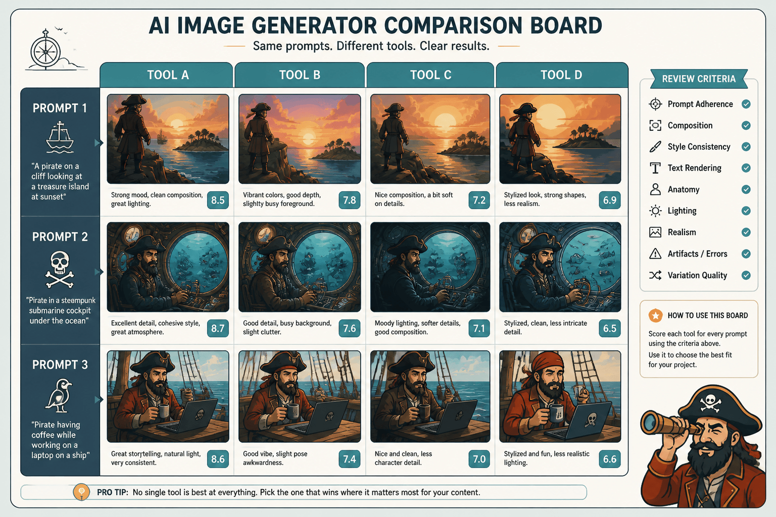
4. A side-by-side review tool for visual analysis
This is the most important underrated layer in the best tool stack to support AI image tool comparisons.
If you are evaluating visual outputs, you need to compare them visually in a way that highlights differences without making you work too hard to notice them. That usually means some kind of side-by-side board, comparison layout, slide deck, or image review workspace.
What matters here is not fancy software. It is visual clarity.
A useful side-by-side review setup should help you compare:
- Prompt adherence
- Composition
- Style consistency
- Text rendering
- Hands, faces, anatomy, and small details
- Lighting and realism
- Artifact issues
- Variation quality across multiple generations
The easiest setup for many reviewers is a simple presentation or whiteboard tool where each slide or frame covers one prompt, with outputs aligned in the same order every time. Add short notes below each image. Keep the visual layout consistent so your brain is not relearning the page on every test.
Consistency is boring, which is exactly why it works.
5. A writing tool that helps you think clearly, not just type faster
Once the testing is done, you still need to turn evidence into a comparison people can read without falling asleep.
Your writing layer should help you organize claims, examples, and takeaways. This can be a simple document editor, a structured writing app, or a notes system with draft support. If you use AI writing assistance, use it for speed and cleanup, not for inventing opinions you did not earn.
Good writing tools help with:
- Outlining test sections
- Turning notes into readable comparisons
- Creating tables or summary boxes
- Rewriting clunky sentences
- Repurposing the same comparison into article, post, thread, and newsletter formats
What they do not do is replace judgment. A writing tool cannot tell you whether one platform genuinely handles stylized illustration better or whether you just liked one image more because it looked dramatic. Those are not the same thing.
If your bigger workflow includes other AI content systems, you may want to browse the broader AI writing tools workflows section and the AI image tool comparisons hub for related process articles.
6. A publishing and repurposing layer
The comparison is not finished when the draft is done. You still need a system for publishing, reusing, and updating the piece.
A publishing layer can be very simple:
- Your CMS for the main article
- A scheduler for social snippets
- A checklist for updating screenshots and results later
- A content tracker for related pieces like speed tests, bias notes, and best-fit recommendations
This matters because one comparison can become several useful assets if your stack supports it. A full article can turn into a short breakdown, a creator-focused recommendation post, a speed-test summary, or a “who this tool is actually for” guide.
That is also where these related pieces fit naturally: best AI image tool comparisons speed tests questions for creators and best AI image tool comparisons for creators who need the right fit.
A practical stack by function, not by hype
If you are hoping for one magic app that handles everything, sorry, no. That app usually ends up being mediocre at six jobs instead of strong at two.
A better approach is choosing one tool per function. Here is a clean way to think about it:
| Function | What it needs to do | What to prioritize |
|---|---|---|
| Planning | Define tests, criteria, and schedule | Clarity, repeatability, easy updates |
| Prompt tracking | Store exact prompts and settings | Accuracy, searchable structure |
| Asset storage | Keep outputs organized and retrievable | Folders, naming, cloud access |
| Visual review | Compare images side by side | Consistent layout, annotation support |
| Writing | Turn evidence into readable analysis | Clean drafting, outlining, editing |
| Publishing | Ship and repurpose content | Workflow simplicity, update tracking |
Notice what is missing: “most viral,” “most advanced,” and “coolest interface.” None of those matter if the stack makes your comparisons harder to run.
What a lean comparison workflow looks like
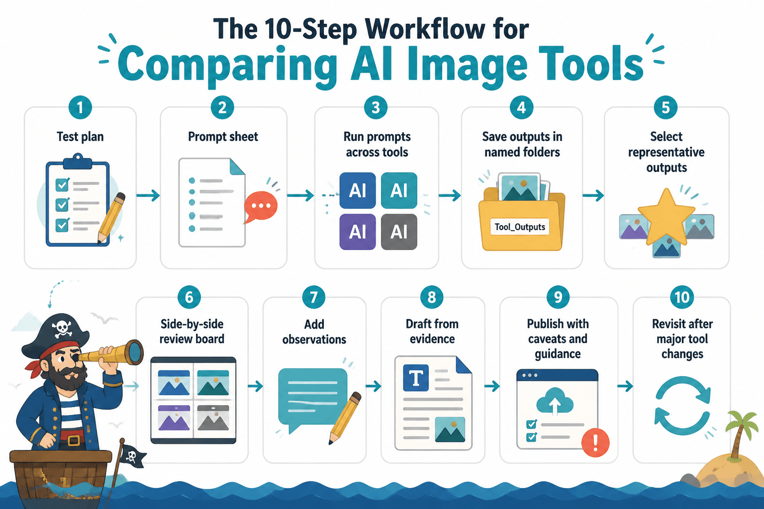
Here is a simple process that works well for solo creators, reviewers, and small teams.
- Create your test plan with categories and scoring notes.
- Build a prompt sheet with exact prompt wording and settings.
- Run each prompt across each tool in a controlled order.
- Save all outputs into clearly named folders.
- Select representative outputs using the same selection rule each time.
- Place results into side-by-side review boards.
- Add observations while the test is fresh.
- Draft the article from the evidence, not from memory.
- Publish with clear caveats, who-it-is-for guidance, and next-step links.
- Revisit the comparison when major tool changes happen.
That workflow is not glamorous. It is just reliable. Which, for this kind of content, is worth a lot more.
The biggest stack mistakes people make
Using the image tool itself as the whole system
The generation app is not your project manager, asset library, analysis board, and editorial process. Trying to force it into all those roles creates confusion fast.
Not documenting prompt changes
If you optimize prompts differently for each tool, document that. Otherwise your “comparison” turns into a weird mix of raw model quality and prompt engineering skill.
Picking winners from cherry-picked outputs
If one tool got twenty attempts and another got four, you do not have a fair test. You have preference theater.
Keeping notes in your head
You will forget what stood out. You will misremember which tool handled a detail better. Then you will write a confident paragraph built on mush. Write your observations down as you test.
Using AI writing tools to smooth away uncertainty
This one is sneaky. Sometimes AI-assisted writing makes weak evidence sound polished and authoritative. That is not a feature. That is a risk. If your conclusion is mixed, say it is mixed.
How to choose the right stack for your situation
You do not need the same setup as a media team publishing weekly benchmark reports.
If you are a solo creator doing occasional comparison content, keep it lightweight. Use one planning sheet, one cloud folder system, one visual review board, and one writing space. That is enough.
If you are publishing frequent reviews or testing many tools across categories, invest in a more structured database, stronger naming conventions, shared review templates, and a repeatable publishing checklist.
The stack should match your output volume. Not your fantasy identity as a research lab.
For solo creators
- Simple spreadsheet or database for prompts and tests
- Cloud storage with strict file naming
- Slides or whiteboard for side-by-side review
- One document editor for drafting and repurposing
For small teams
- Shared project tracker with review status
- Central prompt log and version control
- Shared asset folders with permissions
- Standardized comparison templates
- Editorial review step for bias and clarity
What your stack cannot fix
It is worth saying this plainly because tool-stack articles sometimes drift into gadget worship.
No stack can fix a lazy comparison angle. No tool can decide what makes a result meaningful for your audience. No automation layer can magically turn vague opinions into trustworthy analysis. And no writing assistant can rescue a review built on inconsistent tests.
The best tool stack to support AI image tool comparisons makes good work easier. It does not create good judgment from nothing.
That is why the best comparison content usually feels measured. It explains tradeoffs. It shows evidence. It admits limits. It helps readers choose based on fit, not hype. If you want more on that side of the craft, the broader AI image tool comparisons section is the right rabbit hole.
Build the stack once, use it repeatedly
The real value of a comparison stack is not that it helps one article. It is that it gives you a repeatable system for every article after that.
Once your planning template, prompt log, review board, and draft structure are in place, future comparisons get faster and cleaner. You spend less time hunting for files and more time making sharper judgments. Which is the entire point.
So if you are building the best tool stack to support AI image tool comparisons, do not chase the most impressive setup. Build the one that helps you test fairly, organize cleanly, and write honestly. Readers can tell the difference between a real comparison and a glossy mess. Usually faster than the writer can.
FAQ
The bigger point is simple: clearer structure and clearer writing make the piece more useful. That is usually what makes the ending land better too.
The bigger point is simple: clearer structure and clearer writing make the piece more useful. That is usually what makes the ending land better too.