
One creator is trying to decide whether to compare three tools, review one product, or just write the recommendation and move on. Another is staring at a draft that needs to convert this week, not eventually. The difference is not the headline. It is the section structure. Buyer-intent affiliate articles work when the page helps a reader make one real decision without turning that decision into a scavenger hunt.
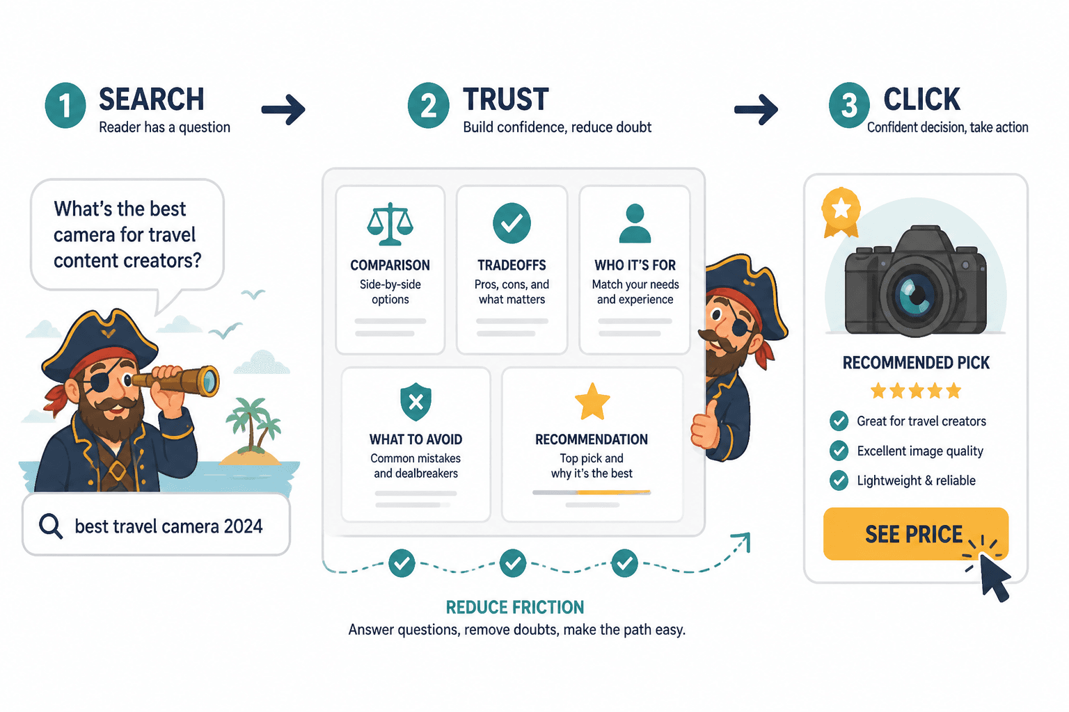
That is the useful part of buyer intent: the reader is already close to action. The article does not need to seduce them into the concept of purchase. It needs to reduce friction, answer the last objections, and place the right CTA where it feels like the next step instead of an interruption. For the broader cluster context, see the affiliate articles parent guide and the related guide on how to write better affiliate articles.
This is not about stuffing in more sections. It is about choosing the few sections that actually help a buyer-intent reader decide.
What buyer-intent sections need to do
A buyer-intent article section has one job: move the reader one step closer to a decision. Usually that means doing at least one of these things well:
- Clarify the choice. What exactly is being decided?
- Show fit. Who is this for, and who should skip it?
- Reduce risk. What would make the reader hesitate?
- Earn trust. Why should this recommendation be taken seriously?
- Offer the next step. What should the reader do now?
If a section does none of those things, it is probably decoration. Decorative sections are cute in a mood board. They are less impressive when the article is supposed to earn a click.
A simple buyer-intent section stack
For most busy creators, the cleanest structure is:
- Open with the buying problem.
- Frame the choice.
- Show the best fit or comparison.
- Address objections or limits.
- Make the recommendation.
- Add a CTA that matches the reader’s readiness.
That order is flexible, but the logic matters. Start with the decision the reader is actually making, not with the history of the category. Save the category biography for the sections where it helps the decision.
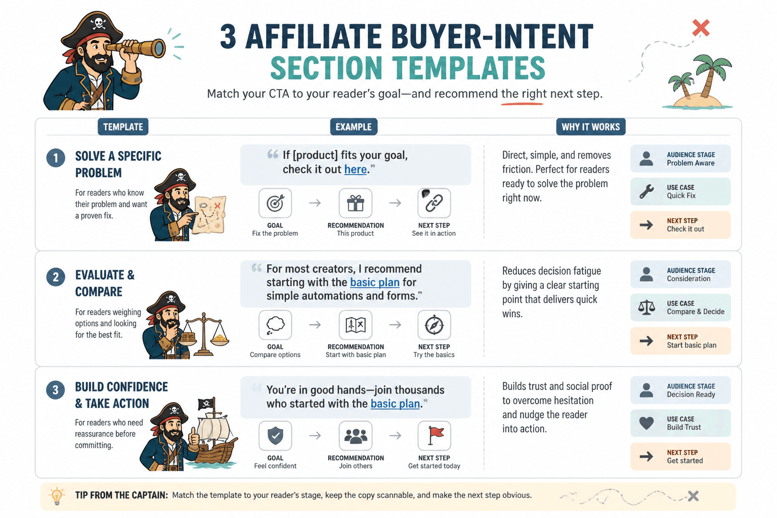
Template 1: for the ready-to-buy reader
Use this when the reader already knows the problem, knows the product type, and mostly wants confirmation that they are not making a silly purchase under fluorescent lighting.
Section order
- Opening frame: name the decision in one sentence.
- Best-for summary: say who this is for immediately.
- Short proof block: features, results, or criteria that matter.
- Limitations: one honest paragraph about what it does not do well.
- Recommendation: explain why this is still the best fit.
- CTA block: one clear action, not three competing ones.
What this sounds like
Opening frame: “If you already know you need a lightweight email tool and you care more about speed than endless automations, this is the part that matters.”
Best-for summary: “This option works best for solo creators who want a simple setup and a short learning curve.”
Recommendation: “It is not the most advanced option, but it does the useful job well without making setup feel like a tax form.”
The point is to shorten the distance between recognition and action. Ready-to-buy readers do not need a thesis. They need a clean yes or no.
Template 2: for comparison posts
Use this when the reader is choosing between several options and the article needs to help them sort the field instead of nudging them toward the loudest brand name in the room.
Section order
- Decision intro: frame what is being compared.
- Comparison criteria: define the standards.
- Option A: one tight section on strengths and tradeoffs.
- Option B: same treatment.
- Option C: same treatment.
- Best match summary: map each option to a user type.
- CTA block: direct readers to the best-fit option.
What makes this work
The comparison becomes useful when every option is judged by the same yardstick. If one product gets a generous paragraph and the other gets three bullets and a shrug, the structure is doing marketing cosplay.
Good comparison sections answer:
- What does this do especially well?
- Where does it feel limited?
- Who should choose it?
- Who should keep looking?
That final question matters more than people admit. Good comparisons are not just about saying yes. They are also about saying no early enough to save everyone time.
If you are building more comparison-led affiliate posts, the cluster guide on best affiliate article ideas and examples for creators is a useful companion.
Template 3: for hesitant readers
Use this when the reader wants the product, but not the regret. These readers need reassurance, not pressure.
Section order
- Problem acknowledgement: name the hesitation directly.
- Fit section: who this is for and what it solves.
- Objection section: price, complexity, setup, quality, or risk.
- Reality check: what the product can and cannot do.
- Recommendation: a calm, specific recommendation.
- Low-friction CTA: try, view, compare, or learn more.
Example structure
Problem acknowledgement: “The issue is not whether the tool works. The issue is whether it is worth the extra setup for a one-person workflow.”
Objection section: “If you need a deep automation stack, this is probably too simple. If you need a fast setup and fewer moving parts, that simplicity is the reason to pick it.”
That kind of writing sounds boring in the best possible way. It respects the reader’s hesitation instead of trying to outshout it.
How to place CTAs without wrecking the article
A buyer-intent CTA should feel like a natural next step, not a hallway jump scare. The placement depends on how ready the reader is.
Top-of-page CTA
Use this only when the reader is already close to buying or the page is built around a specific recommendation. Keep it short. No motivational seminar energy required.
Mid-page CTA
Use this after the first useful comparison or after the main objection has been answered. This is often the best placement for hesitant readers who need a nudge after they understand the fit.
End-of-page CTA
Use this as the final recommendation. It should reinforce the decision, not reopen the whole argument.
A useful rule: the more complex the decision, the more the article needs a middle CTA that appears after real context. A simple “buy now” button pasted on top of uncertainty is not strategy. It is just typography with ambition.
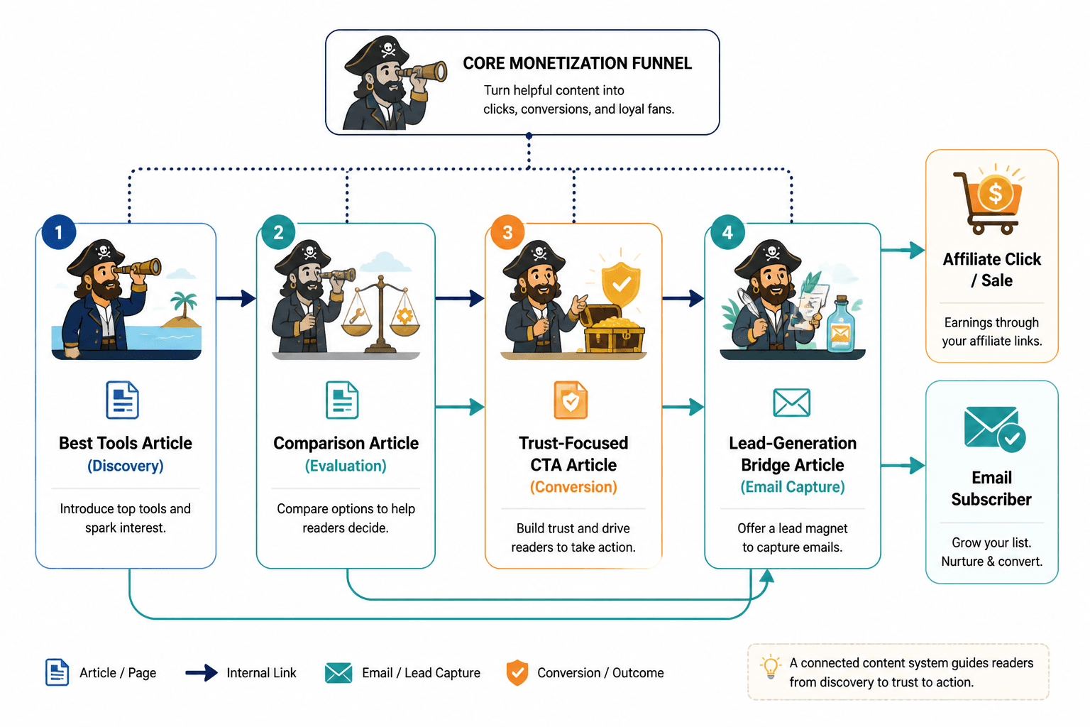
For structure ideas that pair well with affiliate posts, the related guide on best funnel ideas to pair with affiliate articles helps connect the article to the next step more cleanly.
What to reuse from older affiliate drafts
Most old affiliate articles do not need a total rewrite. They need the right sections moved into the right order.
Start by asking three questions:
- What decision is the reader making here?
- Which sections actually help that decision?
- Which sections are just taking up oxygen?
Then preserve the good parts and cut the drift. A weak old review often becomes much stronger when you swap in a clearer fit section, a cleaner comparison block, and a CTA that matches actual intent.
If you are updating existing posts, the guide on how to turn old content into better affiliate articles is the practical next stop.
Common mistakes in buyer-intent section templates
- Too many sections. More structure is not always more clarity.
- Product-first framing. Lead with the decision, not the shiny object.
- Softness where specificity is needed. “Great for everyone” is usually a sign the article has lost the plot.
- Vague objections. If there is a downside, name it plainly.
- CTA overload. Repeating the same ask every few paragraphs makes the article feel nervous.
A strong buyer-intent page is calm. It knows what it is trying to help the reader decide, and it does not panic if the answer is not “click immediately.”
That calm clarity is also what keeps affiliate content trustworthy. For disclosure and transparency basics, authoritative guidance from the FTC’s disclosures guidance is still worth keeping nearby. For the search side of things, Google’s helpful content guidance remains a useful benchmark for making content genuinely useful rather than merely decorative. And if your article uses structured snippets or comparison-style formatting, Google’s review snippet documentation is relevant enough to read before improvising your way into a formatting mess.
A practical default template
If you need one reusable version, use this:
- Problem frame: name the decision.
- Best-fit summary: say who the option is for.
- Proof or comparison: show why it stands out.
- Limitation: state the tradeoff honestly.
- Recommendation: give the conclusion.
- CTA: tell the reader exactly what to do next.
That template is boring in the useful sense. It keeps the article from wandering off into polite generalities, which is usually where affiliate drafts go when nobody is watching them closely.
Close
Busy creators do not need a more impressive affiliate article structure. They need a smaller one that matches the reader’s actual decision. Once the article is built around the choice, the right sections become obvious: fit, proof, tradeoff, recommendation, next step. Everything else is optional, and a surprising amount of optional content has been masquerading as strategy for years.