
Weak offer messaging burns trust fast. It makes visitors work too hard, slows decisions, and turns a page that should create momentum into expensive busywork. The offer may be solid. The language around it is usually the thing getting in the way.
That is the real job of offer messaging and positioning: help the right people recognize the right offer quickly enough to act. Not eventually. Not after six more scrolls. Now.
If you want the broader framework first, start with the parent guide to offer messaging and positioning. If you want practical examples, the offer messaging and positioning examples page is the cleaner companion piece.
What offer messaging and positioning do for conversion
Offer messaging explains the thing. Positioning explains why this version, for this person, deserves attention. Together, they shape whether someone feels clear, unconvinced, or mildly allergic to the whole page.
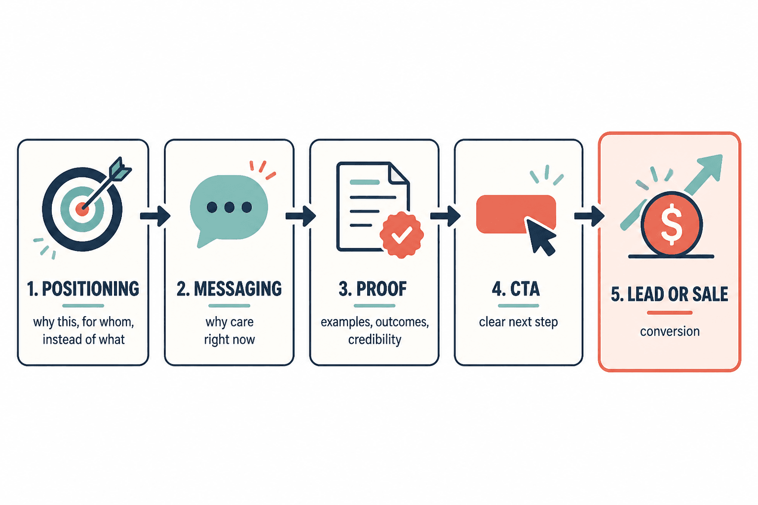
Conversion happens when the page does four jobs in order:
- names the offer plainly
- signals who it is for
- makes the outcome feel credible
- gives a next step that fits the level of readiness
That sequence matters because people do not buy complexity. They buy recognition, fit, and confidence. Nielsen Norman Group has long emphasized that users scan first and read second, which is a polite way of saying your copy has to earn deeper attention quickly. How Users Read on the Web is still useful here.
For a related look at how message structure affects buying paths, see the best AI tools for offer messaging and positioning page only if you are actively looking at workflow support. The message still comes first. Tools are just the broom, not the mess.
The minimum conversion path: clarity, fit, proof, CTA
Most pages do not need more sections. They need a cleaner sequence. A good conversion path usually runs like this:
- Clarity: What is this offer?
- Fit: Who is it for?
- Proof: Why trust it?
- CTA: What should I do next?
When one of those is missing, the page starts compensating. The headline gets bigger. The subhead gets vaguer. The proof gets decorative. The CTA gets pushy. None of that helps.
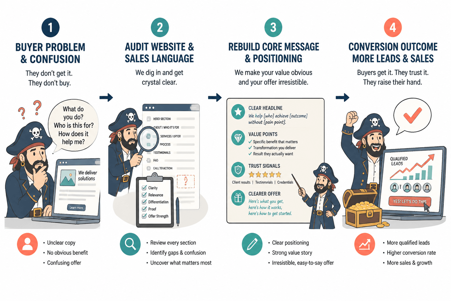
Where leads or sales usually get lost
There are a few predictable leak points:
- The offer is described in category language. People know the type of thing, but not why this one matters.
- The positioning sounds impressive but not specific. It reads like it was built to avoid being wrong rather than to help someone buy.
- The proof is mismatched. Testimonials, case studies, or stats support a different promise than the one the page makes.
- The CTA asks for too much too soon. “Book a call” can work, but only when the page has already earned that level of commitment.
The offer messaging and positioning guide covers the underlying framework. This page is about the conversion layer: what changes when the goal is not just a better message, but more leads or sales from that message.
How to tighten the page without overcomplicating it
1. Say what the offer is
Lead with the actual offer, not the philosophy around it. Visitors should not have to infer whether this is a course, service, template, consultation, audit, or done-for-you package.
A simple offer statement is usually enough:
- what it is
- who it is for
- what it helps them do
If the first line sounds like branding fog, keep trimming until it does not.
2. Say who it is for
Positioning gets sharper when it excludes as well as includes. “For founders who already have traffic but need a cleaner conversion path” is more useful than “for ambitious businesses.”
The goal is not broad appeal. The goal is fast recognition.
3. Say why this version is worth choosing
This is where positioning earns its keep. You are answering the quiet question under every scroll: why this offer, and why now?
Useful angles include:
- faster implementation
- less risk
- better fit for a specific stage
- more direct path to a measurable outcome
- clearer support than the alternatives
Do not make the page sound like it is trying to win a prize for originality. Clarity converts better than peacocking.
4. Show proof that matches the promise
Proof should reinforce the same outcome the page is selling. If the promise is “more qualified leads,” then proof about “saved time on admin” is nice, but it is not doing the main job.
Useful proof can include:
- before-and-after examples
- comparison screenshots
- outcome-based testimonials
- process proof when outcome proof is limited
- numbers that support the actual claim
For a broader trust lens, the FTC’s Disclosures 101 for Social Media Influencers is useful because it reinforces the basic rule: if something is promotional, make that relationship clear. Trust dies fastest when the page tries to be clever about the commercial intent.
5. Make the CTA match the buying stage
CTA mismatch is a quiet conversion killer. A visitor who is still evaluating usually needs a lower-friction next step than someone who is ready to purchase.
Examples:
- Early stage: download, read, compare, diagnose
- Mid stage: view details, see examples, review options
- Late stage: book, apply, buy, start
When the CTA is too advanced for the page, the page starts acting like a pushy salesperson with a clipboard.
Practical page fixes by section
Headline and subhead
The headline should identify the offer and the outcome. The subhead should remove ambiguity, not repeat the headline in a different shirt.
Good pattern:
- Headline: what it is + core outcome
- Subhead: who it is for + why it is credible
If the headline needs a decoder ring, it is not ready.
Body copy
The body should move in a straight line:
- problem
- fit
- mechanism
- proof
- CTA
Keep the explanation grounded. The page is not there to impress other copywriters. It is there to reduce friction.
Proof block
Place proof near the claim it supports. If the testimonial, metric, or example appears far away from the promise it validates, the page makes people work harder than necessary.
One useful pattern is to pair each major benefit with one proof point rather than dumping everything into a single testimonial graveyard.
CTA block
Make the CTA specific to the page promise. If the page sells a diagnostic service, “Get the audit” is more coherent than a generic “Learn more.”
If you want a more examples-first angle on this, the examples page is a good follow-up.
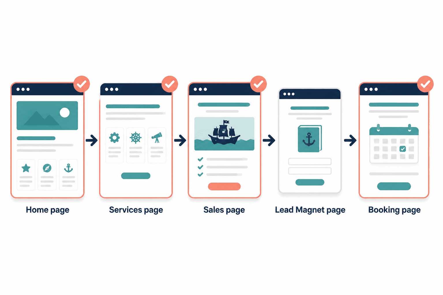
What a good funnel-message match looks like
The best funnel is not the fanciest one. It is the one that matches how the offer is actually sold.
A few simple fits:
- Simple offer, direct sale: short page, clear CTA, strong proof
- Higher-consideration service: educational page, comparison points, application CTA
- New or nuanced offer: explainer content, proof, diagnostic or lead magnet first
That is why the sibling piece on offer messaging and positioning matters so much. Conversion is easier when the funnel and the message are not arguing in the hallway.
For readers mapping message structure to funnel structure, the page on best AI tools for offer messaging and positioning can help if you need a process boost, but it should support the strategy, not define it.
Quick audit checklist
- Can a visitor tell what the offer is within a few seconds?
- Can they tell who it is for?
- Does the page explain why this offer is the right choice?
- Does the proof match the promise?
- Does the CTA fit the buyer’s readiness?
- Is the next step obvious without being pushy?
If the answer to any of those is no, the page is probably leaving leads or sales on the table. Not because the offer is bad. Because the message is making the buyer do unpaid labor.
Conclusion
Offer messaging and positioning do not magically create demand. They do something more practical: they help the right people understand the offer quickly enough to trust it and act on it.
That is where more leads and more sales usually come from. Not from louder claims. Not from another CTA. From a cleaner path between what the offer is, why it fits, and what to do next.
If you want to keep building from here, go back to the parent guide or review the examples page for sharper patterns.