
Most landing page CTA problems are not actually CTA wording problems.
The button is often fine. The placement is doing the damage.
People obsess over whether the button should say “Book a Call” or “Get Started,” then quietly bury it under a swamp of vague copy, drop it too early, repeat it too aggressively, or make the next step feel weirdly high-stakes. Then they wonder why the page is getting traffic but not conversions.
Landing Page CTA Placement Mistakes That Hurt Performance usually come down to one thing: the ask is out of sync with the reader’s readiness. The page wants a decision before it has earned one, or it withholds the CTA until the reader has already lost momentum.
This is fixable. You do not need a full redesign and you do not need to start worshipping button colors. You need cleaner sequencing, better timing, and CTAs placed where they match intent instead of interrupting it.
Here’s how to spot the placement mistakes that quietly hurt performance, and what to do instead if you want your landing page to feel easier to say yes to.
To see how this fits into the wider strategy, open the parent guide.
Why CTA placement matters more than most people think
A CTA is not decoration. It is not there because “landing pages need buttons.” It is there to catch intent at the right moment.
If the CTA shows up before the reader understands the offer, it feels pushy. If it appears after a long scroll with no clear next step, it feels buried. If it repeats in every section without any change in context, it starts to feel like the page is nagging.
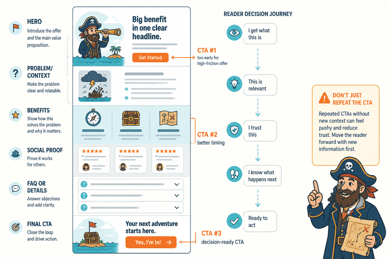
Good CTA placement follows the reader’s decision path. It shows up when someone is likely to think one of these things:
- Okay, I get what this is
- This seems relevant to me
- I trust you enough to keep going
- I can see what happens next
- Fine, yes, this is probably worth doing
That means placement is part copy, part UX, part sales psychology, and part basic common sense. Which, sadly, is where a lot of pages get into trouble.
Mistake 1: Putting the first CTA too high for a high-friction offer
Above-the-fold CTAs are not automatically smart. They are only smart when the reader is ready.
If your offer is low-friction, familiar, cheap, or obvious, an early CTA can work well. If your landing page asks someone to book a sales call, apply for coaching, request a proposal, or buy a premium service they barely understand yet, slapping a big CTA at the top and calling it optimized is a bit optimistic.
The issue is not that you should never have a top CTA. You usually should. The issue is treating the top CTA like the only persuasive move that matters.
What to do instead
- Keep a clear primary CTA near the top, but support it with enough context
- Add a strong headline and subhead that explain the offer fast
- Use nearby proof or clarity elements so the CTA does not feel like a blind leap
- If the ask is big, soften the pressure with language that makes the next step feel manageable
For example, “Book Your Strategy Call” can feel heavy if the page has not explained the outcome, audience, or process. “See if we’re a fit” or “Book a free fit call” might lower the perceived pressure, but only if the surrounding copy also does its job.
A top CTA should catch ready visitors. It should not be your entire persuasion strategy.
Mistake 2: Hiding the next CTA after a good moment of interest
This one is common on long landing pages. The reader gets through a strong problem section, likes the positioning, maybe nods along at the offer breakdown, and then… nothing. No CTA. No action point. No clean next step.
Then they keep scrolling, get distracted, hit a bloated FAQ, lose energy, and leave.
Momentum matters. If a section creates belief, interest, or relief, that is usually a good place to give the reader a way forward. Not every section needs a button, but strong sections should not dead-end.
Where mid-page CTAs usually help
- After you clearly explain what the offer is
- After a useful benefits or outcomes section
- After social proof or a case-study block
- After handling a major objection
- After a pricing or package explanation
If the reader just got the answer they needed, give them a button while the answer is still warm.
Mistake 3: Repeating the same CTA with zero context
Yes, repeated CTAs are usually a good idea. No, mindlessly pasting the same button after every section is not the same thing.
When a CTA repeats with no contextual lead-in, it starts to feel mechanical. Readers stop seeing it. Worse, it can make the page feel like it is rushing the sale instead of guiding a decision.
Each CTA placement should make sense based on what the reader just read.
| Weak placement | Stronger placement |
|---|---|
| Button dumped after a generic paragraph | Short transition that connects the section to the action |
| Same CTA text every time | Same destination, slightly adjusted framing when useful |
| No reminder of why to click now | Quick reason tied to the section’s point |
For example:
- After explaining your process: “Want help with this? Book a consultation.”
- After proof: “If you want this kind of result without reinventing your whole site, let’s talk.”
- After pricing clarity: “If the offer fits what you need, you can apply here.”
Same action. Better timing. Better framing. Much less robotic.
Mistake 4: Placing CTAs before the reader has basic clarity
A surprising number of landing pages ask for action before answering the most obvious questions:
- What is this?
- Who is it for?
- What happens if I click?
- Why this instead of the other options?
- How do I know you are credible?
If those answers are fuzzy, CTA placement gets blamed for a clarity problem. The real fix is not always “move the button.” Sometimes it is “stop making people guess.”
This is why section order and CTA placement are linked. A button cannot rescue a messy page structure. If your page jumps from headline to CTA to vague benefits to testimonials to origin story to another CTA, the reader is doing too much assembly work.
If your page flow is clunky, this is where a piece on improving landing page section order without sounding generic becomes very relevant. CTA placement only works when the surrounding sequence makes sense.
Mistake 5: Making the reader scroll-hunt for the main action
If someone decides they want the offer, the page should not make them work to find the button again.
This sounds obvious, yet plenty of landing pages have one lonely CTA near the top, then a long scroll of content, then maybe another button buried at the very bottom. Anyone who decides halfway through has to either keep scrolling on faith or reverse direction like they misplaced their car keys.
That tiny bit of friction matters more than people think. Especially on mobile, where long pages feel longer and patience is not exactly thriving.
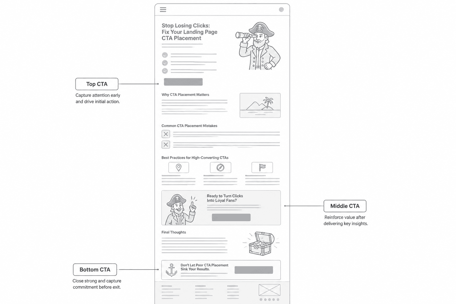
What good coverage looks like
- One clear CTA near the top
- At least one well-placed CTA in the middle
- One final CTA near the bottom
- Consistent destination and action path
- No guessing about what the button does
This does not mean your page needs buttons raining from the ceiling. It means the action should be easy to take whenever the reader becomes ready.
Mistake 6: Using the same CTA placement for every kind of traffic
Not all visitors arrive with the same level of awareness. Someone clicking from your email list is warmer than someone landing cold from search or an ad. Someone referred by a podcast appearance may trust you more than someone who found one random post and wandered in.
So if your CTA placement strategy assumes every visitor is equally ready, performance will wobble.
Cold traffic usually needs more context before a strong ask. Warm traffic can often handle earlier CTAs because some trust and understanding already exist before the page even starts.
This is also why copying examples blindly is a bad plan. A page converting well for a known creator with warm traffic may flop for a newer consultant with low brand recognition. Context matters. So does audience trust.
If you want stronger comparison points, it helps to study landing page examples for coaches, consultants, and personal brands rather than only staring at giant software-company pages that live in a completely different world.
Mistake 7: Stacking multiple different CTAs too early
Book a call. Download the guide. Join the newsletter. Watch the video. Read the case study. Follow on LinkedIn. Send a message.
Pick a lane.
When the top half of a landing page offers too many paths, the CTA placement problem becomes a decision overload problem. Instead of guiding action, the page creates hesitation. The reader is not impressed by your options. They are trying to figure out what you actually want them to do.
Multiple CTAs can work when they are clearly prioritized and placed with intent. But if your main conversion goal is a booked consultation, do not make the opening screen feel like a menu at a confused cafe.
A better rule
- One primary CTA per page
- One optional secondary CTA if the offer genuinely needs a softer step
- Clear visual hierarchy so the main action is obvious
- Secondary options placed lower or framed for less-ready visitors
If you need help getting the whole page to convert more cleanly, not just the buttons, this pairs nicely with how to turn landing pages into more leads or sales.
Mistake 8: Placing CTAs after sections that create doubt or friction
Not every section is a good launch point for a CTA.
Some sections naturally build momentum. Others make people pause, evaluate, or second-guess. If you put a CTA right after a dense pricing explanation, a complicated comparison table, a wall of process details, or a jargon-heavy section, you may be asking at the exact moment their confidence dips.
This is where placement gets subtle. You want the CTA after enough information, but not immediately after the most cognitively heavy part of the page.
Often the better move is:
- Explain the complex thing
- Translate it into a simple takeaway
- Reassure the reader what happens next
- Then place the CTA
That tiny transition matters. It restores momentum before the ask.
Mistake 9: Treating the bottom CTA like an afterthought
The final CTA on a landing page is often weirdly lazy.
After all the work of the page, the bottom section ends with something limp like “Contact us today” or “Ready to get started?” with no real reinforcement of why, for whom, or what happens next.
The bottom CTA matters because by then the reader has context. They have seen your argument. They have weighed the offer. This is not the place for vague filler.
A strong bottom CTA usually includes
- A quick restatement of the outcome or offer
- A reminder of who it is for
- A little reassurance about the next step
- The primary button
For example:
If you want a landing page that sounds like you, makes the offer clearer, and gives people an easier path to say yes, book a copy consultation. We’ll look at the page, spot the friction, and map the next moves.
That does more than “Get Started.” It closes the page with a reason.
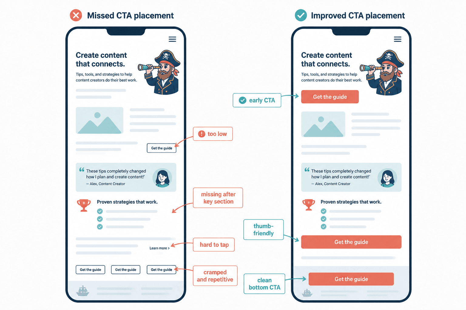
Mistake 10: Not matching the CTA to mobile reading behavior
CTA placement that feels fine on desktop can get clumsy fast on mobile.
Long sections become longer. Proof blocks push buttons farther down. Tiny visual cues disappear. And if your page relies on readers seeing a CTA “just below” something important, mobile may quietly break that assumption.
At minimum, check:
- How far the first CTA sits below the headline on mobile
- Whether key mid-page CTAs still appear after strong sections
- Whether buttons are easy to tap
- Whether repeated CTAs feel excessive on small screens
- Whether the bottom CTA still lands cleanly rather than feeling crammed
A lot of “copy problems” are just layout problems wearing a fake mustache.
How to fix CTA placement without rebuilding the whole page
You do not always need a full overhaul. Often, a few smart edits can make the page feel much easier to act on.
Quick audit process
- Mark every CTA on the page. Note where each one appears.
- Check what the reader knows at each CTA point. Is there enough clarity and trust yet?
- Look for dead zones. Where does interest build without an obvious action?
- Cut redundant placements. If two CTAs appear close together with no added value, remove one.
- Add short transition copy. Help each CTA feel earned by the section before it.
- Review on mobile. This is where awkward spacing and buried actions show up fast.
If your page is struggling more broadly, not just with CTA timing, it is worth reviewing the bigger conversion issues in better landing pages: landing page mistakes for personal brands.
A simple CTA placement structure that usually works
There is no one perfect structure for every page, but this is a solid default for many service, coaching, consulting, and personal brand landing pages:
The bigger point is simple: clearer structure and clearer writing make the piece more useful. That is usually what makes the ending land better too.