Most landing pages for coaches, consultants, and personal brands do not fail because the design is ugly. They fail because the message is foggy, the offer is buried, and the page asks for trust it has not earned yet.
You have probably seen the usual mess: a giant “transform your life and business” headline, three stock-photo smiles, six pastel icons, and absolutely no clear reason to believe any of it. It looks polished. It converts like a cardboard parachute.
This guide gives you landing page examples for coaches, consultants, and personal brands that are actually useful. Not as pretty little inspiration snacks. As working models you can adapt for offers, lead magnets, consultations, waitlists, workshops, and service pages that need to persuade a real human with limited patience.
If you want the broader strategy behind high-converting pages, start with this landing pages guide for creators who want better results. If your current page already exists and feels suspiciously beige, you should also read these landing page mistakes personal brands keep making.
For the broader learning path, visit our parent guide.
What good landing pages for coaches, consultants, and personal brands usually do right
Before the examples, here is the part people skip: good pages are not just “well written.” They do a few specific jobs in the right order.
- They make the offer obvious fast
- They name the audience clearly
- They describe the result without floating into self-help wallpaper
- They reduce friction with proof, specifics, and structure
- They make the next step feel easy
That is it. Not magic. Not secret conversion pixie dust. Just a clear argument built in the right sequence.
A lot of personal brands write landing pages like social posts. Vague, personality-heavy, a little dramatic, and allergic to detail. That can work on a feed where attention is loose and people are browsing. It falls apart on a landing page, where the whole job is to help someone decide.
Example 1: A coach selling a discovery call without sounding needy
This is one of the most common page types: book a call, apply now, schedule a consult, grab a strategy session. Also one of the easiest to ruin.
The usual mistake is making the page all about the coach’s philosophy instead of the buyer’s problem. People do not book because your process is “heart-centered, aligned, and powerful.” They book because they think you can help with a problem they already care about.
Weak version
Headline: Step Into Your Highest Potential
Subhead: I help ambitious humans unlock clarity, confidence, and purpose through transformational coaching.
CTA: Book a Free Call
Sounds important. Says almost nothing.
Stronger version
Headline: Book a coaching call if your business feels messy, scattered, or stuck in overthinking
Subhead: For solo founders and personal brands who need sharper positioning, better decisions, and a plan they can actually follow.
CTA: Apply for a strategy call
Notice what changed. The stronger version names the right person, the right pain, and the kind of help on offer. It is not trying to sound profound. It is trying to make the right person think, “Yes, that is my problem.”
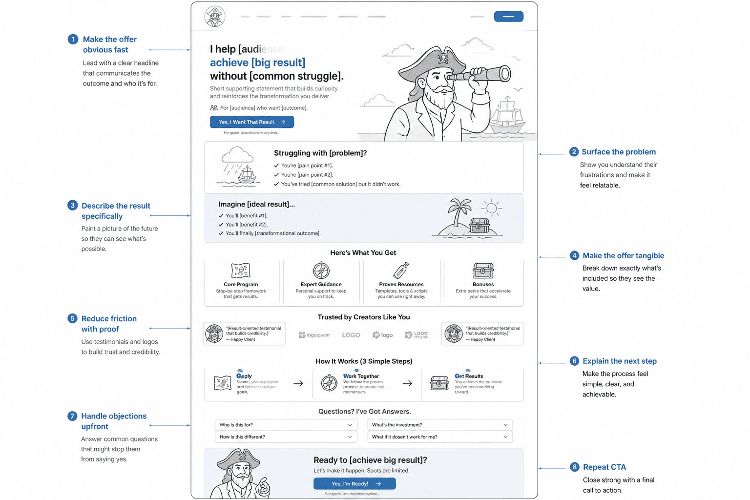
Suggested page structure
- Headline: clear problem and audience
- Subhead: what the call helps with
- Short proof strip: client roles, outcomes, or quick testimonials
- What happens on the call: 3 bullets max
- Who this is for: specific fit
- Who this is not for: optional but useful
- CTA: application or booking button
A quick “what happens on the call” section often helps here because people are not just buying your expertise. They are also deciding whether the next step feels awkward, salesy, or like a waste of Tuesday.
Good booking pages reduce uncertainty. Bad ones ask for a calendar commitment on pure vibes.
Example 2: A consultant landing page selling a focused service
Consultants often make the opposite mistake. They stuff every capability onto one page and call it positioning. The result is a buffet of competence with no main dish.
A focused landing page works better when it sells one clear service to one clear type of client. If you help with messaging, do not also cram in funnel audits, team workshops, personal branding, ad strategy, ghostwriting, and mindset support because technically you can.
Weak version
Headline: Strategic Marketing Support for Visionary Brands
Body copy: I help businesses with content, copy, funnels, positioning, systems, messaging, and brand growth.
This creates one immediate question: support for what, exactly?
Stronger version
Headline: Fix the messaging on your homepage, sales pages, and emails before you buy more traffic
Subhead: Conversion copy consulting for service businesses that already have attention but are losing leads to vague positioning and weak page structure.
CTA: Request a copy audit
That is much tighter. It frames the service around a business problem, not a vague category. It also filters better. Not everyone needs “strategic support.” Plenty of people do need help fixing conversion copy before they throw more money at traffic.
Suggested sections for this kind of page
- What the service is
- What problem it solves
- What is included
- What outcomes clients usually want from it
- Proof: examples, numbers if honest, testimonials, mini case studies
- What the process looks like
- Who it is best for
- CTA
If you need stronger top-of-page copy, these landing page headline block examples will help you tighten the first screen without making it sound like a stale webinar registration page from 2019.
Example 3: A personal brand page for a lead magnet that does not feel disposable
Lead magnet pages are where a lot of creators get lazy. The thinking seems to be: it is free, so the copy does not matter. That is exactly backwards.
If the lead magnet page looks generic, people assume the freebie will be generic too. And frankly, they are often right.
Weak version
Headline: Free Guide to Grow Your Brand
Subhead: Learn my top tips for success online.
This is free, yes. It is also forgettable.
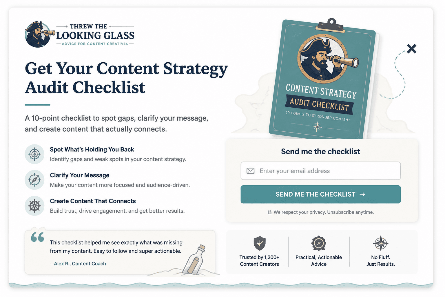
Stronger version
Headline: Get the 9-part landing page checklist I use to spot conversion leaks fast
Subhead: Built for coaches, consultants, and creators who have traffic, offers, or profile visits but weak page performance.
Bullets:
- What to fix above the fold
- How to tighten proof without writing a novel
- Where weak CTAs quietly kill action
CTA: Send me the checklist
Specificity does a lot of heavy lifting. It makes the free thing feel more real, more useful, and more worth the email address.
One more thing: if the lead magnet is basic, say less. Do not puff up a two-page PDF into “the ultimate blueprint.” Nobody likes that. If it is short but sharp, own that. “A quick checklist” can convert beautifully when the outcome is clear.
And if your page needs more believable proof, these proof section templates for busy creators are worth stealing from with dignity.
Example 4: A workshop or webinar page that sells the payoff, not the event
Event landing pages often spend too much time announcing the event and not enough time clarifying why anybody should care. Date, time, host, and format matter, but they are not the main pitch.
The main pitch is the outcome. What will the attendee understand, fix, avoid, or walk away with?
Weak version
Headline: Join My Free Live Masterclass
Subhead: I will be sharing my best tips on content, messaging, and visibility.
That is event-shaped. Not compelling.
Stronger version
Headline: Fix the 5 landing page mistakes that make good offers look skippable
Subhead: A live session for coaches, consultants, and personal brands who are getting clicks but not enough signups, replies, or bookings.
Section ideas:
- What you will learn
- Who this is for
- Why this matters now
- Short host credibility section
- Registration CTA
You do not need six giant agenda modules unless the event is paid and high-ticket. For most free workshops, people mainly want a credible promise and a reason to believe it will be worth their time.
Example 5: A sales page for a personal brand offer with actual personality
Some personal brands hear “clear copy” and accidentally make their pages sound sterile. Then the whole page reads like a legal memo written by a productivity app.
Clarity does not mean flattening your voice. It means your personality supports the message instead of stepping on it.
A simple before and after
Before: I created this intimate experience for purpose-driven experts ready to align their message, audience, and authority.
After: This program helps smart people stop sounding vague online. You will leave with clearer positioning, sharper content angles, and a profile that does not read like recycled business confetti.
The second version has personality, but it still communicates. That is the balance. Not “quirky for the sake of quirky.” Not robotic respectability either.
If you want a broader view of what strong pages need, the main landing pages hub is a useful next stop.
A practical landing page template you can adapt fast
Here is a simple structure that works for a lot of coaches, consultants, and personal brands. You do not need every section every time. But this gives you a sane starting point.
- Headline: name the result or problem clearly
- Subhead: say who it is for and what the offer helps them do
- Primary CTA: book, apply, download, join, request, register
- Proof strip: client names, testimonial snippet, mini result, audience size if relevant
- Problem section: show you understand the issue
- Offer section: what this is and what is included
- Outcome section: what changes after using it
- Proof section: testimonials, examples, screenshots, case study blurbs
- Objection section: answer the obvious concerns
- Final CTA: make the next step feel simple
This works because it follows how humans decide. First, they ask, “Is this for me?” Then, “Do I want it?” Then, “Can I trust this?” Then, “What do I do next?”
A weird number of landing pages answer those questions in the exact wrong order. They open with the founder’s life story, jump into a giant offer breakdown, and only later mention who the page is for. No wonder conversion suffers.
What these landing page examples have in common
Across different page types, the good examples share a few habits.
- They are specific. Not “grow your business,” but how and for whom.
- They are concrete. They describe the offer in ways a buyer can picture.
- They use proof well. Not just praise, but relevant reassurance.
- They avoid hype. Confidence beats inflated promises.
- They keep one main goal. One page, one next step.
This is where a lot of pages wobble. Someone wants the same page to educate, inspire, introduce the brand, rank in search, collect emails, sell a service, and maybe tuck in a podcast bio while they are at it. Pick a lane. Your reader is not there to admire your sitemap.

Common mistakes to avoid when adapting these examples
- Using broad emotional language instead of a real promise. “Feel empowered” is not a strong offer.
- Making the headline about you. The reader cares about their problem first.
- Burying the CTA. If they are ready, do not make them hunt.
- Adding too much copy before proof. Claims need support.
- Using testimonials that sound nice but prove nothing. “Amazing experience” is weak. “Helped me clarify my offer in one week” is useful.
- Listing features without translating them into value. Calls, PDFs, reviews, audits, recordings: fine. Why do they matter?
- Sounding like everyone else. “Authentic impact-driven transformation” is not a voice. It is wallpaper.
If your current draft is committing several of these crimes at once, congratulations, you are normal. It is fixable.
How to use these examples without copying them badly
Examples are useful because they show structure and logic. They become unhelpful when people copy the wording and swap in a few nouns.
Instead, borrow the decision path underneath the copy.
The bigger point is simple: clearer structure and clearer writing make the piece more useful. That is usually what makes the ending land better too.