
Most proof sections on landing pages are doing one of two unhelpful things.
They are either painfully thin, with one vague testimonial saying “she was amazing to work with,” or they are bloated little museums of self-congratulation that make the reader work way too hard to figure out if any of it matters.
If you are a busy creator, coach, consultant, or solo founder, you do not need a giant social proof shrine. You need a proof section that helps someone think, “Alright, this person seems legit, relevant, and likely to help me.” That is the job.
This guide gives you simple landing page proof section templates for busy creators, plus examples, structure tips, and the mistakes that quietly kill trust. If your landing page is decent but still feels a little thin, this is usually one of the first places to fix.
For the main guide behind this topic, visit the parent guide.
What a proof section is actually supposed to do
A proof section is not there to brag. It is there to reduce doubt.
Your reader has questions, even if they are not saying them out loud:
- Has this worked for someone like me?
- Can I trust this person?
- Is this specific or just polished?
- What kind of result should I realistically expect?
- Will this feel worth the money, time, or attention?
A good proof section answers those questions quickly. A bad one just adds more claims with nicer formatting.
This matters even more on simple landing pages. When the page is short, every section has to pull its weight. Your proof section is often the bridge between “interesting” and “fine, I’ll click.”
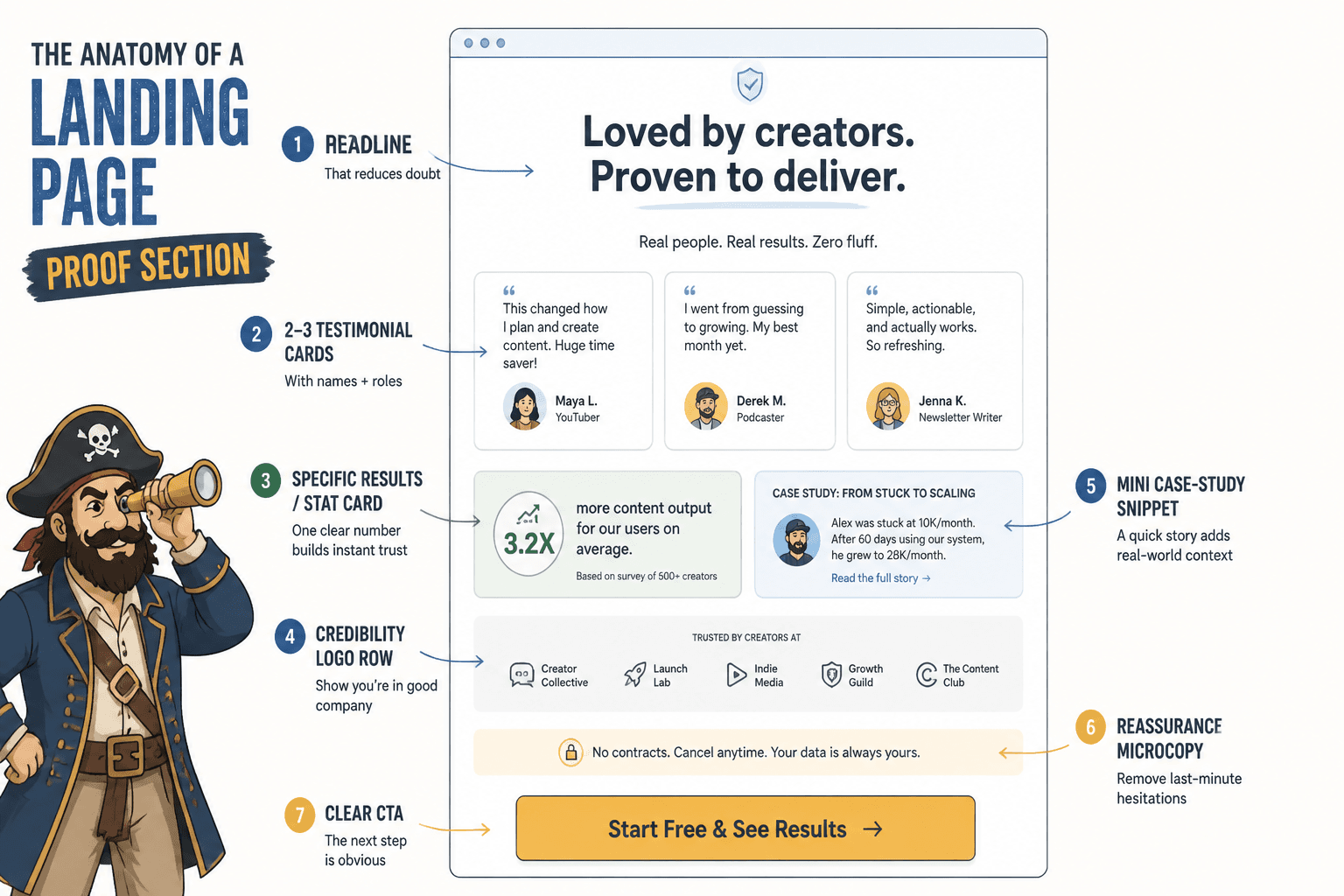
What busy creators should include in a proof section
You do not need every type of proof. You need the right mix for your offer.
Usually, the strongest proof sections use two or three of these:
- Testimonials: short quotes from clients, customers, readers, or collaborators
- Specific outcomes: revenue, leads, reply rates, signups, audience growth, saved time, or other meaningful results
- Credibility markers: companies worked with, publications featured in, audience size, years of experience, or number of projects completed
- Case-study snippets: one or two sentence mini stories showing problem, action, and result
- Volume proof: “helped 120+ coaches” or “written 400+ conversion-focused emails”
- Process trust: proof that working with you is clear, responsive, and low-chaos
Not all proof has to be dramatic. If your service helps people clarify positioning, improve messaging, or feel more confident selling, the outcome may not be “made a million dollars by Thursday.” Good. Those cartoonishly inflated claims are part of the problem.
Relevant proof beats impressive-looking proof. A quote from the exact kind of person you want to attract usually does more than a fancier testimonial from someone who is not a fit.
5 proof section rules that make simple landing pages work better
1. Match the proof to the promise
If your page promises clearer messaging, your proof should mention clarity, confidence, conversions, or better-fit leads. Not “great energy” and “such a lovely person.” That might be true. It is also not enough.
2. Use specifics, not perfume
“Amazing experience” is fluff. “We rewrote the page and bookings went from 2 per month to 7 in six weeks” is useful. Readers trust details because details sound like reality.
3. Keep it skimmable
No one wants to excavate trust from a giant wall of text. Break proof into cards, short quotes, mini case studies, or grouped bullets. Clean beats crowded.
4. Show range without creating chaos
If you help different kinds of people, show a few relevant examples. But do not throw in random testimonials from every offer you have ever made. That does not make you versatile. It makes your positioning wobble.
5. Put proof near decision points
A proof section works well after the promise and before the CTA, but you can also sprinkle proof near pricing, objection-heavy sections, or booking buttons. Trust tends to work better when it appears right before commitment.
Simple landing page proof section templates for busy creators
Here are practical templates you can adapt fast. Use them as structures, not sacred scripture.
Template 1: The clean testimonial grid
Best for: service pages, 1:1 offers, low-friction booking pages, lead magnet pages with some traction
Structure:
- Short section headline
- 1 sentence framing what people tend to get from working with you
- 3 to 6 testimonials
- Optional CTA below
Headline: What clients usually say after we fix the messaging
Intro line: Clearer positioning, stronger landing page copy, and fewer “sounds great but not right now” leads.
Example testimonial set:
- “You pulled the actual value out of my offer in one session. My page finally sounds like it belongs to my business, not a random template.”
- “Within two weeks of updating the page, I had three better-fit inquiries and one booked client from people who said the page made the decision easy.”
- “What changed most was clarity. I stopped rambling in sales calls because the page was finally doing its job.”
This template is simple for a reason. It works well when your offer is easy to understand and your main friction is trust, not education.
Template 2: The before-and-after proof block
Best for: copywriting, design, positioning, audits, profile rewrites, funnels, and anything transformational
Structure:
- Headline focused on change
- 2 to 4 mini case studies
- Each one includes before, after, and why it mattered
Headline: A few quick examples of what changed
Before: Homepage headline was vague and sounding “professional” in the worst way.
After: Rewrote the page around one audience, one problem, and one outcome.
What happened: Bounce dropped, inquiries got more specific, and sales calls started warmer.
Before: Lead magnet page had decent traffic and weak conversion.
After: Added clearer promise, sharper proof, and one cleaner CTA.
What happened: Opt-ins improved because people could finally tell what they were getting.
This format works because it makes the improvement visible. Readers do not have to guess what you actually did.
Template 3: The numbers-plus-voice section
Best for: creators with some volume, repeatable services, courses, or strong audience proof
Structure:
- Headline that frames credibility
- 3 to 4 quick stat blocks
- 2 supporting testimonials underneath
Headline: Trusted by creators who wanted cleaner copy and better conversion
Stat blocks:
150+ landing pages reviewed
60+ client projects completed
4.9/5 average client feedback
Clients across coaching, consulting, education, and personal brands
Supporting quotes:
“Fast, sharp, and weirdly good at finding the exact sentence that was killing conversions.”
“I thought I needed more traffic. I needed a page that made sense.”
The numbers get attention. The quotes add texture. Together, they feel more believable than either one alone.
Template 4: The objection-busting proof section
Best for: higher-ticket offers, cautious buyers, consulting pages, strategy sessions, and custom services
Structure:
- Headline tied to hesitation
- 3 to 5 short proof snippets, each addressing a common objection
- CTA that feels calm, not pushy
Headline: If you are wondering whether this will actually be worth it
“I was worried this would just give me nicer words. It gave me a page that made my offer easier to buy.”
“I did not need more theory. I needed someone to fix the messaging mess. That happened fast.”
“The process was clear, low-drama, and surprisingly efficient. No endless revisions. No vague feedback loops.”
This is underrated. People have objections anyway. You can either leave them alone in their head with those objections, or answer them like an adult.
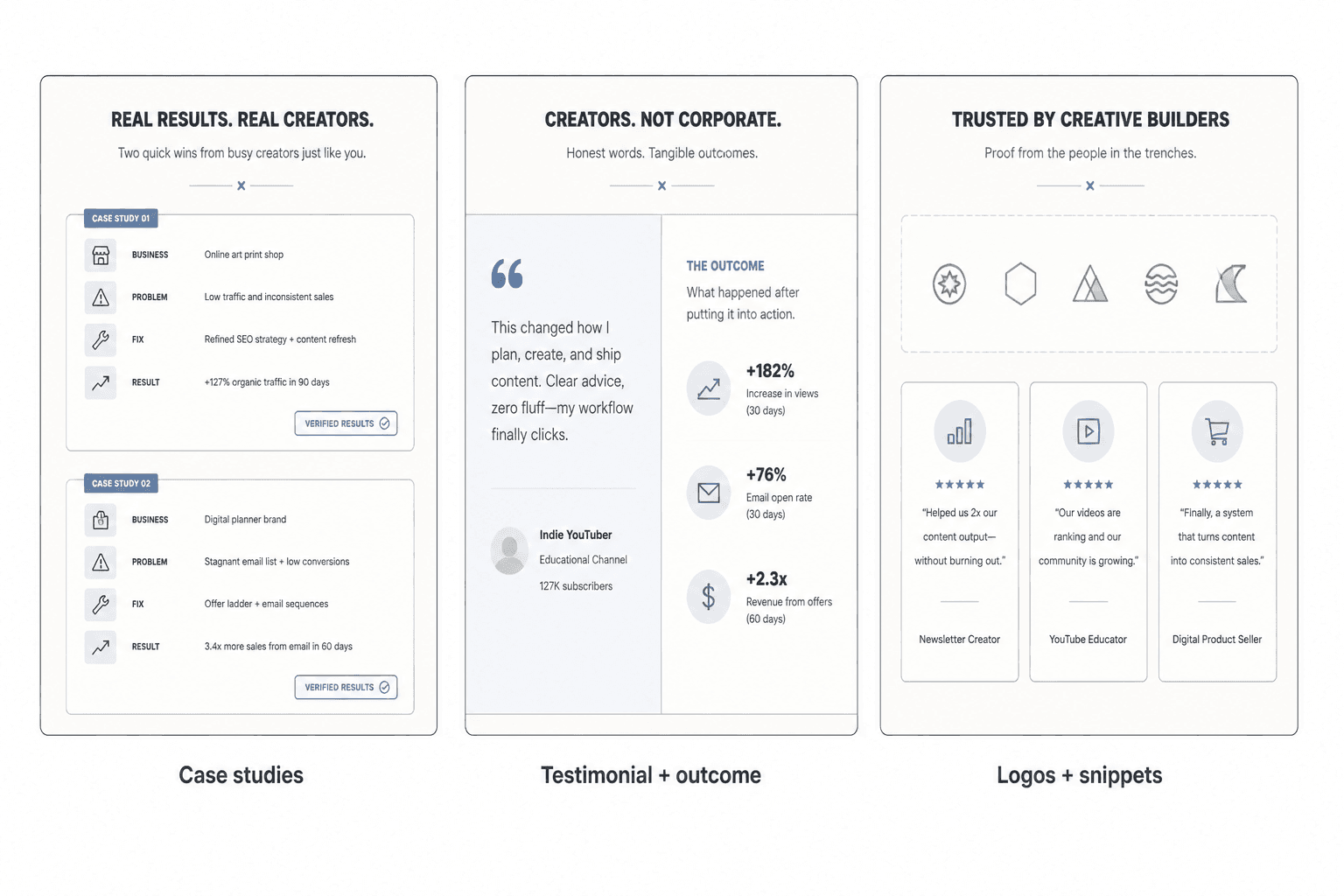
Template 5: The mini case study stack
Best for: consultants, strategists, fractional experts, funnel builders, and people selling outcomes that need context
Structure:
- Headline
- 3 mini case studies
- Each one uses audience, problem, fix, and result
Headline: A few examples from recent client work
Business: Leadership coach
Problem: Page sounded thoughtful but not compelling
Fix: Reframed offer around one urgent transformation and rewrote the proof section
Result: More qualified inquiries and fewer price-only calls
Business: B2B consultant
Problem: Homepage had authority but no momentum
Fix: Tightened message, reordered sections, clarified CTA
Result: Better-fit leads from colder traffic
This one takes a little more work, but it is excellent when your reader needs to see how you think, not just hear that you are “great.”
How to write stronger testimonials when the originals are weak
Sometimes the client feedback is real but not very usable. It is warm, kind, and completely non-specific. A lot of testimonials need editing for clarity, not fiction.
You should not invent outcomes or rewrite someone into sounding like a copywriter with a conversion podcast. But you can tighten messy quotes, remove filler, and pull out the part that actually matters.
Weak testimonial: “Working together was an amazing experience and I felt so supported throughout the whole process.”
Better: “The process was clear, fast, and focused. I came away with a landing page that finally explained the offer without me needing to overexplain it on calls.”
Weak testimonial: “She really knows her stuff and helped me a lot.”
Better: “She spotted the messaging problem in about ten minutes. Once we fixed that, the page felt sharper and the inquiries got better.”
If you are collecting testimonials in the first place, ask better questions. Not “would you mind leaving a testimonial?” That usually gets you mush.
Ask things like:
- What was not working before we worked together?
- What changed after the update?
- What part of the process stood out?
- What would you say to someone considering this?
- What specific result or difference mattered most?
That is how you get proof with spine.
Simple proof section formulas by creator type
Different offers need different proof. Here is the practical version.
| Creator type | Best proof to lead with | What to avoid |
|---|---|---|
| Coach | Transformation stories, confidence shifts, client outcomes, process trust | Vague emotional praise with no concrete change |
| Consultant | Case snippets, business results, expertise markers, relevant client types | Generic “great to work with” quotes only |
| Copywriter or marketer | Before/after examples, conversion lifts, stronger leads, clearer messaging proof | Only showing compliments about style |
| Course creator | Student wins, completion feedback, lesson usefulness, volume proof | Random hype or suspiciously huge claims |
| Personal brand | Credibility markers, audience trust, featured work, selective testimonials | Listing every media logo you have ever touched |
If your landing page feels too generic, the issue may not just be the proof section itself. It could be how the entire page is sequenced. If that is the problem, this guide on landing page section order will help you clean that up without making everything sound like template sludge.
Where to place the proof section on a simple landing page
There is no sacred placement, but here are the common patterns that make sense:
- After the hero section: useful when your offer is clear and trust is the main obstacle
- After the problem and solution sections: useful when the reader needs context before proof lands
- Before pricing or booking CTA: useful when hesitation spikes near commitment
- Repeated in smaller forms: one big section plus small proof snippets near key CTAs
If you are building from scratch, it helps to study more complete examples too. You can browse landing page ideas and examples for creators, plus landing page examples for coaches, consultants, and personal brands if your offer sits in that world.
And if your page opening is weak, your proof section has to work too hard. Fix the top first. These landing page headline block examples can help you sharpen the promise before people reach the proof.
Common proof section mistakes that make pages feel less trustworthy
The bigger point is simple: clearer structure and clearer writing make the piece more useful. That is usually what makes the ending land better too.
The bigger point is simple: clearer structure and clearer writing make the piece more useful. That is usually what makes the ending land better too.