
Most landing pages do not have a writing problem first. They have an order problem.
You can have a solid headline, decent proof, a reasonable offer, and a clear CTA, then still watch the page underperform because everything shows up in the wrong sequence. The reader lands, looks around, feels mild friction, and leaves. Not because your offer is bad. Because the page makes them do too much mental work too early.
That is usually what people mean when a page feels “generic.” Not just bland wording. Generic structure. The same stack of hero, features, testimonials, FAQ, CTA, and hope. No real thought about what the reader needs to believe first, second, and next.
If you want to know How to Improve Landing Page Section Order Without Sounding Generic, the fix is not throwing in more buzzwords or copying the latest high-converting template from someone selling “7-figure funnel secrets” from a beige Google Doc. It is understanding buyer momentum. Each section should answer the next obvious question in the reader’s head.
This is how to structure a landing page so it feels sharper, more specific, and easier to trust. We’ll cover what order usually works, what to move around depending on the offer, and where people keep stuffing sections that do not belong where they put them.
For the full path around this topic, head to the parent guide.
Why landing page section order matters more than people think
A landing page is not just a container for sections. It is an argument.
Not an angry argument. A persuasive one. A clean sequence that moves someone from “What is this?” to “This seems relevant” to “I believe you” to “Fine, I’ll click.”
When section order is off, one of two things usually happens:
- You ask for action before trust exists.
- You explain details before the reader cares enough to read them.
That is why so many pages feel weirdly flat. They are technically complete but strategically upside down.
A strong section order reduces friction. It makes the page feel obvious in the best way. The reader does not have to hunt for the point, decode your offer, or guess why they should care. They just keep moving.
And no, this does not mean every page should follow one rigid formula. It means every section should earn its place.
The real goal: match section order to reader psychology
If you want a landing page that does not sound generic, stop thinking in terms of “what sections should a landing page have?” and start thinking in terms of “what does my reader need next?”
That shift matters because generic pages are usually built from a checklist. Specific pages are built from decision friction.
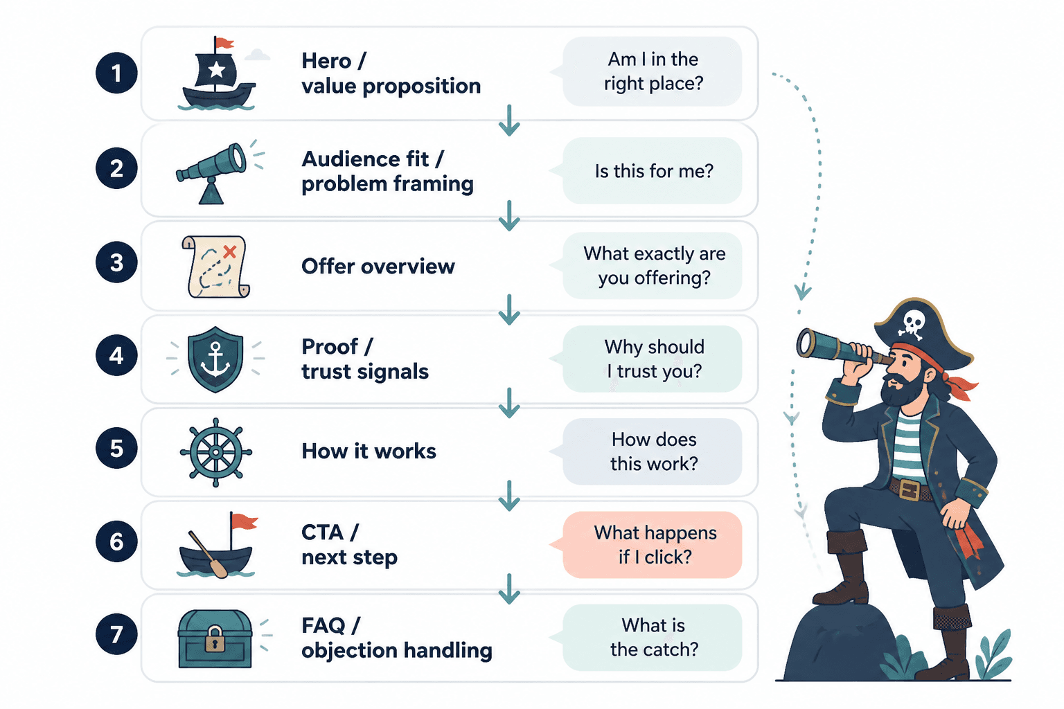
Your reader is silently asking things like:
- Am I in the right place?
- Is this for me?
- What exactly are you offering?
- Why should I trust you?
- How does this work?
- What happens if I click?
- What is the catch?
Your section order should answer those questions in a clean sequence. Not all at once. Not in random bursts. And definitely not with a giant slab of “about us” copy before you have even made the offer feel relevant.
A practical landing page section order that works for most offers
Here is a strong default structure for many service, coaching, consulting, course, and lead-gen landing pages:
- Hero section
- Problem or stakes section
- Offer explanation
- Benefits or outcomes
- Proof
- Process or how it works
- Objection handling
- CTA section
- FAQ
- Final CTA
That does not mean every page needs all ten. It means this sequence tends to match how people evaluate an offer.
Now let’s make that more useful.
1. Hero section: clarity first, not cleverness first
Your hero section has one job: make the reader instantly understand what the page is about and why it might matter to them.
That means a clear headline, supporting subhead, and CTA. Not a vague manifesto. Not a poetic mood board in sentence form. Not “Scale your brilliance with aligned systems.” No one knows what that means, including the person who wrote it.
If your openings tend to wobble, this is exactly where starting landing pages without a weak opening matters. A sharp first section saves the rest of the page from having to overcompensate.
2. Problem or stakes section: show you understand the friction
After the hero, many pages jump straight into features. Too soon.
The reader still needs to feel seen. A short problem or stakes section helps them think, “Yes, this is exactly the mess I am dealing with.” It should name the cost of the problem, the pattern they are stuck in, or the frustration your offer solves.
This section is not for melodrama. It is for relevance. You are proving that you understand the context before you start selling the cure.
3. Offer explanation: say what the thing actually is
This is where too many pages get fluffy. They talk around the offer instead of naming it clearly.
Spell it out:
- What is it?
- Who is it for?
- What does it help them do?
- What format does it take?
- What happens after they sign up or click?
If the reader has to infer the mechanics of your offer from seven adjacent sections, the structure is doing a bad job.
4. Benefits or outcomes: translate the offer into useful change
Features tell me what is included. Outcomes tell me why I should care.
This section should focus on the practical shift your offer creates. Less “6 modules, templates, and bonus worksheets.” More “write landing pages faster, sound more convincing, and stop second-guessing every section.”
The key is specificity. Generic pages talk in broad promises. Better pages name the before-and-after clearly.
5. Proof: place it before skepticism gets loud
Proof often gets buried too low, like the page is trying to earn trust on vibes first. That is optimistic.
Once the reader understands the offer and wants the outcome, skepticism shows up. Naturally. So proof should arrive around then, not four scrolls later after your brand values and an icon grid.
Proof can include:
- Testimonials
- Client results
- Case study snippets
- Relevant experience
- Numbers, if they are honest and useful
- Examples of the work itself
If you need help building these sections, simple landing page proof sections and templates will save you from the usual vague praise parade.
6. Process or how it works: lower the effort fog
Once the reader believes you might help, they want to know what engagement actually looks like.
A simple process section works well here because it reduces uncertainty. It turns the offer from an abstract promise into a concrete experience. That is especially helpful for services, consulting, and higher-trust offers where people want to understand the steps.
Keep it clean. Three to five steps is usually enough. If your process section reads like operating instructions for industrial machinery, tighten it.
7. Objection handling: answer the hesitation before it stalls the click
Good landing pages do not pretend objections do not exist. They handle them with calm specificity.
This can be a short section before the CTA, or woven into FAQs lower down. Common objections include:
- Time
- Price
- Fit
- Complexity
- Fear of wasting money
- Fear of being locked in
- Uncertainty about results
You do not need to swat every possible concern. Just address the major ones honestly.
8. CTA section: ask cleanly, not theatrically
If your CTA only appears once at the bottom, you are making interested readers work harder than necessary. If it appears every 14 seconds, you are hovering.
Your CTA should appear when the reader has enough context to act. Usually that means once in the hero, again after proof or core explanation, and again near the end.
If your CTA placement is chaotic, read landing page CTA placement mistakes that hurt performance. A good section order falls apart fast when the asks show up in awkward places.
9. FAQ: keep it useful, not bloated
FAQ is not a junk drawer for random leftover copy.
Use it to handle practical decision questions that matter near the end: timing, access, refund policy, deliverables, who it is for, and what happens next. If a question is important enough to shape buying intent early, it should not be hidden in the FAQ.
10. Final CTA: close the loop
The final CTA should feel like the natural next step after everything the page has established. Clean button. Brief reminder of the value. No desperate last-minute paragraph trying to emotionally tackle the reader into converting.
How to Improve Landing Page Section Order Without Sounding Generic
Now for the more important part: improving section order is not just about arranging blocks neatly. It is about making the page feel like it was built for this offer, this audience, and this level of trust.
Here is how to do that.
Start with the conversion question, not the template
Before you move any section around, ask:
- What does the reader need to understand before they can care?
- What do they need to believe before they can trust?
- What do they need to know before they can act?
That sequence should shape the page.
A webinar registration page, a coaching sales page, and a lead magnet opt-in page should not all have the exact same section order. The trust burden is different. The commitment level is different. The amount of explanation required is different.
Move proof earlier if the offer asks for more trust
The higher the perceived risk, the earlier proof usually needs to show up.
If you are asking someone to book a call, pay a premium fee, or trust you with a meaningful problem, they will look for evidence fast. In those cases, moving proof higher can improve flow dramatically.
For lower-friction offers, you can often explain the offer first and then support it with proof. For higher-friction offers, the proof may need to appear right after the hero or problem section.
Move process earlier if the offer feels abstract
Some offers sound fuzzy unless you explain how they work. Strategy retainers, consulting engagements, audits, and done-with-you services often benefit from an earlier process section.
Why? Because the reader is not just wondering whether the result sounds good. They are wondering what they are actually signing up for. Clarifying the process sooner can reduce that uncertainty.
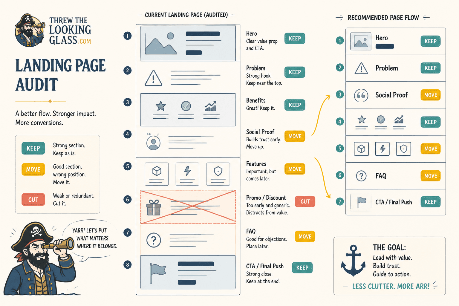
Cut sections that only exist because “landing pages usually have that”
This is where a lot of generic structure comes from.
If you have a section that says almost nothing new, merges three weak ideas, or repeats what was already said above, cut it. A page with six purposeful sections usually beats a page with eleven half-useful ones.
Common low-value sections include:
- A giant founder story no one asked for
- A feature grid that repeats the offer explanation
- A mission statement with no buying relevance
- A vague “why choose us” block with generic claims
- An FAQ built from filler questions
If a section does not reduce friction, increase clarity, build trust, or support action, it is probably decorative. Decorative is not the same as persuasive.
Write section transitions like a human, not a brochure
Order is not only about what appears where. It is also about how one section leads into the next.
If every new section lands with a stiff heading and no connective logic, the page can still feel choppy. A quick bridge paragraph can do a lot of work. It helps the reader understand why this next section matters now.
For example:
“If that sounds familiar, the next question is usually whether this can actually be fixed without rewriting your entire site.”
That kind of line keeps momentum going. It also makes the page sound less templated and more considered.
Common bad section orders and how to fix them
Bad order #1: Hero → Features → CTA → Proof
The problem: you are asking for action before the reader has enough reason to trust the offer.
Better order: Hero → Problem → Offer → Proof → CTA
Bad order #2: Hero → Founder story → About section → Offer
The problem: the page starts by making the business the main character.
Better order: Hero → Problem → Offer → Why trust us → Founder context if needed
Bad order #3: Hero → Testimonials → More testimonials → FAQ → Offer details
The bigger point is simple: clearer structure and clearer writing make the piece more useful. That is usually what makes the ending land better too.
The bigger point is simple: clearer structure and clearer writing make the piece more useful. That is usually what makes the ending land better too.