
Most people do not lose sales because their sales page is missing one more persuasion trick. They lose sales because the handoff from sales page to checkout is clunky, confusing, or weirdly high-friction.
You can write a strong offer, make the page clear, stack proof properly, and still watch people vanish the second they click “buy.” That is usually not a copy problem. It is a checkout problem, a funnel problem, or both.
The best checkout tools and funnel builders for Sales Pages are not the ones with the flashiest templates or the longest feature list. They are the ones that make buying feel easy, trustworthy, and annoyingly obvious.
This guide will help you choose the right kind of tool for your sales page setup, depending on what you sell, how complex your funnel is, and how much nonsense you are willing to tolerate from your software stack.
Want the broader roadmap? Start with the parent guide.
What a checkout tool or funnel builder actually needs to do
Before comparing platforms, it helps to get brutally clear on the job.
A checkout tool should not just “process payments.” That is the bare minimum. For a sales page, the tool needs to carry buying momentum forward. The reader has already done the mental work. Your system should not reward that with extra tabs, account friction, confusing order forms, or a mini obstacle course disguised as onboarding.
- Fast, clean checkout flow
- Trust signals at the point of purchase
- Mobile-friendly payment experience
- Order bumps, upsells, or simple post-purchase offers if relevant
- Easy integration with email, automations, and delivery
- Reasonable customization without needing a developer on standby
- Clear analytics so you can spot where people drop off
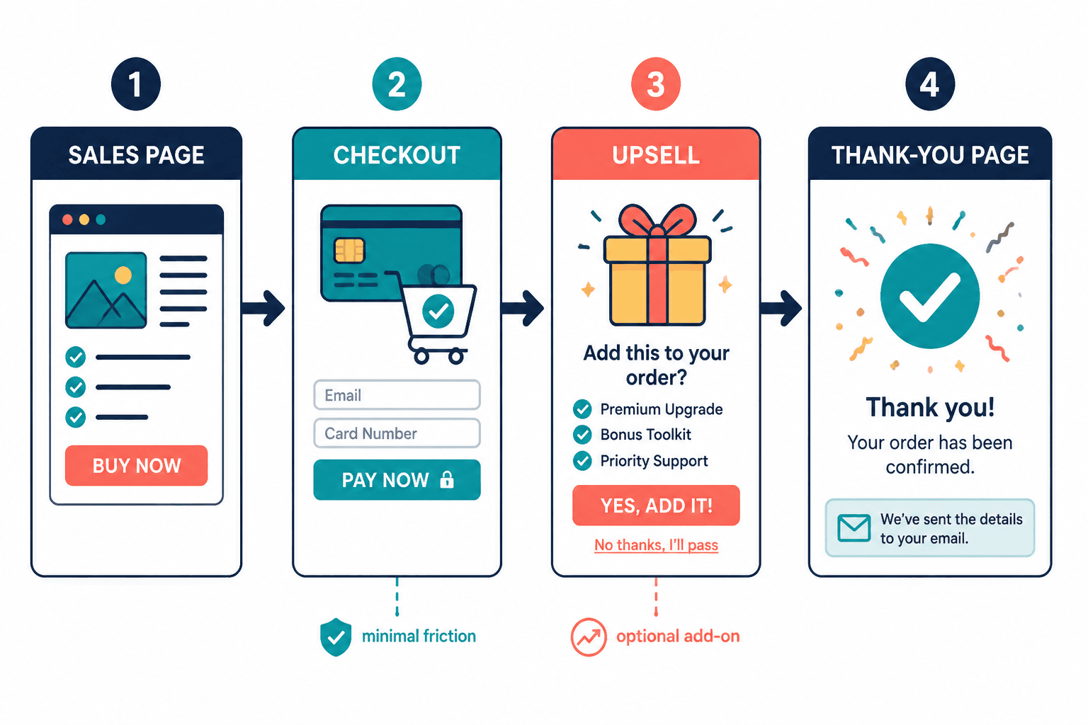
A funnel builder has a slightly bigger job. It needs to manage the pages before and after the sale too. That can include opt-in pages, lead magnet delivery, sales pages, checkout pages, upsells, thank-you pages, scheduling pages, and basic automations.
If you are selling one digital product, one service, or one offer, you probably do not need some bloated enterprise funnel machine that acts like it is launching a moon mission. But you do need the pieces to connect cleanly.
A sales page does the convincing. The checkout flow gets out of the way long enough for money to happen.
How to choose the best checkout tools and funnel builders for Sales Pages
There is no one best platform for everybody. Annoying answer, but true.
The right choice depends on what you sell, how many offers you have, how much customization you need, and whether you want a lean setup or an all-in-one system. Some creators want a simple checkout link they can drop onto a page. Others need a whole funnel with upsells, booking, tagging, automations, and segmented follow-up.
Start with these four questions
- What are you selling? A digital product, coaching package, service retainer, membership, course, or low-ticket offer all have different needs.
- How many steps does the funnel need? Just sales page to checkout, or opt-in to nurture to sales page to checkout to upsell?
- How much control do you need? Some tools are easier but rigid. Others are flexible but fiddly.
- Do you need simplicity or scale? Most smaller creators need simplicity more than they need 49 automation branches.
If your offer is simple, keep your stack simple. A lot of people build a six-piece funnel for an offer that really just needs a strong page, a clean checkout, and one decent follow-up email.
The main types of tools worth considering
Instead of pretending there is one perfect tool, it is more useful to think in categories. That will narrow the field fast.
1. Standalone checkout tools
These are best when you already have your sales page somewhere else and just need a strong payment flow. They usually handle payment processing, product setup, coupons, bumps, maybe subscriptions, and basic post-purchase actions.
Good fit for creators, consultants, and small businesses that already have a site and do not want to rebuild the whole funnel universe from scratch.
2. Website builders with native checkout
These work well if you want your sales page and checkout under one roof. You get fewer moving parts, fewer integration headaches, and usually a cleaner editing experience. The tradeoff is that checkout flexibility can be limited depending on the platform.
3. Funnel builders
These are built for multi-step journeys. Think lead magnet to email capture to sales page to checkout to upsell to thank-you page. If you actively use funnels, launches, tripwires, or segmented customer journeys, these can make sense.
They can also become overengineered very quickly. Some funnel tools seem to assume every business wants seven pages and a countdown timer having a panic attack in the sidebar. You do not have to use all of that.
4. Ecommerce platforms
These make sense if you sell multiple products, physical goods, bundles, or need catalog management. They can absolutely support sales pages, but they are often heavier than what a solo creator or service business needs.
Best tool categories by use case
| Use case | Best tool category | Why it fits |
|---|---|---|
| One offer, one sales page, simple checkout | Standalone checkout tool | Fast setup, less friction, easier maintenance |
| Digital products with upsells | Checkout tool or light funnel builder | Supports bumps, upsells, delivery, and follow-up |
| Coaching or consulting with nurture flow | Funnel builder | Works well for lead magnet, email sequence, and booking path |
| Course or membership business | Funnel builder or platform with checkout plus delivery | Keeps sales and fulfillment more connected |
| Large product catalog or physical products | Ecommerce platform | Handles inventory, variants, and broader store needs |
| Service business that needs speed and trust | Website builder with native checkout or payment form | Simple path, fewer moving parts, cleaner user experience |
What to look for in a good checkout experience
If you are comparing tools, ignore the shiny homepage for a minute and inspect the actual buying experience. That is the part that matters.
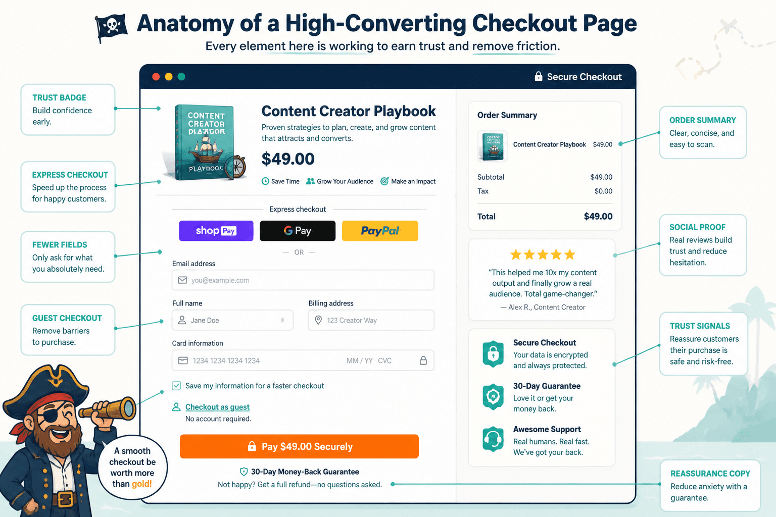
Clean order form design
The page should look trustworthy, not cobbled together from ten plugins and a prayer. The best checkout pages are visually calm. They make the next step obvious. They do not distract people with extra menu junk, sidebars, or random navigation choices.
Mobile usability
A lot of people will hit your sales page on mobile, then tell themselves they will buy later. “Later” is where conversions go to die. If your checkout is awkward on a phone, you are leaking revenue quietly.
Order bumps and upsells, if they make sense
These can work very well. They can also make your checkout feel like an airport gift shop. Add them only when they genuinely increase value and fit the original purchase.
A good order bump is small, obvious, and relevant. A bad one feels like you changed the deal halfway through.
Flexible payment options
If you sell higher-ticket offers, installments can help. If you sell lower-ticket products, express checkout options can reduce friction. The platform does not need every payment method under the sun, but it should support the options your buyers actually expect.
Post-purchase flow
The sale is not the end of the user experience. It is the start of fulfillment. Your tool should make it easy to send the right confirmation, deliver the product, trigger the next email, or direct someone to the next step.
What to look for in a funnel builder
If you need more than a checkout page, the funnel side matters just as much.
- Easy page building without requiring custom code for basic layout control
- Connected steps so opt-ins, sales pages, checkout, and thank-you pages feel coherent
- Basic automation for tags, follow-up, segmentation, and delivery
- A/B testing if you plan to optimize pages seriously
- Analytics that show page conversion and drop-off points
- Decent templates you can simplify instead of overdesigned ones you have to wrestle into submission
Also, check whether the builder plays nicely with your existing email platform, CRM, and site. A tool can be “powerful” and still create a maintenance mess that makes you resent your own business.
Best options for common creator and service business setups
Since the exact best tool depends on setup, here is the practical version.
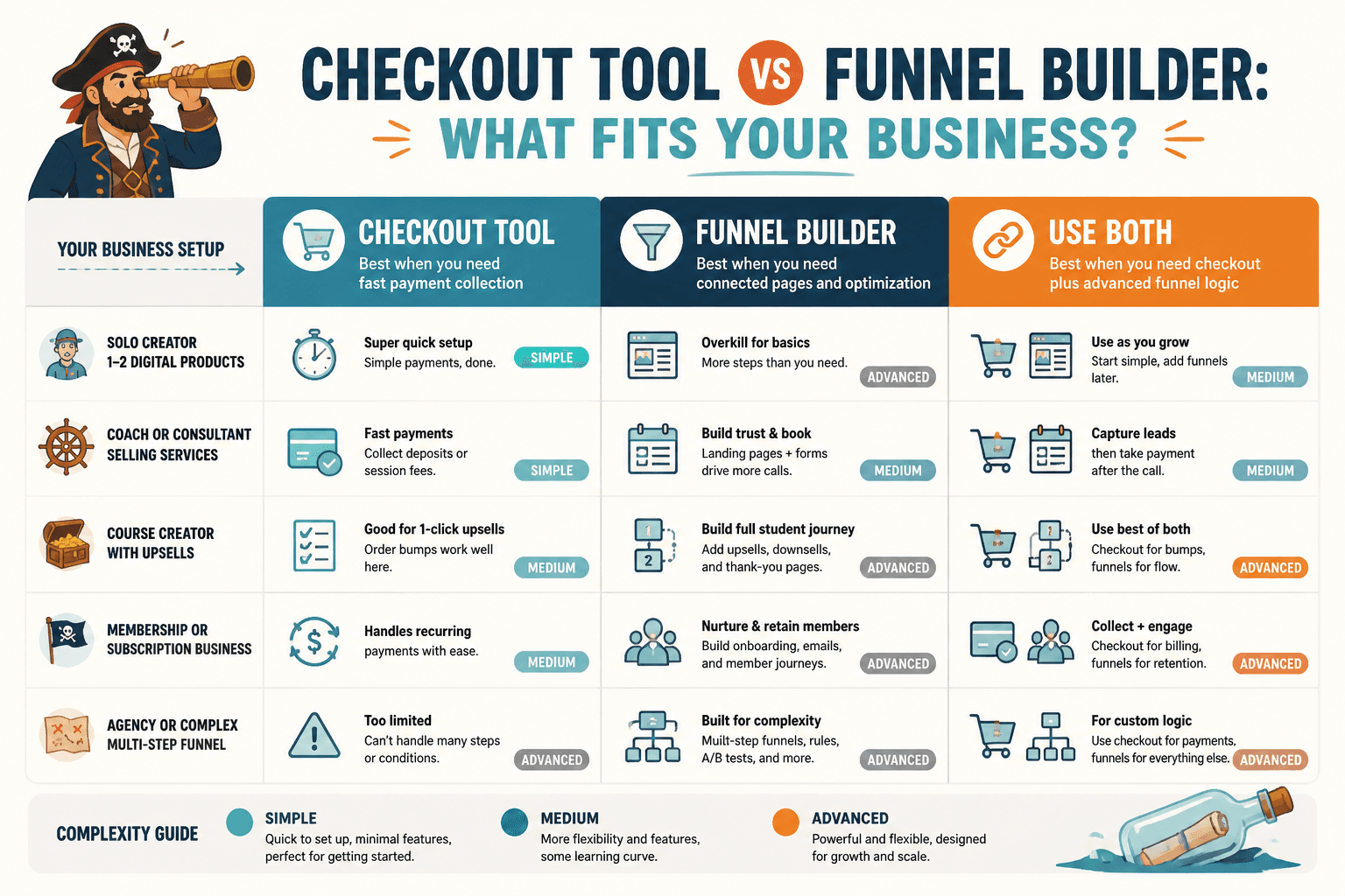
For a solo creator selling one or two digital products
Use a lightweight checkout tool or a simple platform with native payments. You want speed, decent design, simple product delivery, and maybe an order bump. You probably do not need an elaborate funnel builder unless your offer stack is growing fast.
Prioritize:
- Fast setup
- Simple checkout links or embedded checkout
- Coupons and basic upsells
- Email integration
- Clean thank-you page flow
For a coach or consultant selling calls, retainers, or programs
A light funnel builder often makes more sense here, especially if your path includes lead capture, nurture emails, a sales page, and then a booking or checkout step. If the offer is high trust and not purely impulse-driven, the funnel before the sale matters more than clever checkout tricks.
Prioritize:
- Lead magnet or opt-in support
- Email tagging and segmentation
- Sales page to checkout or scheduler flow
- Clear thank-you and onboarding steps
- Payment plans if relevant
For a course creator or educator
If your checkout and course delivery can live in the same ecosystem without becoming ugly, that is often a win. Fewer integrations usually means fewer things breaking at inconvenient times. But if the built-in checkout is weak, a better standalone checkout can still be worth it.
Prioritize:
- Bundles and payment plans
- Student enrollment automation
- Upsells to add-on trainings or templates
- VAT or tax handling if applicable
- Decent post-purchase onboarding
For businesses with more advanced funnels
If you are actively testing lead magnets, tripwires, webinars, segmented offers, and timed follow-up sequences, use a funnel builder that actually supports that work. This is one of the few times “all in one” can be useful instead of mildly threatening.
Just do not confuse complexity with strategy. Plenty of businesses build intricate funnels to avoid fixing the offer, messaging, or trust problem sitting right in front of them.
Common mistakes when choosing checkout and funnel tools
Choosing for features instead of fit
A giant feature list looks impressive until you are six weeks in and still have not published because the platform wants you to configure seventeen settings before it can send one receipt.
If you do not need webinars, affiliates, CRM pipelines, appointment routing, and subscription dunning, you do not get points for buying them anyway.
Ignoring the post-click experience
People obsess over hero sections and headline formulas, then slap a generic checkout link under the CTA and call it done. The gap between “I want this” and “I bought this” is where too many sales quietly disappear.
Overcomplicating the funnel
Not every offer needs an opt-in page, a nurture sequence, a mini training, a long sales page, a VSL, a checkout page, two upsells, one downsell, and a seven-email urgency campaign. Sometimes you just need a better sales page structure and a simpler path to purchase.
Using ugly default templates without editing them
Templates are starting points, not finished strategy. If the checkout page looks generic, overloaded, or visually disconnected from the sales page, it can weaken trust. This is one reason good design systems and smart sales page templates and tools matter more than people think.
Expecting the tool to fix weak conversion copy
A better checkout experience can reduce friction. It cannot rescue an offer people do not want, a vague promise, or a sales page full of polished fog. Tools help good strategy work better. They are not magic dust for mediocre positioning.
A practical tool selection checklist
If you are comparing options this week, use this instead of drowning in comparison tabs.
- Map your actual funnel. Write the steps from visitor to buyer to delivery.
- List only the must-have features. Not the fantasy-business features. The real ones.
- Test the mobile checkout flow. If possible, run through demo checkouts on your phone.
- Check integrations. Email, scheduling, CRM, fulfillment, analytics.
- Look at customization limits. Can you make it match your brand without a full rebuild?
- Review upsell and post-purchase options. Useful if relevant, not mandatory.
- Estimate maintenance burden. A stack that breaks often is expensive even if the monthly price looks fine.
- Choose the simplest tool that supports the strategy. This is the part people love to ignore.
That last point deserves emphasis. The simplest setup that supports your actual funnel is usually the best choice. Not the most “robust.” Not the one with the loudest fan club. The one that helps people buy with the least amount of confusion.
How checkout tools and funnel builders support better sales pages
This part often gets missed: the tool choice should support the kind of sales page you are trying to build.
If your sales page is short and direct, the checkout should be equally clean. If your offer uses a longer educational sales page, your post-click flow may need stronger proof, a clear order summary, and maybe payment plan options. If your page is part of a broader nurture sequence, then the funnel needs to remember where people came from and what message they already saw.
A good tool setup also makes testing easier. You can change CTA destinations, compare direct checkout against a two-step form, test order bumps, or route buyers into different follow-up sequences. None of that matters if the sales page itself is weak, but once the page is solid, tooling can absolutely improve conversion.
If you are still building your page itself, it is worth reading more broadly around conversion copy and reviewing more specific advice on funnel ideas to pair with sales pages. The tool should fit the path, not force a weird path just because software made it available.
And if you are using AI in your page workflow, keep it in its lane. It can speed up drafts, idea organization, and variations. It cannot decide your funnel strategy for you. For that side of the stack, this guide to AI tools for sales pages can help you separate useful support from hype.
When a simple checkout is better than a full funnel builder
Quite often, honestly.
If your traffic is warm, your offer is clear, and your sales page does most of the selling, a simple checkout tool may outperform a more elaborate funnel simply because it introduces less friction. More steps are not automatically more persuasive. Sometimes they are just more steps.
This is especially true for:
- Low- to mid-ticket digital products
- Simple services with a clear outcome
- Repeat buyers
- Warm audiences from email or social content
- Offers with strong specificity and obvious fit
The bigger point is simple: clearer structure and clearer writing make the piece more useful. That is usually what makes the ending land better too.