
A comparison project can go off the rails in about three clicks: prompts in one tab, images in another, notes in a half-finished doc, and a folder full of “final-final-2” files that no longer deserve the name. The problem is rarely the writing. It is the handoff between tools. A lean stack fixes that by making the comparison easier to plan, easier to check, and much harder to accidentally turn into a small archaeological site.
This article pulls together the practical side of building comparison-led affiliate pages for AI image tools. It sits alongside the broader AI image tool comparisons guide and the sibling piece on best-fit examples, but here the focus is narrower: what tools you actually need to make the comparison process hold together.
The job of your support stack
The support stack is not there to make the page feel elaborate. It exists to reduce drag. A good stack keeps the test plan visible, the prompt variants trackable, the outputs comparable, and the final page easy to publish without rethinking the same decisions five times.
That matters because AI image comparisons are not just about “which tool is better.” They are about context: speed, control, style consistency, prompt sensitivity, editing limits, and whether the outputs are useful for a real use case. A stack that handles those variables cleanly will beat a flashy setup every time. The flashy setup usually just exports more friction.
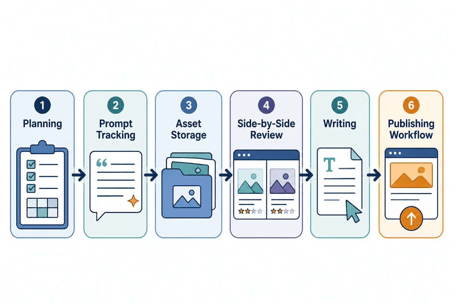
The six-part stack that actually works
You do not need a different app for every tiny job. You need six clear functions covered well enough that the work can move. The specific tools can vary, but the roles should stay stable.
1. A planning tool for test design
Start with a place to define the comparison before you generate anything. That can be a simple doc, a spreadsheet, or a project board. The point is to lock in:
- which tools are being compared
- which prompts will be reused across tools
- what success looks like for each test
- what output sizes or formats you need
- what notes you will capture for the page later
This is where comparison pages win or lose clarity. If the test plan is vague, the article becomes vague. If the test plan is precise, the rest of the workflow has something to follow.
For structure planning, a lightweight writing or spreadsheet tool is usually enough. The goal is not project theater. It is making sure the same prompt does not mysteriously become five different prompts by the time you are halfway through the tests.
2. A prompt tracking system that removes chaos
Prompt tracking sounds fussy until you need to know exactly what produced a specific image. Then it becomes the difference between a tidy comparison and a guessing game with thumbnails.
Use a simple tracking system that records:
- the exact prompt text
- tool name and version, if relevant
- date and time
- parameter settings
- revision notes
A spreadsheet is often enough. Some teams prefer a notes app or database-style workspace. The format matters less than the discipline. Without prompt tracking, side-by-side comparison becomes side-by-side mythology.
If the stack needs one place to be boring, let it be here. Boring is good. Boring is searchable.
3. Cloud storage that does not sabotage your sanity
Comparison work generates a surprising amount of visual clutter. You need a storage setup that keeps source files, exported images, cropped versions, and publish-ready assets separated without turning the folder tree into a cautionary tale.
A practical storage system should support:
- clear folder naming by tool, test, or page
- easy access to original outputs
- versioned exports for web use
- quick retrieval when an article needs updating
Cloud storage matters because comparison pages tend to get revisited. A page built today may need fresh screenshots, updated model references, or revised conclusions later. If the file trail is neat, the update is a quick edit. If it is not, the update is a small scavenger hunt.
4. A side-by-side review tool for visual analysis
This is the part where the comparison becomes, well, a comparison. You need a way to line up outputs and inspect them under similar conditions.

That may be as simple as a document with images arranged in a grid, or as structured as a visual review board. The important part is consistency: same prompt, similar presentation, same criteria. Otherwise the review is just a mood board wearing a lab coat.
Useful review criteria often include:
- prompt adherence
- image quality
- style consistency
- editing or iteration flexibility
- speed and convenience
- output reliability across repeated runs
If the article is going to recommend one tool for a specific use case, this is the layer that helps justify the call.
5. A writing tool that helps you think clearly, not just type faster
A comparison page needs more than fast drafting. It needs synthesis. The writing tool should make it easier to compare tool behavior, explain tradeoffs, and keep the page readable without flattening every nuance into one generic verdict.
At minimum, the writing layer should help with:
- outline control
- section reuse without repetition
- clean headings and internal linking
- drafting concise summaries from test notes
- keeping the article aligned with the actual evidence
This is also where comparison pages can easily overpromise. The page should say what the tools do well, where they stumble, and what kind of user they suit. That keeps the content useful and keeps the affiliate logic honest. A rare and welcome combination.
6. A publishing and repurposing layer
Finally, the stack needs a way to turn the finished comparison into something public and reusable. That means a publishing system that handles article structure cleanly and a repurposing layer that lets one comparison support multiple surfaces.
Useful outputs can include:
- comparison tables
- summary callouts
- feature breakdowns
- tool-specific recommendation blocks
- social snippets or newsletter blurbs
The repurposing layer is especially helpful for comparison-led affiliate pages because the same research can feed multiple posts. One test cycle can support a broader guide, a narrower “best for” page, and an update later when a tool changes pricing or output quality.
How the stack supports comparison-led affiliate pages
Comparison-led affiliate pages work when the page gives readers a clear decision path. The stack helps create that path by making the evidence easier to gather and easier to present.
With the right setup, the page can answer practical questions like:
- Which tool is best for fast mockups?
- Which tool gives the most control?
- Which tool is easiest for non-specialists?
- Which tool deserves a premium recommendation?
That structure matters for affiliate content because the page has to do two jobs at once: it must be useful as a comparison, and it must be persuasive without sounding slippery. A solid stack keeps those jobs from fighting each other.
If you need a broader framework for how the comparison pages fit together, the parent guide covers the cluster-level strategy. If you want the page-type angle, the best-fit examples piece shows how those recommendations can be framed around real use cases.
What to keep simple, what to standardize
The stack should be lightweight, but not loose. The trick is to standardize the parts that need consistency and simplify the parts that do not.
Standardize:
- prompt format
- file naming
- comparison criteria
- capture notes
- export conventions
Keep simple:
- the number of tools in the stack
- the number of steps between test and draft
- the number of places where final assets can live
There is a sweet spot here. Too little structure, and you cannot trust the comparison. Too much structure, and the whole process becomes a product demo for the workflow itself.
Practical stack examples by workflow size
Not every publisher needs the same amount of machinery. A solo site and a larger content operation will usually use the same six functions, but with different levels of formality.
Lean solo setup
- planning: a simple doc
- prompt tracking: spreadsheet
- storage: cloud folder structure
- review: image grid in a doc or page builder
- writing: one main editor
- publishing: CMS with reusable blocks
This setup works when speed and clarity matter more than elaborate process. It is usually enough for most comparison-led affiliate pages.
More structured editorial setup
- planning: project board plus test brief
- prompt tracking: spreadsheet or database
- storage: separated source and publish folders
- review: consistent comparison templates
- writing: collaborative drafting environment
- publishing: CMS plus repurposing checklist
This version suits teams or sites that update comparisons often. It keeps handoffs cleaner and makes refreshes less annoying, which is a real virtue in content operations.
Build the stack for clarity, not for spectacle
The best AI image tool comparison stack is the one that gets out of the way. It should help you design better tests, keep the outputs organized, and turn the evidence into a page that actually helps readers choose. That is the job.
Start with six functions, not six promises. Keep the workflow lean, keep the evidence visible, and let the comparison do the persuading. If the stack is doing its job, the article will feel calm. That is usually a sign it was built well.
If you want to keep moving through the cluster, start with the main guide or jump to the best-fit examples page for a more recommendation-driven angle.