Choosing an AI image tool gets awkward fast. One tool makes clean graphics in half a minute, another gives you more control, and a third seems brilliant right up until you need it to do the same thing twice. The trick is not finding the “best” tool in the abstract. It is making the right decision sooner, with less guesswork and fewer tabs pretending to be research.
This guide focuses on best-fit comparisons: how to compare AI image tools by the work you actually need done, then use those comparisons to pick a sensible winner. For the broader framework, see the AI image tool comparisons guide.
What best fit means in practice
“Best fit” is not about feature volume. It is about whether a tool matches the job with the least friction. For one creator, that might mean fast social graphics. For another, it might mean controllable brand visuals. For someone else, it is simply: Can I get a usable image without spending my afternoon negotiating with prompts?
A useful comparison looks at:
- Output fit – does the image match the style and purpose you need?
- Control – can you steer layout, composition, and revisions?
- Speed – how quickly do you get something usable?
- Consistency – can you repeat the result without a luck ritual?
- Workflow fit – does the tool fit how you already create?
If a tool wins only because it looks impressive in a demo, that is not a win. That is an expensive screenshot.
How to compare AI image tools without wasting time
The fastest comparison method is simple: pick one job, use matched prompts, generate multiple outputs, and score the results against the same criteria. That keeps the comparison honest and makes the differences obvious.
1. Start with the job, not the tool
Before testing, define the actual task. A blog featured image is not the same as a course thumbnail. A sales-page visual is not the same as a mood-board image. Different jobs reward different strengths.
Ask:
- What am I making?
- Where will it be used?
- What would make it feel successful?
- What would make it unusable?
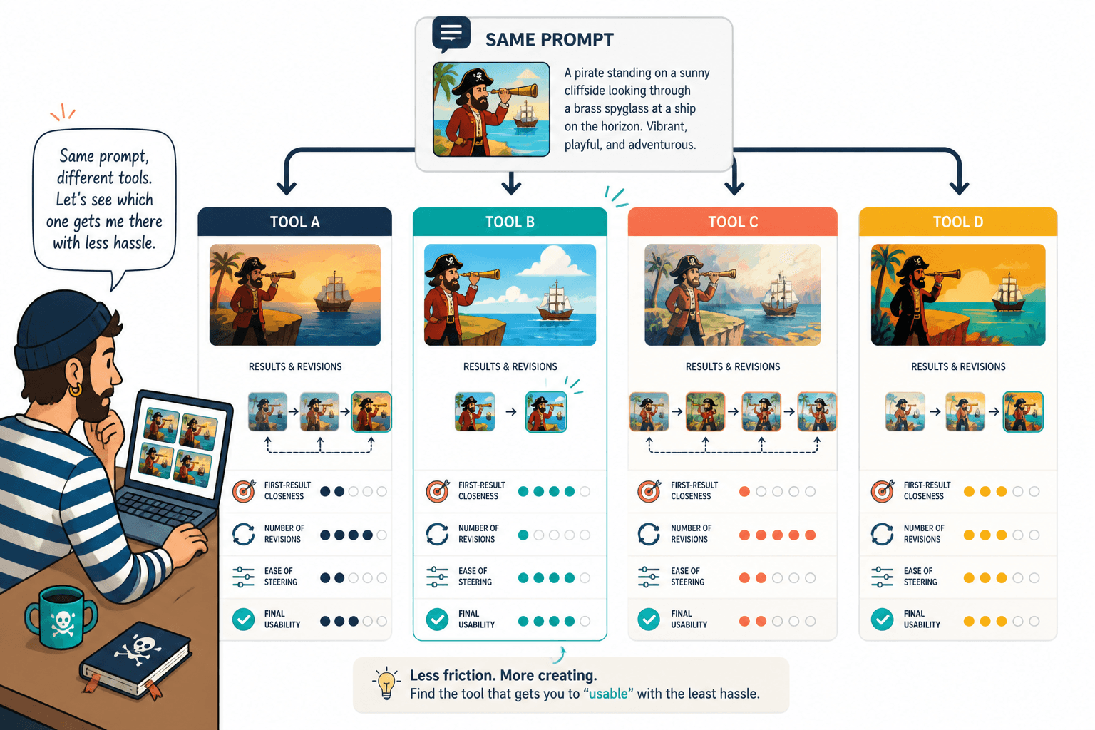
2. Use the same prompt shape across tools
Keep the prompt structure as matched as possible. If one tool gets a detailed prompt and another gets a vague one, the comparison is basically decorative. Use the same subject, style, format, and constraints where the tools allow it.
This is especially important when comparing tools for brand work. Otherwise you are comparing prompt luck, which is a charming hobby and a poor decision method.
3. Generate more than one output
A single result can lie. Tools often look great once and then drift immediately afterward. Generate a few outputs per prompt so you can see whether the tool is genuinely reliable or just having a good day.
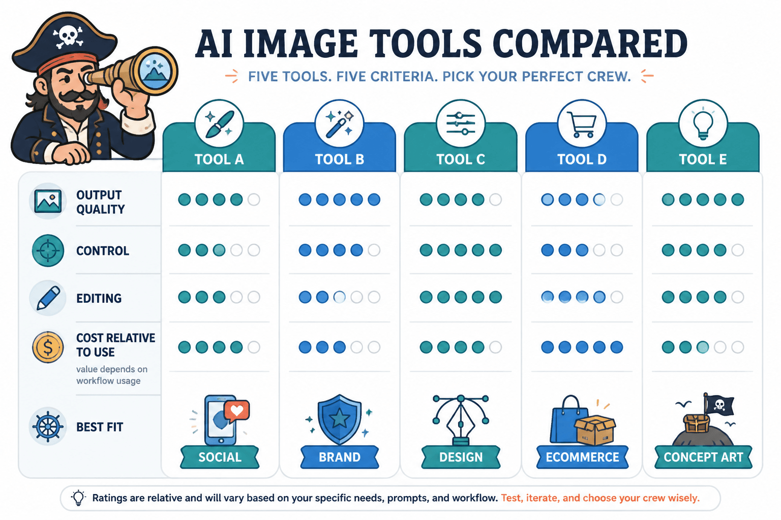
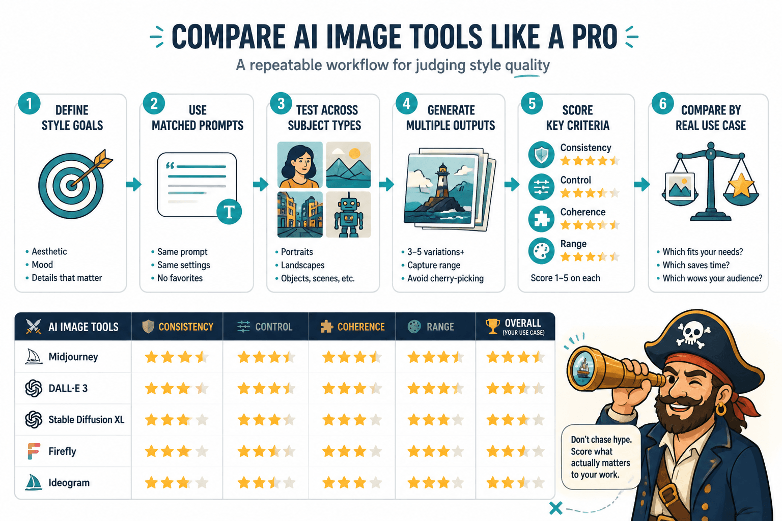
4. Score what matters
Use the same criteria every time. A simple 1-5 scorecard is enough if it stays consistent. The point is not to create a science fair project. The point is to choose better.
- Style match
- Prompt adherence
- Editing flexibility
- Speed to usable output
- Consistency across tries
Best-fit comparison examples by creator use case
These examples show how the same tool can be excellent in one context and merely fine in another. That is normal. Tools are not sacred; they are fitted for different jobs.
Example 1: A creator needs clean social graphics fast
In this case, the best tool is usually the one that gets to a decent, on-brand graphic quickly with minimal fiddling. Speed and simplicity matter more than deep control.
What tends to win this comparison:
- fast first usable result
- easy resizing or formatting
- clear prompt response
- low edit overhead
What tends to lose:
- tools that need many rewrites before they cooperate
- tools that make attractive but awkward layouts
- tools that are powerful yet slow for routine graphics
Example 2: A course creator needs polished lead magnet and sales visuals
Here the comparison should favor control, polish, and consistency over raw novelty. A lead magnet cover or sales-page visual needs to look intentional, not like it wandered in from a prompt generator with artistic ambitions.
Look for:
- good control over composition
- reliable text-free layouts when needed
- clean design language
- repeatable visual patterns for a set of assets
In this scenario, a tool that is merely “creative” may be less useful than one that is quietly predictable.
Example 3: A blogger wants featured images that do not look like stock sludge
For blogging, the comparison is often about whether the tool can create images that feel specific without becoming theatrical. The best fit is usually the one that handles conceptual visuals cleanly and can stay visually consistent across posts.
Helpful criteria here:
- ability to create editorial-feeling images
- subtlety instead of overworked spectacle
- strong output in common blog dimensions
- repeatable styling for series posts
If the images all come out looking like they belong on an insurance brochure from another dimension, keep looking.
Example 4: A personal brand needs a consistent visual identity
For personal branding, consistency matters more than one-off brilliance. The comparison should reward tools that can echo the same visual language across multiple assets without drifting every time you click generate.
Prioritize:
- style consistency
- reusable composition patterns
- control over color and mood
- good iteration without style collapse
This is where a comparison matrix helps most. It shows whether a tool is genuinely repeatable or just occasionally flattering.
How to read the comparison results
Once you have outputs, resist the urge to pick the prettiest one and call it strategy. Compare the tools against the actual task.
Use this decision order:
- Does it fit the use case?
- Can I steer it where I need to go?
- Does it save time or create more work?
- Can it stay consistent across repeat tries?
- Does the price still make sense after testing?
If a tool is slightly less glamorous but gets you to publishable work faster, that is usually the better fit. Glamour is cheap. Shipping is not.
A simple shortlist rule for creators
After comparing a few tools, narrow the choice with one practical question: Which tool gives me the best result for this exact job with the least friction?
That answer usually comes from the combination of:
- output quality for the actual use case
- how many edits it takes to get there
- whether the style is repeatable
- whether the workflow feels sustainable
If you want a broader framework for organizing comparisons before you test, return to the AI image tool comparisons guide.
Final takeaway
The best AI image tool comparison is not the longest one. It is the one that helps you decide faster, with enough confidence to move on and make the thing. Compare by job, score the criteria that matter, and let the tool earn its place in the workflow. Everything else is just feature folklore.
For related comparison structure and use-case framing, see the parent guide on AI image tool comparisons.