
A creator has two tabs open, a deadline breathing down the neck, and a half-made decision that still feels expensive. One AI image tool looks cheaper, another looks faster, and a third sounds more powerful until the fine print starts doing cardio. That is where comparison content earns its keep: not by listing every feature, but by showing which difference actually changes the choice.
This page is about building AI image tool comparisons for people who are already evaluating. They do not need another broad roundup. They need a comparison that makes the decision easier, cleaner, and less likely to produce regret on day three.
If you want the wider cluster map, start with the parent guide to AI image tool comparisons. For more support on structure and positioning, the sibling pages on the comparison guide, best-fit examples, and tool stack fit naturally alongside this one.
What buyer intent means in an AI image tool comparison
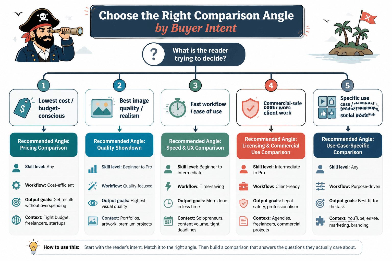
Buyer intent is simple: the reader is not browsing for entertainment. They are trying to decide whether a tool is worth money, time, or both. In AI image tool comparisons, that usually means they are comparing based on one of three things:
- Use case – which tool fits their actual workflow
- Constraint – which tool survives budget, time, quality, or licensing limits
- Switching pressure – which tool replaces something they already use
That matters because broad comparison pages often answer the wrong question. A reader asking “Which tool is best for product mockups?” does not need a ten-tool museum tour. They need the two or three options that actually hold up under that workload.
Why most comparison pages pull weak traffic
Many comparison articles are built like shopping mall directories: lots of storefronts, very little decision help. That can attract clicks, but it rarely creates the kind of reader confidence that leads to an affiliate click or a purchase.
The usual problem is that the page starts with tools instead of decisions. That sounds harmless until the reader realizes they still do not know which option fits their budget, output needs, or team setup. At that point, the article has provided motion without progress. Very efficient, in the way a treadmill is efficient.
Better comparison pages do the opposite. They begin with the decision frame, then narrow the field. That is the difference between “here are some tools” and “here is the one that fits what you are actually trying to do.”
The three buyer-intent angles that change the decision
1. Use-case intent
This is the most obvious angle, and still the most useful. The reader wants a tool for a specific job: blog visuals, ad concepts, product mockups, social graphics, concept art, thumbnails, or quick client approvals.
Use-case intent works when the comparison focuses on what the tool helps someone finish, not just what the tool can technically produce. A feature list does not tell the reader whether the tool belongs in their workflow. A workflow-based comparison does.
2. Constraint intent
Some readers are not looking for the “best” tool. They are looking for the tool least likely to create pain. That pain might be price, learning curve, commercial use limits, image consistency, or the sheer annoyance of getting usable output at scale.
This is where pricing mistakes matter. A cheap subscription is not automatically a good deal if it produces fewer usable images, takes more edits, or requires a messier workflow. Compare the real cost of getting a final image, not just the number on the billing page.
3. Switching intent
Switching intent shows up when the reader already uses something else and is wondering whether to move. Maybe they are leaving a generic generator for a more controlled workflow. Maybe they want better prompt consistency. Maybe they are tired of paying for features they never touch.
Comparison content aimed at switchers should be blunt about tradeoffs. The question is not “which tool is coolest.” The question is “what do I gain, what do I lose, and is the swap worth the disruption?”
How to structure a buyer-intent comparison page
Start with the decision, not the tool list
Open with the problem the reader is trying to solve. That could be speed, commercial safety, output control, or cost per usable image. Once the decision frame is clear, the tool list becomes a solution set instead of a parade.
Compare what actually changes the outcome
Good comparison criteria are boring in the best possible way. They are the things readers can verify or feel immediately:
- How many usable outputs the plan realistically supports
- How many edits it takes to get to publishable quality
- Whether the tool fits solo creators or team workflows
- How much control exists over style, format, and consistency
- Whether commercial usage is straightforward or tangled
If a comparison column does not affect the buying decision, cut it or move it down the page.
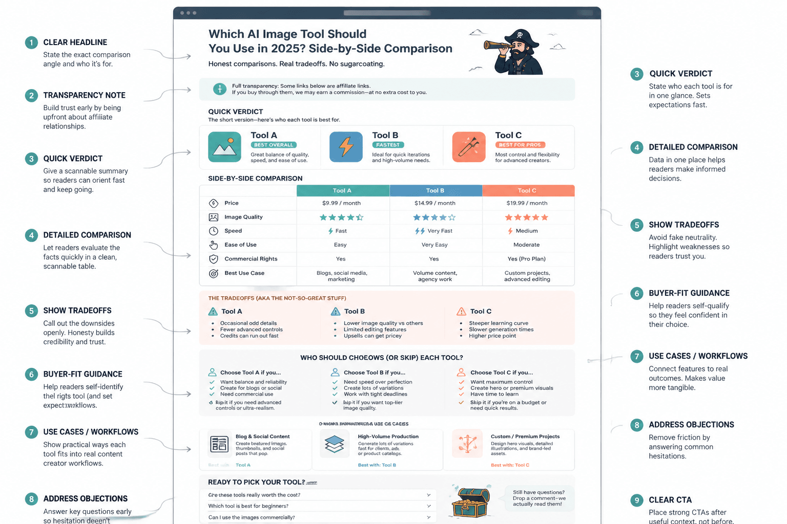
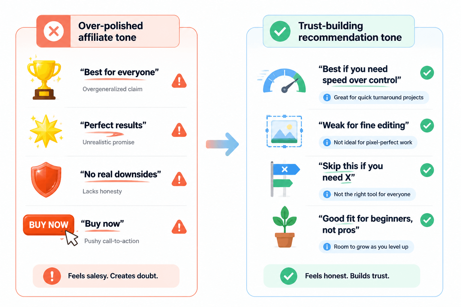
Use verdicts that sound like recommendations, not evasions
Readers can smell fake neutrality from a mile away. A comparison page that refuses to say what it recommends usually ends up saying nothing useful. Better to explain the criteria, state the fit, and be honest about tradeoffs.
That does not mean you need to turn every verdict into a sales pitch. It means you should say, plainly, which tool is best for which reader and why. Honest bias toward usefulness is welcome. Hidden bias toward commission is not.
How to frame affiliate recommendations without fake neutrality
Affiliate content works better when the recommendation model is declared up front. If the page is comparing tools for product mockups, say that. If the recommendation is based on speed plus predictable output, say that too. Readers do not need a performance art piece about objectivity; they need a clear rationale.
A practical format looks like this:
- Best for: the reader type or use case
- Why it wins: the deciding factors
- Tradeoff: the drawback worth knowing
- Bottom line: whether it is worth trying
This keeps the page readable and commercially honest. It also makes the recommendation easier to scan, which is useful because buyers tend to scan first and trust second.
The pricing mistakes that distort buyer-intent comparisons
Pricing deserves a lot of attention because it is where comparison pages get sloppy fast. The monthly fee might look small, but the real issue is the ratio between cost and usable output.
Price per month is not the same as cost per usable image
A cheaper plan can be worse value if it requires more retries, more manual cleanup, or more tools to finish the job. The reader is not buying storage space. They are buying a path to a result.
The cheapest plan is not always the safest first step
Starting cheap can be wise, but only if the plan lets the reader test the actual workflow. If the entry tier blocks core features, hides commercial terms, or gives too little output to judge quality, the low price is mostly decorative.
Commercial-use rules need to be visible, not buried
If your reader is buying with publication or client work in mind, commercial usage is not a footnote. It is part of the decision. Compare licensing, attribution requirements, and any restrictions that affect real deployment.
For background on commercial content and disclosures, the FTC’s disclosure guidance is still a useful baseline, especially when the page includes affiliate links. For pricing clarity and subscription expectations, the Google Ads billing documentation is a good example of how clearly cost structures should be presented, even though the product category is different. And if your comparison touches on copyright-sensitive image use, the U.S. Copyright Office’s AI resources are worth keeping close.
Example comparison structures that work for buyer intent
Structure 1: Use-case first
Start with the job the reader needs done, then rank tools by fit:
- Best for quick marketing visuals
- Best for controlled brand consistency
- Best for fast experimentation
- Best for team review and handoff
This structure works when the buyer already knows the category and wants a sensible shortlist.
Structure 2: Constraint first
Start with the limit that matters most:
- Lowest total cost for light use
- Best quality at mid-tier pricing
- Best for strict commercial use needs
- Best for minimal editing overhead
This is especially useful when readers are comparing tools because they have to justify the spend. Which, to be fair, is most spend.
Structure 3: Switching first
Start with the current tool and the reason someone might leave it:
- Leaving a basic tool for more control
- Leaving a complex tool for faster output
- Leaving a cheap plan for better commercial confidence
- Leaving a generalist tool for a use-case specialist
This format is strong for readers who are already invested in a workflow and need a reason to change it.
How this page should connect to the rest of the cluster
Buyer-intent content should not sit alone. It works best as part of a sequence that helps the reader move from comparison to decision to implementation.
- Use the parent guide for the full category view.
- Send readers to the comparison guide if they need a cleaner framework for evaluating options.
- Use best-fit examples when the reader needs concrete scenarios.
- Link to tool stack when the next question is how to build the workflow around the chosen tool.
That internal path matters because a comparison page should rarely be the end of the journey. For buyers, it is usually the moment the shortlist gets real.
Practical recommendation pattern for buyer-intent pages
If you want the page to convert without feeling pushy, use a simple pattern:
- State the decision
- Show the criteria
- Rank the short list
- Explain the tradeoff
- Recommend the best fit
That keeps the page grounded in evaluation rather than hype. It also makes affiliate links feel earned, which is generally a better business model than hoping readers enjoy being gently manipulated.
Conclusion
Buyer-intent comparison content works when it helps someone decide faster with less second-guessing. The strongest pages focus on use case, constraint, and switching pressure; compare the costs that actually matter; and recommend tools with clear, declared criteria.
For the full content system around this topic, return to the parent guide and branch into the sibling pages as needed. The point is not to make the biggest comparison page. It is to make the most useful decision page.