Most personal brand landing pages do not fail because the design is ugly. They fail because the page is confused.
The headline is vague. The offer is buried. The CTA asks too much too soon. The copy tries to sound impressive instead of useful. And somewhere in the middle, there is usually a section full of abstract promises about transformation, excellence, and impact. Which is lovely, if your goal is to say many words and convert almost nobody.
If you want better landing pages, start by fixing the mistakes that quietly kill trust and momentum. Not flashy hacks. Not “high-converting secrets.” Just the common problems that make people hesitate, bounce, or think, “I still do not know what this person actually helps with.”
This is a practical breakdown of the landing-page mistakes personal brands keep making, why they hurt performance, and what to do instead. If your page needs more clarity, more action, and less business-casual fog, you’re in the right place.
For the broader learning path, visit our parent guide.
Why personal brand landing pages go wrong so often
Personal brands have a weird advantage and a weird problem.
The advantage is trust. People often buy from a coach, consultant, writer, or creator because they like the person, not just the product. The problem is that trust gets mistaken for telepathy. You know your work so well that you stop noticing how unclear the page sounds to someone seeing you for the first time.
So the page ends up trying to do five jobs at once. It introduces you, explains your philosophy, proves credibility, sells the offer, shares your backstory, and asks for a booking or purchase. None of those things are bad. But when they are stacked badly, the page feels heavy and slippery at the same time.
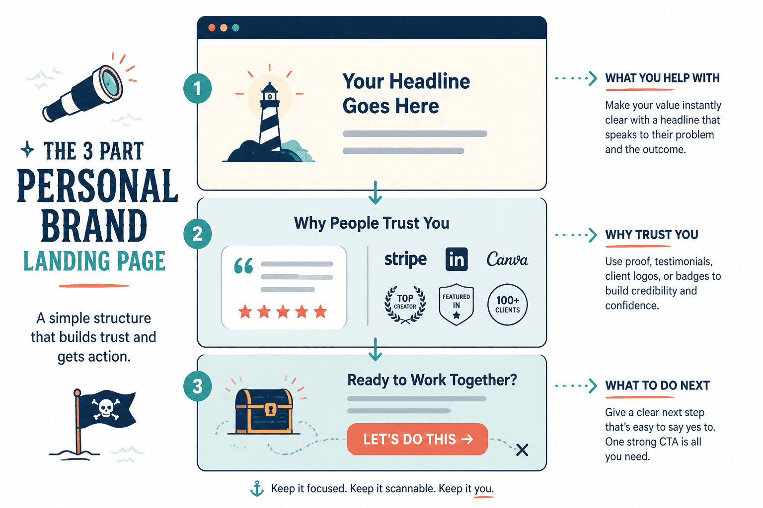
A good landing page is not a personality museum. It is a focused path. Someone lands, understands what you help with, sees why it matters, gets enough proof to trust you, and knows what to do next.
The biggest better landing page mistakes to fix for personal brands
1. Leading with a clever headline instead of a clear one
A lot of personal brands want the top of the page to feel smart, polished, and elevated. So they write headlines like:
- Build your next chapter with confidence
- Words that move people and brands
- Helping visionary founders scale their message
These are not headlines. They are decorative mist.
Your landing page headline should help the right person immediately understand what you do, who it is for, or what result they can expect. Clarity beats charm here. Every time.
Weak: Helping experts show up online with confidence
Stronger: Landing pages and conversion copy for coaches, consultants, and personal brands who want more qualified inquiries
Weak: Build a brand people believe in
Stronger: Position your expertise clearly so your profile, content, and website convert better
You can still sound like yourself. You just cannot make visitors work for the meaning.
2. Talking about yourself before talking about the reader
People care about you most after they understand why you matter to them.
One of the most common landing-page mistakes for personal brands is opening with a mini autobiography. You get the founder story, the journey, the values, the pivot, the mission. Meanwhile, the visitor is still wondering if this page helps with their actual problem.
Your story has value. It just should not block the sale.
A better order usually looks like this:
- What this page is about
- Who it is for
- What problem it solves
- What outcome or next step is available
- Why you are credible
- Then, if useful, your story
If your “About me” energy shows up before your “Here is why this matters to you” energy, the page drifts.
3. Making the offer too vague
Visitors should not have to decode what they are getting.
Personal brands often describe offers in broad emotional language:
- Get personalized support
- Transform your messaging
- Grow with aligned strategy
- Create content that resonates
Fine. But what is the thing?
Is it a 90-minute strategy session? A done-for-you landing page? A 4-week copy intensive? A recorded audit? A template pack? A monthly advisory retainer? “Support” is not an offer. “Transformation” is not an offer either. It is a wish with a pricing page.
Spell out what someone gets, how it works, and what kind of outcome it is designed to help with.
Instead of: A high-touch experience for founders ready to elevate their digital presence
Try: A conversion copy package that rewrites your homepage, services page, and lead capture page so visitors understand your offer faster and are more likely to inquire
4. Asking for a big commitment before earning enough trust
If someone barely knows you, “Book a consultation now” can feel like a lot. Especially for personal brands selling services, strategy, coaching, or custom work.
This does not mean your CTA should be weak. It means it should match the temperature of the visitor.
Cold readers usually need one of these before they are ready to book or buy:
- A clear explanation of the offer
- Proof that it works
- Examples of your thinking or process
- A lower-friction next step
If your page jumps from vague headline straight to “Apply now,” you are creating friction, not urgency.
For a lot of personal brands, the best CTA is not always the final sale. It might be:
- See examples
- View the process
- Get the guide
- Book a fit call
- Request details
If CTA placement is one of your weak spots, this related guide on landing pages CTA placement mistakes that hurt performance is worth reading next.
5. Hiding proof in a sad little corner
Proof should not be treated like garnish.
Testimonials, case-study snippets, client logos, audience results, and concrete outcomes are often what move someone from “interesting” to “okay, maybe.” Yet many landing pages tuck them far below the fold, after giant blocks of copy nobody has earned yet.
Good proof does three things:
- Shows that real people got real value
- Makes the outcome feel more believable
- Reduces the fear that this is all polished talk
And no, “She was amazing to work with” is not strong proof on its own. Pleasant, yes. Persuasive, not really.
Use testimonials that mention specifics like:
- The problem they had before
- What changed after working with you
- What stood out about your process
- Why the result mattered
If possible, place proof near the claim it supports. Do not make people scroll through your entire philosophy to find out if anyone has ever paid you money and liked the result.
6. Writing copy that sounds “professional” instead of human
This one is especially brutal on personal brand sites, because the whole point is that there is a person behind the offer.
When the copy starts sounding like a committee in a blazer wrote it, trust drops. Not because readers hate professionalism, but because they can smell the generic phrasing from space.
Watch for lines like:
- I empower mission-driven leaders to amplify their impact
- I create bespoke solutions for sustainable growth
- I help brands unlock aligned visibility
These sound polished. They also say almost nothing.
Plain language tends to convert better because it lowers friction. A clear sentence is easier to trust than an elegant fog machine.
If your landing page sounds impressive but hard to picture, it probably needs rewriting.
This is also where many pages get accidentally AI-ish. Not because AI was used, necessarily, but because the copy has that smooth, padded, oddly bloodless tone. You do not need to sound casual all the time. You do need to sound like a real person saying real things.
7. Cramming in too many audiences
Trying to appeal to everyone usually means converting almost no one well.
A personal brand might help founders, consultants, agencies, course creators, executives, and small businesses. Great. Your landing page still should not try to speak equally to all of them at once unless the offer is genuinely built that way.
Different audiences care about different problems, language, proof, and buying triggers. If your page says:
- For entrepreneurs, creators, teams, brands, coaches, and thought leaders…
…that usually reads as “I have not made a positioning decision.”
You do not have to exclude people rudely. Just lead with the best-fit audience and problem. Relevance beats breadth.
8. Treating the page like a brochure instead of a path
Brochure pages dump information. Landing pages guide decisions.
This is a structural problem more than a wording problem. The sections may all be decent on their own, but the order makes no sense. You get testimonials before the offer, process before problem, founder bio before relevance, FAQ before tension, CTA before confidence.
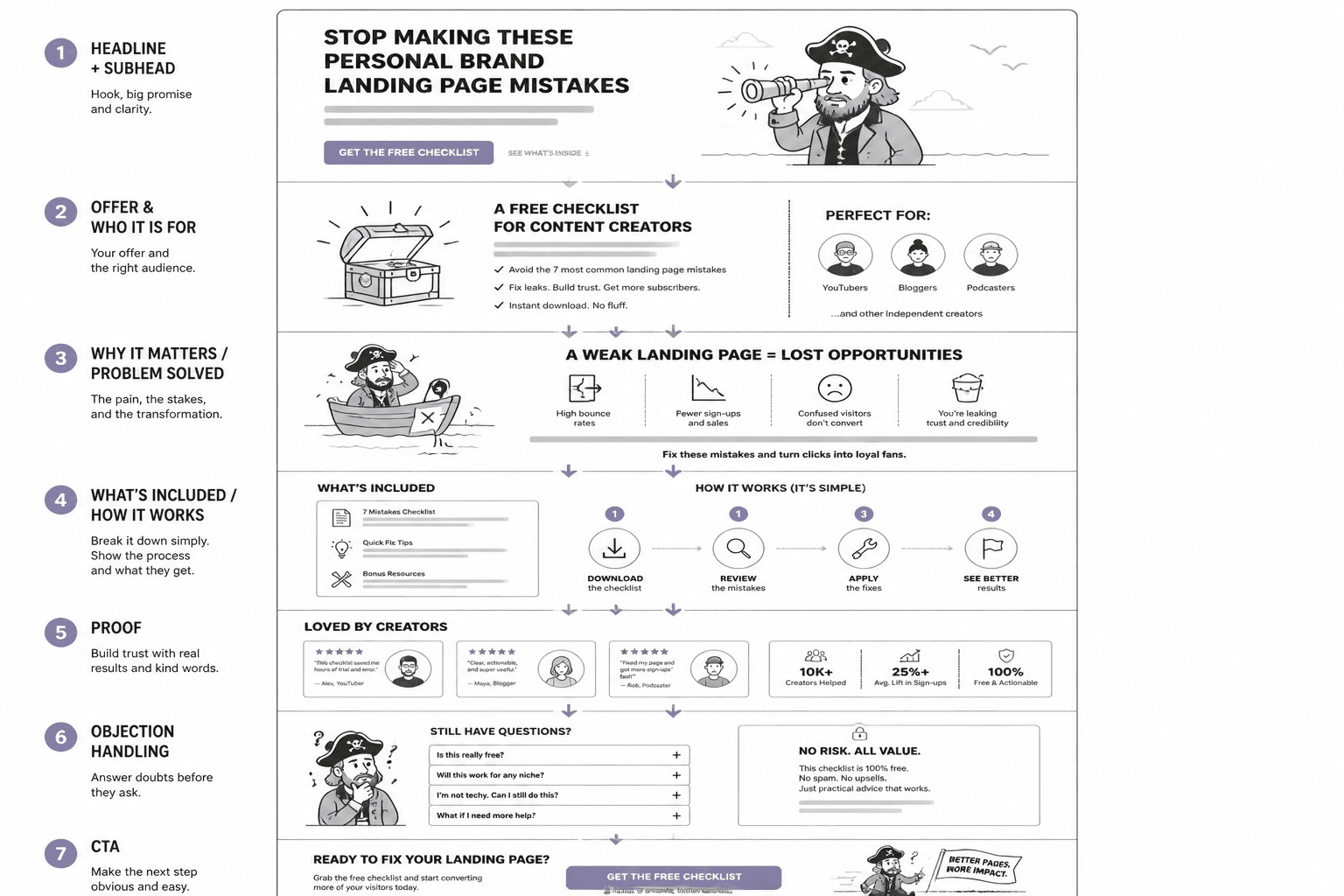
A better landing page usually moves through a simple sequence:
- Clear headline and subhead
- What the offer is and who it is for
- Why it matters or what pain it solves
- What is included / how it works
- Proof
- Objection handling
- CTA
That structure is not sacred. But direction matters. A landing page should make the next step feel easier with every section, not more confusing.
9. Burying the actual objection
People do not avoid buying because they forgot to appreciate your values statement. They avoid buying because they have objections.
Usually some version of:
- Is this for someone like me?
- Will this actually work?
- Why is it worth the price?
- What exactly happens after I click?
- Is this too generic?
- Do I need this now, or later?
Strong landing pages answer these questions before the visitor has to dig for them. Weak landing pages pretend objections are rude and hope enthusiasm will cover the gap.
You can handle objections through:
- Specific FAQ answers
- Process sections
- Testimonials that address hesitation
- Clear fit and non-fit language
- Examples of deliverables or outcomes
10. Using weak or scattered CTAs
If the page has one tiny button at the bottom, that is a problem. If the page has six different CTAs fighting each other, that is also a problem.
A good CTA is visible, specific, and consistent with the page’s goal. It does not need to shout. It does need to make sense.
Weak CTA: Submit
Better CTA: Book your strategy call
Weak CTA: Learn more
Better CTA: See what’s included
Weak CTA: Work with me
Better CTA: Apply for 1:1 copy support
If you want stronger examples and structure, the broader landing pages guide for creators who want better results can help tighten the whole page, not just the button copy.
A practical landing page self-audit for personal brands
If you want to improve a page quickly, run through this checklist and be honest. Slightly ruthless is ideal.
- Can a new visitor understand what I offer within a few seconds?
- Does the page speak to a clear audience, or everyone with a Wi-Fi signal?
- Is the headline clear before it is clever?
- Do I explain the offer in concrete terms?
- Is there proof near the main claims?
- Do the sections follow a logical buying path?
- Are the CTAs specific and easy to find?
- Have I addressed likely objections?
- Does the copy sound human?
- Would a skeptical but interested person know what to do next?
If you answered “not really” to several of those, good. That means you found the real work. Better to fix the page than keep feeding traffic into a leak.
Before and after: a quick rewrite example
Here is the kind of rewrite that often improves a personal brand landing page fast.
Before:
I help purpose-driven experts amplify their message and step into their next level of visibility through aligned content and brand strategy.
After:
I help coaches and consultants clarify their message, tighten their website copy, and create content that brings in better-fit leads.
The second version is not magical. It is just clearer. You can picture what the person does. You can tell if it is relevant. You do not need to decode “next level of visibility,” which is nice, because no one has time for that.
If you already have decent content lying around, another smart move is repurposing it into stronger page copy. This guide on how to turn old content into better landing pages is useful for that.
What better landing pages usually do instead
Once you strip away the mistakes, better landing pages for personal brands tend to share a few traits.
- They are specific about the audience
- They name the offer clearly
- They sound like a person, not a positioning workshop transcript
- They guide the visitor step by step
- They include proof early enough to matter
- They make the next action feel sensible
If you want inspiration for what this can look like in practice, see these landing pages examples for coaches, consultants, and personal brands.
The bigger point is simple: clearer structure and clearer writing make the piece more useful. That is usually what makes the ending land better too.