Most people ask how long a landing page should be like there is a clean little number hiding somewhere. There is not.
A landing page should be exactly as long as it needs to be to get the right person to say yes. No shorter. No longer. That sounds annoyingly obvious, but it is still the answer people keep trying to dodge.
In 2026, the question is not really about length. It is about friction, clarity, and proof. If your offer is simple, low-risk, and already understood, a short page can work beautifully. If your offer is expensive, unfamiliar, crowded, or asks for real trust, a longer page often wins because it actually does the job.
Here is how to figure out the right landing page length without copying some internet guru who is still acting like every page needs 47 testimonials and a fake countdown timer from 2018.
For the full path around this topic, head to the parent guide.
How Long Should Landing Pages Be in 2026? The useful answer
How Long Should Landing Pages Be in 2026? Long enough to answer the buyer’s real questions before they leave, and short enough that the page does not feel like a hostage situation.
That usually means the right length depends on five things:
- How aware the visitor already is
- How expensive or risky the offer feels
- How much proof they need
- How much explanation the offer requires
- What action you want them to take
If somebody already wants the thing and just needs a clean path to buy, shorter works. If they are skeptical, confused, comparing options, or worried about wasting money, the page needs more substance. Not more fluff. Substance.
This is why blanket advice about “high-converting pages must be short” or “long-form always converts better” is mostly recycled sludge. Different offers carry different levels of resistance. Your page length has to match that.
The real job of landing page length
Length is not a style choice. It is a conversion tool.
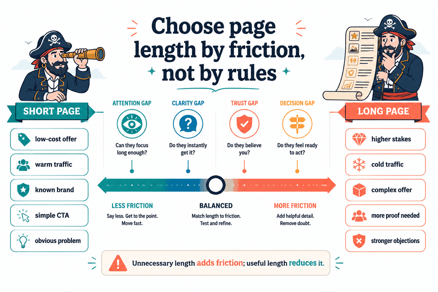
A landing page exists to move someone from interest to action. The page has to close a few gaps on the way:
- Attention gap: Is this relevant to me?
- Clarity gap: What is this exactly?
- Trust gap: Why should I believe you?
- Decision gap: Why should I act now instead of later?
Short pages work when those gaps are tiny. Long pages work when those gaps are bigger.
What ruins pages is not length by itself. It is unnecessary length. Repeated claims. Bloated sections. Testimonials that all say the same thing. Feature lists pretending to be persuasion. A FAQ that exists mostly because someone thought “pages should have FAQs.”
There is a big difference between a long page that keeps reducing friction and a long page that just keeps talking because nobody had the courage to edit it.
When short landing pages make more sense
Short landing pages are great when the offer is easy to understand and the visitor does not need much convincing.
This usually applies when:
- The product is low-cost
- The audience already knows you
- The offer solves an obvious problem
- The CTA is low-commitment, like downloading a free resource or joining a list
- The traffic is warm and already pre-sold by email, social content, or ads
- The page is tied to one simple outcome
A short page often includes:
- A sharp headline
- A few lines of supporting copy
- Clear benefits
- One or two proof elements
- A direct CTA
That is enough when the visitor does not have a pile of objections sitting in their browser tab like uninvited guests.
If you want a more detailed breakdown of where short pages tend to outperform, read When Short Landing Pages Beat Long Ones.
Good fit for short pages
- Lead magnet opt-ins
- Webinar registrations for warm audiences
- Simple tripwire offers
- Waitlist signups
- Brand-aware product launches
- Minimalist sales pages for highly desirable, easy-to-grasp offers
When long landing pages usually win
Longer landing pages are usually better when the ask is bigger or the offer is less obvious.
This includes pages for:
- High-ticket services
- Coaching and consulting offers
- Complex products
- Offers with skeptical audiences
- Competitive categories where differentiation matters
- Cold traffic from ads or search
- Situations where trust has to be earned on-page
When someone is considering a serious spend, they usually need more than a headline, three icons, and a smug button saying “Get Started.” They need to understand the problem, the solution, the process, the outcome, and why you are not just another polished internet stranger with nice fonts.
A good long-form page earns its length by answering the next reasonable question before it slows the reader down. That often means layering persuasion in the right order:
- Hook attention
- Clarify the offer
- Show what is at stake
- Explain how it works
- Add proof
- Handle objections
- Make the next step feel clear and safe
If your page needs stronger foundations before you even worry about length, this will help: How to Write Better Landing Pages.
A better way to decide length: match the page to the decision
Instead of asking, “How many words should my landing page be?” ask, “How hard is the decision I am asking someone to make?”
That one question gets you much closer to the right answer.
| Type of decision | Typical page length | Why |
|---|---|---|
| Simple, low-risk opt-in | Short | Little explanation needed |
| Warm traffic buying a familiar offer | Short to medium | Reader already has context |
| Mid-price product with some objections | Medium | Needs benefits, proof, and clarity |
| High-ticket, trust-heavy service | Medium to long | Needs authority, process, proof, and objection handling |
| Complex or unfamiliar offer to cold traffic | Long | More education and trust required |
Notice what is missing here: a magic word count. That is because word counts are rough clues, not laws. Some pages convert well at 300 words. Some need 2,000 or more. The point is not to hit a number. The point is to remove enough uncertainty for the right buyer to move.
Practical length guidelines for 2026
If you want rough ranges, here they are. Use them as starting points, not holy scripture.
- Lead magnet or email opt-in: 150 to 500 words
- Simple webinar or event signup: 250 to 700 words
- Low-ticket product page: 400 to 1,000 words
- Mid-ticket course or service page: 800 to 1,800 words
- High-ticket coaching, consulting, or done-for-you service: 1,200 to 3,000+ words
Those ranges widen in 2026 because traffic quality is messy, trust is thinner, and readers are more selective. People are absolutely willing to read long pages when the offer matters to them. They are not willing to read long pages that say the same thing six different ways while hoping one version finally lands.
The modern reader is not anti-length. They are anti-waste.
What usually matters more than page length
A short page with a weak message will not suddenly convert because it is “clean.” A long page with strong persuasion can absolutely work. So before obsessing over length, fix the pieces that do most of the heavy lifting.
1. The opening
If the first screen is vague, the rest of the page barely matters. Readers should know quickly:
- What the offer is
- Who it is for
- Why it matters
- What they should do next
If your page starts with a cloudy headline and a stock-photo level promise, no amount of extra sections is saving that thing. Start here if your intro needs work: How to Start Landing Pages Without a Weak Opening.
2. The clarity of the offer
People do not buy what they do not understand.
Your page should explain the offer in plain English. Not in cute brand language. Not in abstract transformation talk. If someone has to reread your copy to work out whether you are selling a service, a workshop, a membership, or a life philosophy, that is a problem.
3. The proof
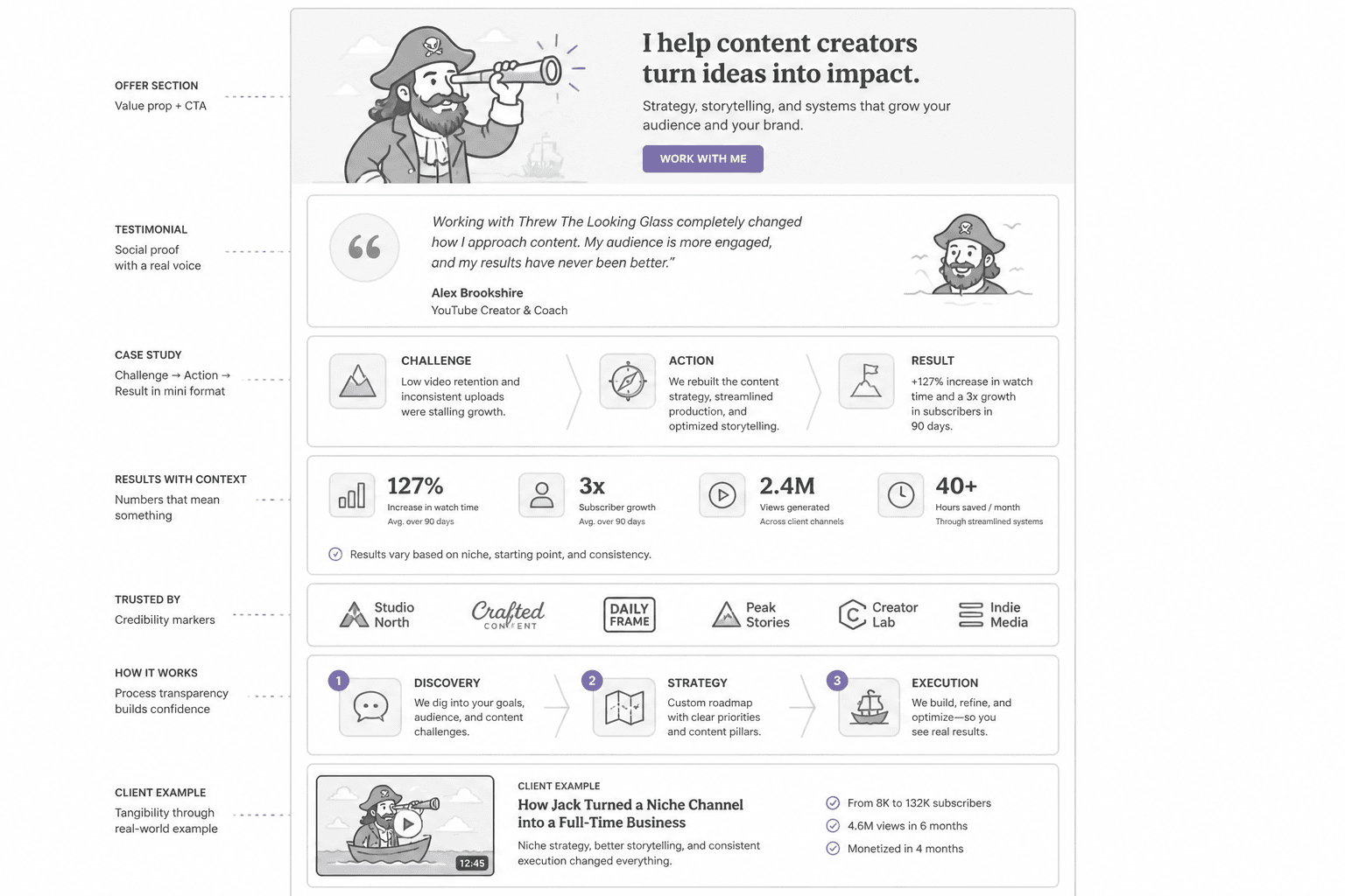
Longer pages often need more proof, but even short pages need some. Proof can include:
- Testimonials with specifics
- Case studies
- Results with context
- Client examples
- Process transparency
- Credibility markers
Not all proof is equal. “Amazing experience, highly recommend” is filler wearing a testimonial nametag. Specific proof beats generic praise every time.
4. The page flow
Pages feel too long when the structure is sloppy. A well-structured long page can feel easy to move through because each section earns the next one.
Strong flow usually looks like this:
- Clear promise
- Problem or stakes
- Offer explanation
- Benefits and outcomes
- How it works
- Proof
- Objection handling
- CTA
Weak flow usually looks like this:
- Big claim
- Another big claim
- Random feature block
- Founder paragraph
- Five testimonials
- A pricing section with no setup
- A FAQ trying to rescue the whole mess
How to tell if your landing page is too short
Your page is probably too short if visitors are interested but still not moving because they lack confidence, clarity, or reassurance.
Common signs:
- The offer sounds interesting, but details are thin
- You get lots of basic questions that the page should have answered
- The CTA feels abrupt
- There is little to no proof
- The page assumes trust instead of building it
- People click around looking for more context
If you are asking for a sale, application, or call booking and the page barely explains what happens next, the page is likely underwritten.
How to tell if your landing page is too long
Your page is too long when extra copy is no longer reducing resistance and is just making the experience heavier.
Common signs:
- You repeat the same benefit in slightly different outfits
- Sections could be cut without changing the decision
- The page explains obvious things your audience already knows
- Testimonials blur together
- The CTA is buried under too much throat-clearing
- The copy sounds like it is trying very hard to justify its own existence
A lot of long pages are not too long because of one giant section. They are too long because of 14 mediocre ones.
A simple 2026 framework for choosing the right length
If you want a faster way to decide, use this four-part check.
The CROP check
- C — Complexity: How much explanation does the offer need?
- R — Risk: How risky or expensive does the decision feel?
- O — Objections: How many likely concerns need handling?
- P — Proof: How much evidence does this audience need before acting?
If all four are low, keep the page short. If two or more are high, the page probably needs more depth.
This is also why copying your favorite creator’s landing page is often a bad move. Their traffic, authority, audience awareness, and offer complexity may be completely different from yours. Same aesthetic, different conversion reality.
What changed by 2026
The core principles are not new, but a few things matter more now.
- Readers are faster at filtering fluff. Generic copy gets skipped immediately.
- Trust is harder to assume. More proof and specificity are often required, especially for service offers.
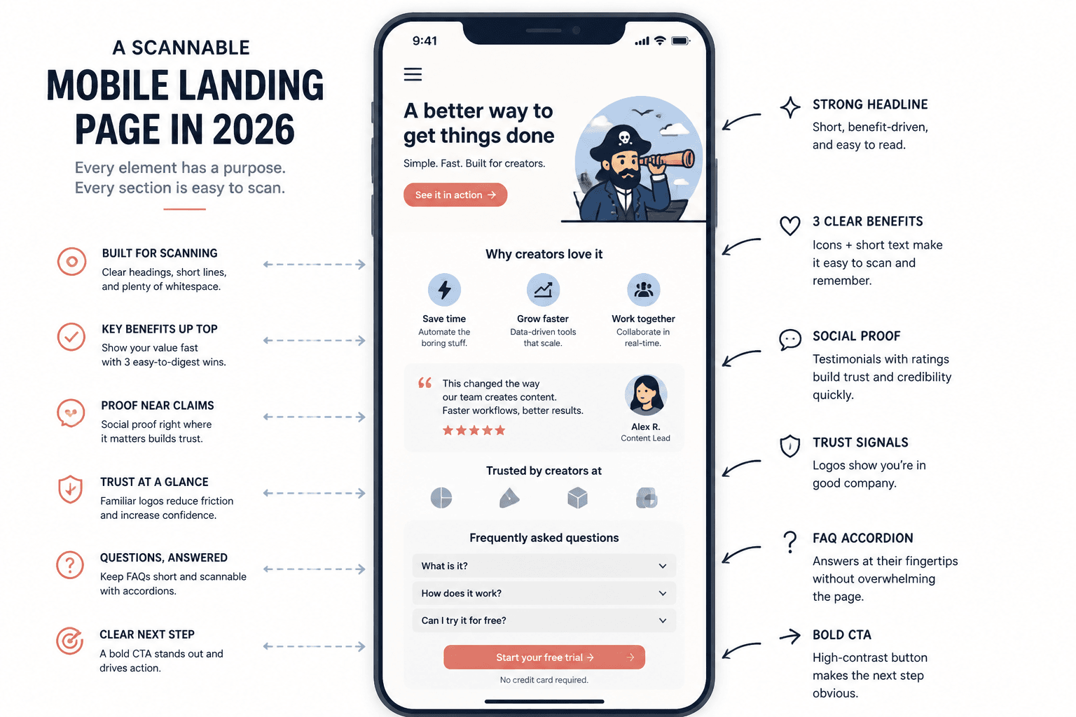
- Mobile experience matters even more. Long pages still work, but only if they are easy to scan.
- AI-generated sameness is everywhere. Pages that sound polished but empty lose.
This last one matters more than people think. A lot of landing pages in 2026 do not fail because they are too long or too short. They fail because they sound like they were assembled by a competent robot with no skin in the game. Smooth wording. No edge. No specifics. No real proof. Plenty of “transformation.” Almost no trust.
Readers can feel that. Maybe not consciously every time, but they feel it enough to hesitate.
How to improve a landing page without obsessing over word count
If your page is underperforming, do not start by chopping random paragraphs or adding random ones. Audit it in this order:
- Fix the headline and opening. Make the offer instantly clearer.
- Cut repeated claims. Keep the strongest version.
- Add missing proof. Use specifics, not applause.
- Answer obvious objections. Especially around fit, process, price, time, and outcomes.
- Improve section order. Put ideas where they support the decision naturally.
- Strengthen the CTA. Make the next step feel clear and low-friction.
The bigger point is simple: clearer structure and clearer writing make the piece more useful. That is usually what makes the ending land better too.