
Most CTA advice is weirdly theatrical.
You get told to “create urgency,” “drive action,” and “maximize conversions,” and somehow that becomes a button that says Act Now Before It’s Too Late. Which is a fast way to make normal people quietly back away from your page.
The best templates and tools for CTA writing do not magically turn dull offers into irresistible ones. They help you do something simpler and much more useful: make the next step clear, relevant, low-friction, and worth taking.
If your calls to action are vague, pushy, or weirdly generic, this is where to fix them. We’ll cover practical CTA templates, the kinds of tools that actually help, what each tool is good for, and how to use templates without sounding like a recycled funnel page from 2019.
If you want broader context first, the main CTA writing guide is a useful companion. And if you want fast swipeable examples after this, keep these handy: simple CTA templates for busy creators and CTA button copy examples creators can adapt fast.
For the full path around this topic, head to the parent guide.
What makes a CTA work in the first place
Before we get into the best templates and tools for CTA writing, let’s clear up the main problem: most CTAs fail long before the wording does.
A CTA is not just a line at the bottom of a page. It’s the moment where your reader decides whether the next step feels obvious, useful, and safe enough to take. If the offer is muddy, the audience fit is off, or the page has not earned trust, no template is going to save it.
That said, wording still matters. A lot. Good CTA copy usually does four things:
- Names the action clearly
- Signals the outcome or value
- Matches the reader’s stage of intent
- Reduces friction instead of adding pressure
So “Book a Strategy Call” can work. But “See If We’re a Fit” might work better if the reader is still cautious. “Download the Checklist” is fine. “Get the 10-minute CTA checklist” is usually stronger because it tells the person what they’re getting and roughly how usable it is.
Bad CTAs often ask for too much, too soon, in language that sounds like it was approved by three anxious marketers and one intern.
The best CTA templates are flexible, not robotic
A template should help you think, not replace thinking.
If you use templates like fill-in-the-blank incantations, your CTA copy starts sounding suspiciously identical to everyone else’s. The useful version is this: templates give you proven structures, then you adapt them to your offer, audience, and level of trust.
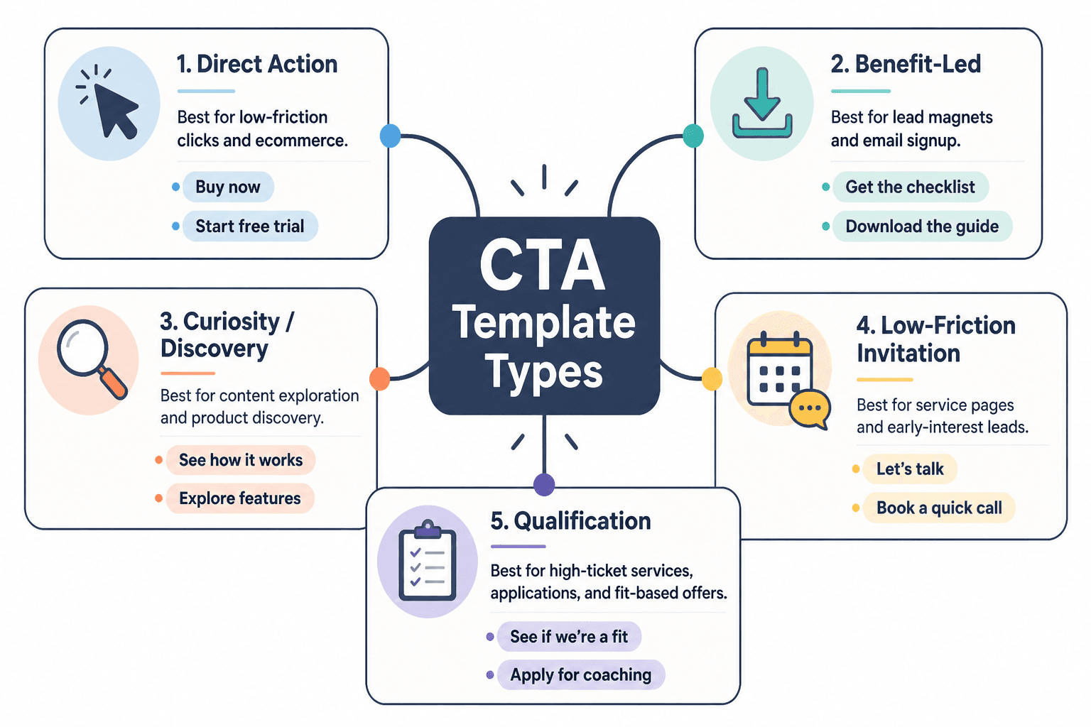
Here are the CTA template types worth keeping around.
1. Action + outcome template
This is one of the cleanest CTA formats because it tells the reader what to do and why they might care.
- Get the guide to write faster landing pages
- Book a consult to find the leak in your funnel
- Start the audit and see what’s hurting conversions
This works well for lead magnets, services, audits, bookings, demos, and content upgrades.
2. Low-friction invitation template
Useful when the reader is interested but not ready for a hard commitment.
- See how it works
- Take a look inside
- Browse the examples
- See if it fits
- Read the breakdown
These are softer, which is not the same as weaker. For colder traffic or trust-sensitive offers, softer often converts better because it does not trigger resistance.
3. Specific asset template
When your CTA offers a concrete thing, say the thing.
- Download the 7-email welcome sequence
- Get the CTA swipe file
- Grab the homepage checklist
- Use the proposal template
This beats “Learn more” in almost every situation where the next step is a clear resource.
4. Benefit-led button template
Sometimes the action itself is boring, but the result is compelling.
- Fix my homepage copy
- Show me better CTAs
- Help me get more replies
- Make my funnel clearer
This style can work beautifully for buttons, especially when the page has already made the offer clear. It feels more human. Less corporate beige. Just do not get too cute and sacrifice clarity.
5. Qualification template
Great for higher-ticket services, applications, and fit-based offers.
- See if we’re a fit
- Check if this is right for you
- Apply for coaching
- Request a custom quote
These signal selectiveness and reduce the feeling of a hard sell. That can increase trust when the offer is more considered.
For more category-specific examples, you can also explore related conversion copy resources.
Best templates and tools for CTA writing by use case
The right CTA tool depends on what problem you are solving. Some tools help you generate options. Some help you organize swipe files. Some help you test buttons on pages. Some help you tighten language when your draft sounds like it swallowed a webinar.
Here’s the cleaner way to think about it.
| Use case | Best template style | Best tool type |
|---|---|---|
| Lead magnet signup | Specific asset + outcome | Swipe file, AI draft assistant, landing page builder |
| Service inquiry | Qualification or low-friction invitation | Copy editor, form builder, A/B testing tool |
| Newsletter signup | Benefit-led or specific promise | Email platform, CTA testing tool, headline analyzer |
| Sales page CTA | Action + outcome | Page builder, heatmap tool, conversion testing tool |
| Button copy refresh | Benefit-led button template | AI variation tool, swipe database, UX testing tool |
| Social post CTA | Low-friction invitation | Content planner, template library, AI ideation tool |
For creators and consultants: a simple CTA stack
If you are a solo operator, you probably do not need a giant optimization setup. You need a sane little system that helps you write, store, adapt, and test calls to action without making this your full-time hobby.
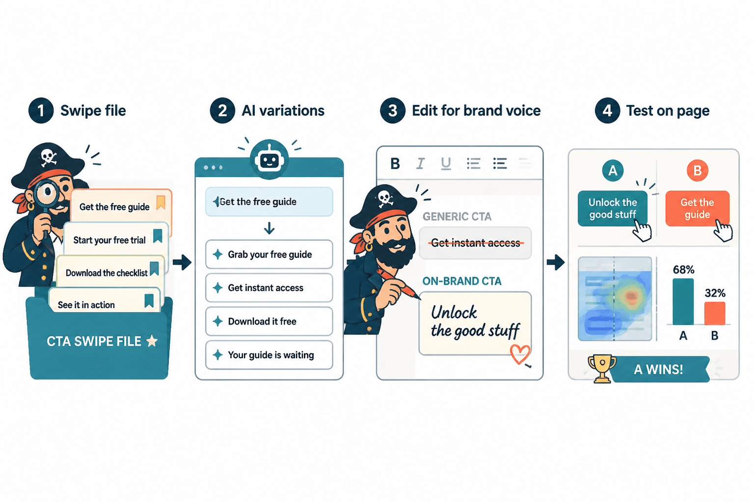
- Keep a swipe file with strong CTAs you actually like
- Use a template bank sorted by goal: subscribe, book, buy, reply, download
- Use AI for variation, not truth
- Test on real pages or real posts
- Track what gets clicks and what gets qualified action
That last part matters. Clicks are nice. Booked calls, replies, purchases, and qualified leads are nicer. A CTA can get plenty of clicks while attracting exactly the wrong people. Which is, in technical terms, annoying.
The tool categories that actually help CTA writing
You do not need one perfect CTA tool. You need the right kind of tool for the job. Here are the categories that pull their weight.
Swipe file and template storage tools
This is the least glamorous category and one of the most useful. Save CTA examples by context:
- Homepage hero buttons
- Newsletter signups
- Lead magnet forms
- Sales page CTAs
- Booking page buttons
- Social post soft CTAs
What these tools are good for:
- Building your own CTA library
- Spotting patterns in good copy
- Reducing blank-page syndrome
- Adapting proven structures faster
What they cannot do:
- Tell you if a CTA fits your audience
- Fix a weak offer
- Replace testing
AI writing tools for variation and ideation
AI is useful for CTA writing in one very specific way: generating angles quickly. It’s handy when you already know the offer, audience, and desired action, but you want 20 versions to compare.
It is not useful when you expect it to understand your buyer psychology better than you do. That’s how you end up with buttons that sound polished but emotionally vacant.
Use AI to ask for variations like:
- Make this CTA clearer
- Give me 15 lower-friction versions
- Rewrite this CTA for skeptical buyers
- Make this sound more specific and less salesy
- Give me button copy under 4 words with a practical tone
If you want a deeper breakdown on this category, read best AI tools for CTA writing.
Copy editing and clarity tools
These help when your CTA is technically fine but clunky. Good editing tools catch extra words, vague phrasing, repetitive language, and overly formal nonsense.
They are especially handy for creators who default to safe corporate phrasing like “Submit your inquiry” when “Ask about working together” would sound much more human.
Testing and conversion tools
This is where opinion has to meet evidence.
A/B testing tools, heatmaps, click tracking, and page analytics can help you compare CTA variants on real pages. Not every creator needs heavy testing software, but if a page matters financially, guessing is not a personality trait you should cling to.
If you want tools on the broader conversion side, this is the companion piece: best copy and conversion tools for CTA writing.
A practical template library you can actually use
Here’s the part most people actually want: usable CTA templates by context.
These are not sacred. They are starting points. Steal the structure, then make it sound like your business instead of an overcaffeinated funnel gremlin.
Lead magnet CTA templates
- Get the free checklist
- Download the template
- Grab the guide
- Send me the swipe file
- Get the 10-minute framework
- Download the exact script
Better: Get the CTA swipe file
Weaker: Learn more
Booking and service CTA templates
- Book a consult
- See if we’re a fit
- Ask about working together
- Request a proposal
- Start your project inquiry
- Book a strategy call
Better: Ask about working together
Weaker: Submit
Newsletter CTA templates
- Join the newsletter
- Get weekly copy breakdowns
- Send me the good stuff
- Subscribe for sharper content tips
- Get one useful email a week
Better: Get weekly copy breakdowns
Weaker: Sign up
Sales page CTA templates
- Start your trial
- Choose your plan
- Get instant access
- Buy the template pack
- Start building smarter CTAs
Better: Get instant access
Weaker: Continue
Social and content CTA templates
- Reply if you want the template
- Read the full guide
- Steal this structure for your next post
- Save this for your next launch
- Try this on your homepage
Social CTAs should usually feel lighter than page CTAs. You are continuing attention, not always trying to close the deal on the spot. That distinction saves a lot of creators from posting useful content and then ruining it with “DM me NOW to scale.”
How to use tools without making your CTAs sound fake
This is where people go wrong. They use a template or AI tool, get something passable, and stop there. The CTA is not terrible, but it does have that slightly sterile, too-symmetrical sound. Like it came out of a machine that has read a lot of landing pages and understood none of the subtext.
Here’s how to clean that up.
- Match the CTA to the page stage. Cold readers need lower-friction next steps than warm readers.
- Name the actual thing. “Download the homepage checklist” beats “Access resources.”
- Cut inflated urgency. If the urgency is fake, people can smell it.
- Use the reader’s language. Sound like a smart human, not a conversion seminar.
- Check for friction. Is the CTA asking for more commitment than the page has earned?
A good rule: if the CTA sounds slightly more polished than the rest of the page, rewrite it. Good CTA writing should feel connected to the voice around it, not pasted in from a separate marketing universe.
Common CTA tool mistakes
The tools are not usually the problem. The way people use them is.
- Using one CTA template everywhere. A booking page CTA and a blog post CTA should not sound identical.
- Optimizing for clicks instead of qualified action. More clicks do not always mean better leads.
- Trusting AI’s first draft. It can produce nice-sounding mush at alarming speed.
- Testing tiny wording changes on a broken page. If the offer is unclear, button tweaks are lipstick on a haunted mannequin.
- Choosing “clever” over clear. If the user has to decode the CTA, you have already lost them.
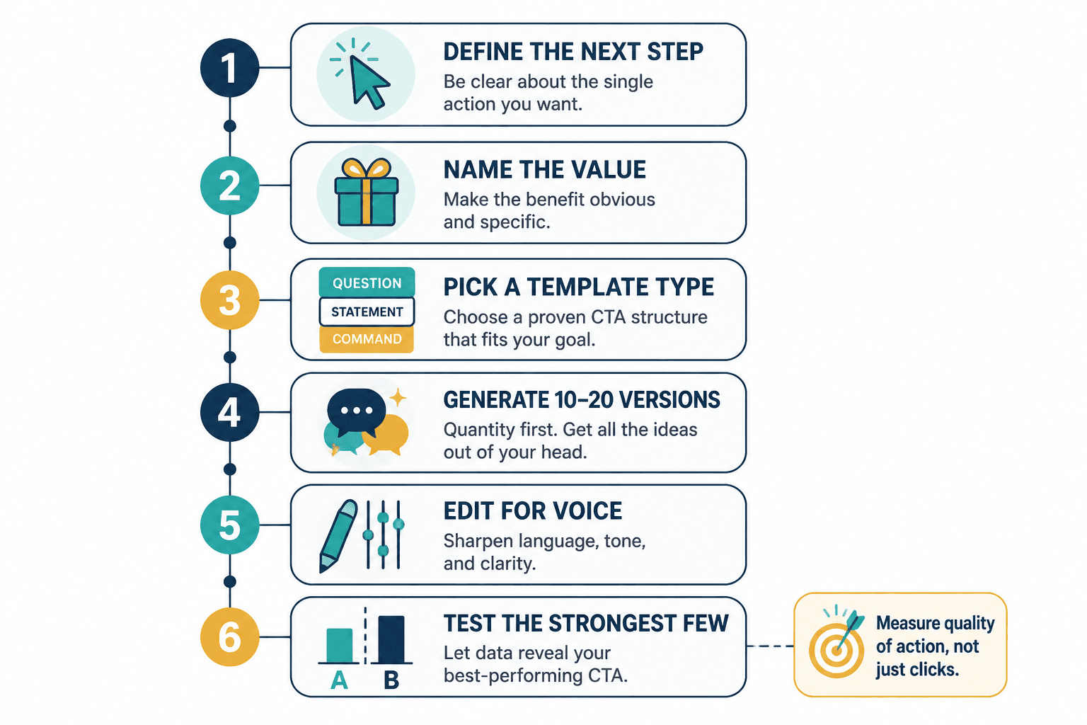
A quick process for writing stronger CTAs faster
If you want a repeatable workflow, use this:
- Define the next step. What exactly should the reader do?
- Name the value. What do they get or move closer to?
- Pick a template type. Action + outcome, low-friction invite, specific asset, benefit-led, or qualification.
- Generate 10–20 versions. Use your swipe file, your brain, or an AI tool for variation.
- Edit for voice. Make it sound like your brand, not generic conversion sludge.
- Test the strongest few. Measure quality of action, not just click rate.
Small FAQ
What is the best tool for CTA writing?
There is not one best tool. Most people need a mix: a swipe file, an AI variation tool, an editing tool, and some basic testing or analytics.
Are CTA templates bad for conversion?
No. Bad adaptation is bad for conversion. Templates are useful when you customize them to the offer, audience, and page intent.
Should CTA buttons be short?
Usually yes, but not at the expense of clarity. “Get the guide” is better than “Submit.” Short and specific is the sweet spot.
The bigger point is simple: clearer structure and clearer writing make the piece more useful. That is usually what makes the ending land better too.