
Want the broader roadmap? Start with the parent guide.
A quick before-and-after example
The bigger point is simple: clearer structure and clearer writing make the piece more useful. That is usually what makes the ending land better too.
The bigger point is simple: clearer structure and clearer writing make the piece more useful. That is usually what makes the ending land better too.
People love arguing about landing page length like there is one correct answer and everyone else is committing conversion crimes.
There is not.
When short landing pages beat long ones, it is usually for a boring reason that gets ignored: the visitor did not need a 14-scroll sales saga. They needed clarity, relevance, and a clean next step. That is it.
A lot of long pages are not persuasive. They are just anxious. They keep talking because the offer is fuzzy, the audience is mixed, or the writer does not trust the reader to make a decision without being dragged through every possible objection in alphabetical order.
If you are trying to decide between a short landing page and a long one, the better question is not “How much copy should I write?” It is “How much information does this visitor actually need before taking the next step?”
Here is how to tell when short landing pages win, what makes them work, where people get them wrong, and how to tighten your page without cutting out the parts that actually sell.
When short landing pages beat long ones
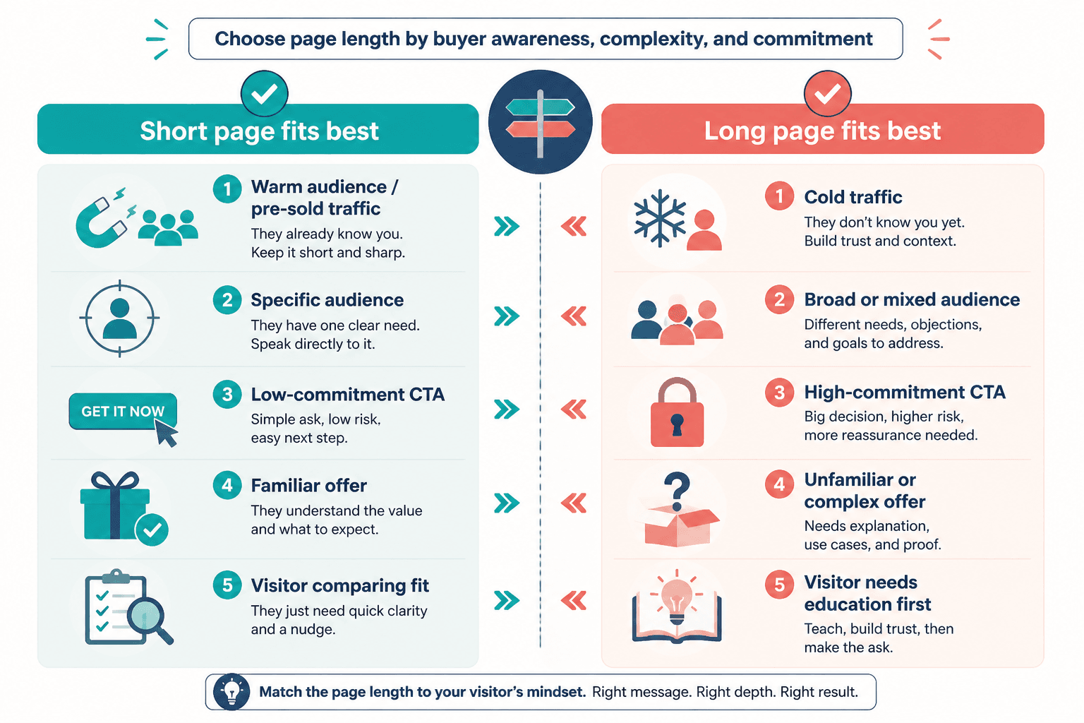
Short landing pages tend to outperform long ones when the decision is simple, the traffic is warm, and the ask is relatively low friction.
That means the reader already gets the problem, already trusts you a bit, or does not need a full courtroom defense before clicking.
- The offer is easy to understand in one glance
- The audience is specific enough that the page can speak directly
- The CTA is low commitment, like joining a list, downloading a resource, or booking a quick call
- The traffic comes from content, referrals, email, or social posts that already did some pre-selling
- The product or service is familiar enough that you do not need to educate from scratch
- The visitor is comparing fit, not trying to decode what you even do
In plain English: if your prospect already arrives half-convinced, your page does not need to behave like a three-act monologue.
Short pages work best when they remove friction fast. They say the right thing, in the right order, without making the reader dig through paragraphs of throat-clearing and decorative persuasion.
Why short pages often convert better
The obvious answer is “people have short attention spans,” which is not exactly wrong, but it is also lazy.
Short pages often convert better because they are easier to process. They lower cognitive load. They help the visitor quickly answer the only questions that matter:
- Is this for me?
- Do I want this?
- Do I trust this enough?
- What happens if I click?
If your page handles those four questions cleanly, extra copy can actually hurt. Not because long copy is bad, but because unnecessary copy creates drag. Every extra section gives the visitor another chance to hesitate, skim badly, get distracted, or notice that your “transformation framework” sounds suspiciously like warmed-over consultant soup.
Good short pages have a kind of discipline to them. They do not try to prove everything. They prove the right thing. That usually means they are sharper on positioning, stronger on structure, and less padded with generic claims.
Short pages force better messaging
A short landing page does not give you room to hide behind fluff. If the offer is unclear, the page falls apart fast. If the value proposition is vague, you feel it immediately.
That is useful. It forces you to say what the thing is, who it is for, why it matters, and what to do next. Not in 27 slightly different ways. In one clear way that lands.
They match how many visitors actually arrive
A lot of landing pages are not the first touch. Someone clicks from a post, an email, a referral, a podcast mention, or a profile link. They already have context.
So if you hit them with a giant page that re-explains the universe, you are not nurturing. You are repeating yourself. And repeated information is not automatically persuasive. Sometimes it just feels slow.
Best situations for a short landing page
If you want a practical rule, short pages usually do best when the page is there to confirm and convert, not educate and rescue.
1. Warm traffic from content or email
If someone clicked from your newsletter, a useful social post, or a referral, they probably do not need the long version. They need continuity. The page should feel like the natural next step from what they already read.
This is especially true for creators, coaches, and consultants with personal brands. Your content often does part of the persuasion before the click. The landing page should cash that in, not start over from zero.
2. One focused offer with one clear outcome
Short pages work well when the offer is narrow and concrete.
- A free guide
- A discovery call
- A workshop registration
- A waitlist
- A template pack
- A newsletter signup tied to a clear promise
If the visitor can understand the offer in a sentence, you probably do not need six sections trying to make it sound bigger than it is.
3. Lower-risk decisions
The more commitment you ask for, the more proof and detail you usually need. A short page is often enough for low-friction actions. It is less often enough for expensive services, complicated products, or skeptical cold traffic.
That does not mean high-ticket offers always need monster pages. It means they need enough substance for the specific buyer. Sometimes that still ends up fairly short if the traffic is warm and the positioning is excellent.
4. Specific audiences
The more specific the audience, the less explanation you need.
A landing page for “consultants who get traffic but not enough qualified inquiries” can be much shorter than a page for “business owners who want to grow.” One of those sounds like you know who you are talking to. The other sounds like you would happily accept any mammal with a wallet.
If you are working with smaller, niche audiences, this becomes even more useful. A short page aimed at the right people can outperform a bloated “covers everything” page by a mile. For more on that angle, see landing pages for creators with small audiences.
What a high-converting short landing page usually includes
Short does not mean careless. It means selective.
A strong short page usually includes most of the following, just without the dramatic bloat:
- A headline that says what the offer is and why it matters
- A subhead that adds context or outcome
- A few lines that clarify who it is for
- One clear CTA
- Light proof, like a testimonial, result, credential, or credibility marker
- A concise “what you get” section
- A friction-reducing note about what happens next
That is often enough.
Not because long copy is overrated in every case, but because many pages do not fail from lack of words. They fail from lack of precision.
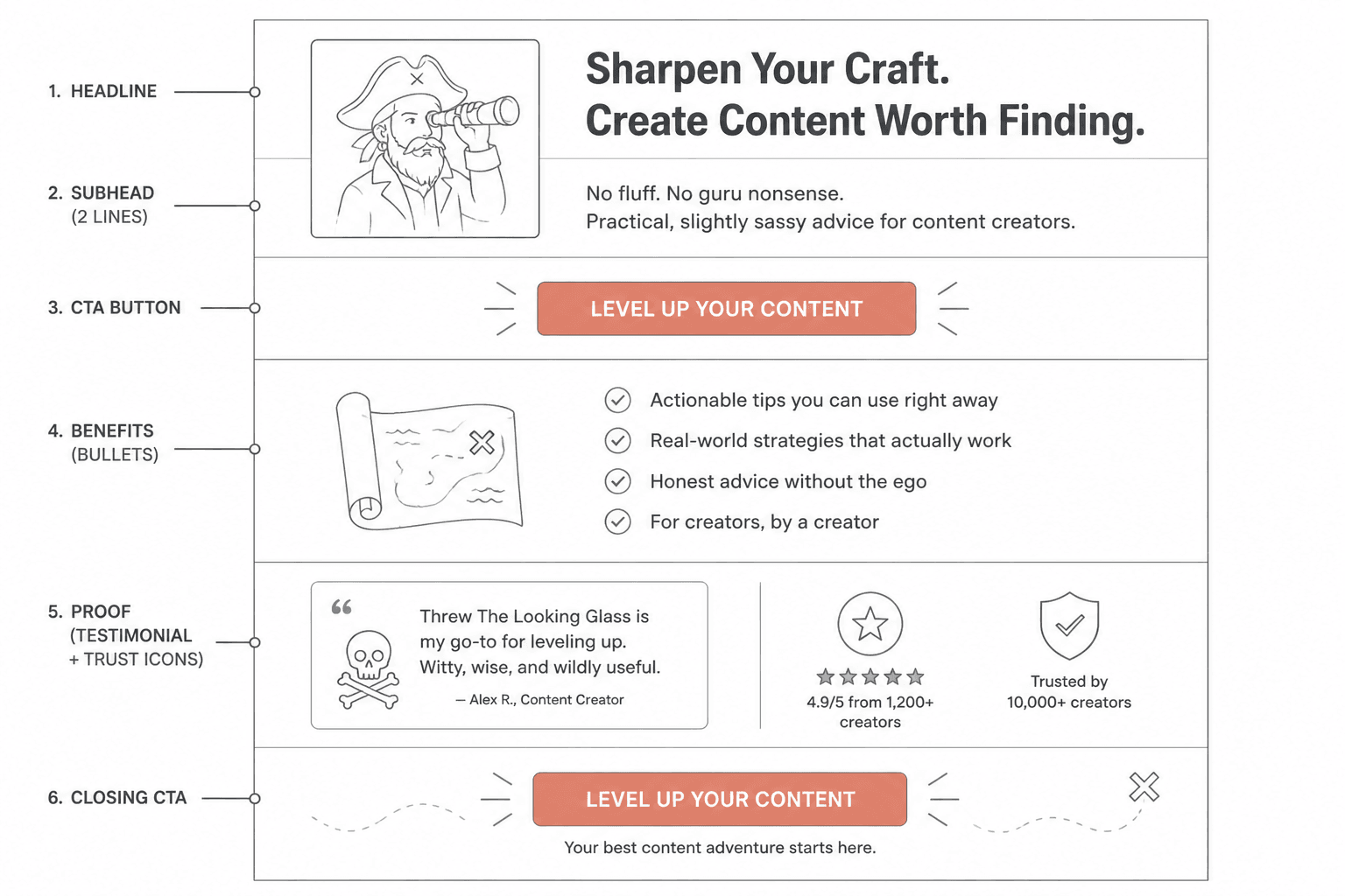
A simple short-page structure
- Headline: Make the offer and benefit obvious
- Subhead: Add who it is for or what makes it valuable
- CTA: Put the next step early
- Benefit bullets: Show what they get or what improves
- Proof: One or two strong trust signals
- Closing CTA: Repeat the action with less friction
If you want to see how that plays out in the wild, these landing page examples for coaches, consultants, and personal brands will help.
Where people mess this up
The biggest mistake is assuming short means minimal. It does not. Minimal is an aesthetic choice. Effective is a conversion choice. Sometimes those overlap. Sometimes they absolutely do not.
Here is where short pages usually go sideways.
They get vague to stay sleek
Clean design cannot save weak copy. If your headline says something like “Scale your next level with clarity,” congratulations, your page is short and useless.
Short pages need concrete language even more than long ones do. You have less room. Every line has to carry its weight.
They remove proof
People trimming long pages often cut the wrong things. They keep soft brand language and delete the testimonial, mini case study, or credibility marker that actually helps a decision happen.
If you shorten a page, do not just make it smaller. Make it sharper. Keep the lines that answer doubt.
They ask for too much too fast
A short page can absolutely convert for a consultation, application, or sales call. But if the audience is cold and the service is expensive, a tiny page with a giant ask often underperforms because it has not earned enough trust.
This is where page length and funnel logic matter together. If the offer needs more trust, build that before or around the page. You may need stronger content, a better nurture path, or a softer CTA. If you want that piece, read how to turn landing pages into more leads or sales.
Short vs long landing pages: use this decision filter
If you are stuck, use this simple filter instead of arguing with strangers about copy length.
| Question | If the answer is yes | What it suggests |
|---|---|---|
| Does the visitor already know you or the offer? | Mostly yes | Shorter page may work well |
| Is the offer simple to understand? | Yes | Shorter page is more likely to convert |
| Is the CTA low commitment? | Yes | Short page often enough |
| Does the buyer need education before acting? | Yes | Longer page or better pre-sell may be needed |
| Is the service expensive, complex, or unfamiliar? | Yes | More detail and proof usually help |
| Is your traffic cold and skeptical? | Yes | Longer page may outperform a short one |
This is also why “best landing page length” advice is usually half-useful at best. The right length depends on the decision, the audience, the traffic source, and how much context the visitor already has. If you want a fuller breakdown, read how long landing pages should be in 2026.
How to shorten a landing page without making it worse
If your current page feels too long, do not start hacking paragraphs at random. That is how people end up with a beautifully trimmed page that now converts like a damp napkin.
Use this process instead.
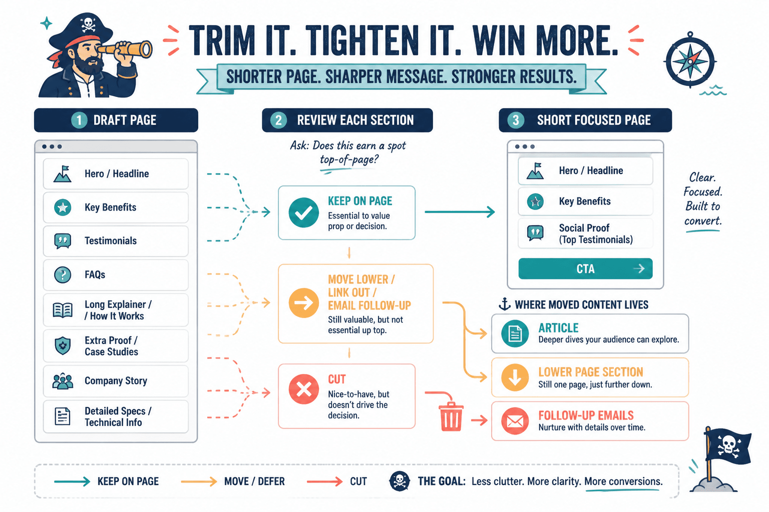
1. Keep only one core promise
If your page is trying to sell speed, clarity, revenue, confidence, authority, better systems, and inner peace, no wonder it is sprawling. Pick the main outcome. Support that outcome. Cut the rest.
2. Remove repeated claims
Many long pages say the same thing five different ways because the writer thinks repetition equals persuasion. It can. But usually only when each repeat adds a new angle, proof point, or emotional layer.
If your page keeps restating the same promise with slightly different adjectives, trim it.
3. Cut generic filler first
- “Imagine if…” sections with no substance
- Broad claims anyone could say
- Overlong founder bio paragraphs
- Fake urgency
- Feature dumps that belong in a FAQ or follow-up email
The things to protect are clarity, specificity, and trust.
4. Move supporting detail below the CTA or off the page
Sometimes the answer is not “delete the detail.” It is “stop forcing every visitor to read it before they can act.”
You can keep a short page focused by placing extra explanation lower down, linking to a relevant article, or using a follow-up sequence after the signup. That is often a smarter structure than one giant page trying to do every job at once.
If you are building out your broader conversion copy system, the related resources in this landing pages hub and the wider conversion copy section are worth a look. You can also browse more guidance across the website conversion copy collection.
A quick before-and-after example
The bigger point is simple: clearer structure and clearer writing make the piece more useful. That is usually what makes the ending land better too.
The bigger point is simple: clearer structure and clearer writing make the piece more useful. That is usually what makes the ending land better too.