
A draft sits open in one tab, subject lines are scattered across a notes app, and the newsletter itself is made of five blocks that all want to be the main character. That is usually the moment structure stops being a nice idea and becomes the only thing keeping the issue from turning into polite chaos. Examples help because they turn vague advice into something you can actually place on the page.
This guide is built for creators who want usable newsletter section ideas and format templates, not theory with a nicer font. If you want the broader framework behind the structure, start with the parent guide on newsletter sections and formats. If you want to improve the opening specifically, see how to write better newsletter sections and formats. For CTA-only ideas, there is also a dedicated set of newsletter CTA block templates.
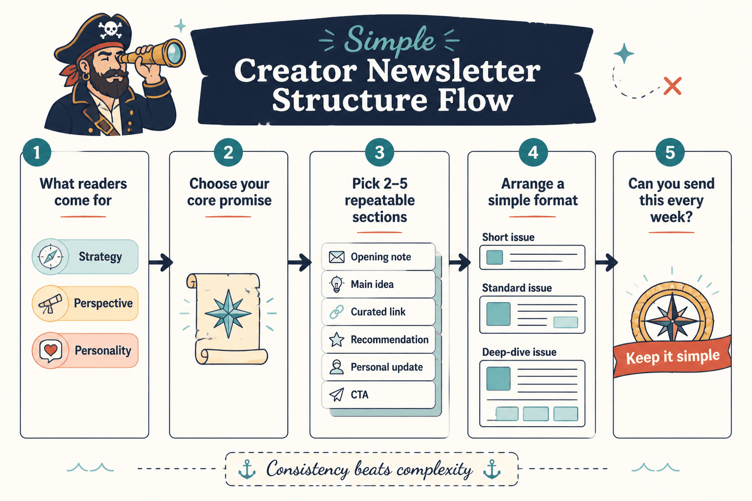
What a useful newsletter section is supposed to do
A section is not just “more content.” It has a job. The job might be to open the issue, make one point, prove it, add a quick useful extra, or move the reader to a next step. If a section does none of those things, it is probably just occupying space.
The best newsletters usually follow a simple sequence:
- Hook: earn attention fast.
- Point: say what matters.
- Support: show why it is true or useful.
- Payoff: give the reader something they can use.
- Next step: point to one clear action.
That structure is simple on purpose. Readers do not need a parade. They need momentum.
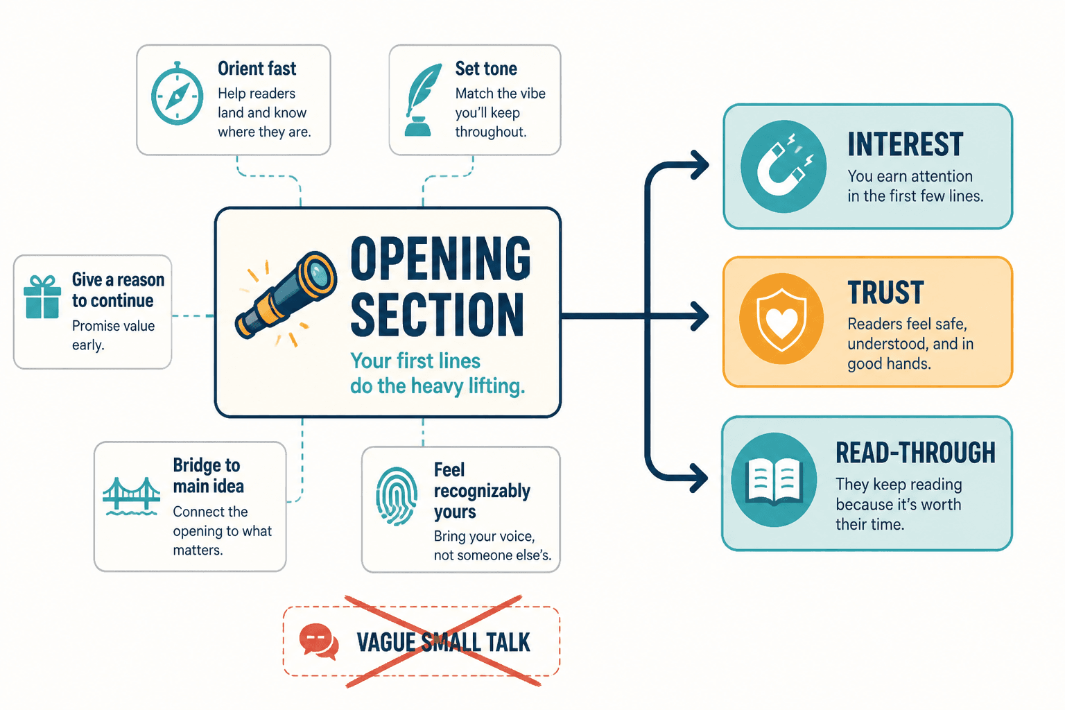
Best newsletter opening section examples
The opening section should tell the reader what kind of issue this is and why they should keep going. Not with a grand speech. With a quick, specific lead-in that creates relevance.
1. The direct opening
Use it when: you want to get to the point immediately.
Example: “Today’s issue is about the one newsletter section most creators underuse: the proof block. If you write advice, teach concepts, or sell services, this is where your email starts feeling more believable.”
2. The problem opening
Use it when: the issue solves a common friction point.
Example: “A lot of newsletters read like three good ideas in a trench coat. The opening promises one thing, the middle wanders, and the CTA arrives like it took a wrong turn.”
3. The contrast opening
Use it when: you want to show the gap between bad and better structure.
Example: “A long newsletter is not automatically a strong newsletter. A focused one usually beats it, because readers can tell the difference between depth and drift.”
For more opening patterns and examples, the sister guide on newsletter opening section examples creators can adapt fast is the best companion piece.
Best main lesson or insight section ideas
This is the section where the email earns its keep. One main lesson is usually enough. Two if they belong together. Seven is a mood, not a strategy.
1. The one-idea teaching block
Use a short explanation, then stop. The point is clarity, not compression for its own sake.
Example: “A good format makes the next section obvious. When the issue has a clear opening, one main point, and one CTA, the reader never has to wonder whether they missed the point.”
2. The “why this matters” section
This is useful when the topic could feel abstract.
Example: “Structure matters because attention is expensive. If the reader has to do the work of organizing your email, they will usually stop halfway through and call it a day.”
3. The framework section
If your newsletter teaches repeatable process, give the reader a small framework they can remember.
Example: “Use this order: hook, point, proof, payoff, CTA. It is not sacred. It is just sturdy enough to keep the issue from collapsing into a list of nice-sounding fragments.”
When the article needs stronger practical examples, the parent guide on newsletter sections and formats is the right place to anchor the explanation.
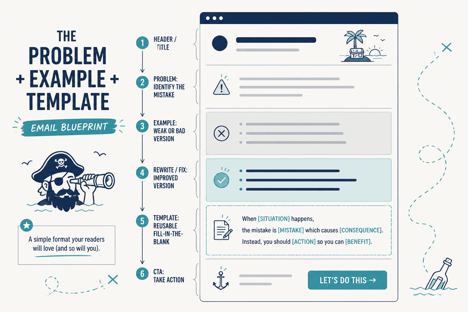
Best proof or example section ideas
This section is where the newsletter stops claiming and starts showing. Proof can be a short scenario, a before-and-after comparison, a mini case study, a tiny teardown, or a concrete example of how the format works.
1. The before-and-after block
Use it when: you want to show the value of structure fast.
Example:
- Before: “Here are five loosely related tips.”
- After: “Here is one idea, one example, one practical move, and one next step.”
2. The use-case block
Use it when: one format could fit different creator goals.
Example: “A coach might use this section to unpack a client misconception. A newsletter writer might use it to show how a subject line affects open rates. A product creator might use it to explain one feature in plain language.”
3. The mini-demo block
Use it when: readers need to see the format in motion.
Example: “Opening: one sharp problem. Main section: one explanation. Proof: one example. CTA: one clear next step. That is enough for a strong issue without turning the email into a field report.”
For a deeper strategy discussion on moving readers toward action, see how to turn newsletter sections and formats into more leads or sales.
Best quick-hit or curated extra section ideas
Not every newsletter needs a bonus section, but many benefit from one. A quick-hit section gives readers a little more value without demanding a second main idea.
1. The resource drop
Use it when: you want to share a link, tool, or reference.
Example: “One useful reference for structuring emails is the official guidance on email format and deliverability basics from major email platforms and standards groups. It is less glamorous than a “hacks” thread, but also less likely to get you ignored.”
2. The quick lesson
Use it when: the main issue has room for one small extra insight.
Example: “A CTA does not need to feel urgent to be effective. It needs to feel specific.”
3. The roundup strip
Use it when: you want to include a few related items without building a full list post.
Example: “Three useful things this week: one subject line test, one opening pattern, one CTA to avoid.”
Best newsletter CTA block examples
A CTA block should do one thing well. Not three things in a trench coat. The cleanest CTA blocks are usually simple, specific, and easy to scan.
1. The related-resource CTA
Example: “If you want the full structure behind this issue, read the parent guide on newsletter sections and formats.”
2. The reply CTA
Example: “Reply with the section that gives you the most trouble: opening, proof, or CTA. That is usually where the draft is leaking energy.”
3. The soft-offer CTA
Example: “If you want more examples like this, keep an eye on the next issue. It will build on this format and show how to adapt it for different newsletter goals.”
4. The direct sales CTA
Example: “If this structure would save you time every week, take a look at the tool, template, or service that helps you build it faster.”
For more CTA-specific patterns, the sibling guide on simple newsletter CTA block templates for busy creators goes deeper.
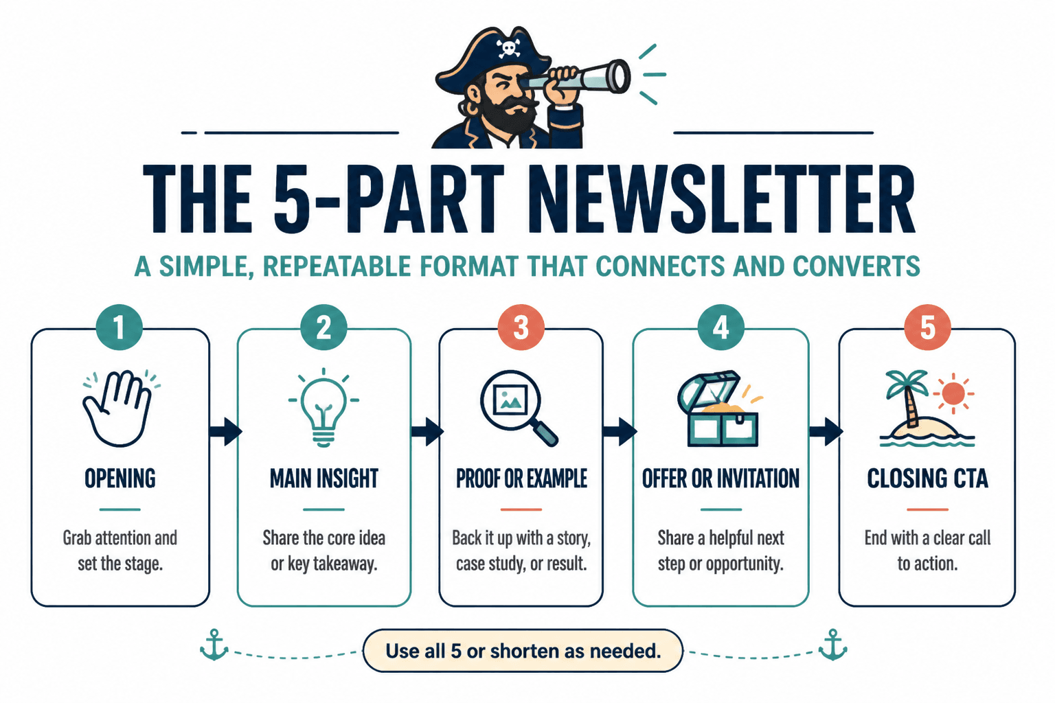
Four newsletter format templates that actually work
Sections are useful on their own. Formats make them repeatable. That is the real prize: a structure you can reuse without feeling like you are manufacturing the same issue forever.
1. Short lesson format
Best for: advice, teaching, and quick insights.
- Opening
- One main lesson
- One example
- One CTA
Why it works: it stays narrow. Readers know they are getting one takeaway, not an entire syllabus.
2. Story-plus-lesson format
Best for: creators who teach through lived examples or narrative setup.
- Opening
- Short story or scenario
- Lesson from the story
- CTA
Why it works: the story earns attention, and the lesson gives it shape.
3. Curated roundup format
Best for: linking out to resources, ideas, or examples.
- Opening
- Brief framing point
- Three to five curated items
- Quick CTA or reply prompt
Why it works: it creates value without forcing a single thesis where one is not needed.
4. Offer-led format
Best for: launches, services, and newsletters that need to sell without sounding like a pop-up ad.
- Opening
- Problem or desire
- Proof or example
- Offer block
- CTA
Why it works: it lets the sale feel like the natural next step, not a hard left turn.
How to choose the right newsletter format
Pick the format based on the goal of the email, not on what looks clever in a template library.
- Want to teach one clear thing? Use the short lesson format.
- Want to make an idea feel more real? Use story plus lesson.
- Want to share links or examples? Use a roundup.
- Want to sell something? Use the offer-led format.
If the format matches the goal, the issue feels calm. If it does not, the email spends half its life explaining why it exists.
Common mistakes when building newsletter sections
- Making every section equally important. One section should lead. The rest should support.
- Opening too broadly. A vague opener makes the rest of the email work harder.
- Adding examples that do not prove anything. A decorative example is just extra text with better posture.
- Using too many CTAs. One main next step is usually enough.
- Choosing format before purpose. The structure should serve the email, not the other way around.
For readers who want help using tools without letting the tools drive, there is also a related guide on best AI tools for newsletter sections and formats. Used well, they speed up drafting. Used badly, they produce surprisingly confident wallpaper.
Conclusion
The best newsletter section ideas are not the fanciest ones. They are the ones that help a reader move from opening to point to payoff without getting lost. Start with a structure that matches the goal, keep the sections doing one job each, and use examples to make the email easier to trust. That is usually enough to turn a rough draft into something people can actually read all the way through.
If you want the full framework behind this article, go back to the parent guide on newsletter sections and formats. If you want to improve one part at a time, the opening, CTA, and lead-conversion companion pieces are the best next stops.