
Most newsletter CTAs are not bad because they are too short. They are bad because they are vague, needy, or weirdly dramatic for no reason.
You finish a decent newsletter, get to the bottom, and then slap on something limp like “Let me know your thoughts” or “Book a call if this resonated.” That is not a CTA block. That is a shrug in button form.
If you want better results from your emails, your CTA block needs to do one job clearly. Not five. Not “engage, convert, nurture, build community, and create alignment.” One job. Click this. Reply to that. Read the next thing. Buy the offer. Join the list. Simple.
This guide will help you build simple newsletter CTA block templates for busy creators who do not have time to reinvent the ending of every email. You will get practical formats, copy templates, examples, and a few rules for making your CTA feel human instead of funnel-scented.
If you are still shaping the rest of your newsletter, it helps to start with a stronger structure first. You can pair these CTA blocks with the frameworks in newsletter sections and formats, or go broader with this guide for creators who want better results.
For the full path around this topic, head to the parent guide.
What a newsletter CTA block actually needs to do
A CTA block is the closing section that tells the reader what to do next. That sounds obvious, yet a lot of creators still treat it like decorative email mulch.
A good CTA block does three things:
- It matches the goal of the email
- It asks for one clear next step
- It makes that next step feel easy and relevant
That is it.
If your email teaches one lesson and then ends by asking people to book a discovery call, follow you on three platforms, share the email, and check out your paid product, the problem is not your formatting. The problem is that you have commitment issues and you are making the reader pay for them.
Busy creators need CTA blocks that are reusable, flexible, and quick to adapt. Which means you want formats, not fresh existential copywriting pain every week.
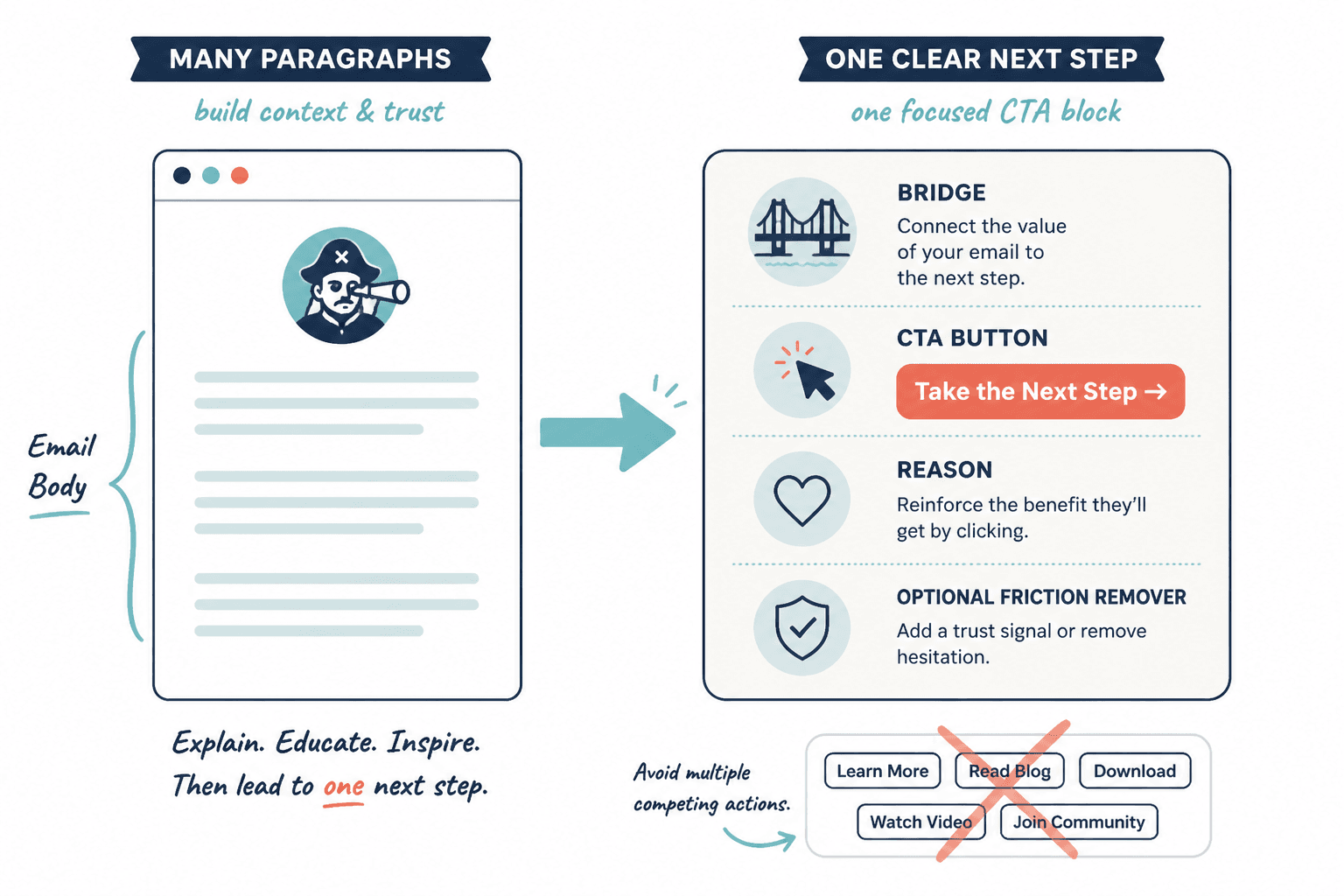
The basic anatomy of a strong CTA block
You do not need a giant banner, a rainbow button, or ten lines of persuasive theater. Most good newsletter CTA blocks use some version of this:
- Bridge: a short line connecting the email topic to the next step
- CTA: the actual action you want the reader to take
- Reason: why that action matters now
- Optional friction remover: a quick reassurance, detail, or expectation-setter
In plain English, it often looks like this:
If this is the part you are struggling with, here is the next useful thing.
Click here to get it.
It will help you do X faster or better.
No fluff, no long setup, no awkward mystery.
Not every CTA block needs all four parts, but this structure keeps you from writing endings that sound like a sleepy webinar host trying to seem casual.
How to choose the right CTA block for the email
The best CTA block depends on what kind of email you are sending. Different newsletter formats need different endings.
| Email type | Best CTA goal | Common mistake |
|---|---|---|
| Educational tip email | Read related article or reply | Jumping straight to a hard sale |
| Story email | Reply, reflect, or read next resource | Ending with no clear next step |
| Sales email | Click to offer page or book call | Hiding the pitch under fake softness |
| Curated links email | Click one featured resource | Giving equal weight to everything |
| Launch email | Buy, join, or learn more | Adding too many side actions |
| Relationship-building email | Reply with answer or question | Using boring “thoughts?” copy |
If you need help tightening the rest of your structure too, this roundup of newsletter sections and formats ideas and examples is worth bookmarking.
Simple newsletter CTA block templates for busy creators
Here is the useful part. These templates are built to be fast to customize and flexible enough for creators, coaches, consultants, freelancers, and solo business owners.
Use them as structures, not scripts carved into stone. If your audience is warmer, you can be more direct. If they are newer, add a little more context. But keep the spine intact.
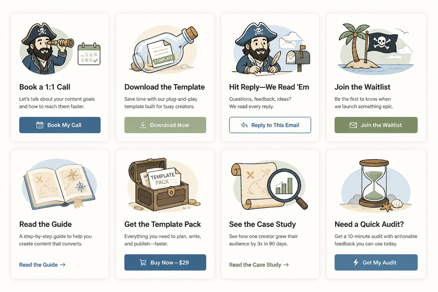
1. The related-resource CTA block
Best for educational newsletters, insight emails, and content-led nurturing.
If you want to go deeper on this, read [resource].
It walks through [specific outcome] without making you dig through twelve tabs and a half-baked notes app folder.
Example:
If you want to tighten the structure of your newsletter, read these opening section examples next.
They will help you start stronger, which makes the CTA at the end work a lot better too.
2. The reply CTA block
Best for relationship-building, audience research, and increasing actual conversation.
Quick question: what is your biggest challenge with [topic]?
Hit reply and tell me. I read these, and the answers usually shape future emails.
This works because it gives the reader a narrow prompt. “What did you think?” is lazy. “What part of your newsletter takes the longest to write?” is answerable.
Better prompt examples:
- What part of your weekly email is the biggest time drain?
- Are you struggling more with intros, transitions, or CTA blocks?
- What are you usually trying to get readers to do after your emails?
3. The soft-offer CTA block
Best when you want to mention a paid offer without turning the whole email into a pushy little infomercial.
If you want help with this instead of patching it together alone, [offer] is where I help with that.
You can check it out here: [link]
Example:
If you want help building a sharper newsletter that actually pulls readers toward your offers, that is exactly what my strategy work is for.
You can learn more here: [link]
No fake urgency. No “spots are filling fast” unless that is actually true. No mysterious “I opened a few containers.” Please speak like a person.
4. The direct sales CTA block
Best for launch emails, offer-focused newsletters, and promotion windows.
[Offer] is open now.
If you want [specific result], you can join here: [link]
Inside, you will get [brief list of what matters most].
Example:
The template pack is live now.
If you want faster newsletter writing without sending bland little oatmeal emails, grab it here: [link]
It includes CTA blocks, opening formats, and plug-and-play newsletter sections.
5. The one-link focus CTA block
Best for curated newsletters, roundups, and creators who share multiple resources but still want one priority action.
If you only click one thing from this email, make it this:
[link/resource]
It is the most useful next step if you are trying to [outcome].
This is especially useful when you know your newsletter tends to get crowded. Readers do not need more options. They need more clarity.
6. The bridge-to-next-email CTA block
Best for multi-email sequences, themed newsletters, and creators building reader habit.
Next email, I will show you [specific upcoming topic].
If you want to make sure you catch it, keep an eye out for [teaser phrase or timing].
This one does not drive clicks immediately, but it can improve consistency and reader anticipation. It works best when the next email clearly builds on the current one.
7. The lead magnet CTA block
Best for audience growth, list segmentation, and pulling readers toward a more useful free resource.
If you want the shortcut version, grab [resource].
It gives you [specific benefit] and helps you avoid [specific annoyance].
Get it here: [link]
This works better when the free resource is directly related to the email. A checklist about newsletter CTAs after an email on newsletter structure makes sense. A random “business growth toolkit” does not.
For more reusable frameworks like this, you may also want templates and tools for newsletter sections and formats.
8. The book-a-call CTA block
Best for consultants, strategists, service providers, and coaches with a clear paid offer behind the call.
If you want help applying this to your business, you can book a call here: [link]
We will look at [specific scope] and figure out what is actually worth fixing first.
The key phrase there is what is actually worth fixing first. That gives the call a reason to exist. “Book a call to chat” is not a reason. That is a trap disguised as friendliness, and readers can smell it.
Before and after: fixing weak CTA blocks
Sometimes the problem is not the offer. It is the wording. Here are a few quick rewrites.
Weak: “Let me know what you think”
Better: “Hit reply and tell me which part of your newsletter you overthink the most: the opening, the middle, or the CTA.”
The rewrite gives the reader a prompt and makes replying easier.
Weak: “Check out my offer if you are interested”
Better: “If writing your newsletter still takes too long every week, my template pack will save you a silly amount of time. You can check it out here: [link]”
The rewrite ties the offer to a real pain point. Much better than timidly lurking near the sale and hoping the reader does the work.
Weak: “Read more here”
Better: “If you want stronger newsletter structure, read these section ideas and examples next.”
The rewrite tells the reader why the click matters.
Rules for making your CTA blocks work better
Keep one main action per block
If you want clicks, ask for clicks. If you want replies, ask for replies. If you want sales, ask for sales. A CTA block that tries to do everything usually achieves the rare miracle of doing nothing.
Match the tone of the email
If the email is thoughtful and useful, the CTA should not suddenly sound like a hyperactive landing page. The transition matters. Readers notice when your voice turns into borrowed funnel cosplay.
Make the benefit specific
Newsletter structure works best when each section has one clear job and supports the main point of the issue. Simpler formats usually outperform busier ones when the writing stays sharp.