
Newsletter sections do not usually fail because the writer ran out of talent. They fail because the structure starts doing the wrong job. A useful issue is not a pile of vaguely relevant blocks with a subject line on top. It is a sequence: hook, point, support, payoff, next step. Once that order breaks, the whole email starts feeling like it was assembled under mild pressure and optimism.
That is the practical shift: stop treating sections as decorative containers and start treating them as decisions. Each section should earn its place, do one clear job, and move the reader toward the next line without making them work for the privilege.
Why newsletter sections matter more than they seem
A newsletter can have good ideas and still feel ineffective if the sections are arranged badly. Readers do not experience your email as a content outline. They experience it as momentum. If the opening is vague, the middle wanders, or the ending forgets to ask anything, the issue loses force even when the raw material is solid.
That is why structure matters so much for creators, personal brands, and smaller lists in particular. When every send has to work harder, the layout needs to help. A clear section structure reduces friction, makes your point easier to follow, and gives repeated issues a recognizable rhythm.
If you want the broader system behind that, start with the parent guide. This article stays focused on writing better sections and choosing formats that actually carry the email.
The core newsletter sections most creators should know
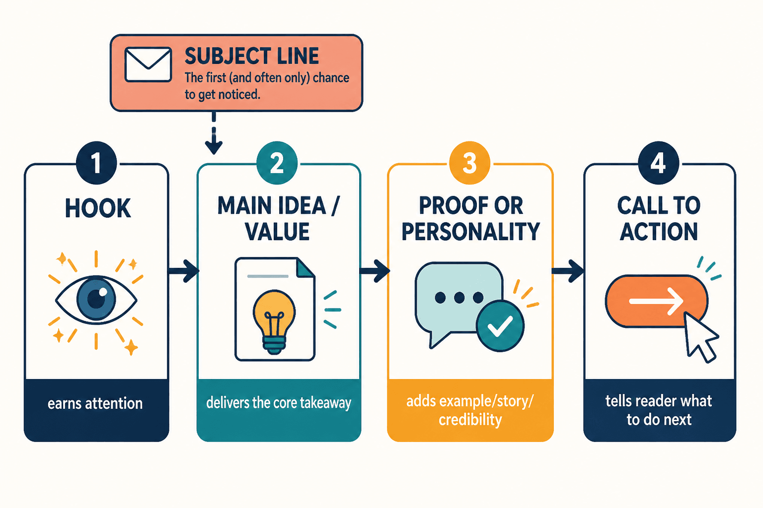
Not every newsletter needs every possible block. But most effective issues use some version of the same core parts:
- Subject line: earns the open.
- Opening line or intro: tells the reader why this email matters now.
- Main idea section: delivers the central point, lesson, opinion, or update.
- Supporting section: adds proof, context, an example, or a second useful idea.
- Curated links or resources: gives the reader something to explore, save, or click.
- Personal note or behind-the-scenes section: adds voice, trust, or a human edge when it genuinely helps.
- Call to action: tells the reader what to do next, if anything.
The list looks simple because it should. Complexity is not the same thing as quality. A clear newsletter format usually beats a clever one that needs a diagram and a strong coffee.
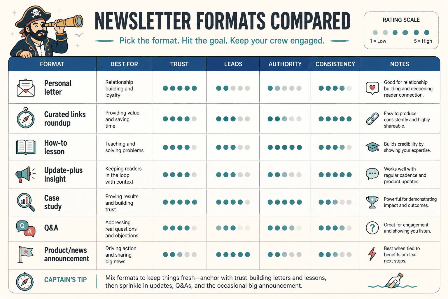
How to choose the right newsletter format
The right format depends on what the email is supposed to do. If the issue is meant to teach, it should not read like a casual link roundup. If it is meant to drive clicks, it should not bury the action under three paragraphs of setup. If it is meant to build trust, it needs a structure that feels human, not assembled from a template library with a confidence problem.
Choose based on reader intent
Ask what the reader came to the email for:
- Quick clarity: use a short one-idea format.
- Useful browsing: use a note-plus-links or resource-led format.
- Deeper thinking: use an opinion, lesson, or breakdown format.
- Relationship building: use a story-driven or behind-the-scenes format.
The email should match the reading mode. A busy reader on mobile does not need a five-act structure. They need a clean path from first line to payoff.
Choose based on your strength
A format is easier to sustain when it fits how you naturally think. Some writers are strongest at concise teaching. Others are better at pattern-spotting, commentary, or story. Pick a structure that lets your actual strengths show up without forcing every issue into the same shape.
This is where better newsletter issue formats for personal brands becomes useful as a companion read. It helps with choosing repeatable issue shapes that do not collapse after week three.
Choose based on the job of the email
Different jobs want different formats:
- Teach one thing: one idea, one takeaway, one next step.
- Share perspective: opinion, example, application.
- Drive action: short setup, clear offer, obvious CTA.
- Build trust: a grounded story with a useful lesson.
- Send readers onward: resource block with specific context.
When the job is clear, the format gets easier. When the job is fuzzy, the email tends to become “a little of everything,” which is another way of saying “none of the important thing.”
How to make each newsletter section work better
Once the format is chosen, the real work is section-level clarity. Each block should do one job cleanly and then get out of the way.
1. Write a stronger opening line
A weak opening usually starts too late, too vaguely, or too politely. The first line should not clear its throat for three sentences before saying anything useful. Open with the point, the tension, the mistake, or the contrast.
Example pattern:
- Weak: “Today I wanted to share a few thoughts about newsletter writing.”
- Stronger: “A newsletter can be perfectly written and still fail if the format makes the reader work too hard.”
That kind of opening gives the reader a reason to keep going. It also gives the rest of the section a job to do.
If you want more patterns, the sibling guide on how to start newsletter sections and formats without a weak opening goes deeper on this.
2. Keep the main idea section focused
The main idea section should not become a parking lot for every related thought. Give it one clear claim or takeaway, then support that claim with the shortest useful explanation. If the section starts wandering, the reader stops knowing what to remember.
A strong main section usually has:
- a clear claim
- one example or proof point
- a simple implication for the reader
That is enough. The internet will survive without the fourth tangent.
3. Make supporting sections earn their space
Supporting sections often become filler because they are added as “extra value” without a clear purpose. Instead, decide whether the section is there to:
- show evidence
- add a second angle
- clarify a nuance
- create momentum toward the CTA
If a support block does not do one of those things, it probably just wanted attention.
For a deeper reset on this kind of block, see how to improve newsletter resource blocks without sounding generic.
4. Keep resource blocks specific
Resource sections get generic fast because they are often written like announcements instead of recommendations. “Check this out” is not enough. Tell the reader why the resource matters, who it is for, and what they will get from it.
Better resource block formula:
- Name the item.
- Say why it matters.
- State the benefit or use case.
Specificity beats hype. Every time.
5. Use personal notes only when they add something
A personal note or behind-the-scenes section should not be there just to sound warm and human. It needs to reveal something useful: a decision, a tradeoff, a lesson, or a context point that improves the reader’s understanding of the main topic.
If it does not change how the reader sees the issue, it is probably just decorative sincerity.
How to keep newsletter sections from sounding generic or robotic
Newsletter copy starts sounding fake when the structure is doing all the talking. The transitions are too smooth, the sections are too symmetrical, and every paragraph feels like it was taught the same corporate manners.
There are a few reliable fixes:
- Start with the job of the section, not the label.
- Use natural section lengths instead of forcing every block to match.
- Cut filler transitions that only exist to sound polished.
- Vary rhythm across issues so the format feels alive, not stamped.
That is also why a section can sound “boring” even when it is technically correct. It is not always a wording problem. Sometimes it is a format problem wearing neutral colors.
If that is the problem you are seeing, the companion article on how to rewrite boring newsletter sections and formats is the next sensible stop.
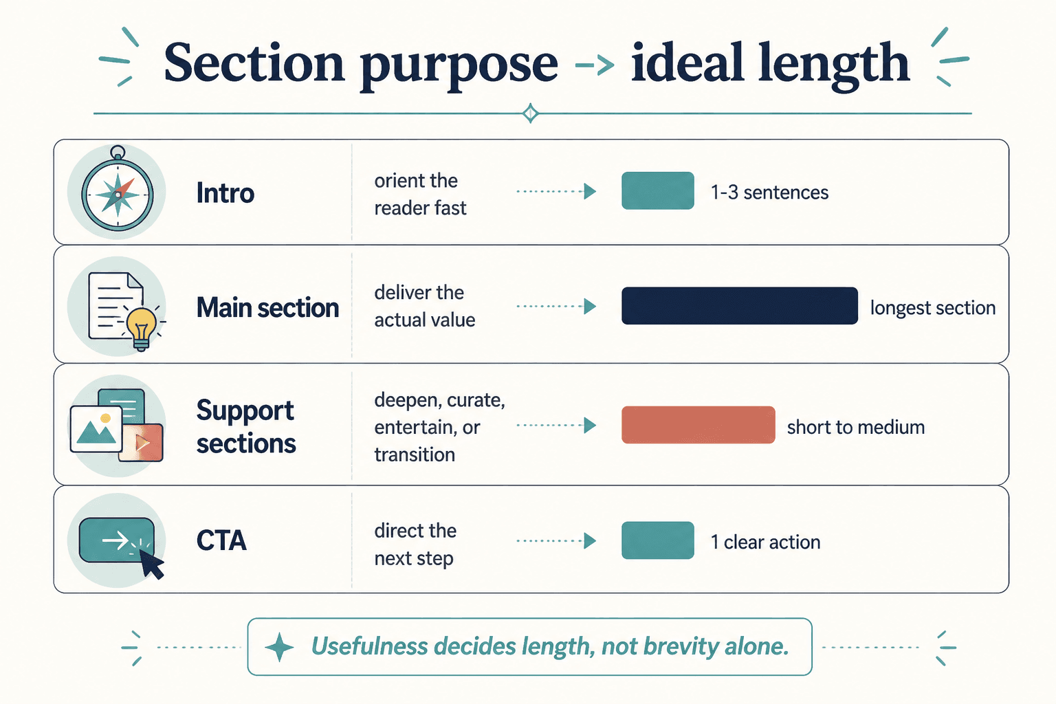
How long should newsletter sections be?
Length is not a style preference in the abstract. It is a function of purpose. A section should be as long as it needs to be to complete its job and no longer. Longer paragraphs do not automatically mean more value; often they just mean more chances for the reader to drift off and check something else.
Use these rough guides:
- Openings: usually short and direct.
- Main idea sections: long enough to make the point clearly, short enough to stay tight.
- Resource blocks: brief, specific, and scannable.
- Story sections: only as long as the tension and lesson require.
- CTAs: almost always shorter than people think.
Short sections often win when the point is simple, the audience is mobile, the format repeats weekly, or the goal is click-through. Longer sections make sense when the idea needs context, the reader already trusts you, or the nuance is the actual value.
For a more exact framework, see how long newsletter sections and formats should be in 2026.
Common newsletter section formats that work well
Not every newsletter needs a dramatic structure shift. In many cases, the best move is choosing a cleaner repeatable format and using it consistently.
- The one-idea email: one point, one example, one takeaway.
- The note plus links format: a short personal opening followed by curated resources.
- The recurring column format: a familiar weekly structure readers can recognize quickly.
- The story-driven lesson: a small story that leads to a practical point.
- The quick breakdown: problem, explanation, action.
For small audiences especially, simple formats tend to outperform clever ones. They are easier to write, easier to scan, and easier to repeat without needing a full production crew. The companion guide on newsletter sections and formats for creators with small audiences covers that angle well.
If you are working with a newsletter that leans story-heavy, the article on story section mistakes that hurt performance is also worth a look.
A quick checklist for better newsletter sections and formats
- Does the opening say something useful quickly?
- Does each section have one clear job?
- Does the format match the email’s purpose?
- Is there any section that exists mainly out of habit?
- Would this issue be easier to read if one block were cut?
- Does the CTA feel like the natural end of the email?
- Does the structure help the reader move, or just help the draft look complete?
If the answer to the last question is “mostly the second one,” the format needs work.
A note on using outside sources wisely
If you want more context on email structure and readability, it helps to borrow from primary sources rather than content-mill advice. Mailchimp’s guidance on newsletters, for example, is useful for general email best practices, and Google’s bulk sender guidelines are worth knowing if deliverability matters. For accessibility, the W3C guidance on images is a solid reference when you are using visuals inside content-heavy emails.
Bottom line
Better newsletter sections and formats are not about making the email fancier. They are about making the structure do its job cleanly: open well, deliver value, keep momentum, and end with a clear next step. When each section has one purpose and the format matches the email’s goal, the whole issue feels sharper without trying so hard to impress anyone.
If you want to keep building the system, move next through the parent guide and the related sibling pieces on openings, resource blocks, story sections, length, and conversion. Structure is the unglamorous part of good writing. It is also the part that makes the rest work.