
Most newsletter sections do not become boring because the writer has nothing to say. They become boring because the format starts doing the thinking.
You get a familiar structure, fill in the expected boxes, and suddenly the whole thing reads like a polite container for information nobody feels excited to open. “Editor’s note.” “Top links.” “Quick updates.” “Thoughts.” Fine. Functional. Also a little dead behind the eyes.
If you want to know how to rewrite boring newsletter sections and formats, the fix is usually not “be more creative.” It is more practical than that. You need to tighten the purpose of each section, sharpen the framing, vary the rhythm, and stop using formats that make everything sound equally important.
Here’s how to make your newsletter feel more useful, more readable, and much less like it was assembled from a template that once attended a branding webinar.
For the full path around this topic, head to the parent guide.
Why newsletter sections get boring in the first place
Boring sections usually come from one of five problems:
- The section has no clear job
- The label is generic and lifeless
- The writing starts too slowly
- Every section uses the same tone and length
- The format was copied from someone else without asking if it fits your audience
This is why a newsletter can be technically fine and still feel stale. The information may be useful. The structure may even be organized. But the reader experiences it as flat because nothing has shape, tension, or priority.
A good newsletter format does not just store content. It helps the content land.
If every section sounds equally mild, the whole newsletter starts to feel optional.
Start by rewriting the job of each section
Before you rewrite any wording, rewrite the purpose.
Most weak newsletter sections are vague containers. They exist because newsletters are “supposed” to have them, not because they help the reader move through the email in a useful way. So the first question is not “How do I make this section sound better?” It is “What is this section doing here?”
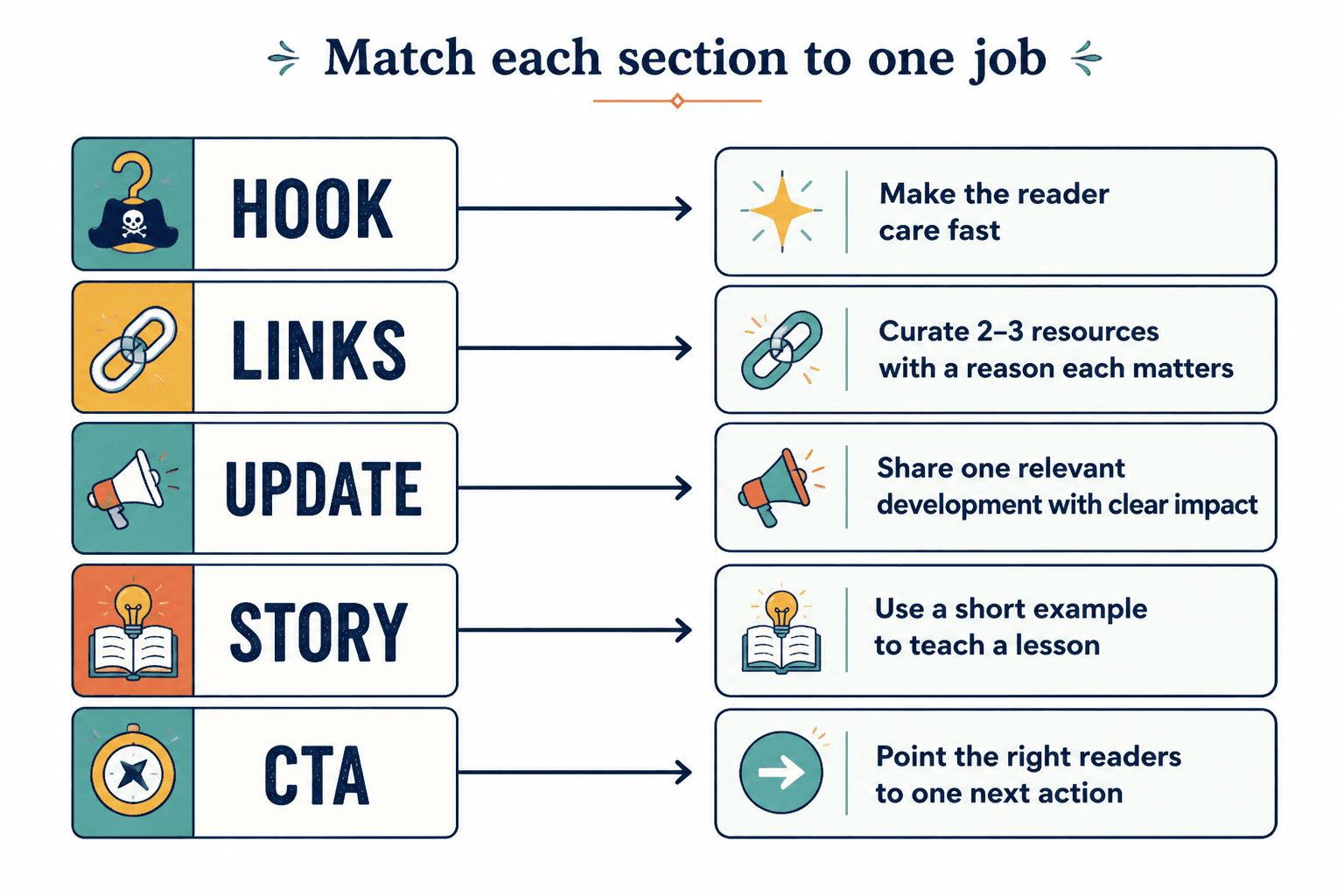
Give each section one primary job:
- Open with a sharp idea
- Teach one useful thing
- Share a story with a point
- Curate resources worth clicking
- Offer a next step
- Build trust through proof, opinion, or relevance
If a section is trying to do three jobs at once, it usually does none of them well.
| Weak section job | Better section job |
|---|---|
| “Intro” | Frame the issue and make the reader care fast |
| “Links” | Curate 2–3 resources with a reason each matters |
| “Update” | Share one relevant development with clear impact |
| “Story” | Use a short example to teach a lesson |
| “CTA” | Point the right readers to one next action |
That one shift fixes a lot. It becomes much easier to rewrite a section once you know what the section is supposed to accomplish.
For more on building better section logic in general, it helps to review broader email newsletter writing guidance and the parent topic on newsletter sections and formats.
Cut the labels that make everything sound generic
Section labels matter more than people think. A lazy label lowers energy before the reader even reaches the first sentence.
That does not mean every heading needs to be quirky. Please do not turn your newsletter into a personality test with six mysterious section names. It means your labels should help the reader understand what they are about to get and why it is worth reading.
Weak labels vs stronger labels
- Weak: Thoughts
Better: One idea worth stealing this week - Weak: Resources
Better: Three useful links if you create content for a living - Weak: Update
Better: What changed and why it matters - Weak: Story time
Better: A quick example of this going wrong - Weak: Takeaway
Better: What to do with this
Notice the pattern. The stronger labels are more specific, more reader-aware, and less in love with themselves.
If your current section names feel bland, you do not need to become clever. You need to become clearer.
Rewrite the opening line inside each section
A lot of newsletter sections are not boring all the way through. They are boring at the top, which is enough to lose people.
Many writers waste the first line of a section on warm-up language:
- “This week I wanted to talk about…”
- “Here are a few things I have been thinking about lately…”
- “I thought it might be helpful to share…”
- “One thing that has been on my mind is…”
That is throat-clearing. It slows the section down before it even begins.
Instead, open with the point, the tension, the surprising detail, or the useful claim.
Before and after: section opener rewrites
Before: This week I wanted to talk about why consistency matters in email marketing.
After: Consistency matters in email marketing, but not for the reason people usually say. The real benefit is that readers learn what kind of value to expect from you.
Before: Here are some links I found interesting this week.
After: Three links worth your time if you are trying to make your newsletter sharper, not just longer.
Before: I thought I would share a quick story from a recent client conversation.
After: A client recently showed me a newsletter with solid advice and miserable click-through. The problem was not the ideas. It was that every section sounded equally unimportant.
If opening lines are a recurring issue, read how to start newsletter sections and formats without a weak opening. That is often where the rot begins.
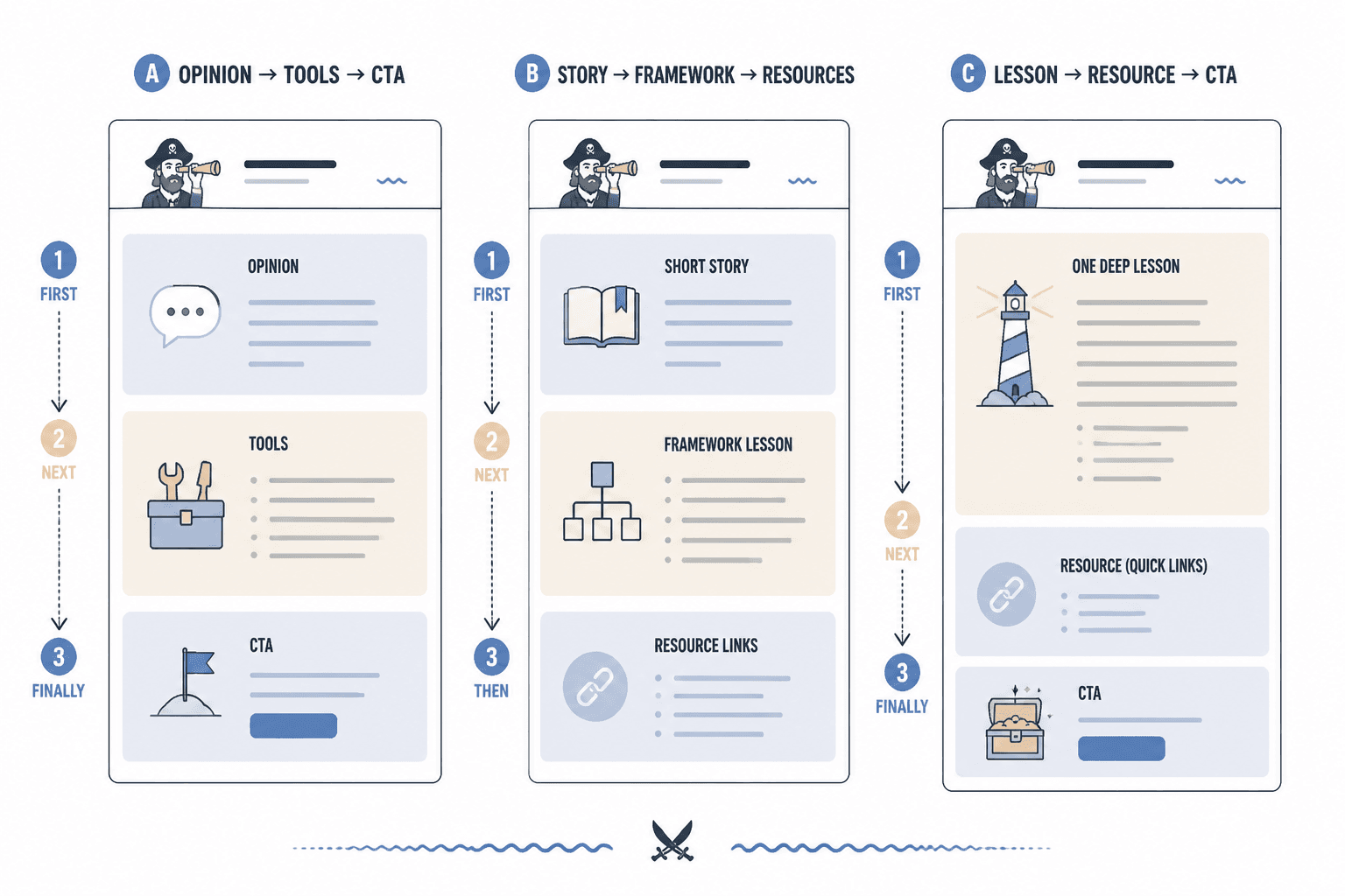
Stop using the same format for every issue
Consistency is useful. Repetition is not automatically useful.
A rigid format can make writing easier, but it can also sand down your voice and flatten reader interest. If every issue has the exact same section order, same section length, same heading style, and same emotional tone, readers start skimming by habit.
You do not need chaos. You need controlled variation.
What to keep consistent
- Your overall promise
- Your point of view
- Your visual cleanliness
- Your broad content pillars
- Your CTA style
What to vary on purpose
- Section order
- Section length
- The lead section type
- The balance of teaching, curation, and story
- The intensity of the issue
For example, one issue might open with a sharp opinion and then move into tools. Another might open with a quick story and then teach a framework. Another might be mostly one strong lesson with a very short resource block. Same newsletter. Better pacing.
Readers usually do not need your format to be identical. They need it to be recognizable and worth the click.
Use contrast so sections do not blur together
One of the easiest ways to rewrite boring newsletter formats is to create contrast between sections.
If every block is the same length, same style, and same energy level, the email feels monotonous even when the content is decent. Contrast gives the reader a sense of motion.
You can create contrast through:
- Length: one deeper section followed by two short hits
- Tone: one serious insight followed by a lighter observational note
- Function: teach, then curate, then prompt action
- Format: paragraph, bullets, short example, CTA
- Specificity: broad principle followed by a concrete example
This is not just about style. It improves comprehension. Readers can feel where they are in the email and what kind of attention each section requires.
Rewrite bloated sections into cleaner formats
Some sections are boring because they are too weak. Others are boring because they are too swollen.
If a section rambles, repeats, or wanders through six sub-points, the rewrite may require changing the format entirely. Not every idea deserves a full essay block.
Common bloated sections and better alternatives
| Boring format | Rewrite it as |
|---|---|
| Long intro paragraph with no tension | 2–3 short paragraphs with a direct claim |
| Five loosely related links | Three links with one-line context each |
| Rambling founder update | What changed / why it matters / what’s next |
| Overlong story with delayed lesson | Short story + immediate point |
| Big advice dump | Numbered checklist or quick framework |
A cleaner format creates discipline. It forces the section to earn its space.
This is especially useful for resource blocks, which often become generic little piles of links. If that section is dragging, see how to improve newsletter sections and formats resource blocks without sounding generic.
A simple rewrite process for boring newsletter sections
When a section feels dull, use this five-step rewrite process.
- Find the actual point. What is the reader supposed to understand, feel, click, or do?
- Cut the warm-up. Remove any sentence that merely announces the section.
- Add specificity. Replace vague claims with examples, stakes, or contrast.
- Choose the right format. Paragraph, bullets, mini case study, checklist, curated links, or short Q&A.
- Tighten the ending. Land the point cleanly instead of fading out.
Here is a quick example.
Original section:
Today I wanted to share a few thoughts on subject lines. They are really important and can have a big impact on open rates. I have been testing some different approaches lately and noticed some interesting things. The main thing is that it helps to be clear and not too clever. You want people to know what they are getting.
Rewritten section:
Most weak subject lines are not too short. They are too foggy. If readers cannot tell what they are opening, “clever” usually just means ignorable. A better rule: make the benefit or tension obvious first, then add personality if it actually helps.
Shorter. Sharper. Same basic idea. Much better delivery.
Better newsletter section formats you can steal
If your current structure feels stale, here are some formats that tend to work well for creators, consultants, coaches, writers, and personal brands.
1. The main idea + practical takeaway
Format: One opinion or lesson, followed by a simple application.
Why it works: It respects the reader’s time and gets to the point fast.
Example structure:
- The idea
- Why people get it wrong
- What to do instead
2. The quick case study
Newsletter structure works best when each section has one clear job and supports the main point of the issue. Simpler formats usually outperform busier ones when the writing stays sharp.
Newsletter structure works best when each section has one clear job and supports the main point of the issue. Simpler formats usually outperform busier ones when the writing stays sharp.