
Newsletter sections that are arranged badly do more than look untidy. They waste trust, create weak leads, and make sales harder by forcing every block to compete for attention instead of moving a reader toward one useful next step. A newsletter can be perfectly readable and still underperform if the section structure and the offer are pointing in different directions.
That is the basic problem this guide solves. Once you treat each section as a conversion job-not just a content block-you can match the format to the right CTA, the right offer, and the right level of pressure. The result is less decorative email work and more useful movement: replies, signups, bookings, downloads, or purchases.
If you want the structural side first, start with the parent guide on newsletter sections and formats. For the editorial version, see how to write better newsletter sections and formats. If you want examples before strategy, the sibling guide on best newsletter sections and formats ideas and examples for creators is the cleaner place to browse.
Newsletter sections are conversion jobs, not just layout choices
A section only earns its spot if it does a job. That job might be trust-building, authority-building, lead capture, product education, reply generation, or direct sales. When a newsletter section tries to do all of those at once, it usually does none of them well.
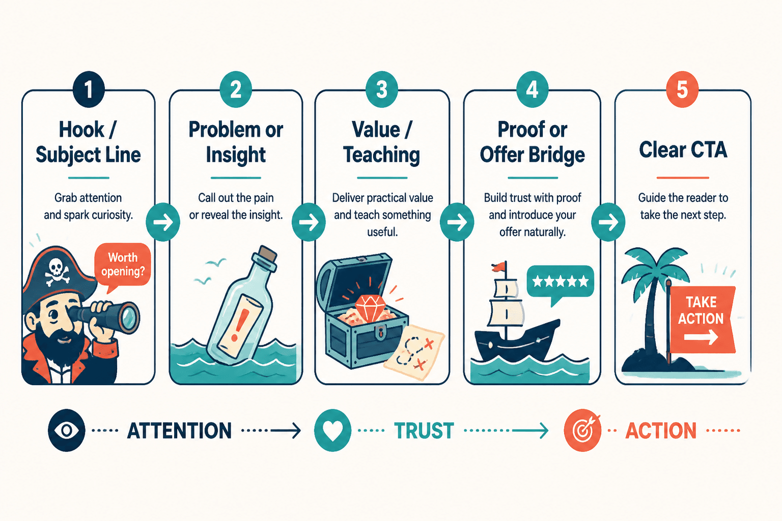
Think of the structure this way:
- Hook earns attention.
- Point earns relevance.
- Support earns belief.
- Payoff earns momentum.
- CTA earns the next step.
That sequence is simple on purpose. Readers do not need a complicated funnel dissertation in their inbox. They need a path that feels like, “This made sense, so the next click also makes sense.”
For a broader funnel view, the companion post Best Funnel Ideas to Pair With Newsletter Sections and Formats shows how section types map to funnel stages. That matters because the wrong CTA in the wrong section is how a decent newsletter starts acting like a confused sales page in a trench coat.
How to match section type to the right business outcome
The fastest way to improve conversion is not to add more promos. It is to match the section’s natural purpose to the business action you want.
Use this basic rule:
- Trust-first sections should invite replies, follows, or soft opt-ins.
- Teaching sections should lead to templates, lead magnets, or deeper education.
- Proof sections should lead to services, audits, consults, or product demos.
- Resource sections should lead to curated offers, affiliate clicks, or archives.
- Opinion sections should lead to community, membership, or authority-building offers.
That is the difference between “monetizing a newsletter” and “bolting a sales pitch onto whatever happened to be written that week.” One feels aligned. The other feels like somebody remembered revenue at the last possible second.
Best ways to monetize or convert each section without wrecking trust
1. Personal note or founder-style intro → reply funnel or relationship funnel
Personal notes work best when they sound human first and promotional second. The point is not to fake intimacy. The point is to create context. A short observation, a small lesson, or a sharp takeaway can naturally lead to a reply prompt, a question, or a low-friction invitation to learn more.
Good CTAs for this section:
- Reply with a question
- Join the list or segment for a specific topic
- Read a related guide
- Download a lightweight resource
Bad move: turning the intro into a disguised pitch deck. Readers are not stupid. They can smell the “by the way, buy my thing” pivot from several paragraphs away.
2. How-to section → lead magnet or template funnel
How-to sections are conversion-friendly because they create immediate utility. If the reader just learned something practical, the next logical step is often a tool that saves time, reduces friction, or helps them apply the idea faster.
Best conversion plays for how-to sections:
- Checklist
- Template
- Swipe file
- Worksheet
- Mini course
Example: a newsletter section about writing better subject lines can naturally point to a subject-line template pack or a deeper guide. The offer is not random. It is the continuation of the lesson.
3. Case study section → consult call, audit, or service funnel
Case studies create proof, which is the most valuable conversion asset in the newsletter. When a section shows a process, outcome, or before-and-after change, it creates a bridge between “this is interesting” and “this could work for me.”
Best conversion plays for case study sections:
- Consultation call
- Audit
- Service page
- Product demo
- Testimonials or proof-driven landing page
This is also where you should be careful not to over-explain. A case study section does not need a courtroom transcript. It needs enough evidence to make the next click feel sensible.
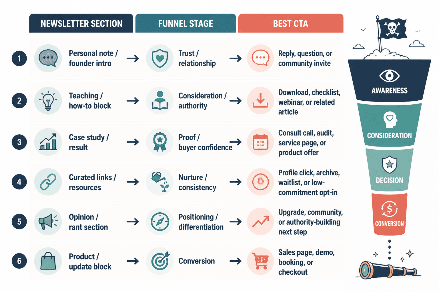
4. Curated resources section → archive, profile, or nurture funnel
Curated links are easy to underestimate because they look lightweight. In practice, they can be excellent for nurturing, internal traffic, and affiliate or partner monetization when used honestly.
Best conversion plays for curated sections:
- Archive page
- Resource library
- Partner offer
- Relevant tool recommendation
- Deeper topic hub
Keep this section selective. Curated links work when they feel like a filter, not a landfill. The reader should think, “That saved me time,” not “I have been handed the internet in no particular order.”
5. Opinion or rant section → authority funnel or community funnel
Opinion sections can convert well because they sharpen positioning. A clear stance attracts the right readers and repels the wrong ones, which is extremely useful if your business depends on fit.
Best conversion plays for opinion sections:
- Community signup
- Membership
- Premium newsletter
- Founder-led offer
- Topical lead magnet
The trick is to avoid mistaking volume for conviction. Loud is not the same as persuasive. A good opinion section says something useful enough that the CTA feels like a natural extension of the viewpoint.
Where to place the CTA so it feels earned
Placement matters because readers do not experience newsletters as a spreadsheet. They experience them as momentum. If the CTA appears before the section has done its job, it feels pushy. If it appears too late, it gets buried under good intentions.
Use one of these patterns:
- Inline CTA: place it right after the key teaching point.
- End-of-section CTA: use it after proof, takeaway, or example.
- Soft bridge CTA: use a short transition sentence before the offer.
- Two-step CTA: ask for a reply or click first, then move to a higher-commitment offer later.
For most newsletters, the best CTA is the one that requires the least narrative gymnastics. A clean transition beats a clever one most of the time.
Example transitions that work:
- “If you want the template, it is here.”
- “If this is useful, the next step is the full guide.”
- “If you want help applying this, book the audit.”
- “If you want more examples like this, join the list.”
How to monetize without making the newsletter feel cheap
The trust issue is real. Readers will tolerate offers. They will even welcome them when the offer clearly follows the section. What they resent is surprise monetization that interrupts the article’s own logic.
A few practical guardrails:
- Do not monetize every section the same way.
- Do not place a hard sell inside a section that is still trying to build trust.
- Do not use affiliate links or promos as filler.
- Do not make every CTA sound urgent unless it actually is.
- Do keep the offer relevant to the section’s job.
This is especially important if you are pairing the newsletter with broader monetization work. The guide on how to monetize newsletter sections and formats without wrecking trust goes deeper on which parts of the newsletter can handle direct revenue and which parts should stay mostly editorial.
What to measure so you do not confuse attention with revenue
Open rates and clicks can tell you something, but they are not the whole story. A section that gets opened and admired is not automatically converting. It may just be politely entertaining people before they leave.
Track the metrics that match the CTA:
- Replies for relationship or research-driven sections
- Clicks for resource, lead magnet, and offer links
- Signups for list-building or segment growth
- Bookings for service and consult funnels
- Sales for direct product or membership offers
Then compare performance by section type. That will usually tell you more than a single overall newsletter average ever will.
For benchmarking email behavior and deliverability basics, the Campaign Monitor email marketing benchmarks and MailerLite’s email marketing statistics are useful starting points. For landing page and conversion clarity, Google’s own landing page experience guidance is a reminder that relevance and consistency still matter when the click lands somewhere else.
A simple optimization workflow
You do not need to rebuild the entire newsletter every time. Start with one section, one offer, and one measurable outcome.
- Pick a section that already performs reasonably well.
- Identify its real job: trust, teaching, proof, curation, or opinion.
- Choose the CTA that fits that job.
- Place the CTA where the section has earned the ask.
- Send the issue and measure the result.
- Change one thing at a time on the next send.
That process is unglamorous, which is usually a sign it will work.
Quick checklist
- Does the section have one primary job?
- Does the CTA match that job?
- Does the offer feel like the next step, not a left turn?
- Does the section build enough trust before asking for action?
- Are you measuring the right conversion outcome?
- Would the same section still work if the CTA changed?
Final takeaway
Newsletter sections and formats turn into leads or sales when they stop behaving like interchangeable blocks and start behaving like a sequence with purpose. Match the section to the funnel stage, match the CTA to the reader’s momentum, and protect trust by keeping the offer relevant.
That is the whole trick. Not more pressure. Better fit.
If you want the structural overview again, go back to the parent guide on newsletter sections and formats. If you want the editorial side next, continue with how to write better newsletter sections and formats.