AI visuals can absolutely help a sales page. They can also quietly wreck it.
The problem is not that people are using AI-generated images. The problem is that they are using them like decorative wallpaper, brand cosplay, or cheap stand-ins for proof. Then they wonder why the page looks polished but converts like a damp napkin.
AI Image Use Cases for Sales Page Visuals: Mistakes That Hurt Performance is really about one thing: knowing where AI visuals help clarity, trust, and momentum, and where they make your page feel vague, fake, or weirdly slippery.
If your sales page needs better visuals, the goal is not “make it prettier.” It is to make the offer easier to understand, easier to trust, and easier to act on. AI can help with that. But only if you stop asking it to do jobs it is bad at.
For the full path around this topic, head to the parent guide.
What sales page visuals are actually supposed to do
A lot of visual mistakes happen because people think images are there to “add polish.” That is not the job.
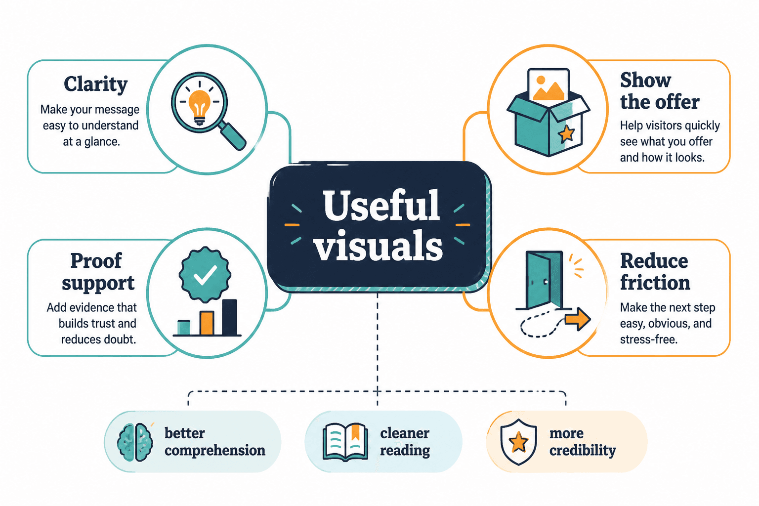
Good sales page visuals usually do one or more of these things:
- Clarify what the offer is
- Show what the buyer gets
- Support a claim with proof
- Reduce friction or confusion
- Create a cleaner reading experience
- Make the page feel credible and coherent
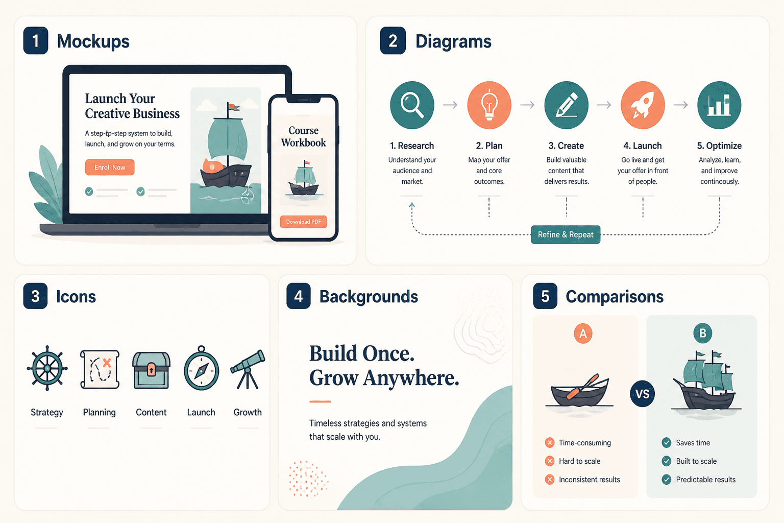
That means the best AI image use cases for sales page visuals are usually practical, not dramatic. Think diagrams, process graphics, mockups, comparison visuals, section dividers, icon systems, and simple conceptual support. Not haunted corporate stock people smiling at a laptop like it just revealed the meaning of life.
When visuals are doing real work, performance tends to improve because comprehension improves. When visuals are just there to fill space, they often distract from the copy, muddy the promise, or make the page feel less trustworthy.
The biggest mistake: using AI images as fake proof
This is the one that hurts most.
If your sales page needs testimonials, product screenshots, client examples, results, behind-the-scenes process, or real interface views, AI should not be inventing those. Once a visual starts implying evidence, it enters trust territory. And trust is not the place to get cute.
People can forgive a conceptual hero image. They do not forgive feeling misled.
Bad examples:
- Fake dashboard screenshots for a product that does not exist yet
- AI-generated “client scenes” that imply customer success stories
- Invented book covers, templates, or worksheets that are not actually included
- Fake team photos for a solo business trying to look larger
- Mock testimonials designed to look real at a glance
Even if you are not technically lying, you are still introducing suspicion. And once a buyer starts squinting at your page, your conversion rate usually does not send a thank-you card.
If the visual is meant to prove something, use the real thing. AI can help you frame it, clean it up, crop it, or turn it into a better layout. It should not be fabricating the evidence.
Better approach
- Use real screenshots of the product, portal, dashboard, workbook, or deliverables
- Turn actual testimonials into designed quote blocks
- Use AI-generated background elements or layout support around real proof
- Use annotated screenshots to make the proof easier to follow
If you are building a broader workflow around this, the ideas in AI image use cases are a better foundation than treating AI visuals like a trust costume.
Mistake #2: making the visuals more abstract than the offer
Some offers are already intangible. Strategy. Coaching. Consulting. Messaging. Templates. Education. If the offer lives in someone’s head, your sales page has to work harder to make it concrete.
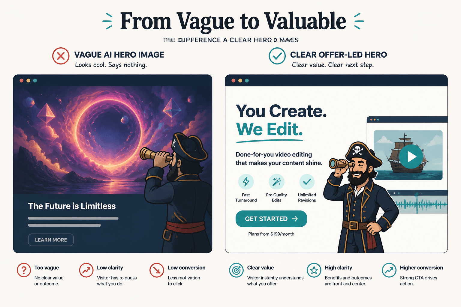
That is why overly abstract AI art often backfires. If your offer is already hard to picture and your visuals are a glowing staircase in a lavender cloud, you have managed to make the whole thing less understandable. Impressive, in the wrong direction.
Common offenders:
- Cosmic portals for mindset offers
- Floating chess pieces for strategy services
- Generic futuristic interfaces for practical business tools
- Dreamy symbolic portraits that explain nothing
- Random metaphor images repeated across every section
AI visuals work better when they reduce abstraction instead of adding more of it. For example, if you sell a messaging package, show a mockup of the messaging framework, a before-and-after homepage header, or a visual process map. If you sell a course, show the modules, workbook pages, lesson snapshots, or student path.
The more invisible the transformation, the more your visuals should make it visible.
Mistake #3: using AI hero images that look expensive but say nothing
The hero section is not where you win design points for mood. It is where you help a visitor answer three questions fast:
- What is this?
- Is it for me?
- Why should I care right now?
A lot of AI-generated hero images fail because they are visually loud and strategically empty. They pull attention but do not support the headline, the offer, or the CTA.
If the hero image disappeared and nothing about the offer became less clear, that image probably was not helping.
What works better in a hero section
- Clean product or deliverable mockups
- A simple visual showing the system, framework, or result
- A tasteful conceptual image that directly supports the promise
- A real photo of the creator, if trust and personality matter to the sale
- A comparison graphic showing before vs after state
For many service pages, a strong headline and clean layout do more than a giant AI-generated scene ever will. Not every page needs a cinematic visual. Sometimes restraint converts better than spectacle. Annoying, I know.
Mistake #4: inconsistent style that makes the page feel stitched together
One section has glossy 3D icons. Another has soft watercolor blobs. Then there is a hyper-real businesswoman with six fingers. Then a minimalist line graphic. Then a faux app screen. This is not a visual system. This is a yard sale.
AI makes it very easy to generate visuals quickly. It also makes it very easy to create a page that looks like five different brands got into an argument.
When your visual style jumps around, it creates low-level friction. The page feels less intentional. Less premium. Less believable. People may not consciously identify the problem, but they feel it.
Keep these elements consistent
- Color palette
- Lighting and realism level
- Illustration style
- Shape language
- Icon style
- Device mockup treatment
- Background texture and contrast
If you are using AI image generation for a sales page, build a mini visual system first. Decide the style rules before you start making assets. Otherwise the page ends up looking “creative” in the same way an unassembled wardrobe looks like furniture.
Mistake #5: choosing polished visuals that overpower the copy
Sales pages do not convert because the graphics are gorgeous. They convert because the message is clear, relevant, credible, and easy to act on.
Sometimes AI visuals are so dramatic that they hijack attention from the actual argument. The page starts feeling like a portfolio piece instead of a decision-making tool.
This shows up when:
- Each section opens with a large decorative image that adds no meaning
- The visual contrast is stronger than the CTA contrast
- The page becomes image-heavy and scan-light
- Important proof gets buried below design flourishes
- Readers have to work harder to find the actual offer details
A good rule: visuals should support reading flow, not interrupt it every 300 pixels like an attention-hungry toddler.
If your page is long-form, keep asking: does this visual move the sale forward, or is it just announcing that you have access to image tools?
Mistake #6: using AI visuals where screenshots or diagrams would work better
This is one of the most fixable mistakes, because the solution is usually simple.
People reach for AI-generated scenes when what the page really needs is a screenshot, a labeled mockup, a process diagram, a feature callout, or a side-by-side comparison. In other words, they choose “pretty” over useful.
Here is a cleaner way to think about it:
| Page need | Usually better visual choice |
|---|---|
| Show what is included | Mockup of actual deliverables |
| Explain process | Simple step diagram |
| Show interface or member area | Real screenshots |
| Highlight transformation | Before/after comparison |
| Support a conceptual section | Simple AI illustration or icon-led visual |
| Break up long text sections | Light branded graphic, not giant decorative art |
AI is usually strongest when used to create support visuals around the core information, not instead of it.
Mistake #7: making every visual look like stock, just more expensive stock
One of the supposed advantages of AI visuals is that you are not stuck with the same old stock image library everyone else is using. Then people generate scenes that somehow still look exactly like stock. Very smooth. Very generic. Very “professional.” Very forgettable.
If the visuals could belong to any funnel, any coach, any agency, any template shop, they are not helping your positioning much.
Better AI image use cases for sales page visuals lean into brand specificity:
- Your actual offer structure
- Your method or framework
- Your visual brand language
- Your audience’s context
- Your content format, product type, or service workflow
A creator selling swipe files should not use the same visual style as a leadership coach selling VIP days, and neither should look like a crypto dashboard startup from 2022.
The point is not to be wildly artistic. It is to be recognizably yours.
Where AI visuals actually help sales page performance
So after all that, yes, AI visuals can still be useful. Quite useful, actually. Just in the right roles.
Strong use cases
- Section support graphics: clean conceptual visuals that reinforce a section idea without pretending to be proof
- Framework diagrams: visualizing a method, system, or process in a branded way
- Offer mockups: presenting real deliverables inside polished device or document scenes
- Icon systems: creating a consistent set of visual markers for benefits, modules, or features
- Background treatments: subtle visual texture behind headlines, CTAs, or key content blocks
- Comparison visuals: showing before/after, this/not-that, or option A vs option B
- Repurposed blog-style graphics: adapted educational visuals that support authority and clarity on the page
If you want examples of practical visual formats that creators can adapt fast, this related guide on AI image use cases for blog graphics is worth pairing with your sales page thinking.
A simple filter before you add any AI visual
Before adding a visual to a sales page, run it through this quick filter:
- What job is this visual doing? If the answer is “making it look nicer,” keep going until you have a better answer.
- Does it clarify the offer? If not, it may be decoration.
- Does it imply proof? If yes, use real evidence instead.
- Does it match the page style? If not, it adds friction.
- Is it more helpful than a screenshot, diagram, or mockup? Often, it is not.
- Would the page lose anything important without it? If no, cut it.
This filter saves you from the very common trap of adding visuals because an empty spot on the page feels emotionally inconvenient.
How to use AI visuals without hurting trust
Trust is the whole game on a sales page. Not hype. Not mood. Not “premium aesthetic.” Trust.
That means your AI visuals should be honest about what they are. Supportive visuals are fine. Conceptual visuals are fine. Styled mockups are fine if they represent real assets. What gets risky is when visuals start suggesting proof, scale, product depth, or customer evidence you have not actually earned.
Practical ways to stay on the right side of that line:
- Use real testimonials, results, and screenshots wherever credibility matters
- Keep AI visuals obviously illustrative when they are not literal
- Do not fake environments, teams, or interfaces to look bigger
- Use captions or labels where clarity matters
- Pair visuals with specific copy, not vague claims
If monetization is the goal, this matters even more. You can connect visuals to conversion, but not by sanding off the truth. This guide on monetizing AI image use cases without wrecking trust goes deeper on that line.
How sales page visuals fit into the bigger funnel
A sales page does not live alone. It sits inside a funnel, even if your funnel is simple.
That matters because the visuals on the page should match the promise and tone people saw before they got there. If someone comes from a clean, practical post or email and lands on a page full of bizarre glossy AI fantasy art, the transition feels off. Off is expensive.
Your visual system should support the full path:
- Content introduces the idea
- Profile or landing page builds interest
- Sales page clarifies and proves the offer
- CTA moves them to the next decision
If you are building that path deliberately, these related reads can help: how to turn AI image use cases into more leads or sales and best funnel ideas to pair with AI image use cases.
For broader category context, you can also connect this topic with the site’s work on AI writing tools and workflows and AI image tools.
The bigger point is simple: clearer structure and clearer writing make the piece more useful. That is usually what makes the ending land better too.