The bigger point is simple: clearer structure and clearer writing make the piece more useful. That is usually what makes the ending land better too.
Most newsletter headers fail in one of two ways: they look painfully generic, or they try so hard to look “creative” that they distract from the actual newsletter.
That is where AI image tools can be surprisingly useful. Not as magic. Not as your brand strategist. Not as some one-click design savior. Just as a fast way to create simple, repeatable visual assets that make your newsletter look more considered than “I cropped a stock photo and hoped for the best.”
If you want simple AI image use cases for newsletter header templates, the goal is not to generate masterpieces. It is to build a small visual system you can reuse without eating half your week. Think cleaner headers, stronger consistency, faster production, and fewer moments of staring at Canva like it personally betrayed you.
This article will show you where AI images actually help, what kinds of header templates are worth making, how to keep them on-brand, and what to avoid if you do not want your newsletter looking like a rejected startup mood board.
For the full path around this topic, head to the parent guide.
What AI should actually do for newsletter headers
For most creators, coaches, consultants, and solo brands, newsletter headers do not need to be elaborate. They need to do three jobs well:
- Signal your brand quickly
- Make the newsletter feel intentional
- Support the issue’s topic without becoming the whole show
AI image tools are useful when they help you create visual ingredients for that system. Background textures. Simple conceptual illustrations. Reusable style variations. Topic-based header art. Light brand scenes. Not ten thousand wildly different images with no visual logic tying them together.
A good newsletter header template saves time because it reduces decisions. That matters more than artistic range. Busy creators do not need endless options. They need a dependable visual format that still feels alive.
If you want a broader look at where this fits, this guide to AI image use cases gives helpful context before you start building a template library.
Why simple header templates usually work better than fancy ones
Creators often overestimate how much visual novelty a newsletter needs. Your readers are not opening because they hope to witness a fresh act of digital collage every Thursday. They are opening for insight, updates, perspective, tools, stories, or offers.
The header should support recognition and tone. It should not behave like it is auditioning for an award.
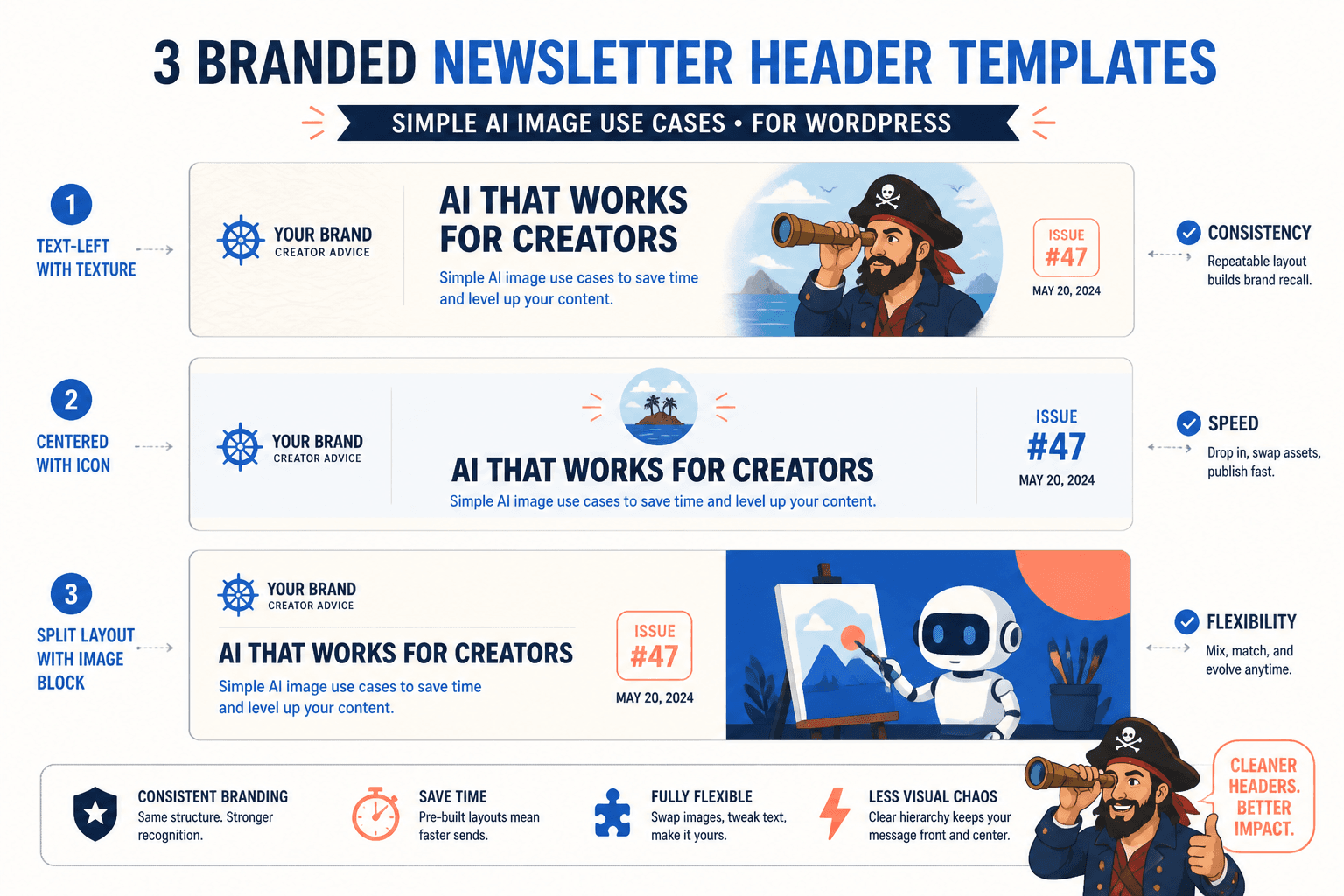
Simple templates work because they give you:
- Consistency: readers start recognizing your emails faster
- Speed: you can swap text and image elements in minutes
- Flexibility: one layout can support many topics
- Less visual chaos: your newsletter stops looking different every issue for no good reason
That last one matters. Randomness is not personality. It is usually just weak art direction wearing confidence.
7 simple AI image use cases for newsletter header templates
Here is where AI image generation is actually useful for busy creators. Not theoretically useful. Actually useful.
1. Branded background textures
This is one of the easiest wins. Use AI to create subtle background textures in your brand palette: grain, soft gradients, paper textures, light abstract shapes, blurred geometry, calm patterns, or minimal digital noise.
These work well because they do not need to carry the whole visual message. They just create atmosphere behind your title, subtitle, and issue number.
Good use cases:
- A muted editorial look for writers and consultants
- A clean modern gradient for tech or strategy newsletters
- A textured paper feel for thoughtful personal brands
- A minimal pattern for repeat weekly issues
Keep these understated. If your background is fighting your text, it is not helping.
2. Topic-based conceptual illustrations
If each issue covers a different idea, AI can help generate lightweight conceptual visuals tied to the theme. Not literal clip-art nonsense. More like visual metaphors.
For example:
- A spotlight for visibility or positioning issues
- A bridge for transitions or audience trust
- A compass for strategy or decision-making
- Stacked paper or folders for systems, workflows, or content planning
These work best when you keep the style controlled across issues. Same color treatment. Similar framing. Similar level of detail. Otherwise your newsletter starts looking like five brands got trapped in one inbox.
3. Reusable themed icon scenes
This is especially useful for newsletters with recurring categories. Say you regularly write about content strategy, AI workflows, client acquisition, audience growth, and systems. You can create one simple AI-generated visual scene per category, then reuse them in matching templates.
That gives readers subtle orientation. They begin to recognize not just your brand, but your content buckets.
Examples:
- Notebook and pencil scene for writing
- Dashboard or organized screen concept for systems
- Speech bubble or network motif for audience building
- Minimal pipeline or document flow for funnels and lead gen
This is cleaner than generating a brand new visual concept for every issue. Repetition, when done well, builds familiarity. Familiarity builds trust.
4. Stylized brand objects
Some personal brands do well with a small set of recurring visual objects: a coffee mug, glasses, laptop, mic, notebook, desk lamp, camera, pen, book stack, or studio setup. AI can help you create stylized versions of those objects in your palette and aesthetic.
This works nicely if your newsletter has a personal editorial feel and you want the headers to feel branded without requiring your face in every single issue. A lot of creators default to “I guess I need another headshot crop here,” which is not always wrong, but it gets old fast.
Objects often create a cleaner, more timeless look.
5. Minimal scene-setting images for issue mood
Sometimes the point of the header is not to explain the topic literally. It is just to establish tone. Calm. Sharp. Thoughtful. Direct. Playful but still useful.
AI can help generate simple mood-supporting scenes:
- Clean desk with negative space
- Abstract editorial composition
- Soft-lit workspace
- Minimal paper collage style image
- Monochrome scene with one accent color
This is good for essay-style newsletters, founder updates, commentary, and weekly roundups. It adds polish without forcing every issue to carry a mini poster campaign on its back.
6. Template variations for newsletter series
If you run multiple newsletter formats, AI can help you create distinct but related header families.
For example:
- Main weekly issue: bold title plus subtle abstract background
- Quick tips edition: smaller punchier layout with category icon
- Case study issue: cleaner structured header with document-style visual
- Tool roundup: grid-like visual motif or interface-inspired backdrop
The key is that these should still feel like cousins, not strangers. Shared type treatment, palette, spacing, and art direction matter more than the generated images themselves.
7. Seasonal or campaign-specific refreshes
You do not need to redesign your newsletter every month because boredom whispered in your ear. But occasional refreshes can help. AI is useful here because it can produce limited-run visual variants without requiring a full custom illustration process.
Good uses:
- Launch month visual treatment
- End-of-year recap series
- Seasonal campaign variation
- Special workshop or event edition
Keep the structure the same and just swap the visual layer. That way the newsletter still feels recognizable.
What a practical newsletter header template should include
If you want these simple AI image use cases for newsletter header templates to save time, your template should be built around repeatability. Not vibes alone.
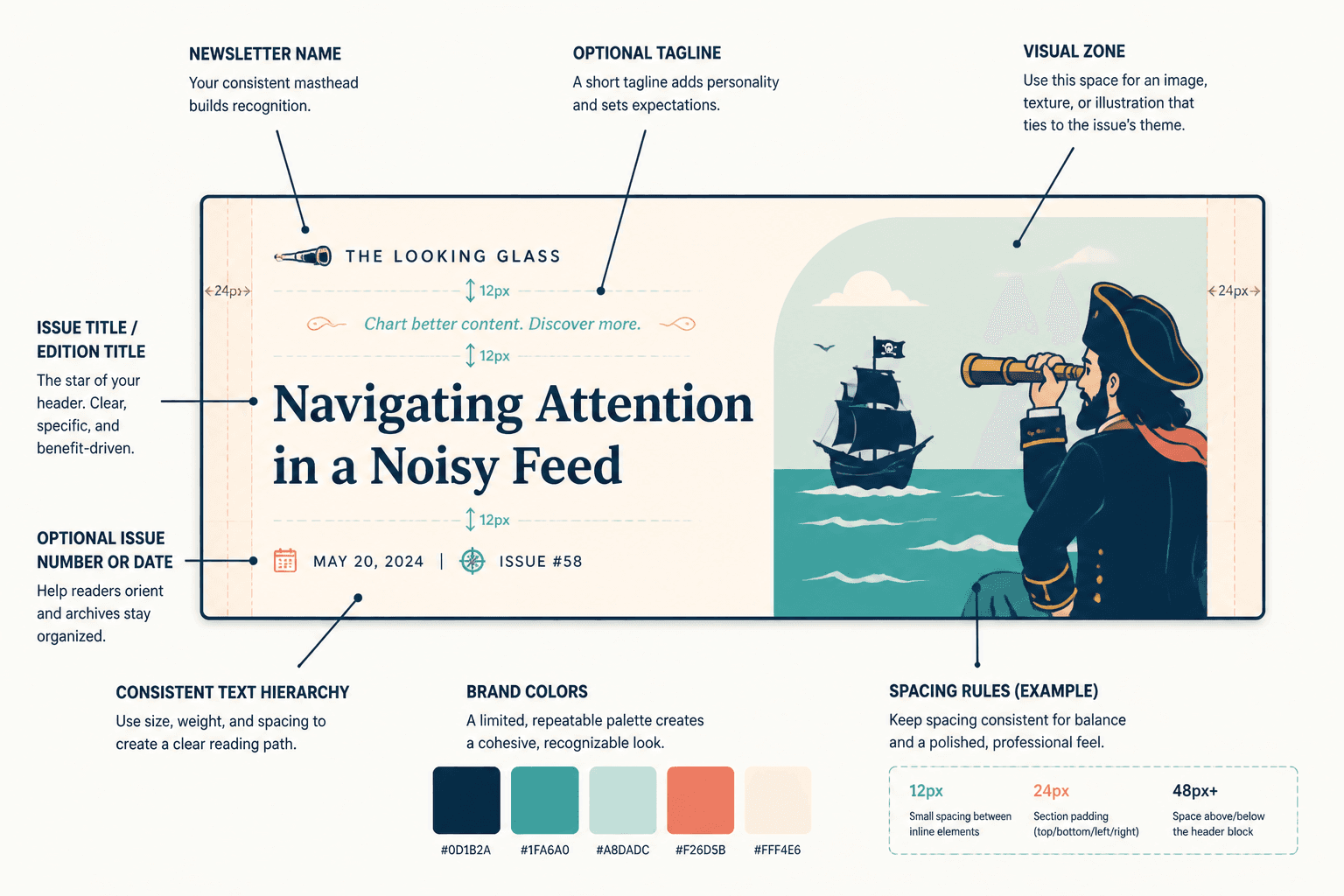
A solid header template usually includes:
- Newsletter name
- Issue title or edition title
- Optional issue number or date
- One visual zone for image, texture, or illustration
- Consistent text hierarchy
- Brand colors and spacing rules
You might also include a short tagline if it actually adds clarity. “Weekly thoughts on writing better content for smart people” is helpful. “Insights for ambitious visionaries building meaningful ecosystems” is not. That kind of line says a lot while somehow saying absolutely nothing.
Build once, then make small swaps. That is the whole point.
How to keep AI-generated headers from looking generic
This is the part people skip. Then they wonder why their newsletter suddenly looks like a very confident template from nowhere in particular.
To keep your AI-generated headers useful and branded, make decisions in advance about the visual system.
Define a few style constraints first
- Choose 2 to 4 core brand colors
- Pick one overall visual mood: editorial, modern, soft, sharp, playful, minimal
- Choose one image treatment direction: flat illustration, textured abstract, realistic minimal scene, collage, or icon-based
- Set a rule for composition: centered, left-weighted, full-bleed, framed, or floating object
Without these constraints, AI gives you variety. Which sounds fun until you need consistency.
Use prompts that describe style, not just subject
Prompting for “newsletter header about productivity” is weak. Prompting for “minimal editorial header background, muted blue and cream palette, soft paper texture, clean negative space, subtle abstract notebook motif, modern professional style” is much more usable.
You are not just asking for an image. You are art directing a component.
Standardize after generation
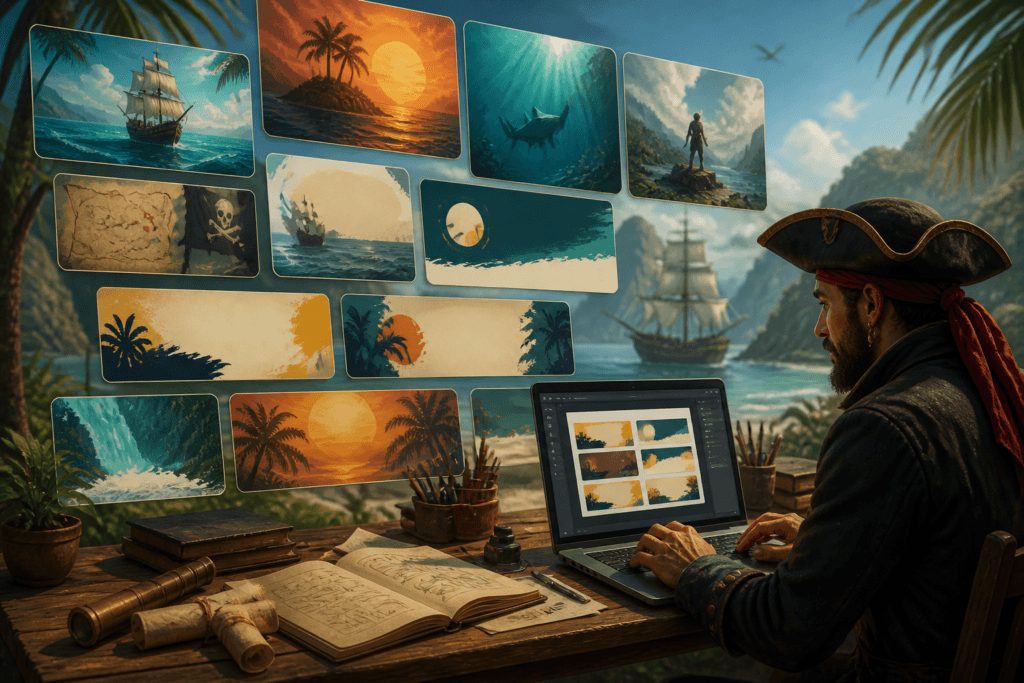
Even with good prompts, generated assets usually need cleanup. Crop them to the same ratio. Adjust overlays. Reduce noise. Apply the same text treatment. Add a consistent color wash if needed.
This is where a lot of the real brand cohesion happens. AI can generate raw material, but your system turns it into something that feels intentional.
If you are still figuring out that process, this guide for creators who want better AI image results is worth reading next.
A simple workflow busy creators can actually maintain
You do not need a sprawling design pipeline for this. A basic workflow is enough.
- Choose 2 to 3 newsletter header formats. Do not make twelve. You are not building a museum.
- Generate 10 to 20 visual assets in one style direction. Focus on backgrounds, conceptual motifs, or recurring category visuals.
- Pick the best 5 to 8. Most generations are average. That is normal.
- Drop them into one consistent template. Same layout, type, spacing, and brand treatment.
- Save editable master versions. One file for weekly issues, one for special editions, one for series content.
- Reuse, rotate, and lightly refresh. That is enough for most newsletters.
This kind of batching matters. AI image tools save the most time when you use them to create a reusable bank of assets, not when you reinvent your visuals on deadline every single week.
For more on tool options and workflows, these templates and tools for AI image use cases can help you choose a setup that does not become its own part-time job.
Common mistakes that make newsletter headers worse, not better
AI makes it easier to produce visuals. It also makes it easier to produce a shocking volume of polished nonsense. A few things to avoid:
- Over-detailing the image: tiny complex scenes often look muddy once cropped into a header
- Using mismatched styles: realism one week, cartoon the next, glossy 3D after that
- Forgetting readability: if the title disappears into the art, the header failed
- Making every issue visually unique: consistency beats novelty most of the time
- Copying trends too closely: your newsletter does not need to look like everyone else’s AI experiment
- Letting the image overpower the newsletter name: branding should still be obvious
A useful rule: if the visual grabs more attention than the issue title for no clear reason, pull it back.
Before you use AI images, decide what kind of newsletter brand you want
This part deserves a little more attention because it affects everything downstream.
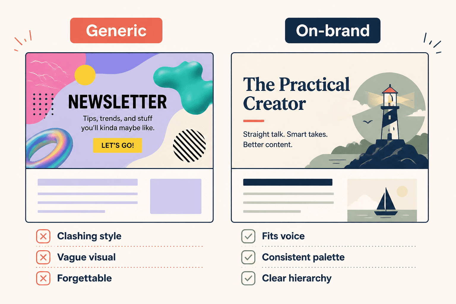
Many creators start with the tool instead of the identity. They ask what kind of image they can generate before asking what the newsletter should feel like. That is backwards. If your newsletter voice is dry, practical, and smart, your header should probably not look like a neon cyber-fantasy poster. If your writing is warm and personal, a cold sterile interface aesthetic may feel off.
The visual does not need to mirror the content perfectly. But it should not contradict it. Readers notice more than people think. Not always consciously, but enough to feel when a brand is coherent and when it is just assembling parts from different internet drawers.
If you have a smaller audience, this matters even more. You do not have enough scale to rely on momentum alone. Cohesion helps people remember you. This piece on AI image use cases for creators with small audiences gets into that in more detail.
The bigger point is simple: clearer structure and clearer writing make the piece more useful. That is usually what makes the ending land better too.