
Most blog graphics fail for one of two reasons: they look generic, or they try so hard to look “designed” that they become visual wallpaper.
That is why AI image use cases for blog graphics are actually worth paying attention to. Not because AI will magically hand you brilliant visuals. It will not. But it can help creators make faster, better-looking blog graphics without burning half a day inside Canva moving arrows around like it is a spiritual test.
If you publish articles, newsletters, case studies, tutorials, or thought-leadership content, you do not need a giant design process for every post. You need a few smart formats you can repeat, adapt, and make your own. That is the real win.
This guide will show you practical blog graphic examples creators can adapt fast, when to use each one, what AI is actually good at, and where people make the whole thing look cheap.
If you want the bigger picture, start with the parent guide.
What AI blog graphics are actually good for
AI is useful when the graphic does one of these jobs:
- Explains an idea visually
- Breaks up long text
- Creates a consistent visual system across your blog
- Makes examples feel more concrete
- Gives a post a stronger first impression
- Helps you publish faster without defaulting to ugly stock images
It is less useful when you are trying to fake a full brand identity with random prompts and no taste. That route gets weird quickly.
A good AI-assisted blog graphic is usually simple. It supports the article. It does not scream for attention like a conference flyer from 2014.
If you want a broader overview before getting into specific formats, this AI image use cases hub is a useful starting point, and this guide for creators who want better results helps if your outputs keep looking almost right and still unusable.
The best approach: build repeatable graphic types, not one-off masterpieces
Creators waste a lot of time treating every article graphic like a fresh identity project. That is backwards.
You will move faster if you create 4 to 6 repeatable graphic formats, then adapt them by topic. Same structure. New text. Slightly new image prompt. Same visual logic. That gives you consistency without boredom.
Think in systems, not random acts of design.
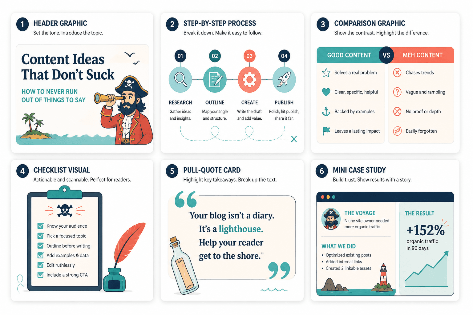
For example, your repeatable formats might include:
- Header graphic with title and conceptual image
- Step-by-step process diagram
- Comparison graphic
- Checklist visual
- Pull-quote card
- Mini case study mockup
That is enough variety for most creator blogs. You do not need 19 styles and a mood board called “futuristic minimal confidence.”
7 AI Image Use Cases: Blog Graphic Examples Creators Can Adapt Fast
Here are the formats worth using first.
1. Article header graphics
This is the easiest and most common use case. You need one strong visual at the top of the article that makes the post feel intentional instead of dropped naked onto the page.
AI helps by generating a conceptual visual base you can layer text over. The trick is not to ask for “a blog header about marketing.” That gets you glossy nonsense. Ask for a specific visual metaphor tied to the topic.
Better prompts:
- A clean editorial illustration of scattered sticky notes becoming an organized content workflow
- A modern workspace scene showing a writer turning rough ideas into structured article drafts
- A minimalist conceptual image of overlapping message bubbles, headlines, and content blocks arranged into a publishing system
Best for: tutorials, strategy posts, workflow articles, list posts, evergreen guides
What to avoid: hyper-generic laptop shots, robotic hands, glowing holograms, and anything that looks like “AI” is the main character instead of your topic.
2. Process diagrams for how-to posts
If your article explains a sequence, a visual process graphic can do a lot of heavy lifting. Readers like seeing the path before they walk it.
This works especially well for creators writing about funnels, content workflows, client journeys, or repurposing systems.
Example:
- Idea
- Draft
- Edit
- Turn into post
- Turn into newsletter
- Turn into lead magnet
An AI-generated base illustration or diagram draft can save time here, but you will usually want to clean it up manually. AI is good at rough structure. It is not reliably great at crisp labels, spacing, or hierarchy.
So use AI for the concept, then refine in your design tool. That is the sane workflow.
3. Comparison graphics
Comparison visuals work because they help readers understand contrast quickly. And contrast is half the job in good teaching.
You can use AI-generated visual scenes or icon-based layouts to support comparisons like:
- Weak hook vs strong hook
- Generic bio vs clear bio
- Messy content workflow vs streamlined workflow
- Stock-photo-looking brand vs editorial-looking brand
Simple structure:
- Left side: the mistake
- Right side: the better version
- One short label under each
This type of graphic is especially useful in educational posts because it turns abstract advice into something the reader can spot immediately.
4. Checklist and framework visuals
If your article includes a checklist, rubric, or mini framework, turn it into a visual. This is one of the cleanest AI image use cases because the format is simple and reusable.
Examples:
- 5 things every blog intro should do
- 3 parts of a useful CTA
- 4 tests for a stronger content hook
- 7 elements of a good creator bio
You can use AI to create a branded background, icon set, or visual layout direction, then place your actual text manually so it stays readable.
This matters because AI text inside images still has a habit of looking like the image had a small argument with language and lost.
5. Pull-quote graphics for key insights
Some blog posts have one line worth pulling out and spotlighting. Not every article needs this, but when the piece includes a sharp claim, a pull-quote graphic gives you a visual asset you can also reuse on social.
Useful blog graphics do not need to be fancy. They need to make the idea easier to notice, understand, or remember.
That sort of line works well as a quote card inside the article, especially in longer posts that need visual rhythm.
Best for: opinion pieces, strategic how-to content, longer guides, case studies
Not great for: weak observations dressed up in typography. A bland sentence does not become profound because you put it on a beige square.
6. Mock screenshots and concept scenes
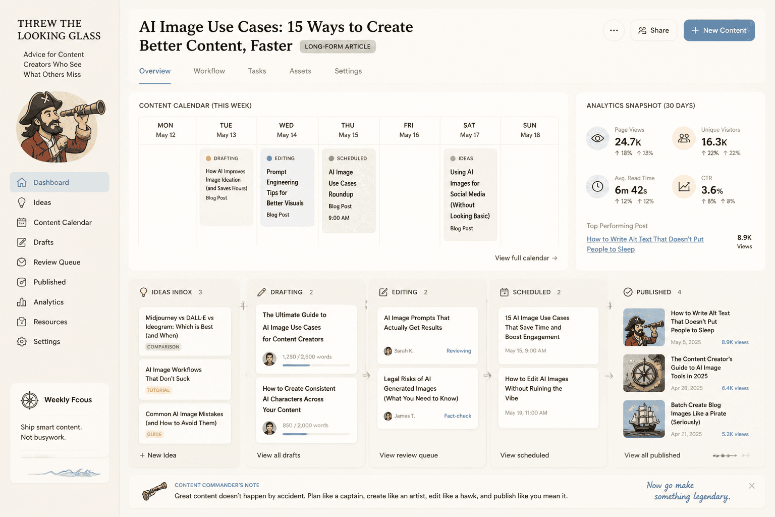
Sometimes you want the article to feel more concrete, but you do not have a real screenshot, or a real screenshot would be messy, irrelevant, or visually ugly. Fair enough.
That is where AI-generated mock interface scenes or conceptual “workspace” images can help. They are useful for illustrating things like:
- Content calendars
- Email workflows
- Idea capture systems
- Dashboard views
- Publishing pipelines
Just be careful. If the article sounds practical and grounded, your visuals should not suddenly turn into neon sci-fi startup fever dreams. Match the image style to the tone of the piece.
7. Section break illustrations for long posts
Long articles can get visually tiring. One clean illustration every few sections can make the reading experience feel less dense without stuffing the page with random junk.
This works best when the illustrations are simple and stylistically consistent. Think editorial support, not visual chaos.
Good fits:
- Long guides
- Pillar articles
- Explainer posts
- Educational breakdowns with multiple frameworks
If you are publishing a lot of content in one category, this is also a smart way to make the archive feel more cohesive. For more ideas on that side of things, see AI image use cases ideas that save time and look better and best ways to use AI image use cases as a creator.
How to make AI blog graphics look better fast
The difference between “pretty useful” and “why does this feel cheap?” usually comes down to a few small decisions.
Use one visual style on purpose
Pick one direction and stick to it for a while:
- Editorial illustration
- Minimal diagrams
- Clean mock screenshots
- Soft 3D objects
- Muted conceptual scenes
Do not use watercolor for one article, glossy cyberpunk for the next, and flat icons for the third unless chaos is somehow your brand strategy.
Keep text out of the AI generation when possible
If the image needs words, headlines, labels, or checklist items, add those yourself after generation. You will get cleaner results and avoid the cursed pseudo-font effect AI still loves to produce.
Use AI for concepting, then polish manually
This is the part people skip because they want one-click magic. But the best workflow is usually:
- Generate a visual direction
- Choose the strongest composition
- Bring it into your design tool
- Add brand colors, text, spacing, and cleanup
- Save as a repeatable template
That takes a little more effort upfront, but it saves a lot more time later.
Design for readability, not just vibes
Many AI graphics look fine in isolation and terrible inside actual content. Why? Because blog graphics are not standalone art pieces. They need to work on-page.
That means:
- Clear focal point
- Enough contrast
- Space for text if needed
- Not too visually busy
- Legible at multiple sizes
A good blog graphic supports reading. It does not interrupt it like a needy pop star.
A simple workflow creators can use every week
If you publish often, do not reinvent this process every time. Use a light system.
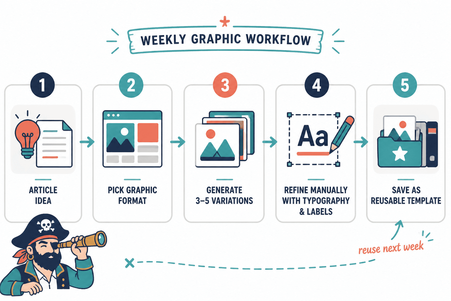
- Pick the article type. Tutorial, opinion, case study, list post, long guide.
- Choose the matching graphic format. Header, process visual, comparison card, checklist, quote card, section illustration.
- Write the core message first. The graphic should support the point, not invent one.
- Generate 3 to 5 image variations. More than that usually becomes a procrastination hobby.
- Select one and refine it manually. Add typography, labels, and brand consistency.
- Save the layout as a template. This is where the speed really comes from.
If you also publish newsletters, it is smart to build overlap between article graphics and email visuals. This piece on simple AI image use cases for newsletter headers and templates pairs nicely with that workflow.
Common mistakes that make AI blog graphics worse
Here is where things usually go off the rails.
| Mistake | What happens | Better move |
|---|---|---|
| Using vague prompts | You get generic nonsense | Describe the concept, composition, and tone |
| Changing style every post | Your blog looks inconsistent | Build a small repeatable visual system |
| Letting AI generate all text in-image | Unreadable labels and weird copy | Add text manually after generation |
| Overdecorating simple ideas | The graphic becomes distracting | Use cleaner layouts with one job |
| Trusting the first output | The result feels half-baked | Generate variations and refine the best one |
| Copying trendy AI aesthetics blindly | The visuals date fast and feel off-brand | Choose a calmer, more durable style |
The broader pattern is simple: creators use AI best when they treat it like an assistant, not a substitute for judgment.
What kinds of creators benefit most from this
These blog graphic examples are especially useful for:
- Coaches publishing educational content
- Consultants turning expertise into articles
- Writers and solo founders building authority posts
- Newsletter creators who want visual consistency
- Personal brands repurposing articles into social content
- Small teams that need decent visuals without a full-time designer
If your content is idea-driven, not product-catalog-driven, AI visuals can save time because they help package thinking. That is the key use case. Not “make random art because the tool can.”
And if you are still sorting the bigger workflow around tools and systems, you can also browse related AI writing tools and workflows resources.
Quick FAQ
Should every blog post have an AI graphic?
No. Use them where they improve clarity, scannability, or visual consistency. Some short posts do not need one beyond a header.
What is the fastest graphic type to create?
Header graphics and quote cards. They are easy to templatize and quick to adapt.
Can AI replace a designer for blog graphics?
For simple recurring blog visuals, sometimes. For stronger brand systems or more strategic design work, not really.
What is the safest way to keep graphics on-brand?
Use fixed colors, type styles, layout patterns, and one consistent image style across multiple posts.
Are AI-generated diagrams reliable as-is?
Not always. They are useful as drafts or concept starters, but manual cleanup usually improves the result a lot.
Use AI blog graphics to support the idea, not cover for a weak one
The smartest way to use AI Image Use Cases: Blog Graphic Examples Creators Can Adapt Fast is not to chase flashy visuals. It is to build a small, reusable set of graphics that make your articles easier to read, easier to remember, and easier to publish consistently.
The bigger point is simple: clearer structure and clearer writing make the piece more useful. That is usually what makes the ending land better too.