
Most AI image use cases are not bad because the tool is boring. They are bad because the writing is asleep.
You have probably seen the usual version: “Use AI images for social media posts, blog graphics, product mockups, and marketing materials.” Technically true. Also technically dead on arrival. It says nothing memorable, nothing specific, and nothing that helps a real person picture using the thing in their actual work.
If you want people to care about an AI image tool, feature, workflow, or prompt method, the use case has to do more than list possible outputs. It needs context, a user, a problem, and a reason this approach is better than the slower, messier alternative.
That is what this guide will help you do: rewrite boring AI image use cases so they sound clearer, sharper, and more useful without drifting into hype. We’ll cover what makes use cases flat, how to rewrite them, and a bunch of before-and-after examples you can steal the structure from.
If you have not already fixed the top of the piece, start with how to start AI image use cases without a weak opening. If your use cases already sound stiff and robotic, pair this with how to write AI image use cases without sounding salesy or robotic.
Want the broader roadmap? Start with the parent guide.
Why most AI image use cases fall flat
Boring use cases usually have one of four problems.
- They describe outputs, not outcomes.
- They are too broad to feel believable.
- They sound like feature packaging, not real-world usage.
- They skip the friction the user is trying to avoid.
Take this line:
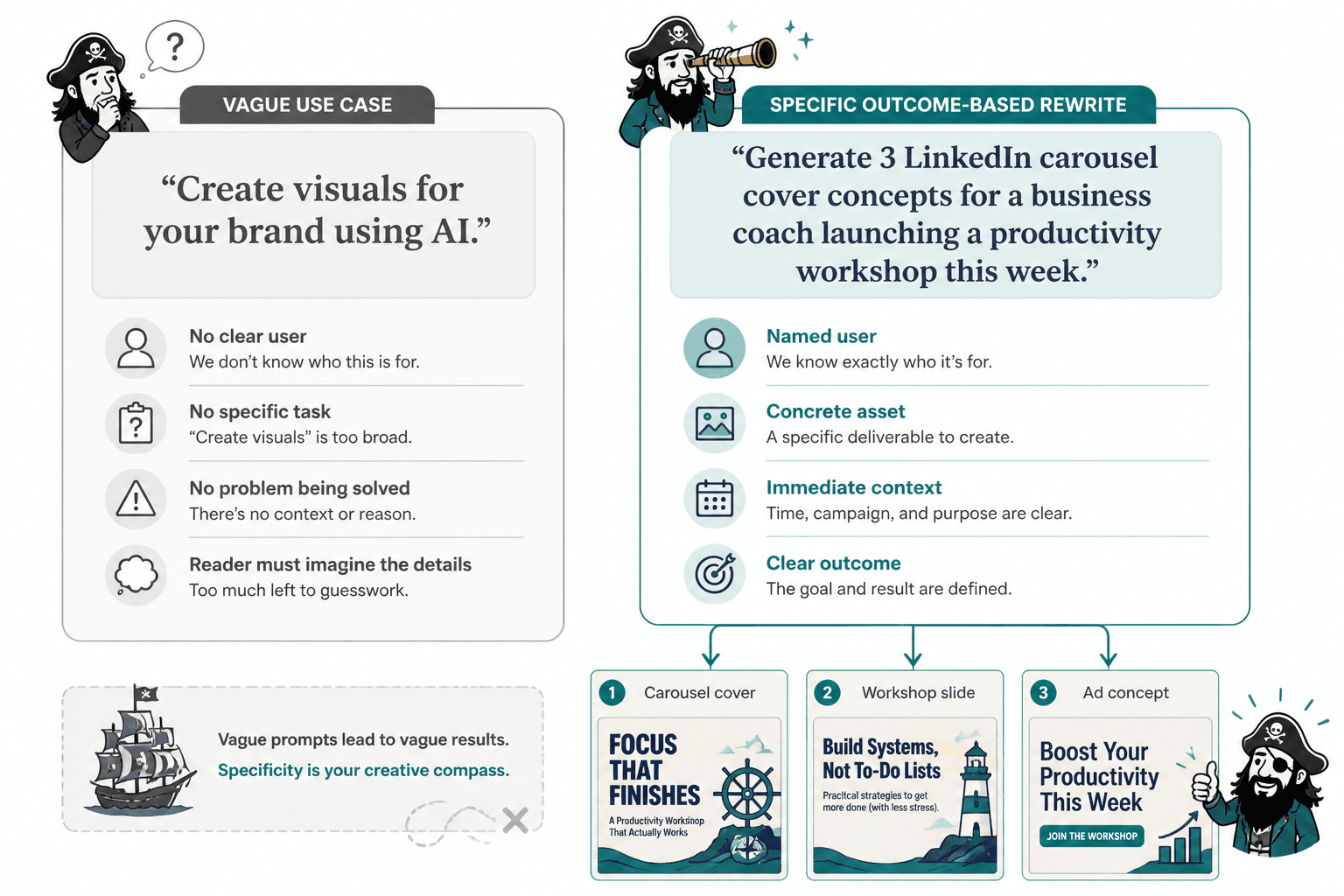
“Create visuals for your brand using AI.”
Fine. But what kind of visuals? For whom? To solve what problem? Is this for a coach making carousel covers, a consultant needing clean workshop slides, or an ecommerce founder testing ad concepts without waiting on a designer?
Weak use cases force the reader to do all the imagination work. Strong use cases do that work for them.
That is the real job here. Not to sound “professional.” To make the use feel obvious.
What a strong AI image use case actually needs
Before you rewrite anything, it helps to know the parts that make a use case land.
1. A clear user
Not “businesses.” Not “creators.” Those are lazy buckets. A stronger version names the person in a way that brings real work to mind.
- LinkedIn creators who need custom carousel covers
- Coaches making lead magnet worksheets
- Consultants mocking up workshop diagrams
- Solo founders testing ad concepts before paying for final design
2. A real task
“Create visuals” is vague wallpaper. “Turn a text-heavy LinkedIn post into a simple branded carousel with custom illustrations” is an actual task.
3. The friction being removed
Good use cases often imply what they save: time, back-and-forth, stock image hunting, awkward design hacks, creative bottlenecks, or budget.
This matters because people do not buy tools for abstract possibility. They use them to get around annoying constraints.
4. A useful outcome
The result should be visible. Can the reader picture what they now have?
- A cleaner webinar deck
- A more clickable article header
- A branded visual system for social content
- Faster concept testing for campaign ideas
5. Optional, but powerful: why AI helps here
Sometimes the use case gets stronger when you explain why AI is the right fit. Not because it is magic. Because it makes iteration, variation, and speed easier in this specific scenario.
That distinction matters. A lot of AI writing sounds flimsy because it treats AI as the main character. It is not. The workflow is.
How to rewrite boring AI image use cases
Here is a practical rewrite process you can use every time.
Step 1: Find the generic noun and make it concrete
Look for vague words like visuals, content, branding, assets, marketing materials, creatives, and campaigns. Then replace them with the actual thing being made.
| Weak | Better |
|---|---|
| marketing materials | sales deck visuals, event flyers, webinar slides |
| social media content | carousel covers, quote graphics, launch teasers |
| brand assets | moodboards, icon sets, concept illustrations |
Step 2: Add the user and the situation
A use case gets stronger fast when you answer two basic questions: who is doing this, and when would they need it?
Weak: “Use AI images for presentation design.”
Better: “Create fast concept visuals for client presentations when you need the deck to feel custom without spending half a day hunting stock photos.”
Step 3: Add the pain, bottleneck, or tradeoff
This is the part many people skip, and it is why the writing ends up sounding generic. Mention what makes the job annoying without this tool or workflow.
- No designer on hand
- Tight turnaround
- Stock images feel too staged
- Need multiple directions fast
- Brand visuals are inconsistent
You do not need melodrama. Just enough tension to explain why this use case is useful.
Step 4: Show the output and the benefit in the same sentence
A lot of use cases stop at the asset. Push one step further and show what that asset helps the person do.
Flat: “Generate branded illustrations for blog posts.”
Stronger: “Generate simple branded illustrations for blog posts so your articles look more original, more readable, and less like they were assembled from the same stock library as everyone else’s.”
Step 5: Cut any wording that sounds like AI oatmeal
If the line includes phrases like “unlock creativity,” “elevate your visuals,” “transform your content,” or “bring ideas to life,” please be ruthless. Those phrases are not helping. They are decorative fog.
Say what happens. Name the thing. Keep your shoes tied.
Before-and-after rewrites for boring AI image use cases
This is where the difference gets obvious. Here are common weak use cases, followed by sharper rewrites.
Example 1: Social media visuals
Before: “Use AI to create engaging social media visuals.”
After: “Create custom social graphics for launches, tips, and carousel covers when you want your posts to look more distinct than another recycled stock image with text slapped on top.”
Why it works: It names the assets, gives a context, and adds a slightly painful truth people already know. Stock-plus-text is the beige wall of content design.
Example 2: Blog images
Before: “Generate blog images with AI.”
After: “Generate article header images and simple in-post illustrations that make your content feel more original without commissioning custom art for every piece.”
Why it works: It is realistic. It does not pretend every article needs a masterpiece. It frames AI as a practical middle ground.
Example 3: Ecommerce product concepts
Before: “Create product mockups using AI.”
After: “Mock up product concepts, packaging directions, or ad-style scenes before paying for final photography, so you can test ideas early instead of guessing expensively.”
Why it works: It captures a real workflow. It also makes the cost-saving angle feel grounded instead of salesy.
Example 4: Personal brand visuals
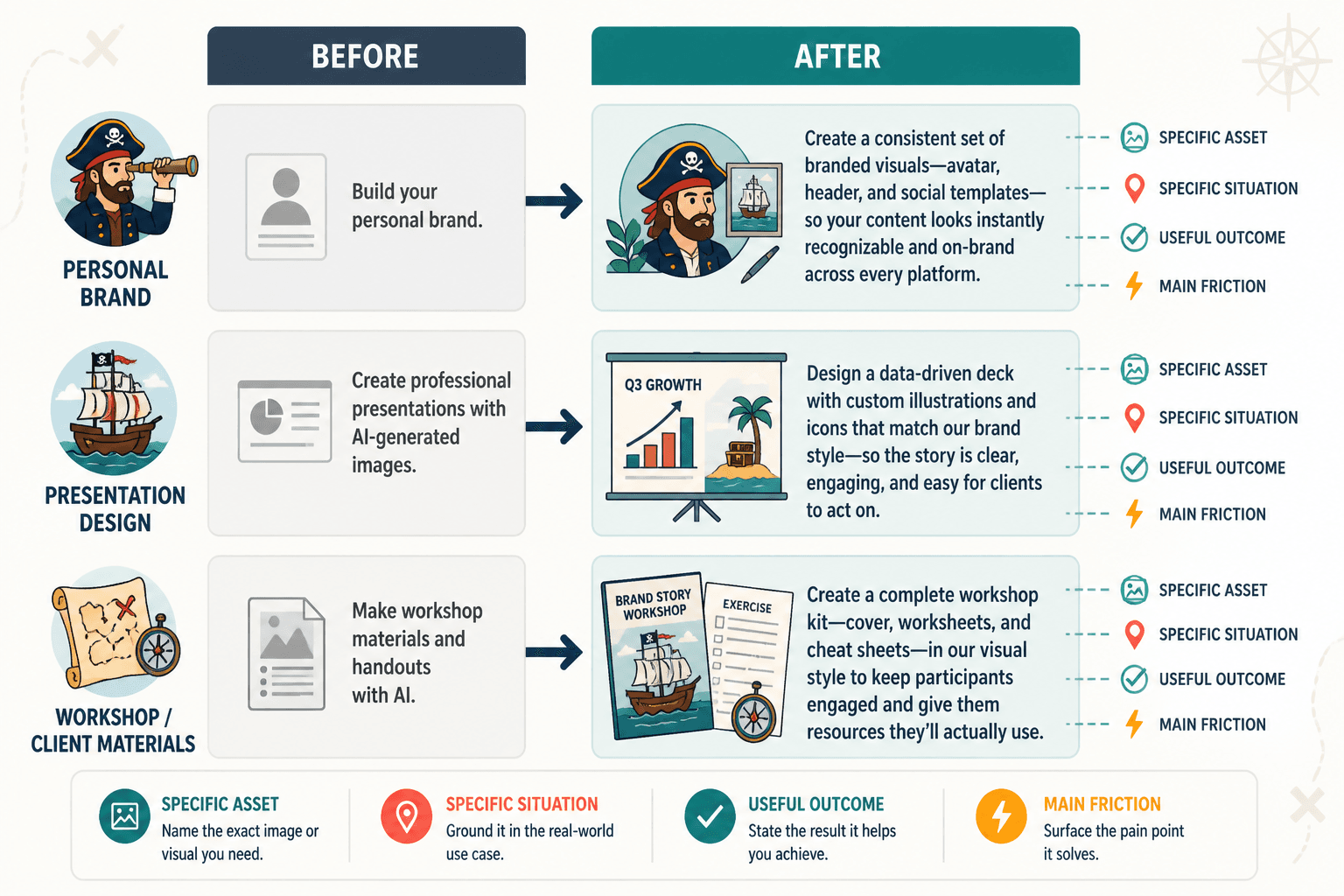
Before: “Use AI images to build your personal brand.”
After: “Create repeatable visual themes for your newsletter, LinkedIn carousels, or lead magnets so your content starts looking recognizably yours, even if you do not have an in-house designer.”
Why it works: “Build your personal brand” says almost nothing. “Repeatable visual themes” is a tangible result people can use.
Example 5: Presentation design
Before: “Create professional presentations with AI-generated images.”
After: “Add clean concept visuals to proposals, workshops, and keynote slides when you need the deck to feel tailored, not stuffed with the same corporate handshake energy as every other presentation.”
Why it works: It adds tone, specificity, and a recognizable problem. Also, yes, some stock photography still looks like it was approved by a committee that fears joy.
A simple rewrite formula you can reuse
If you want a quick structure, use this:
Help [specific user] create [specific asset] for [specific situation] so they can [useful outcome] without [main friction].
Here are a few filled-in examples.
- Help consultants create custom workshop diagrams for client sessions so their materials feel clearer and more tailored without waiting on a designer for every revision.
- Help creators generate branded carousel covers for LinkedIn so their posts look more distinctive without spending hours in Canva every week.
- Help ecommerce teams mock up product scenes for ads and landing pages so they can test visual directions before committing to a full shoot.
This formula is not there to make everything sound the same. It is there to stop you from writing vague sludge.
How to make AI image use cases sound less generic and more credible
Good rewrites are not just more specific. They are more believable.
Use realistic scope
Do not claim AI image tools can instantly solve all design problems. They can help with ideation, variation, rough concepts, repeatable assets, and speed. They do not replace taste, brand judgment, or final production standards in every context.
Oddly enough, this kind of restraint makes the writing stronger. Readers trust use cases more when they sound like they were written by someone who has actually used the workflow, not by a caffeinated landing page.
Use verbs people actually use at work
Swap out floaty verbs for useful ones.
| Weak verb | Better verb |
|---|---|
| elevate | mock up |
| transform | test |
| enhance | adapt |
| reimagine | illustrate |
| unlock | generate |
Include the workflow, not just the output
“Create AI images for lead magnets” is okay. But “turn existing newsletter ideas into simple workbook visuals for a lead magnet” is much stronger because it reflects how people actually build things.
This is especially useful if you are writing for creators, consultants, and solo businesses. They are usually not looking for abstract inspiration. They are trying to get assets made with limited time and limited help.
Common mistakes when rewriting AI image use cases
- Going too broad. If the use case could apply to literally everyone, it will resonate with almost no one.
- Overhyping the AI angle. Make the workflow useful. Do not write like the machine descended from the heavens to save content marketing.
- Listing categories instead of scenarios. “Ads, blogs, ecommerce, education” is not a use case section. It is a filing cabinet.
- Skipping the benefit. If you only name the output, the reader still has to guess why they should care.
- Sounding too polished. If every line feels sanded down by AI, trust drops. Keep it clean, but human.
If your examples are decent but still feel flat, you may need to improve how they are packaged visually too. This is where how to improve AI image use cases LinkedIn carousels without sounding generic can help, especially if you are repurposing the same ideas across channels.
How to rewrite old use cases instead of starting from scratch
You do not need to throw everything out. Usually, the raw material is already there. It is just buried under generic wording.
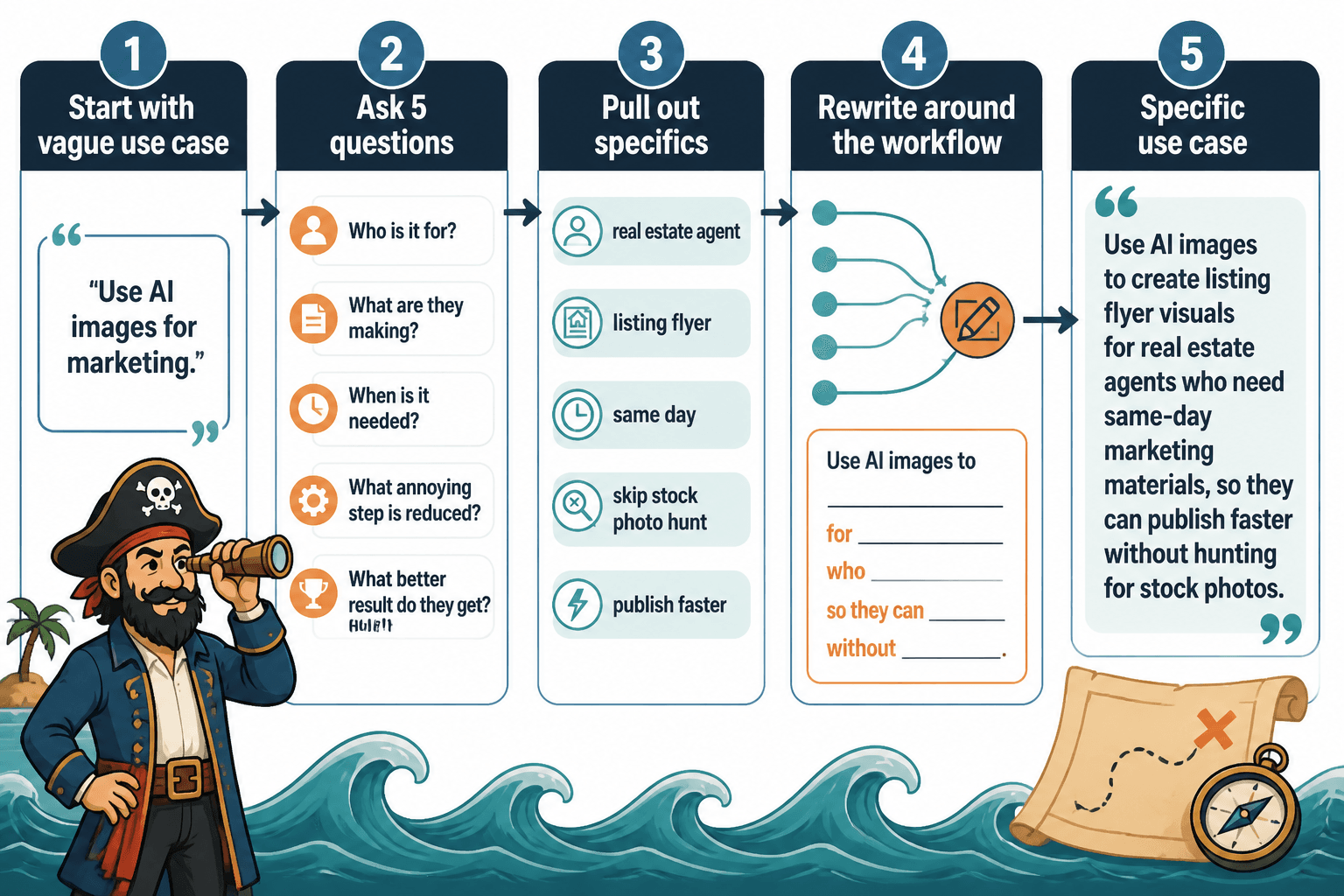
Take your old use case and ask:
- Who is this actually for?
- What exact thing are they making?
- When do they need it?
- What annoying step does this reduce?
- What better result do they get?
Then rewrite the sentence around those answers.
For a deeper cleanup process, read how to turn old content into better AI image use cases. It is useful when you have a whole page of decent-but-dull material that needs a second life.
Use-case templates you can adapt
Here are a few templates that work well for AI image use case writing.
Template 1: The workflow-based use case
The bigger point is simple: clearer structure and clearer writing make the piece more useful. That is usually what makes the ending land better too.
The bigger point is simple: clearer structure and clearer writing make the piece more useful. That is usually what makes the ending land better too.