
Most AI image carousels on LinkedIn do not fail because the visuals are ugly. They fail because the idea underneath them is painfully generic.
You have probably seen the format: polished AI image, tidy slide design, broad claim, zero tension, no real point. It looks finished. It says nothing. People scroll past.
If you want to know how to improve AI image use cases for LinkedIn carousels without sounding generic, the fix is not “make the prompt better” and call it a day. The real fix is using AI images to support a sharper argument, clearer teaching, stronger framing, and more specific relevance to your audience.
In other words: the image is not the content. It is the delivery mechanism. A decent one, sometimes. A very overhyped one, often.
This piece will show you how to make AI image carousels feel more credible, more useful, and much less like you asked a robot to produce “thought leadership visuals for modern professionals” and then posted the results with a straight face.
For the broader learning path, visit our parent guide.
Why most AI image LinkedIn carousels sound generic
The problem usually is not the software. It is the way people use it.
They start with a style trend instead of a message. They create slides around vague themes like productivity, branding, consistency, mindset, storytelling, or growth. Then they add broad captions that could apply to a dentist, a copywriter, a founder, a leadership coach, and somebody selling a course about “building your dream life” from a beach photo.
That is how you end up with a carousel that looks expensive and reads like wallpaper.
Generic carousels usually have a few things in common:
- The topic is too broad
- The audience is unclear
- The examples are interchangeable
- The slides explain obvious points
- The visuals do not add meaning
- The CTA sounds borrowed from a mediocre content template
LinkedIn is full of content that is technically fine and strategically useless. Your job is not to add to the pile.
What a strong AI image carousel is actually doing
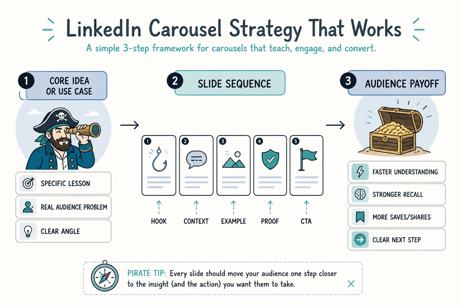
A useful carousel is not just “multiple slides about a topic.” It is a guided idea sequence.
Each slide should move the reader through something: a misconception, a mistake, a framework, a comparison, a process, a before-and-after, a set of examples, or a point of view with proof behind it. The AI image can support that journey, but it should not be the only interesting thing on the slide.
Good AI image use cases for LinkedIn carousels tend to do one of these well:
- Visualize a concept that would be dry as plain text
- Create contrast between wrong and right approaches
- Turn a process into something easier to follow
- Make examples feel more concrete and memorable
- Support a niche point of view with branded visual consistency
- Help skim-readers grasp the point fast
If the images are only there to make the carousel feel more “premium,” you are already drifting into fluff.
For broader strategy around AI image content, it helps to understand the bigger category of AI image use cases and where carousels sit inside that mix. They are one format, not a complete strategy.
Start with a sharper use case, not a prettier prompt
If you are trying to improve AI image use cases for LinkedIn carousels, start by getting painfully clear on the job the carousel is meant to do.
Not “educate my audience.” That means nothing. Pick a real job.
Better use case angles for LinkedIn carousels
- Show 5 mistakes buyers make before hiring a consultant
- Compare weak vs strong positioning statements
- Break down what makes a good CTA actually convert
- Walk through a client journey from post to lead
- Explain a nuanced concept with visual metaphors
- Turn a text-heavy lesson into a swipeable sequence
- Show examples of what bad content looks like and how to fix it
Notice how these are all concrete. They have shape. They imply a reader problem, not just a content format.
Compare that with weak use cases:
- “A carousel about branding”
- “Slides on AI in marketing”
- “Visual content for personal growth”
- “Thought leadership about innovation”
Those are not use cases. They are content fog.
Use AI images to support specificity
The easiest way to sound generic is to pair generic copy with symbolic visuals.
You know the ones: lightbulbs for ideas, chess pieces for strategy, ladders for growth, mountain peaks for success, futuristic people pointing at holograms because apparently that is how all modern businesses work now.
Those visuals are not helping your carousel. They are decorating vagueness.
Instead, build visuals around something more specific:
- A particular audience situation
- A before-and-after contrast
- A named framework
- A workflow with stages
- A decision point
- A realistic work scene tied to the lesson
- A visual metaphor that directly matches the point
For example, if your carousel is about weak content offers, do not use a random glowing megaphone image with “Stand out online” slapped over it.
Use a visual sequence that supports the argument:
- Slide 1: crowded message board full of vague offers
- Slide 2: side-by-side comparison of vague vs specific offer language
- Slide 3: visual framework showing problem, promise, proof, next step
- Slide 4: one realistic niche example applied cleanly
That feels more grounded because it is doing teaching, not just styling.
Write the carousel copy before you generate most of the images
This is one of the biggest practical fixes.
People often generate a batch of AI visuals first, then try to reverse-engineer a carousel around them. That is how you get bloated slides, flimsy points, and weird mismatches between image and message.
Do this instead:
- Choose one narrow idea
- Write the hook slide
- Outline the slide sequence
- Draft the copy for each slide
- Identify where a visual would clarify, reinforce, or sharpen the message
- Generate images to fit those jobs
- Edit the deck so each slide has one main point
This order matters because LinkedIn carousels are still content, not mood boards.
If your opening slide is weak, fix that first. This is where a related piece like how to start AI image use cases without a weak opening can help. A sharper first slide beats a prettier eighth slide every time.
A simple framework for non-generic AI image carousels
Here is a practical structure you can use when the carousel is meant to teach, persuade, or reposition a common idea.
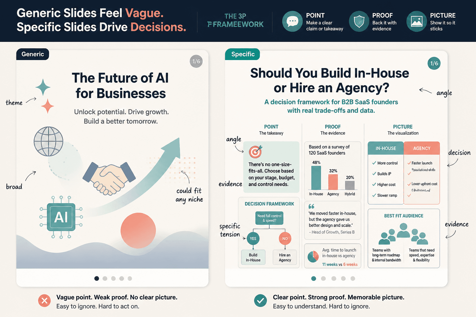
The point, proof, picture framework
- Point: What is the actual claim or lesson on this slide?
- Proof: Why should the reader believe it?
- Picture: What visual would make this clearer, faster, or more memorable?
If you cannot answer all three, the slide probably is not ready.
Example:
- Point: Most AI image content looks generic because it shows themes, not decisions.
- Proof: Generic visuals are easy to apply to any niche, which usually means they are not saying anything precise.
- Picture: Side-by-side slide with abstract symbols on one side and specific decision-based visuals on the other.
That is a real slide. It has an argument. The image earns its place.
Replace broad themes with real angles
One reason AI carousel content gets bland fast is that creators keep reaching for themes instead of angles.
A theme is “personal branding.” An angle is “why most personal branding advice makes consultants sound indistinguishable.”
A theme is “AI visuals.” An angle is “three AI image styles that make educational carousels look polished but less trustworthy.”
That difference matters because LinkedIn rewards content that feels relevant to a specific professional tension. Not just content that exists.
Theme-to-angle rewrites
| Weak theme | Stronger angle |
|---|---|
| Using AI in content | Where AI images help LinkedIn carousels and where they make them less believable |
| Brand storytelling | How to turn client lessons into visual carousels without making them sound rehearsed |
| Productivity tips | Why most productivity carousels get saved and forgotten |
| Marketing strategy | The slide sequence that makes a service offer easier to understand in under 30 seconds |
| Content design | How to use AI visuals without making your educational carousel feel like stock art cosplay |
Angles create tension. Tension creates interest. Interest gets the swipe.
Make each slide earn the swipe
A lot of carousel advice treats every slide like a mini poster. That is part of the problem.
Slides need flow. One should create enough curiosity, clarity, or momentum to justify the next. If every slide says roughly the same thing in a slightly different way, readers feel the drag fast.
A cleaner slide sequence
- Slide 1: Sharp hook with a clear claim
- Slide 2: Name the common mistake
- Slide 3: Show why it happens
- Slide 4: Introduce a better approach
- Slide 5: Give a concrete example
- Slide 6: Show a before-and-after or contrast
- Slide 7: Add a practical takeaway
- Slide 8: Use a clean CTA or next step
This is not the only sequence that works, but it is solid because it moves. It does not just sit there looking polished and hoping people feel impressed.
Before-and-after example: generic vs strong AI carousel use case
Generic version
- Topic: Using AI images in marketing
- Slide 1: “How AI is changing content creation”
- Slide 2: “AI saves time”
- Slide 3: “AI improves creativity”
- Slide 4: “AI helps brands stand out”
- Slide 5: “Use AI strategically”
- CTA: “What do you think?”
This says almost nothing. It is broad, obvious, and far too easy to ignore.
Stronger version
- Topic: How AI images help educational LinkedIn carousels when the concept is hard to show
- Slide 1: “Most AI carousels look polished. That is not the same as useful.”
- Slide 2: “The common mistake: using AI visuals to decorate vague advice”
- Slide 3: “Why that fails: readers need examples, contrast, and clear takeaways”
- Slide 4: “A better use case: use AI visuals to show process, comparison, or structure”
- Slide 5: “Example: vague offer messaging before vs after”
- Slide 6: “Example: abstract brand strategy turned into a 4-step visual model”
- Slide 7: “Rule of thumb: if the visual can fit any niche, it is probably too generic”
- CTA: “If you make educational carousels, audit your last 3 slides for clarity before style”
Same broad category. Much better execution. Because now the reader knows what the carousel is arguing, who it is for, and what to do with the point.
If your drafts still feel lifeless, you may need to tighten the writing itself. That is where how to rewrite boring AI image use cases becomes useful. Sometimes the image is fine. The copy is the sleepy part.
How to choose AI visuals that do not cheapen the carousel
Not every AI image style belongs on LinkedIn. Some styles scream “template pack.” Others look so surreal they pull attention away from the lesson.
A safer standard is this: pick visuals that support credibility, legibility, and concept clarity.
Usually useful visual directions
- Simple conceptual illustrations
- Diagram-like scenes
- Clean editorial-style visuals
- Stylized but restrained business metaphors
- Consistent visual systems across all slides
- Images that leave room for readable text
Usually risky visual directions
- Hyper-glossy sci-fi corporate scenes
- Overly dramatic “future of work” imagery
- Random symbolic objects with no direct connection to the lesson
- Busy compositions that fight with the copy
- Styles that change wildly from slide to slide
- Anything that looks like it belongs on a generic motivation account
You do not need visual fireworks. You need visual alignment.
Use examples that sound like your audience’s real work
One of the fastest ways to stop sounding generic is to stop writing examples for “everyone.”
If your audience is consultants, coaches, service providers, freelancers, or founders, talk like somebody who knows the decisions they are making. Mention offers, lead quality, sales calls, trust gaps, positioning, weak landing pages, low-response CTAs, repurposing problems, or client-proof issues.
That does two things at once. It makes the carousel more relevant, and it makes the AI images easier to direct because you are illustrating actual work contexts rather than vague ambition.
For practical inspiration, pieces like AI image use cases blog graphics examples creators can adapt fast can help you find more grounded visual applications instead of floating off into broad “brand content” language.
Do not let the CTA ruin the whole thing
A surprisingly large number of decent carousels end with a weak, needy, or generic CTA.
Examples:
- “What do you think?”
- “Agree?”
- “Follow for more”
- “Comment YES if this resonated”
That kind of ending makes the whole thing feel thinner than it was.
Try CTAs that match the actual value of the carousel:
- “Before you post your next carousel, check whether every slide makes one specific point.”
- “If your visuals look polished but the post underperforms, audit the message before blaming the format.”
- “Save this if you make educational carousels and want the visuals to clarify the idea instead of dressing it up.”
- “If your last AI carousel felt flat, rewrite the slide titles first. That is usually where the problem starts.”
See the difference? Cleaner. More useful. Less desperate.
If your copy tends to lean robotic once AI enters the workflow, read how to write AI image use cases without sounding salesy or robotic. A lot of people do not have a visual problem. They have an “I suddenly sound like a product brochure” problem.
A practical checklist for stronger AI image carousels on LinkedIn
The bigger point is simple: clearer structure and clearer writing make the piece more useful. That is usually what makes the ending land better too.
The bigger point is simple: clearer structure and clearer writing make the piece more useful. That is usually what makes the ending land better too.