
Most old content does not fail because the ideas are bad. It fails because the format aged out, the examples got stale, or the piece was built for reading when it could be rebuilt for showing.
That is where better AI image use cases come in. Not “make a random image for engagement.” Not “turn every blog post into a soulless carousel with a neon prompt.” I mean taking existing content you already have and reshaping it into visual assets that clarify, sell, teach, or earn attention more effectively.
If you have old blog posts, newsletters, threads, frameworks, client FAQs, workshop notes, or lead magnets gathering digital dust, you probably already have raw material for stronger visual content. The trick is knowing what to extract, what to visualize, and what to stop pretending deserves a graphic in the first place.
Here is how to turn old content into better AI image use cases without creating generic slop, wrecking your positioning, or wasting an afternoon prompting your way into mediocrity.
For the full path around this topic, head to the parent guide.
What “better AI image use cases” actually means
A lot of people treat AI image generation like a decoration machine. They take a decent idea, wrap it in vague visuals, and call it content strategy. It is not. It is wallpaper.
Better AI image use cases do one of four things:
- Clarify an idea faster than text alone
- Package expertise into something easier to share or save
- Support a lead magnet, offer, post, article, or funnel step
- Refresh existing content so it can perform again in a new format
That means the image is not the point. The job is the point.
If you need a broader foundation for planning visuals with intent, start with AI image use cases or the fuller guide for creators who want better results. Both help if your current system is mostly “make something nice and hope.”
Start with content that already proved something
Do not begin with your weakest archive. Begin with old content that already showed signs of life.
Look for content that did at least one of these:
- Got strong engagement or replies
- Led to DMs, calls, leads, or newsletter signups
- Explained a concept clients often struggle with
- Contained a framework, process, comparison, or checklist
- Had a strong core idea but poor packaging
- Still feels true, even if the examples need updating
This matters because old content with real signal gives you a much better source for AI image use cases than random scraps from your content graveyard. If the underlying idea never landed, turning it into an image usually just gives you a prettier version of something people already ignored.
Brutal, yes. Also useful.
Before you generate anything, sort your old content into three buckets:
| Bucket | What it contains | Best next move |
|---|---|---|
| Still strong | Good idea, still relevant, weak format | Repurpose into visual assets |
| Needs rewriting | Good idea buried under fluff or outdated framing | Rewrite first, then visualize |
| Not worth saving | Thin, vague, generic, or off-positioning | Retire it and move on |
If your old material falls into bucket two more often than you would like, read how to rewrite boring AI image use cases before trying to build visuals from weak source material. Better prompts cannot rescue bland thinking.
Find the visual spine inside the old content
Not every piece of content should become an image. The ones that work best usually contain a visual spine: a structure people can grasp quickly when it is shown instead of explained in a pile of paragraphs.
Here are the patterns worth looking for.
Processes
Anything step-based can become a workflow graphic, cheat sheet, mini infographic, simple sequence, or visual slide.
Example:
- Old content: “How I turn client calls into content ideas”
- Better AI image use case: a 5-step visual process showing source, sorting, extraction, drafting, and publishing
Comparisons
Before-and-after posts, bad-vs-good examples, tool comparisons, or strategic tradeoffs often make excellent visual content.
- Old content: “What weak hooks do vs what strong hooks do”
- Better AI image use case: a side-by-side comparison graphic for social posts or lead magnet slides
Frameworks
If you have named stages, pillars, components, or recurring steps, you probably have something visual.
- Old content: “The 4 parts of a useful creator bio”
- Better AI image use case: branded framework diagram, checklist card, or reference sheet
Examples and transformations
People love seeing a thing improve. It feels practical. It proves your thinking. It also gives AI-generated visuals a job that is not just decorative.
- Old content: “Here is a weak CTA and the rewrite”
- Better AI image use case: swipe graphic, annotated screenshot mockup, or visual before/after set
Abstract ideas that need concrete packaging
Some concepts are useful but slippery. Trust, positioning, authority, funnel friction, content angles. They make sense once explained, but they are not naturally visual. This is where conceptual diagrams, metaphor-led graphics, and clean educational visuals can help.
The key is restraint. If your abstract idea needs three captions, two arrows, and a dramatic cyberpunk astronaut, the image is probably doing too much and saying too little.
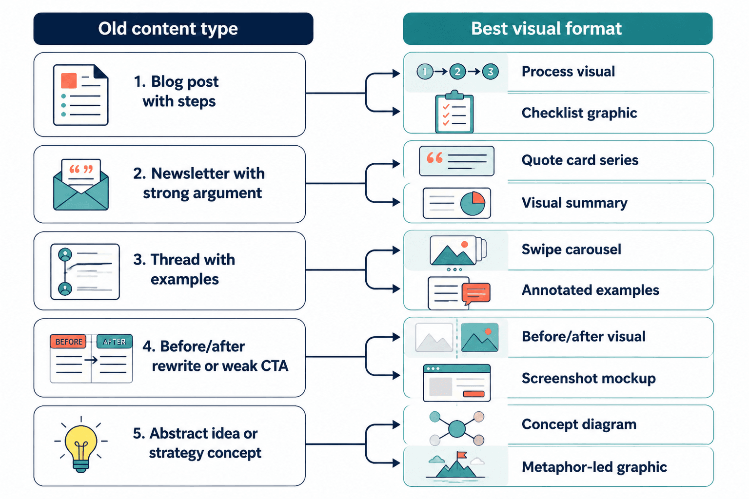
Match the old content to the right AI image use case
Once you know the useful core idea, match it to a visual format that actually fits the goal. This is the part people skip when they jump straight into prompting. And then they wonder why everything looks polished but pointless.
| Old content type | Best AI image use case | Why it works |
|---|---|---|
| Blog post with steps | Process visual, checklist graphic, explainer slides | Makes the logic easier to scan and share |
| Newsletter with strong argument | Quote card series, concept graphic, visual summary | Pulls out strong lines and central ideas |
| Thread with examples | Swipe carousel, annotated examples, mini case-study graphics | Turns text proof into visual proof |
| Lead magnet section | Workbook page art, cover image, diagram, worksheet visual | Improves usability and perceived value |
| Client FAQ | Educational social graphics, objection-busting visuals | Helps answer repeat questions cleanly |
| Sales page idea | Benefit explainer graphic, comparison chart, funnel support image | Supports conversion without adding more copy bloat |
If your goal is not just attention but conversion, pair this with how to turn AI image use cases into more leads or sales. A visually improved asset is nice. A visually improved asset that feeds a real funnel is better.
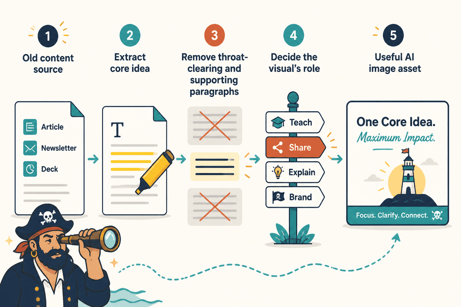
Use a simple extraction process before you prompt anything
The easiest way to get generic visuals is to feed an AI tool a vague summary of a long piece of content and hope for brilliance. Hope is not a workflow.
Instead, extract the parts that matter first.
Step 1: Pull out the core point
Ask: what is the one thing this old content is actually saying?
Bad extraction:
This article is about content marketing strategies for personal brands.
Better extraction:
Most personal brands do not need more content ideas. They need better ways to package the expertise they already have.
Step 2: Identify what can be shown
Go through the old piece and mark anything that could become a visual element:
- Steps
- Stages
- Comparisons
- Inputs and outputs
- Mistakes and fixes
- Examples
- Checklists
- Metrics or proof points
- Decision trees
Step 3: Remove text that only works as prose
Some lines are good in articles but bad in visuals. Transitional paragraphs, scene-setting, and throat-clearing explanation often do not belong in the image version.
You are not “shrinking the article.” You are rebuilding the idea for a different job.
Step 4: Decide the visual’s role
Before you generate anything, define what the image must do:
- Stop the scroll
- Teach the idea faster
- Support a lead magnet
- Make a post easier to understand
- Increase saves or shares
- Strengthen a sales asset
- Give your brand a more coherent visual system
One image can do a couple of these. It should not try to do all of them. That way lies clutter.
Good sources to repurpose into AI image use cases
If you want a practical shortlist, these are usually the best old content sources to mine first:
- High-performing posts: especially ones built around a strong opinion, framework, or example
- Evergreen blog posts: useful pieces whose structure still holds up
- Email newsletters: often full of punchier ideas than formal articles
- Sales call notes: packed with objections, pain points, and real language
- Workshop decks: already semi-visual, which makes them easier to adapt
- Lead magnets: especially checklists, guides, mini playbooks, and worksheets
- Case studies: rich source for timelines, outcomes, and process diagrams
- FAQ content: ideal for educational image series and objection-handling assets
If you are building a more complete system around these workflows, the broader AI writing tools and image workflow hub can help you connect this with the rest of your process.
What to avoid when turning old content into visuals
This is where a lot of decent intentions go to die.
Do not visualize content that was vague to begin with
If the old content says things like “build trust,” “show up consistently,” or “create value” without specifics, the image version will not magically become useful. It will just look more expensive while saying the same mushy nothing.
Do not force every idea into a carousel or infographic
Some ideas want a single strong visual. Some want a diagram. Some want a worksheet cover. Some should remain text. Repurposing is not a loyalty oath to one format.
Do not let style outrun clarity
A lot of AI-generated images look impressive for half a second and then communicate absolutely nothing. If someone cannot tell what the asset is about quickly, the style is getting in the way.
Do not ignore brand fit
If your content voice is sharp, practical, and trust-based, but your visuals look like startup fantasy art or generic corporate stock fever dreams, the mismatch weakens the whole thing. Your visual system should reinforce your positioning, not wander off and start its own career.
Do not skip the editing pass
AI can generate drafts, compositions, concepts, and useful rough assets. It still needs a human to decide if the visual says the right thing, supports the right offer, and matches the level of quality your brand claims to have.
Strong examples of old content turned into better AI image use cases
Here are a few practical transformations.
Example 1: Blog post to lead magnet support art
Old content: a blog post explaining how to write stronger profile bios
Weak use case: a random hero image of a laptop and coffee
Better AI image use case: a branded worksheet-style visual showing the 4 bio parts, plus a clean cover image and simple supporting diagrams for a downloadable checklist
This works because the visual is attached to a specific teaching asset, not floating around as decorative garnish. If that is the direction you want, better AI image use cases for lead magnet art is the next logical read.
Example 2: Thread to educational social graphic series
Old content: an X thread about why generic CTAs fail
Weak use case: one quote card with a vague sentence
Better AI image use case: a 5-card swipe set showing weak CTA, why it fails, stronger rewrite, why it works, and when to use it
Now the image set teaches something. It earns saves. It also has natural reuse across posts, newsletter inserts, and lead magnet snippets.
Example 3: Workshop notes to sales-support visual
Old content: notes from a workshop on content funnels
The bigger point is simple: clearer structure and clearer writing make the piece more useful. That is usually what makes the ending land better too.