Most lead magnets do not have an art problem. They have a taste problem.
People use AI images for ebook covers, checklists, guides, workbooks, and mini-course thumbnails, then wonder why the final thing looks cheap, generic, or suspiciously like a crypto webinar from 2022. The issue usually is not the tool. It is using AI to fake polish instead of support clarity.
Better AI image use cases for lead magnet art start with a simple idea: the visual should make the offer feel more readable, more credible, and more aligned with your brand. Not more “impressive.” Not more surreal. Not more covered in glowing gradients for no reason.
If you create content as a coach, consultant, writer, freelancer, or personal brand, this is where AI images can actually help. They can speed up concept development, mockups, backgrounds, section visuals, brand-consistent illustrations, and content repurposing. They cannot rescue a weak offer, confused positioning, or a lead magnet title that says absolutely nothing.
Here is how to use AI image tools for lead magnet art in a way that feels useful, professional, and not embarrassingly autogenerated.
For the broader learning path, visit our parent guide.
What lead magnet art is supposed to do
Lead magnet art has a job. A very boring, important job.
It should help the right person instantly understand what they are getting, what kind of experience to expect, and whether this feels trustworthy enough to click, download, or hand over an email address.
That means your visual needs to support three things:
- Clarity: Is this a checklist, guide, workbook, swipe file, template pack, or mini training?
- Fit: Does it look like it belongs to your brand and audience?
- Credibility: Does it feel intentional, not slapped together in five chaotic minutes?
A lot of people skip straight to “make it look premium.” That is how they end up with glossy nonsense. Premium is not a lighting effect. It is coherence.
Where AI image use actually makes sense for lead magnet art
AI is most useful when it helps you create support visuals faster, not when it tries to become your entire design strategy. The best use cases tend to be the ones that remove friction from production while keeping human judgment in charge.
1. Concept exploration before final design
This is one of the strongest use cases and one of the least appreciated.
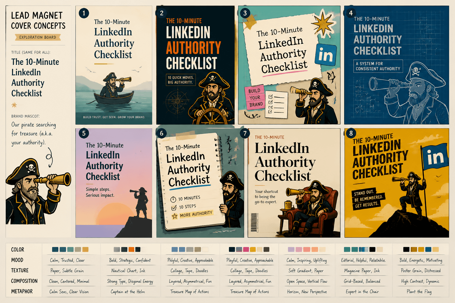
If you are making a lead magnet called something like The 10-Minute LinkedIn Authority Checklist, you may not know right away whether the cover should feel editorial, minimal, strategic, bold, playful, technical, or calm. AI can help you rapidly test visual directions before you commit to a final design in Canva, Figma, or another tool.
Use it to generate rough concepts for:
- Color direction
- Illustration style
- Mood and tone
- Background texture ideas
- Composition inspiration
- Metaphor exploration
The key word there is rough. You are not asking AI for the final answer. You are using it as a sketch partner that does not get tired.
2. Custom background art that avoids stock-photo fatigue
Stock photos are not illegal. They are just often painfully predictable.
If your lead magnet art relies on yet another smiling laptop person, handshake crop, or generic desk flat lay, AI can help you create more distinctive backgrounds. This works especially well for personal brands that want a polished feel without looking like a mid-tier corporate training portal.
Useful examples:
- Abstract editorial textures
- Soft gradient environments
- Minimal geometric backdrops
- Conceptual scenes that support the topic
- Collage-style brand visuals
Then layer your actual title, subtitle, brand elements, and callout text over that background in a design tool. This usually works better than asking AI to generate a complete cover with text baked in. AI text rendering still loves being weird at the worst possible moment.
3. Mockups for ebooks, workbooks, and resource packs
If you want your opt-in page or social posts to show the lead magnet as a real object, AI can help with mockup-style visuals. Not always perfectly, and not without cleanup, but it can speed up the process.
Think:
- 3D-style workbook cover mockups
- Tablet or phone display scenes
- Stacked resource pack visuals
- Desk scenes with your guide in context
- Branded presentation-style slides
This is especially helpful when your lead magnet is digital but you still want it to feel concrete. People trust things more when they can picture what they are about to get.
4. Section illustrations inside the lead magnet
Lead magnet art is not only the cover.
If your guide, workbook, or PDF has multiple sections, AI can help create lightweight visual anchors throughout the piece. A simple illustration at the start of each section can make the whole thing feel more considered and less like a text dump exported in a hurry.
This works well for:
- Framework explainers
- Step-by-step checklists
- Visual metaphors for strategy sections
- Icons or mini scenes for each chapter
- Simple diagrams you later clean up manually
If your content is dense, a few visual breathing points go a long way. Not because your audience is fragile, but because visual pacing improves comprehension.
5. Branded social promo assets for the lead magnet
A lead magnet usually needs more than one visual. You may need:
- A cover image for the landing page
- A social post image
- A carousel opener
- An article banner
- An email thumbnail
- A profile link promo graphic
AI can help you build a small visual system around the lead magnet instead of one lonely cover trying to do all the work. This matters because repeated visual cues help people recognize the offer across platforms.
If you also want broader inspiration for content visuals, this guide on AI image use cases is a useful next stop.
What makes lead magnet art feel good instead of autogenerated
The difference is usually not complexity. It is restraint.
Strong lead magnet visuals tend to share a few traits. They know what they are trying to communicate. They do not try to perform creativity in all directions at once. And they are not stuffed with every visual trick the tool can produce.
Use one clear visual idea
If your guide is about simplifying funnels, your image does not need floating neon staircases, five devices, a holographic chart, and a woman screaming into a ring light. Pick one clean visual concept and support it properly.
Examples:
- A minimal roadmap visual for a strategy guide
- An editorial notebook aesthetic for a writing workbook
- A clean dashboard-style look for an analytics checklist
- A simple collage feel for a creative brand resource
Match the image style to the audience
A mindset coach, B2B consultant, and creator educator should not all be using the same visual language.
If your audience wants calm clarity, do not give them cyberpunk chaos. If they expect premium strategic thinking, do not hand them something that looks like a children’s productivity app.
Style mismatch is one of the fastest ways to make decent content feel off.
Keep text design separate from image generation
This one saves a lot of pain.
Generate visual assets with AI. Then handle the title, subtitle, layout, and hierarchy in a design tool. You will get better alignment, cleaner typography, and much less accidental gibberish pretending to be words.
Build around your brand, not around the prompt
Your prompt is not the brand. It is just a production instruction.
Before generating anything, get clear on:
- Primary brand colors
- Preferred contrast level
- Image mood
- Type of composition you like
- How modern, soft, bold, minimal, or editorial the brand should feel
- What kinds of imagery feel completely wrong for your audience
That guidance makes your AI outputs more usable because you are not reinventing your visual identity every time you open the tool.
Best use cases by lead magnet type
Different lead magnets need different kinds of visuals. This is where people get lazy and use the same cover style for everything.
| Lead magnet type | Best AI image use case | What to avoid |
|---|---|---|
| Checklist | Clean mockup, minimal background, simple icons | Overdesigned fantasy cover art |
| Workbook | Editorial cover concept, section illustrations, page accents | Busy scenes competing with the title |
| Guide or ebook | Conceptual cover background, 3D mockup, promo assets | Generic stock-style business imagery |
| Swipe file or template pack | Layered resource mockups, screen previews, visual system assets | Abstract art with no sense of deliverable |
| Mini-course or training | Thumbnail system, device mockups, branded lesson graphics | Trying to fake a giant course platform aesthetic |
| Framework PDF | Diagram concept drafts, section visuals, metaphor illustrations | Complicated visuals that confuse the actual model |
Notice the pattern: the image should reinforce the format and promise of the lead magnet. Not distract from it.
A simple workflow for better AI image use cases for lead magnet art
You do not need a dramatic creative ritual here. You need a repeatable process.
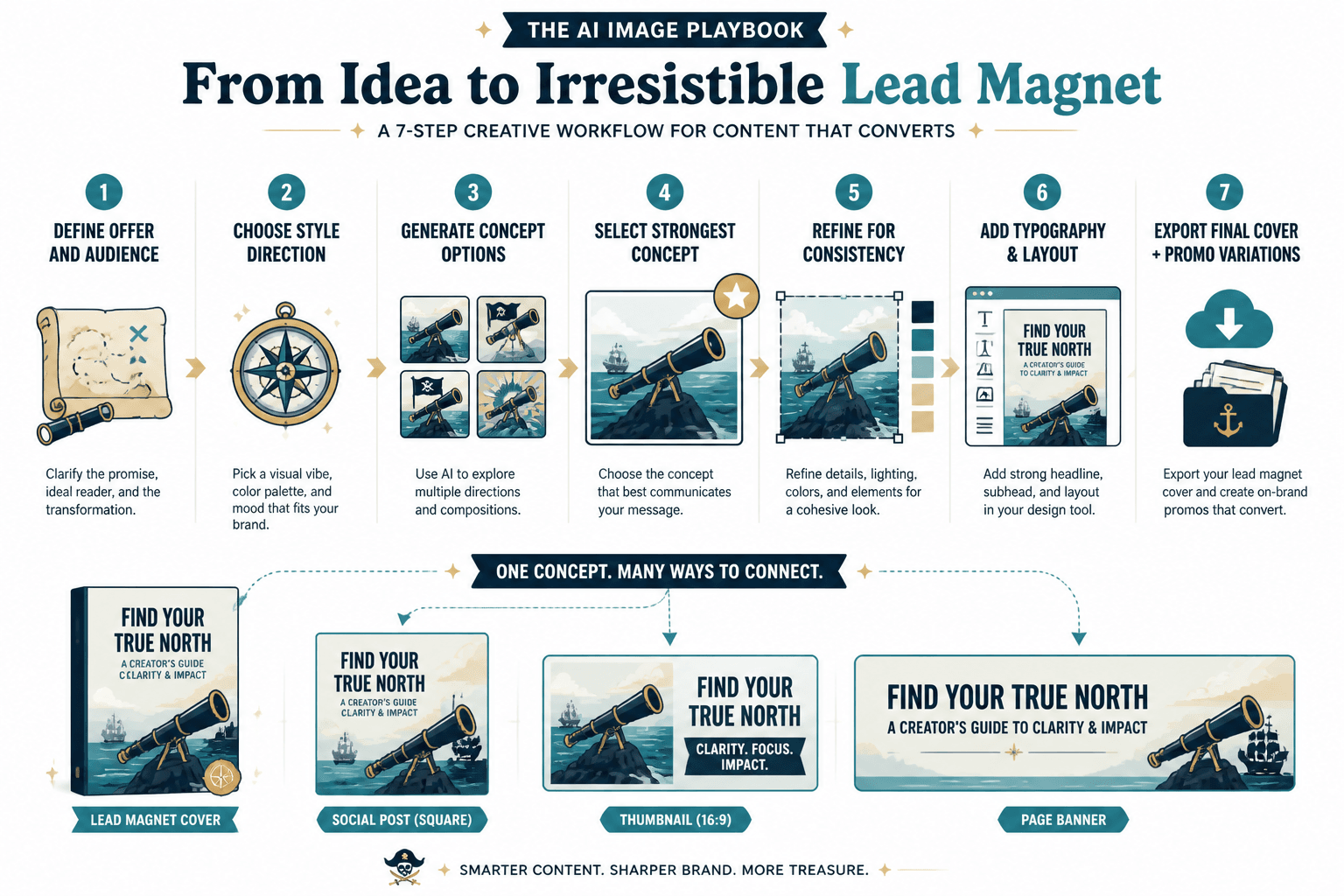
- Define the offer clearly.
What is the lead magnet, who is it for, and what should the visual communicate in one glance? - Choose a style direction.
Minimal, editorial, playful, structured, bold, soft, technical, premium, creative, and so on. - Generate concept options.
Create several visual directions, not one precious prompt result. - Select the strongest concept.
Pick the one that best supports clarity and brand fit. - Refine or regenerate for consistency.
Adjust composition, palette, lighting, and texture until it feels usable. - Bring it into a design tool.
Add title, subtitle, logo, callouts, and any layout elements manually. - Create promo variations.
Turn the same visual direction into social graphics, thumbnails, or page assets. - Check it at actual size.
If it looks muddy or confusing as a small preview, it is not done.
What people keep doing wrong
This part deserves a little honesty because a lot of ugly lead magnet art comes from the same handful of mistakes.
Using AI to hide weak positioning
If your lead magnet is called Transform Your Success Journey, no image on earth is fixing that. The visual can support a clear promise. It cannot invent one.
Making it too complicated
When people discover image tools, they often treat every asset like it needs to prove technological achievement. It does not. A clean background plus sharp typography usually beats an overloaded “masterpiece” every day of the week.
Copying trends that do not fit the brand
Just because moody collage covers are working for somebody else does not mean your practical, trust-based consulting brand should suddenly look like an indie magazine for chaos goblins.
Visual trends are fun until they start confusing buyers.
Forgetting that landing pages need conversion clarity
Your lead magnet art appears inside a larger system. It has to work with the headline, page copy, email opt-in, and next step. If the visual style is gorgeous but the offer still feels vague, conversion suffers anyway.
If that is the part you are trying to sort out, pair this topic with funnel ideas for AI image use cases. The visual is not the whole machine.
Accepting “pretty enough” without checking trust signals
Ask yourself:
- Does this look like it belongs to the same brand as my site and content?
- Would the right audience feel confident downloading this?
- Does the visual make the offer feel clearer or just louder?
- Would this still look solid if the platform preview cropped half of it?
If the answer is no, do not settle because the generation took a while. Time spent is not quality. Annoying, but true.
Practical prompt direction that usually works better
You do not need absurdly long prompts full of cinematic adjectives having a group meeting. You need a clear brief.
A useful prompt structure:
Create a clean editorial background for a lead magnet cover aimed at [audience], about [topic]. Style should feel [3 adjectives]. Use [color direction]. Keep composition simple with space for title text. Avoid [specific visual clichés].
Example:
Create a clean editorial background for a lead magnet cover aimed at consultants and solo service providers, about simplifying their content funnel. Style should feel strategic, modern, and calm. Use muted navy, off-white, and soft gold accents. Keep composition simple with space for title text. Avoid stock office imagery, fake app dashboards, and glossy corporate effects.
Notice how this gives the model a job instead of a mood board meltdown.
When to use AI, and when to use a designer or template instead
AI is not automatically the smartest option.
Use AI when you need fast concept exploration, custom visual ingredients, style development, or a scalable promo asset system.
Use a designer when the lead magnet is central to a premium funnel, your brand needs a more distinct visual identity, or you know your own visual judgment is currently held together with tape.
Use templates when speed matters most and your brand already has a clear visual system. Templates are underrated because they are boring. Boring is often efficient.
If you want tool options that fit this workflow, see best AI image tools and design tools for AI image use cases.
How to repurpose old content into lead magnet visuals
One of the better AI image use cases for lead magnet art is not starting from scratch every time.
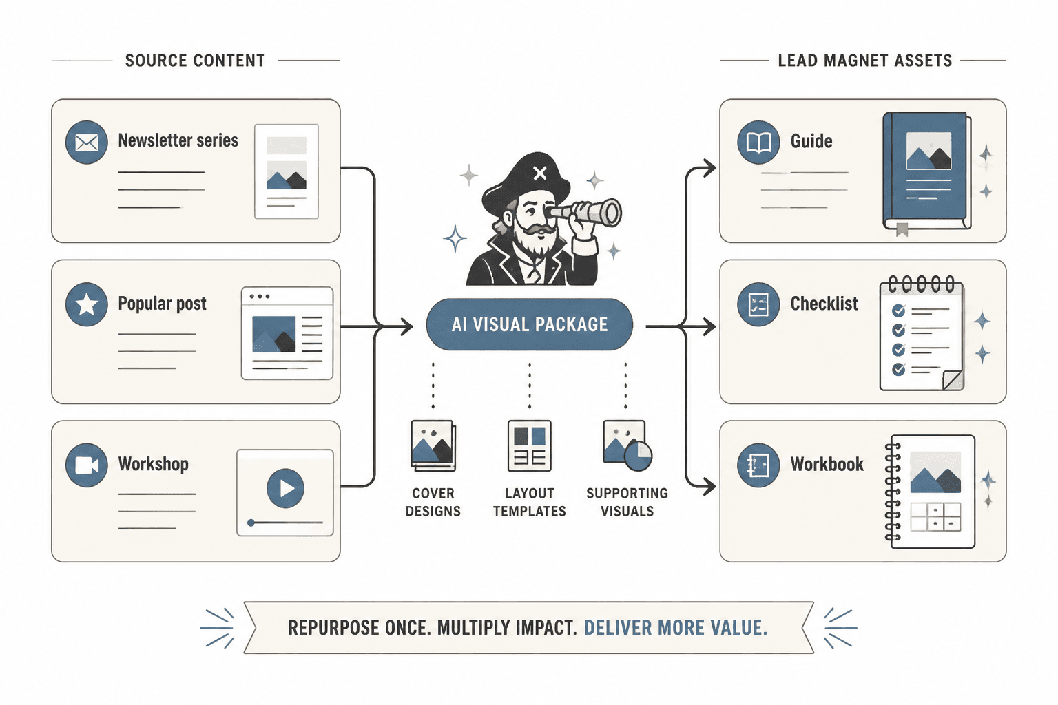
If you already have strong content, you probably already have visual themes hiding inside it. A newsletter series can become a guide. A popular post can become a checklist. A workshop can become a workbook. Once the content angle exists, AI can help create the visual package around it faster.
That is usually smarter than inventing a random freebie just because you feel like your funnel “should” have one.
For that process, read how to turn old content into better AI image use cases.
Examples of strong visual directions for personal brands
If you are a personal brand, your visual style should support the way you already show up in your writing and offers. Here are a few directions that tend to work better than generic “AI art” aesthetics.
The bigger point is simple: clearer structure and clearer writing make the piece more useful. That is usually what makes the ending land better too.