
Most homepage copy is not too short or too long.
It is too vague, too slow, too self-absorbed, or too padded with “we’re passionate about excellence” fluff that should’ve been left in 2014 with the rest of the bad website jargon.
So if you’re asking How Long Should Homepage Copy Be in 2026?, the real answer is not “above the fold only” or “2,000 words minimum.” It depends on what your homepage needs to do, how much trust your visitor needs before taking action, and how quickly you can make your case without wandering off into a scenic route of nonsense.
Here’s the useful version: your homepage should be as long as it needs to be to make the right person understand three things fast:
- what you do
- who it is for
- what they should do next
After that, the rest of the copy has one job: reduce friction. Answer doubts. Add proof. Clarify the offer. Make the next step feel obvious.
This article will help you figure out the right homepage copy length for your business in 2026, what affects that length, when short copy works better, when longer copy earns its keep, and how to stop writing homepages that are technically “complete” but still somehow say almost nothing.
For the main guide behind this topic, visit the parent guide.
There is no magic word count for homepage copy
Let’s get the annoying but necessary truth out of the way.
There is no universally correct homepage length. Anyone giving you one fixed number is either oversimplifying for effect or trying to turn a nuanced copy decision into a tidy rule because tidy rules are easier to sell.
A homepage is not a blog post. It is not a sales page. It is not a portfolio page. It is not your About page wearing a nicer shirt. It sits at the center of your website and often has to do several jobs at once:
- position your brand
- orient new visitors
- show relevance
- build trust
- route people to the right next step
That means the right length depends less on trends and more on function.
In 2026, people still skim. They still judge fast. They still bounce when a homepage makes them work too hard to understand what is going on. But they also still need enough information to trust you, especially if you sell services, higher-ticket offers, expert help, or anything that requires an actual decision rather than a casual click.
So no, shorter is not automatically smarter. Longer is not automatically stronger either. Good homepage copy is sized to the decision.
A better question: how much copy does your visitor need before they can act?
If you want a practical way to decide homepage length, stop asking how many words should be on the page and start asking how much clarity and confidence your visitor needs before they can do something useful.
That “something useful” might be:
- book a call
- view services
- join your email list
- shop a product collection
- read a case study
- inquire about working with you
- understand which offer is right for them
The more trust, context, and explanation that action requires, the more copy your homepage usually needs.
That is why a local bakery homepage can get away with being pretty brief, while a strategist, coach, consultant, designer, or fractional executive may need more space to explain who they help, what kind of outcomes they create, and why they are not interchangeable with everyone else using the same five personality-polished buzzwords.
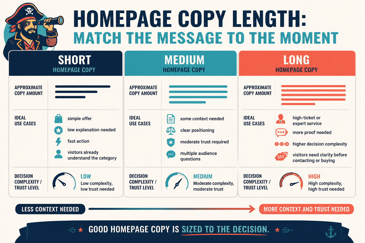
Practical homepage copy length ranges for 2026
These are not laws. They are working ranges.
| Homepage type | Typical copy length | Best for |
|---|---|---|
| Very short | 150–400 words | Simple offers, strong brand recognition, low-friction actions |
| Short to medium | 400–900 words | Most service businesses, creators, consultants, personal brands |
| Medium to long | 900–1,500 words | Higher-trust services, nuanced offers, multi-audience homepages |
| Long | 1,500+ words | Complex businesses, premium services, education-heavy positioning |
For most creators, coaches, consultants, freelancers, and service-based businesses, the sweet spot is usually somewhere between 400 and 1,200 words.
That is often enough room to say something clear, add useful proof, explain your offer at a high level, and give people a sensible next step. Not enough room to write your memoir. Which is healthy.
When very short homepage copy works
Short homepage copy can work beautifully when the offer is simple and the visitor already understands the category.
- single-product brands
- personal brands with strong off-site traffic
- portfolio sites with obvious services
- businesses where the next step is low commitment
- brands with clear navigation doing a lot of the heavy lifting
But short only works when the message is sharp. A short homepage with fuzzy copy is not elegant. It is just underexplained.
If that’s your situation, this related piece on when short homepage copy beat long ones will help you decide if brevity is actually helping or quietly hurting.
When longer homepage copy works better
Longer homepage copy tends to work better when people need more confidence before taking action.
- high-ticket services
- offers that are hard to categorize quickly
- markets where trust is a major factor
- businesses serving multiple buyer types
- expert-led brands where authority matters
- homepages doing the work of pre-selling before a call
In those cases, more copy can reduce hesitation. It can answer the quiet questions people ask while scrolling:
- Is this for someone like me?
- Do they understand my problem?
- What exactly do they offer?
- Why should I trust them?
- What happens next?
That said, longer copy only helps if each section earns its spot. More words do not build trust on their own. Sometimes they just create a larger area for confusion to spread.
What should determine your homepage copy length?
If you want the right answer for your own site, look at these five factors.
1. The complexity of your offer
If you sell one clear thing with one clear outcome, you can usually keep the homepage tighter.
If your offer needs explanation, comparison, context, or qualification, you probably need more room. Not because complexity is impressive, but because confusion kills action.
2. How aware your visitors already are
Warm traffic needs less explanation than cold traffic.
If most visitors arrive from your content, newsletter, podcast appearances, social posts, or referrals, they may already know what you do. Your homepage can focus more on confirmation and routing.
If people land on your homepage with zero context, your copy needs to do more orientation work.
3. The cost or commitment of the next step
The bigger the ask, the more trust your homepage usually needs to build.
“Browse templates” needs less selling than “book a $5,000 strategy engagement.” Fairly obvious, but weirdly ignored.
4. How distinct your positioning is
If your positioning is immediately clear and specific, you can often write less.
If you sound like everyone else, you’ll need more words just to clarify what should have been obvious much earlier. This is one reason weak positioning creates bloated homepages. The copy keeps trying to compensate for a blurry core message.
5. How many jobs your homepage is trying to do
Some homepages only need to point people toward a few clean paths.
Others have to explain multiple services, support different audiences, introduce the founder, provide trust signals, and still move people toward a CTA. Those pages are naturally going to be longer.
The trick is not to cram everything in. It is to include what helps a decision and remove what merely proves you own a keyboard.
What a solid homepage usually includes in 2026
Instead of obsessing over total word count, focus on whether your homepage includes the essential pieces in the right order.
- a clear headline
- a short supporting explanation
- a primary CTA
- proof or credibility
- offer overview or core paths
- audience relevance
- benefits or outcomes
- friction-reducing details
- a stronger CTA later on the page
If your homepage is “short” but missing half of that, the problem is not length. It is structure.
And if your homepage is “long” because it repeats the same promise seven different ways with slightly different adjectives, the problem is also structure. Plus restraint.
If your sections feel off, read homepage copy section order mistakes that hurt performance. A lot of weak homepages do not fail because they are too long. They fail because the important stuff appears too late, and the fluff gets premium placement for no good reason.
How to tell if your homepage is too short
Your homepage is probably too short if visitors can see it and still not quickly answer basic questions.
- What do you actually offer?
- Who is it for?
- Why should they trust you?
- What makes you different enough to care?
- What should they do next?
Other signs:
- your hero section sounds polished but vague
- the page leans too hard on aesthetics to carry meaning
- people click around trying to figure out where to start
- you get traffic but poor inquiry quality
- visitors ask basic questions the homepage should have answered
A short homepage should feel crisp, not cryptic.
How to tell if your homepage is too long
Long homepage copy is a problem when it slows understanding instead of improving it.
- the main message takes too long to emerge
- sections repeat each other
- you explain ideas before making them relevant
- every paragraph sounds equally important
- the CTA gets buried
- the page reads like an About page, manifesto, and sales page fused in a lab accident
If the page feels heavy, it often is not because it has a lot of words. It is because too many of those words are doing weak work.
A simple way to size your homepage copy
If you are writing or revising a homepage, use this process.
Step 1: Decide the primary goal
Pick the one action your homepage most needs to support.
- book a call
- view services
- join the list
- shop now
- start here
If your homepage tries to equally prioritize six different actions, length becomes messy fast.
Step 2: List the minimum questions a visitor needs answered
Not every possible question. The minimum useful ones.
That gives you a sharper idea of how much copy you actually need.
Step 3: Write the shortest clear version first
Start lean. Then add only what improves action or understanding.
This matters because many homepages are drafted in reverse: people begin by pouring everything they could say onto the page, then try to organize the sprawl afterward. It is a terrible workflow and produces exactly the kind of homepage people politely call “comprehensive” when they mean exhausting.
Step 4: Add proof and friction-reducers where needed
This is where useful length comes from.
- results
- testimonials
- logos
- brief process explanation
- who it is for and not for
- specific outcomes
- clearer CTA language
These additions earn attention because they help people decide.
Step 5: Cut repetition mercilessly
Once the page works, tighten it.
Look for repeated promises, padded transitions, generic claims, and intro paragraphs that warm up for four lines before saying anything. Homepage copy should not need a runway.
Homepage copy length by business type
Here are some practical guidelines by situation.
Creators and personal brands
Usually best with short to medium homepages.
You often need enough copy to explain your niche, what people can get from you, and where to go next, but not so much that the homepage starts trying to house your entire body of work.
- good range: 300–900 words
- focus on positioning, credibility, content paths, offer entry points
Coaches and consultants
Usually need medium-length homepages, sometimes longer.
People need clarity, trust, and a sense of how you help. If your offer is premium or nuanced, a thin homepage can feel evasive rather than elegant.
- good range: 600–1,400 words
- focus on audience, problem, approach, proof, CTA
Service providers and studios
Usually do well with medium-length homepages.
- good range: 500–1,200 words
- focus on what you do, who you do it for, examples, process, next step
The bigger point is simple: clearer structure and clearer writing make the piece more useful. That is usually what makes the ending land better too.