
Most homepage copy problems are not actually writing problems. They are sequencing problems.
You can have a decent headline, solid proof, clear services, and a respectable CTA, then still end up with a homepage that quietly leaks attention because everything shows up in the wrong order. The page asks for trust before earning it. It explains details before clarifying relevance. It rambles through background when the reader is still trying to answer one very basic question: “Am I in the right place?”
That is what homepage copy section order mistakes do. They hurt performance without looking dramatic. No flashing error message. No big obvious failure. Just lower conversions, weaker engagement, more drop-off, and visitors who leave with a vague sense that your site felt fine but not convincing.
Here’s how to fix that. We’ll look at the most common homepage copy section order mistakes that hurt performance, why they confuse readers, and how to structure your page so it moves people toward clarity, trust, and action instead of politely escorting them to the back button.
If you want a broader foundation for your site messaging, start with the main website conversion copy guide. If your homepage is the current problem child, the homepage copy resources here will also help.
If you want the bigger picture, start with the parent guide.
Why section order matters more than people think
People do not read homepages like obedient students. They scan, judge, skip, compare, and bail. Fast.
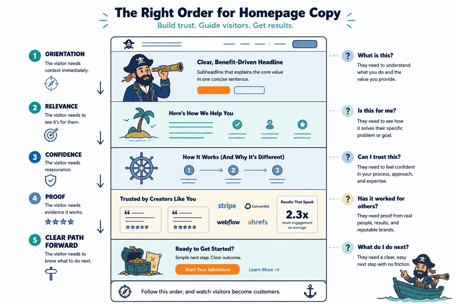
That means your homepage is not just a collection of good sections. It is a guided sequence. Each section should earn the next one. The order needs to match how trust actually builds:
- First, they need orientation.
- Then, relevance.
- Then, confidence.
- Then, proof.
- Then, a clear path forward.
When those pieces appear out of order, the page creates friction. Not dramatic friction. Just enough to make people hesitate, lose interest, or postpone the decision indefinitely, which is just a more polite version of “no.”
Good homepage copy is not about saying everything. It is about saying the right thing at the right moment.
Homepage copy section order mistakes that hurt performance most often
1. Leading with a vague hero, then trying to explain later
This is one of the biggest offenders.
The homepage opens with a stylish but foggy headline like “Helping bold brands grow with intention,” then hopes the visitor will patiently scroll until the real meaning appears three sections later. They usually won’t.
Your hero section has to do immediate sorting work. It should tell the visitor who you help, what you help them do, and why this is worth their attention. It does not need to explain your full process up top, but it does need to say something real.
If your opening is weak, the rest of the page has to fight uphill. You can get sharper with the approaches in how to start homepage copy without a weak opening and browse homepage copy hero section examples creators can adapt fast.
If the first section does not create clarity, the next sections do not get a fair chance.
2. Putting your full origin story before the reader understands the offer
Your story can help. Your journey can build trust. Your values might matter.
But not in the first meaningful slot on the page unless your personal story is directly tied to why your offer exists and why the reader should care right now.
Too many homepages go:
- Hero
- Long founder story
- Some philosophy
- More identity language
- Finally, what the business actually does
That is backwards for most service businesses, consultants, coaches, creators, and personal brands. The visitor is not there to study your autobiography first. They are trying to assess fit, speed-run your credibility, and figure out what happens next.
A better order is usually:
- Clear hero
- Problem or value framing
- Offer overview
- Proof or credibility
- Then founder story or approach
Your background lands better after the reader already sees why it matters.
3. Explaining the process before selling the outcome
People care about process more after they want the result.
Yet a lot of homepages rush into “Here’s how I work” before making the service feel relevant, useful, or distinct. So the page starts reading like a project proposal to someone who has not even decided they want the project.
Your process section is there to reduce uncertainty. It is not usually the thing that creates desire in the first place.
In most cases, put your process after:
- a clear value proposition
- an overview of what you offer
- some sign that it works
Otherwise, you are answering the wrong question too early.
4. Asking for the click before building enough trust
A homepage should absolutely include calls to action early. That part is fine. But there is a difference between making the path visible and making the page feel weirdly impatient.
If your page goes from headline straight into a hard “Book now” push without enough context, visitors who are not ready just feel rushed. The CTA is not bad. The timing is.
This is especially common on personal brand sites that copied SaaS landing page energy for no good reason. Not everything needs to sell like a discount webinar funnel from another era.
A stronger setup looks more like this:
- Hero with a clear CTA
- Quick explanation of what you do and for whom
- Proof, examples, or outcomes
- Then repeat the CTA with better context
If your CTA language is part of the problem, better homepage copy CTAs for personal brands can help clean that up.
5. Burying proof too far down the page
Proof should not be treated like garnish.
Testimonials, client results, recognizable brands, case-study snippets, media mentions, audience numbers, relevant credentials, and concrete outcomes all help people believe you faster. If that stuff is hidden near the footer, the page spends too long asking readers to trust unsupported claims.
Proof does not need to dominate the top of the homepage, but it should appear reasonably early, especially if your offer requires trust, money, or a conversation.
Good places for proof include:
- directly under the hero as a credibility strip
- after a short offer overview
- before a process section
- near major CTAs
People do not want to be sold confidence. They want evidence.
6. Stacking too many “about” sections before the service section
This one shows up a lot on creator, coach, and consultant sites.
The homepage starts with a headline, then rolls into values, mission, beliefs, personality, backstory, and maybe a nice photo with some thoughtful copy about doing business differently. Fine. Lovely. Still not enough.
If a visitor gets halfway down the page and still cannot clearly identify what you sell, the order is doing damage.
People need a usable mental model fast. What is this site? What do you offer? Who is it for? What problem does it solve?
Identity-heavy sections should support the offer, not delay it.
7. Dropping FAQ-level details in the middle of the persuasion flow
Another sequencing mistake: answering edge-case objections before covering the fundamentals.
Things like timelines, deliverables, session mechanics, package distinctions, booking logistics, or niche technical clarifications can all matter. But if they appear too early, they crowd the page with details before the core case has been made.
That creates a weird reading experience. The visitor is still deciding whether they care, and the page is already explaining parking instructions.
Put supporting details later, once the page has established:
- who this is for
- what the offer is
- why it matters
- why they should trust you
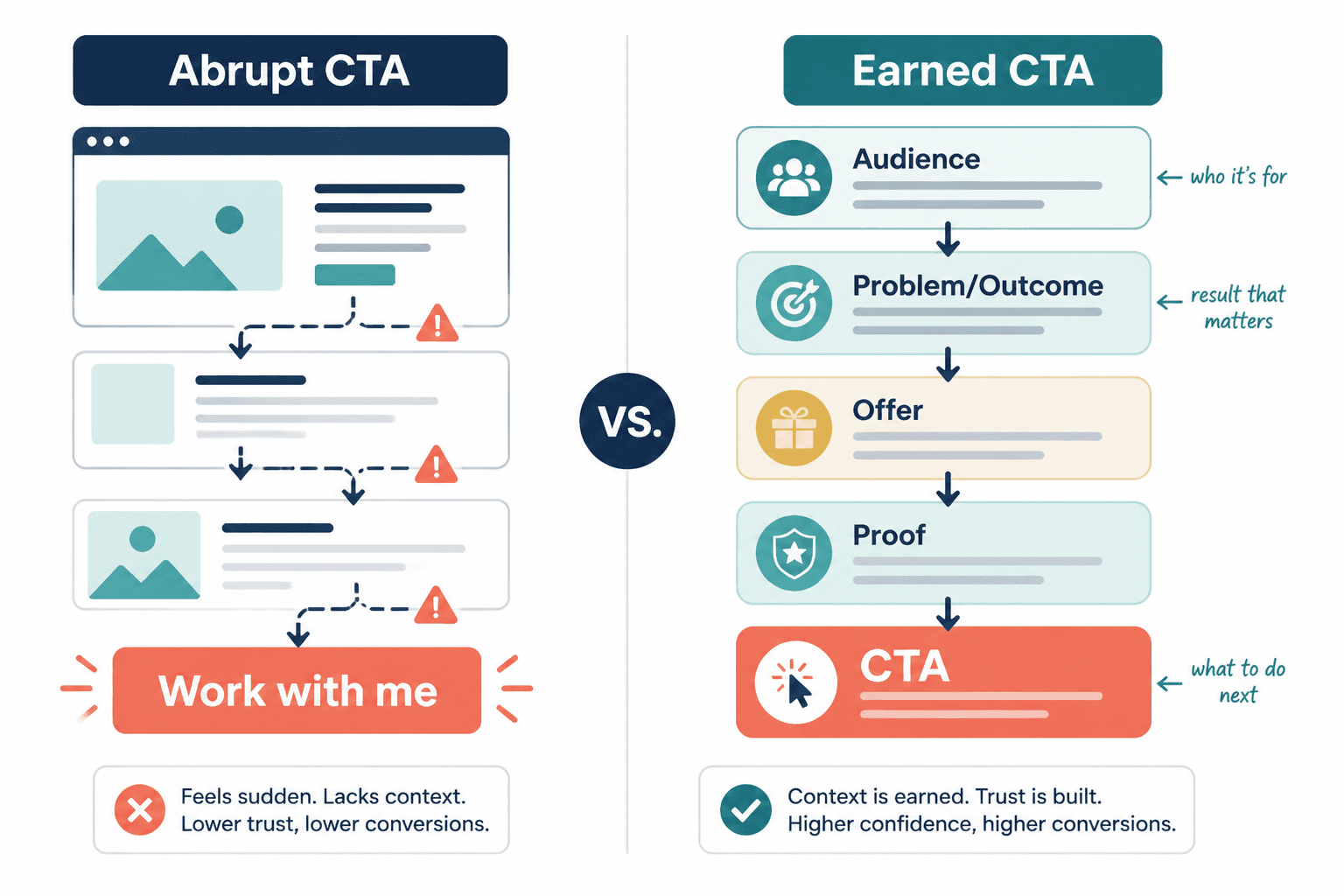
8. Ending with a CTA that feels detached from the page
A homepage can have a perfectly decent CTA and still weaken it through bad ordering.
If the final section just says “Work with me” after a page that never clearly connected your offer, proof, audience, and next step, the CTA feels abrupt. It reads like a button attached to a different page.
Your final CTA should feel earned. By the time readers get there, the page should have built a clean bridge from problem to offer to trust to action.
Usually that means the bottom of the homepage should briefly restate:
- who the offer is for
- what result or transformation matters
- what to do next
Not a random button stranded in emotional weather.
What a better homepage section order usually looks like
There is no single perfect homepage structure. Anyone promising one universal formula is overselling it. Different businesses need different emphasis. A consultant with one flagship service is not structuring the page exactly like a creator with multiple offers or a coach with a personality-led brand.
Still, most high-performing homepages follow a similar logic. They move from clarity to trust to action in a sequence that feels obvious once you see it.
- Hero section: say what you do, who it is for, and what next step matters.
- Problem or value section: show that you understand the visitor’s situation or desired result.
- Offer overview: explain the main service, product, or path.
- Proof: testimonials, outcomes, credentials, featured work, client logos, or case snippets.
- Process or approach: explain how working with you works.
- About section: your background, philosophy, and why your perspective is credible.
- Objection handling or FAQ: answer practical concerns.
- Final CTA: restate fit and give a clear next step.
That sequence is not sacred. You can move pieces around. But if your current homepage puts proof after three philosophical essays and a founder memoir, there is your clue.
How to tell if your homepage order is hurting conversions
You do not always need analytics wizardry to spot a sequencing problem. Sometimes the page itself is basically confessing.
- Your homepage feels clear only after someone reads most of it.
- Visitors ask what you actually do even though the site “explains it.”
- People compliment the design but do not click through.
- The page has lots of information but no strong momentum.
- Your CTA gets little traction unless people already know you.
- The homepage sounds nice but feels weirdly effortful to follow.
That last one matters. Good homepage flow reduces cognitive effort. Visitors should not have to assemble your positioning from scattered clues like they are solving a low-stakes mystery.
A simple way to audit your current section order
If you want to fix homepage copy section order mistakes that hurt performance, do this before rewriting a single sentence.
- List your current homepage sections in order. Just the section names. Hero, about, testimonials, services, and so on.
- Ask what question each section answers. For example: “What do you do?” “Who is this for?” “Why trust you?” “How does it work?”
- Check whether those questions are answered in the order a skeptical visitor actually has them.
- Move any section that asks for too much trust too early.
- Move proof upward if claims appear before evidence.
- Trim or combine sections that repeat the same point in softer language.
This is where a lot of homepages improve fast. Not because the writing got prettier, but because the logic got cleaner.
Before and after: a rough homepage order rewrite
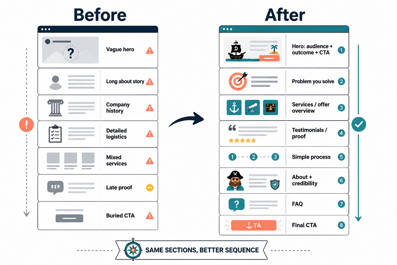
Before
- Hero with vague brand slogan
- Founder story
- Mission and values
- How I work
- Blog preview
- Services
- Testimonials
- CTA
What is wrong here? The page delays clarity, delays the offer, and delays proof. It puts internal identity ahead of external usefulness.
After
- Hero with clear audience, outcome, and CTA
- Short section on the problem you solve
- Services or offer overview
- Testimonials or proof strip
- Simple process section
- About section with founder credibility
- FAQ
- Final CTA
Same business. Same ingredients. Better order. Better odds.
And if your homepage keeps bloating because you are trying to force every possible detail onto one page, it may be worth reading when short homepage copy beats long ones. Sometimes the problem is not missing sections. It is too many sections doing too much.
What to prioritize if you can only fix a few things
If you do not want a full homepage overhaul right now, fair. Start with the changes that usually have the biggest impact.
- Make the hero clearer.
- Move your offer section higher.
- Bring proof closer to your main claims.
- Push detailed logistics lower.
- Make sure the final CTA restates who the offer is for.
That alone can clean up a surprising amount of performance drag.
One more useful gut check: if a stranger landed on your homepage and only read the first third, would they understand what you offer and why they should keep going? If not, the issue is probably not just the wording. It is the order.
FAQ
Should every homepage start with a hero, then services, then testimonials?
Not exactly, but most homepages do need early clarity, early relevance, and reasonably early proof. The exact order can shift. The logic should not.
Where should an about section go on a homepage?
Usually after the visitor understands what you offer and sees some proof. Your background matters more once the reader knows why it is relevant.
The bigger point is simple: clearer structure and clearer writing make the piece more useful. That is usually what makes the ending land better too.