
If your audience is still small, your homepage cannot afford to be vague, clever, or overly impressed with itself.
This is where a lot of creators get it wrong. They think a small audience means they need to look bigger, broader, and more “professional.” So they write homepage copy that sounds like a networking event in paragraph form. Lots of big claims. Very little clarity. Zero reason to trust them.
Homepage Copy for Creators With Small Audiences works better when it does the opposite. It should be specific, grounded, and useful fast. You do not need to sound like a polished brand empire. You need to sound like the right person for the right people.
If someone lands on your site from a post, podcast, referral, or profile click, they should be able to answer a few basic questions in seconds:
- Who is this for?
- What do they help with?
- Why should I believe them?
- What should I do next?
That is the job. Not “build a brand presence.” Not “elevate your digital identity.” Just make the next step obvious for the right visitor.
This article will show you how to write homepage copy that makes a small audience feel like an advantage, not a credibility problem. We will cover what to say, what to cut, how to structure the page, and how to sound trustworthy without pretending you are already internet royalty.
Want the broader roadmap? Start with the parent guide.
Small audience, different homepage job
When you have a massive audience, your homepage can get away with more shortcuts. People may already know your name. They may arrive with trust preloaded. They may even tolerate a slightly fluffy hero section because they are there for you.
With a small audience, your homepage has to do more actual work.
It needs to bridge the gap between “I found you” and “I get why you matter.” That means less chest-beating, more clarity. Less brand fog, more buyer confidence. Less trying to look famous, more trying to be useful.
A small audience is not the problem. Unclear positioning is usually the problem wearing a fake mustache.
If you are a creator, coach, consultant, solo founder, or personal brand, your homepage should not try to impress everybody. It should help the right person quickly recognize that you understand their problem and have a credible way to help.
That often means narrowing your message a little more than feels emotionally comfortable. Yes, that stings. Yes, it works.
What Homepage Copy for Creators With Small Audiences needs to do
A good homepage for a smaller creator brand has four jobs.
- Attract the right person with language they recognize
- Explain the value clearly without inflated jargon
- Build trust with proof, specificity, and tone
- Move the reader forward with one obvious next step
That is it. If your homepage is trying to do twelve things at once, it usually does none of them well.
For a broader foundation, you can also read the main homepage copy guide and this more detailed piece on homepage copy for creators who want better results.
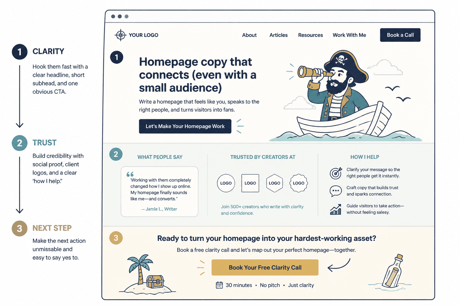
Start with a hero section that says something real
Your hero section is not the place for mood-setting fluff. It is the place for a sharp promise.
Most weak hero copy falls into one of these traps:
- It says who you are, but not who you help
- It sounds impressive, but means almost nothing
- It leads with a slogan instead of a clear outcome
- It makes the visitor work too hard to decode what you do
A simple hero formula that usually works
You do not need a sacred brand incantation. Use this:
- Headline: What you help a specific kind of person do
- Supporting line: How you do it or what makes your approach useful
- CTA: One clear next step
Example:
Homepage headline: Homepage copy that helps creators turn profile clicks into inquiries
Supporting line: I help coaches, consultants, and personal brands write clearer websites so visitors understand the offer, trust the expertise, and actually take the next step.
CTA: See homepage examples
That is not flashy. Good. Flash is overrated when the reader is still trying to work out if you are relevant.
Weak vs stronger homepage headlines
| Weak | Stronger |
|---|---|
| Helping brands tell their story | Homepage copy for creators who need clearer positioning and more qualified inquiries |
| Words that convert | Website copy that helps coaches and consultants sound sharper and sell with less friction |
| Build your dream brand | Messaging and homepage copy for small creator businesses that need trust before scale |
If you need help tightening the promise itself, this roundup of simple homepage copy value prop templates should help.
Do not hide your audience
One of the easiest ways to weaken your homepage is to avoid naming who it is for.
Creators with small audiences do this constantly because they are afraid of sounding too narrow. So instead of saying “I help nutrition coaches” or “I write websites for B2B consultants,” they say “I help purpose-driven entrepreneurs.” Which could mean almost anyone with a ring light and a Stripe account.
Specificity helps smaller brands more than bigger ones. It reduces confusion. It speeds up trust. It gives your visitor a faster “yes, this might be for me” moment.
You can still leave some room if your audience overlaps. For example:
- Creators, coaches, and consultants with expertise but messy messaging
- Personal brands selling services, programs, or digital products
- Small audience creators who need trust-building copy, not generic brand slogans
That is broad enough to breathe, but specific enough to mean something.
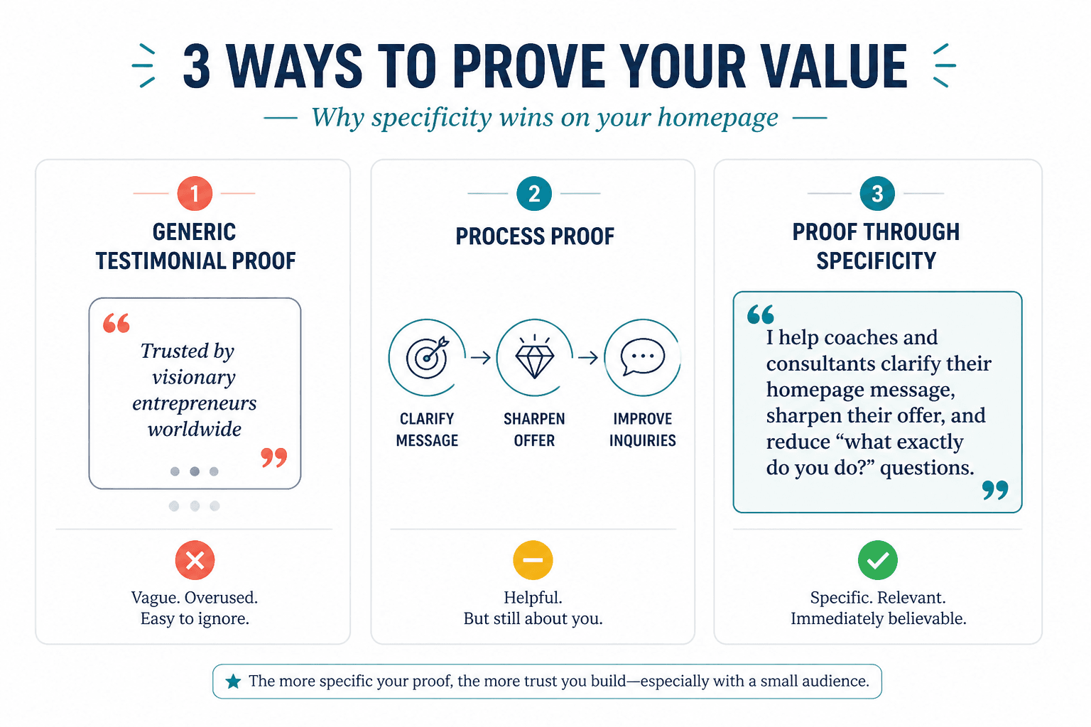
Use proof that fits your stage
A lot of people hear “add proof” and panic because they do not have giant testimonials, famous clients, or enough screenshots to build a shrine.
Relax. Proof does not have to be huge. It has to be believable.
If your audience is small, your proof can come from a few different places:
- Specific client results, even if there are only a few
- Short testimonials that mention outcomes or working experience
- A clear process that shows you know what you are doing
- Relevant experience from past work
- Strong examples of your thinking, writing, or strategy
- Case-study style mini breakdowns
Small brands often think they need to fake scale. They do not. They need to reduce risk.
That is an important difference. A visitor is not always asking, “Are you famous?” More often they are asking, “Do you seem competent, relevant, and clear enough that I would trust you with this problem?”
So instead of this:
Trusted by visionary entrepreneurs worldwide
Try something like this:
I help coaches and consultants clarify their homepage message, sharpen their offer, and reduce the “what exactly do you do?” problem that keeps slowing down inquiries.
That is proof through specificity. Quietly powerful. Much less embarrassing.
If you want inspiration, these homepage copy examples for coaches, consultants, and personal brands can help you see what believable proof looks like in context.
Build your homepage around reader questions
The cleanest homepage copy often comes from answering the questions your visitor already has in their head.
Not every page needs the exact same sections, but this structure works especially well for creators with small audiences because it keeps the page focused and low-friction.
1. What is this, and is it for me?
This is your hero section and opening value proposition. Be direct.
2. What problem do you solve?
Name the pain, friction, or missed opportunity. Show that you understand the mess before promising the fix.
For example, if you write homepage copy, the problem may not just be “bad website copy.” It may be:
- Visitors do not understand the offer fast enough
- The brand sounds generic
- The site gets clicks but not inquiries
- The copy feels polished but does not create trust
3. How do you help?
Explain your service, method, or resource in plain English. This is where people often become vague because they are trying to sound elevated. Resist the urge.
4. Why should I trust you?
Add proof, examples, client snippets, credentials, or a concise credibility section.
5. What should I do next?
Give one primary CTA. Two at most. If the page asks people to browse the blog, join the newsletter, book a call, buy the product, read the case studies, and follow you on three platforms, you are not giving options. You are creating avoidance.
Write like a person, not a laminated brochure
Small audience creators often over-polish homepage copy because they think polish equals trust.
It does not. Clarity equals trust. Specificity equals trust. Sounding like you actually understand your audience equals trust.
A little polish is fine. Corporate glaze is not. If your homepage sounds like it was approved by twelve managers and a sleepy AI tab, it probably will not convert well.
Here is a useful test: read your homepage out loud. If you would never say it to a real client on a real call, rewrite it.
Phrases worth cutting
- Helping you step into your power
- Authentic brands with heart-centered missions
- Transformative solutions for aligned growth
- Crafting compelling narratives that resonate
- Supporting visionary entrepreneurs on their journey
None of these are illegal. They are just exhausted. They blur together. They make a smaller creator sound more generic, not more credible.
What to use instead
- Concrete audience language
- Specific outcomes
- Simple descriptions of your process
- Natural phrasing
- A tone that matches how you actually work
A simple homepage section order that works
If your homepage is currently a beautiful mess, use this as a clean starting structure:
- Hero section with clear promise and CTA
- Short problem section showing what is not working
- Offer or service section explaining how you help
- Proof section with testimonials, examples, or credibility
- About snippet that sounds human, not autobiographical
- Final CTA section with one next step
That structure is not fancy. It does not need to be. Fancy is not the goal. Clear is.
For more layouts and inspiration, browse these homepage copy ideas and examples for creators.

What your CTA should do when you do not have huge traffic
When traffic is lower, every CTA matters more. Which means your call to action should not be vague, passive, or weirdly dramatic.
A good CTA for a smaller creator homepage should match visitor intent and business model. It should feel like the logical next step, not a sudden proposal.
Good CTA options
- Book a consult
- See services
- Read homepage examples
- Get the guide
- Start here
- View packages
Less helpful CTA options
- Learn more
- Work with me today
- Transform your brand
- Click here
- Begin your journey
The best CTA is usually the one that lowers friction while keeping momentum. If your traffic comes from colder sources, a guide or examples page may work better than pushing everybody straight to a booking page. If the traffic is warmer, booking may be fine.
About sections should support the sale, not hijack it
A lot of creator homepages quietly become biography pages with a sales button attached.
The bigger point is simple: clearer structure and clearer writing make the piece more useful. That is usually what makes the ending land better too.