
Most homepage copy is not bad because the writer lacks talent. It is bad because it is trying so hard to sound credible that it forgets to be clear.
You have probably seen the usual mess: vague promises, polished buzzwords, a headline that could belong to literally anyone with a Canva subscription, and a call to action that asks for commitment before trust has even shown up. It looks professional enough. It converts like wet cardboard.
If you want better Homepage Copy Examples for Coaches, Consultants, and Personal Brands, the fix is not “sound more premium.” The fix is saying the right thing, in the right order, with enough specificity that the right person thinks, “Ah. This is for me.”
This guide will show you what strong homepage copy actually looks like, why it works, and how to adapt it without cloning someone else’s site and hoping nobody notices. You will get examples for hero sections, proof sections, about blurbs, offer sections, and CTAs that do not sound like they escaped from a 2019 funnel template.
For the broader learning path, visit our parent guide.
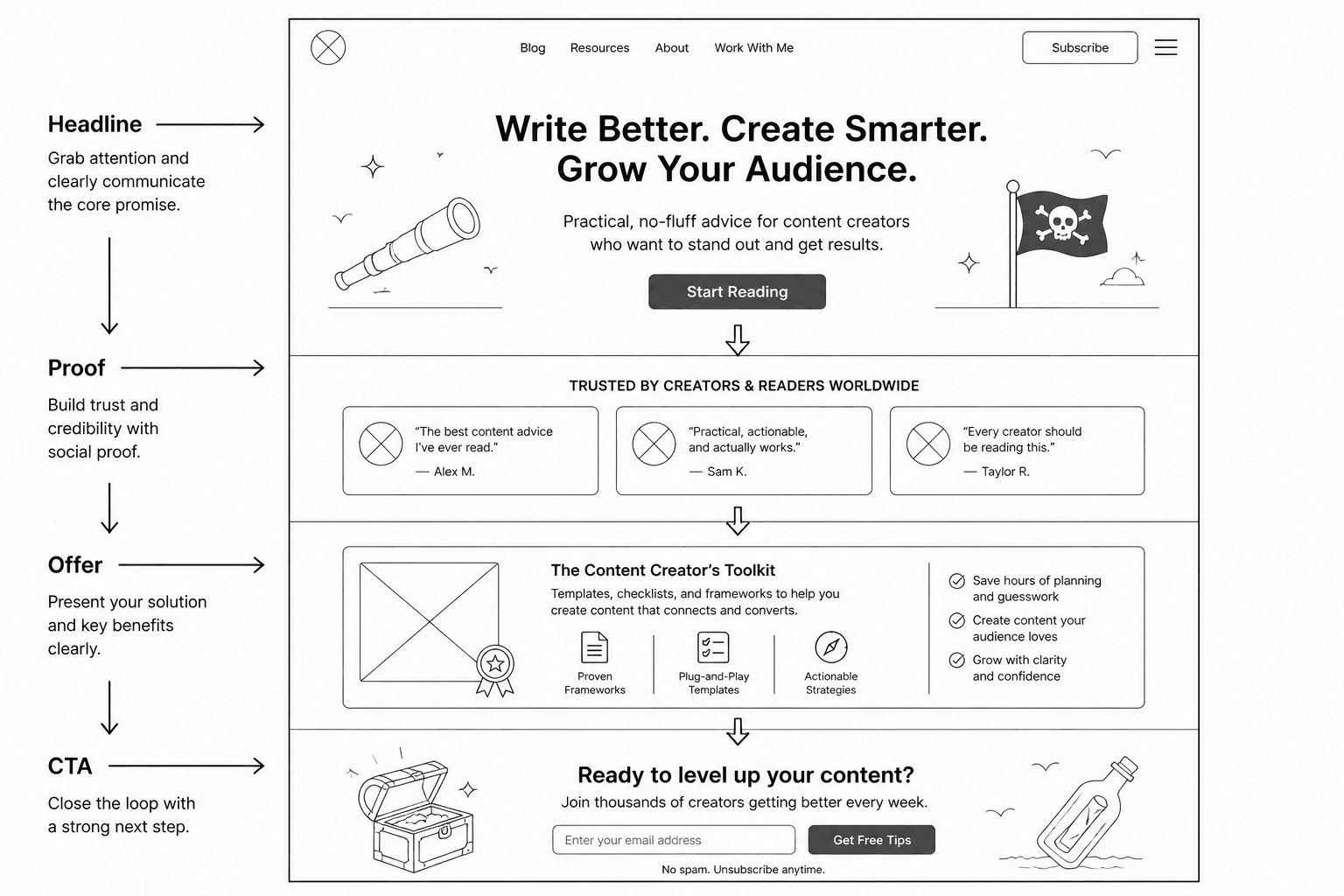
What good homepage copy actually needs to do
A homepage has a job. A few jobs, really. It should quickly tell people:
- who you help
- what you help them do
- why they should trust you
- what they should do next
That is it. Not every sentence has to be dazzling. It has to reduce confusion, build trust, and move the right people one step closer to action.
For coaches, consultants, and personal brands, this matters even more because people are not just evaluating your service. They are evaluating you. Your thinking. Your credibility. Your taste. Your ability to communicate clearly before they ever get on a call.
A messy homepage quietly says, “Working with me may also be messy.” Not ideal.
The biggest homepage copy mistake: trying to sound impressive first
Here is the pattern that keeps showing up:
I help visionary leaders unlock aligned growth through bespoke transformation strategies.
That sentence sounds expensive. It also says almost nothing.
People do this because they think homepage copy should feel elevated. But elevated without clarity is just expensive fog. If a visitor has to decode what you do, they usually will not. They will leave and go find someone who can explain themselves in one pass.
Strong homepage copy is usually more concrete than clever. Not boring. Just grounded. It names the audience, problem, result, or method clearly enough that people can place themselves inside it.
Homepage copy examples for coaches, consultants, and personal brands by section
Let’s break this into the sections most homepages need. You do not need every possible block. You do need a clear message architecture.
1. Hero headline examples
Your hero section is not the place for throat-clearing. It should quickly answer, “What is this site about, and is it relevant to me?” If your hero needs a second paragraph just to become understandable, the headline is probably doing too little.
| Weak | Stronger |
|---|---|
| I help purpose-driven entrepreneurs step into their next level | Homepage copy that helps creators and consultants sound clear, credible, and worth hiring |
| Strategic growth for visionary brands | Messaging strategy for experts who are tired of sounding vague online |
| Build a business aligned with your brilliance | Business coaching for service providers who need a simpler offer, clearer positioning, and better sales conversations |
| Thought leadership for modern founders | Content strategy for founders who want authority without posting beige nonsense every day |
The stronger versions work because they make an actual claim. They tell the visitor who it is for and what changes.
If you want more examples specifically for this section, these homepage hero section examples creators can adapt fast are worth studying.
2. Hero subhead examples
A subhead should support the headline, not reword it with fancier syllables. This is where you can add detail about the audience, process, offer, or outcome.
- Coach example: Get sharper messaging, stronger offers, and a homepage that makes the right clients want the call before you ever pitch them.
- Consultant example: I help B2B consultants clarify what they do, prove their value faster, and turn site visitors into qualified leads.
- Personal brand example: For creators, experts, and solo founders who want their website to sound like a real person with something worth buying.
A good subhead often does one of three things: adds specificity, adds outcome, or lowers friction. Preferably all three.
3. CTA examples that do not sound pushy or vague
Your homepage CTA should match buyer readiness. If someone just landed on your site, “Book now” can be a bit much. On the other hand, “Learn more” often says so little it may as well be decorative.
| Situation | Better CTA |
|---|---|
| You sell consultations | Book a discovery call |
| You want warmer leads first | See how I work |
| You have a signature offer | Explore the program |
| You want email subscribers | Get the free guide |
| You need to reduce friction | Start here |
The best CTA is usually not the cleverest one. It is the one that makes the next step feel obvious.
For a deeper breakdown, see better homepage copy and homepage CTAs for personal brands.
4. Credibility section examples
Once the hero has done its job, many visitors need a quick reason to trust you. Not your full life story. Just enough evidence that you know what you are doing.
- Results-based: Helped 40+ coaches and consultants clarify their positioning, improve conversion copy, and sell higher-value services with less waffle
- Experience-based: 8 years in brand messaging, conversion copy, and content strategy across service businesses and personal brands
- Recognition-based: Trusted by consultants, creators, and educators building authority-led businesses online
- Process-based: Strategy first, fluff never. Every engagement starts by tightening your positioning before touching copy
If you have numbers, use them honestly. If you do not, use specific proof instead of pretending your brand essence is a credential.
5. About section examples
The homepage About section is not your full biography. It is a short positioning section that connects your expertise to the visitor’s problem.
Example for a coach:
I work with independent consultants and service providers who are good at what they do but struggling to explain it simply. Together, we tighten the offer, clean up the messaging, and make the sales process feel far less awkward.
Example for a consultant:
I help founder-led businesses fix the gap between having real expertise and presenting it clearly online. That usually means sharper positioning, cleaner website copy, and a customer journey that does not lose people halfway through.
Example for a personal brand:
I write and strategize for people whose businesses depend on trust. If your content sounds smart but your website still feels fuzzy, generic, or weirdly corporate, that is usually fixable.
Notice what these do well: they stay focused on the client, but they still sound like a person wrote them.
6. Offer section examples
Your homepage should not make people hunt for what you actually sell. Even if your work is customized, you still need a simple way to describe the offer structure.
- Consulting offer: Strategic messaging intensives for founders who need a clearer market position, homepage, and sales narrative
- Coaching offer: 1:1 business coaching focused on offer clarity, client acquisition, and content that leads somewhere useful
- Done-for-you service: Homepage copywriting for experts who want sharper messaging and more qualified inquiries
- Hybrid offer: Strategy, copy, and content guidance for personal brands building trust-led businesses online
Keep the wording clean. Visitors should not need to infer what format the offer is, what problem it solves, or who it is for.
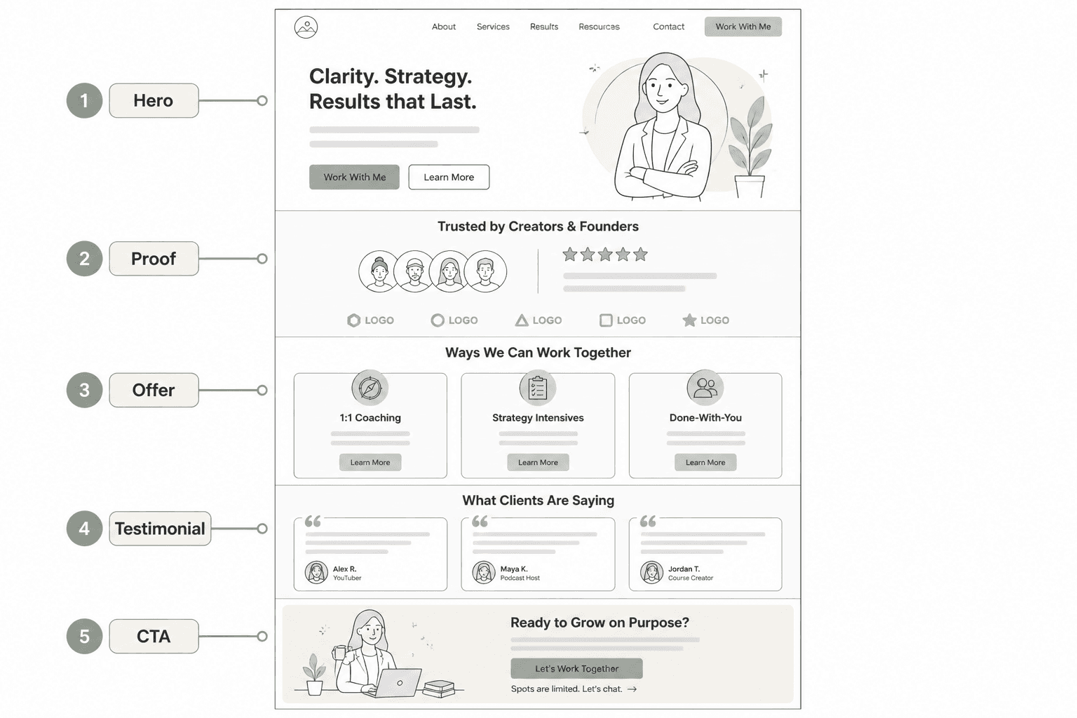
7. Testimonial intro examples
You do not need to slap “What clients are saying” on the page and call it a day. A short line introducing proof can help frame what the testimonials actually demonstrate.
- Clients usually come to me when the expertise is solid but the message is not landing.
- Here is what happened when we cleaned up the strategy before polishing the wording.
- A few kind but useful words from clients whose websites now make more sense and convert better.
That little bit of framing can make the section feel more intentional and less like a pile of random compliments.
8. Closing CTA examples
By the bottom of the page, your reader should know what you do, who it is for, and why they might trust you. Now the CTA can be a bit more direct.
- Coach: Ready to make your offer and messaging easier to buy? Book a call.
- Consultant: If your site sounds competent but not compelling, let’s fix that.
- Personal brand: Want a homepage that sounds like you on your best day, not a chatbot in loafers? Start here.
That last line is about as sassy as we need to get. One sharp elbow, then move on.
Three full mini homepage copy examples
Here are three stripped-down examples showing how the pieces can work together.
Example 1: Business coach homepage copy
Headline: Business coaching for consultants who need a clearer offer and easier sales process
Subhead: I help independent experts simplify their positioning, tighten their message, and stop relying on vague “value” language that never quite lands.
CTA: Book a discovery call
Credibility line: Trusted by solo consultants, coaches, and service businesses building lean, expertise-led brands
Example 2: Messaging consultant homepage copy
Headline: Messaging and website strategy for founder-led service businesses
Subhead: If your business is good but your website still sounds broad, generic, or painfully “professional,” I help fix the gap between what you do and how clearly people understand it.
CTA: See how I work
Credibility line: Strategy-first messaging for businesses that want better-fit leads, not just more page views
Example 3: Personal brand homepage copy
Headline: Homepage copy for creators and experts who are tired of sounding generic online
Subhead: I write clear, sharp website copy that helps personal brands earn trust faster, explain their value better, and convert attention into actual interest.
CTA: Explore services
Credibility line: For writers, coaches, consultants, and solo founders building authority without the usual internet sludge
How to write your own homepage copy without overcomplicating it
If you are staring at a blank page, use this order.
- Write the audience first. Who is this really for?
- Name the main problem or frustration they want solved.
- Describe the result you help create.
- Add one credibility signal.
- Choose one clear next step.
That basic sequence will outperform a surprising amount of “brand messaging” that sounds polished but cannot be understood without a translator.
And yes, sometimes the homepage needs a little personality. You are allowed to sound like a real person. In fact, if you are a coach, consultant, or personal brand, sounding too sanitized can hurt you. People are trying to get a feel for what working with you will be like. A little texture helps. Random cleverness does not.
What to avoid on your homepage
- vague identity statements with no client relevance
- too many audiences crammed into one headline
- buzzword salads about alignment, transformation, and impact
- long origin stories near the top of the page
- CTAs that ask for too much too soon
- proof that is impressive but disconnected from the actual offer
- copy that sounds like everyone else in your niche
One more thing: if your audience is still small, do not copy the homepage style of someone with a huge following and years of built-in trust. Their homepage can get away with more ambiguity because people already know who they are. Yours probably cannot. This guide on homepage copy for creators with small audiences covers that problem well.
Good homepage copy sounds simple because the thinking is strong
A lot of people assume strong copy means clever phrasing. Usually, it means strong decisions. Clear audience. Clear offer. Clear value. Clear path.
The bigger point is simple: clearer structure and clearer writing make the piece more useful. That is usually what makes the ending land better too.