
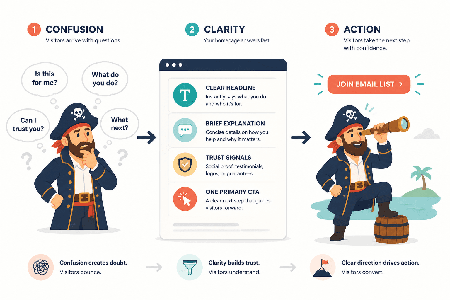
Most homepage copy fails in one of two boring ways.
It either says almost nothing in polished, expensive-sounding language, or it tries to say everything at once and turns into a chaotic wall of “I help” statements, vague promises, and buttons nobody feels like clicking.
If your homepage is supposed to help people understand what you do, trust that you are good at it, and take the next step, then it cannot afford to be pretty mush.
This Homepage Copy Guide for Creators Who Want Better Results is here to fix that. You will learn how to make your homepage clearer, sharper, more believable, and more likely to turn curious visitors into subscribers, leads, or clients without making your site sound like a webinar funnel from the beige era.
A good homepage does not need to say everything. It needs to do a few jobs well:
- Tell the right person they are in the right place
- Explain what you help with
- Give enough proof to feel credible
- Show what to do next
That is the game. Not “sound impressive.” Not “show range.” Not “fit every service, audience, idea, and identity crisis into one screen.”
For the main guide behind this topic, visit the parent guide.
The real job of a homepage
Your homepage is not your full life story. It is not your content archive. It is not your diary with a scheduling tool attached.
Its job is to orient people fast, build confidence, and move them toward one sensible next step.
For most creators, coaches, consultants, solo founders, and personal brands, that next step is usually one of these:
- Join the email list
- Book a call
- View services
- Read your best work
- Download a useful resource
- Inquire about working together
If your homepage tries to push six goals equally, it usually weakens all of them. Pick the primary action you actually want. Then support it with structure and copy that make sense.
If you want a broader foundation for your website messaging, it helps to start with the bigger website conversion copy framework and the related website core copy guidance. But on the homepage specifically, clarity beats cleverness almost every time.
What better homepage copy actually changes
Good homepage copy improves results because it reduces hesitation.
When someone lands on your site, they are quietly asking:
- Is this for me?
- What do you actually do?
- Can I trust you?
- Why this instead of the ten other tabs I have open?
- What should I do next?
Weak copy leaves those questions hanging. Strong copy answers them quickly, naturally, and without sounding like it was generated by a business jargon blender.
Better homepage copy can lead to:
- More newsletter signups
- More qualified inquiries
- Better fit clients
- More clicks to key pages
- Less confusion in sales conversations
- Stronger trust before someone ever contacts you
Notice what is not on that list: “trick people into converting.” Good homepage copy is not manipulation. It is good explanation with a spine.
The core sections every strong homepage usually needs
You do not need every possible section. But most homepages that convert well for service-based creators and personal brands include some version of these.
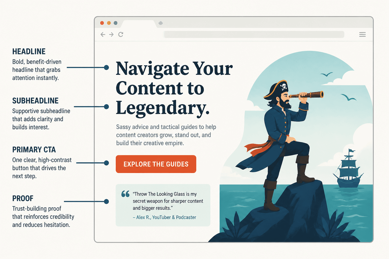
1. A clear hero section
This is the top section people see first. It should answer three things fast:
- Who you help
- What you help them do
- What they should do next
That means your headline does not need to be poetic. It needs to be understood.
Weak example:
Helping bold humans step into aligned visibility
Better example:
I help coaches and consultants turn vague expertise into clear content that earns leads
The first version sounds like it owns three candles and a PDF. The second version tells people what is going on.
Your subheading can then add useful context:
Homepage messaging, content strategy, and conversion copy for creators who are tired of sounding smart but selling nothing.
And then give people one main CTA. One. Not three equal buttons wrestling in public.
2. A quick value proposition section
This section explains why your offer, method, or perspective is worth attention.
Good value props are specific. They connect your work to outcomes people care about. They do not rely on foggy words like transformational, authentic, aligned, empowering, holistic, or elevated unless you also explain what any of that means in practice.
If you need help building those lines, this guide to simple homepage copy value props templates for busy creators can save you a lot of overthinking.
3. Proof or credibility
Visitors need reasons to believe you. Not because they are rude, but because the internet is full of polished nonsense.
Proof can include:
- Client results
- Testimonials
- Notable experience
- Relevant numbers
- Publications or speaking
- Short case study snippets
- Specific examples of what you have helped people achieve
The key is relevance. “Featured in” logos can help a little. But “Helped 37 consultants clarify their positioning and improve homepage conversions” is usually more useful than a vague pile of media badges with no context.
4. A section that explains your offer
Do not make people go hunting to figure out what they can hire you for.
You do not need to explain every detail here. But your homepage should make your offers legible. If you do strategy intensives, copywriting, ghostwriting, consulting, or coaching, say so plainly and link onward.
A simple format works well:
- Offer name
- Who it is for
- What problem it solves
- What happens next
5. A friction-reducing section
This is where you answer the small objections quietly blocking action.
For example:
- What kind of clients are the best fit?
- Do you only work with certain industries?
- Is there a waitlist?
- Do you offer custom work?
- What happens after someone inquires?
Sometimes a short process section does this beautifully. People relax when they know what is about to happen.
6. A clean CTA near the end
By the time someone reaches the bottom, they should not be forced to interpret your intentions like a Victorian codebreaker.
Tell them what to do next, and make the payoff clear.
Weak CTA:
Get in touch
Better CTA:
Book a strategy call and we’ll figure out what your homepage needs to convert better
How to write homepage copy that gets better results
Here is the practical part. If your homepage is underperforming, the fix is usually not “be more clever.” It is usually “be more useful, more specific, and more intentional.”
Start with the reader, not your résumé
Many homepages are too founder-centered. They lead with a long origin story, a list of credentials, or a vague statement about passion.
People care about you in relation to what you can help them do. That does not mean removing personality. It means earning interest by making your relevance obvious first.
A simple formula for your hero section:
- Audience: who it is for
- Problem or goal: what they want or need
- Outcome: what improves
- Action: what to do next
Example:
I help creators and consultants fix homepage copy that sounds polished but does not convert.
Clear messaging, stronger positioning, and pages that make the next step obvious.
Book a homepage review.
Cut vague claims until the page can stand on its own
If your homepage says things like “results-driven,” “high-impact,” “human-centered,” or “designed to elevate your brand,” ask the obvious question: what does that mean here?
Vague claims create the illusion of professionalism while telling the reader almost nothing. Replace them with specifics.
| Vague copy | Stronger copy |
|---|---|
| Strategic messaging for visionary founders | Messaging strategy for solo founders who need a clearer offer and sharper homepage copy |
| I help brands grow online | I help personal brands turn content traffic into email subscribers and consultation leads |
| Authentic copy that connects | Homepage copy that sounds like you, explains the offer clearly, and gives visitors a reason to act |
Make the first screen do more work
Your first screen matters because many visitors decide within seconds whether to keep reading. Not because of secret algorithm magic. Just because people are busy and impatient, and honestly, fair enough.
Your above-the-fold section should usually include:
- A headline with actual meaning
- A subheadline that adds detail or context
- One primary CTA
- Optional trust signal, like a client result or short credibility line
For deeper help on structure, see how to write better homepage copy and the broader homepage copy resources.
Use proof before people need to go looking for it
Do not tuck all your credibility away on an About page and then act surprised when strangers hesitate.
You can build trust on the homepage with small, clean proof elements:
- “Trusted by 50+ coaches, consultants, and creators”
- “Average homepage bounce rate dropped after rewrite” if you can support it
- “Used by clients earning through strategy calls, courses, and service offers”
- A one-sentence testimonial with a real outcome
- A brief case study link
Proof works best when it is specific enough to feel real and short enough not to stall the page.
Write CTAs like a person who knows what happens next
Many homepage CTAs are weak because they are too generic, too timid, or too abstract.
Bad CTA language includes:
- Learn more
- Start here
- Work with me
- Get started
Those are not always wrong, but they often leave too much unsaid.
Stronger CTAs name the action or the benefit:
- Book your homepage audit
- See copywriting services
- Read the best homepage examples
- Get the homepage messaging template
- Join the newsletter for weekly conversion copy tips
A small tweak here can make the page feel more confident and easier to act on.
Homepage copy mistakes creators keep making
Some mistakes show up constantly, especially on creator and personal brand websites.
Trying to sound premium instead of sounding clear
A lot of homepage copy is reaching for sophistication and landing in fog.
Premium does not come from abstract language. It comes from sharp thinking, clean positioning, confidence, and proof.
Leading with identity soup
If your homepage introduces you as a creator, strategist, mentor, speaker, coach, writer, consultant, founder, educator, and digital storyteller, the reader now has homework.
Pick the role that best matches the problem you solve on this site. Your homepage is not a full census of your personality.
Being too broad to feel relevant
“I help businesses grow” is not a homepage message. It is a placeholder for one.
The more competitive your market, the more clarity matters. Narrowing your message does not always mean narrowing your services. It often just means being specific enough that the right people recognize themselves.
Hiding the offer
Visitors should not need detective skills to find out how to work with you.
If your homepage has beautiful language, polished brand photos, and no obvious explanation of what is actually for sale, that is not mysterious. It is just inconvenient.
Writing like every visitor is ready to buy right now
Many homepage visitors are not hot leads. They are curious, cautious, and still deciding if you are relevant.
That is why a homepage should support multiple levels of intent. A clear primary CTA matters, but so do softer paths like reading examples, joining a newsletter, or exploring services.
A simple homepage copy structure you can steal
If your current homepage feels messy, here is a practical structure that works well for many creators, coaches, consultants, and service-based brands.
- Hero: who you help, what you help with, primary CTA
- Quick proof: testimonial, result, or trust signal
- What you do: short explanation of your service or approach
- Why it matters: value props or outcomes
- Offers: 1 to 3 clear ways to work with you
- More proof: examples, testimonials, mini case studies
- About snippet: enough personality to feel human, not a memoir
- FAQ or objections: reduce friction
- Final CTA: clear next step
This structure is not sacred. But it gives the page shape, and shape matters. Good copy is not just good sentences. It is good sequencing.
For more inspiration, you can pair this with best homepage copy ideas and examples for creators and homepage copy examples for coaches consultants and personal brands.
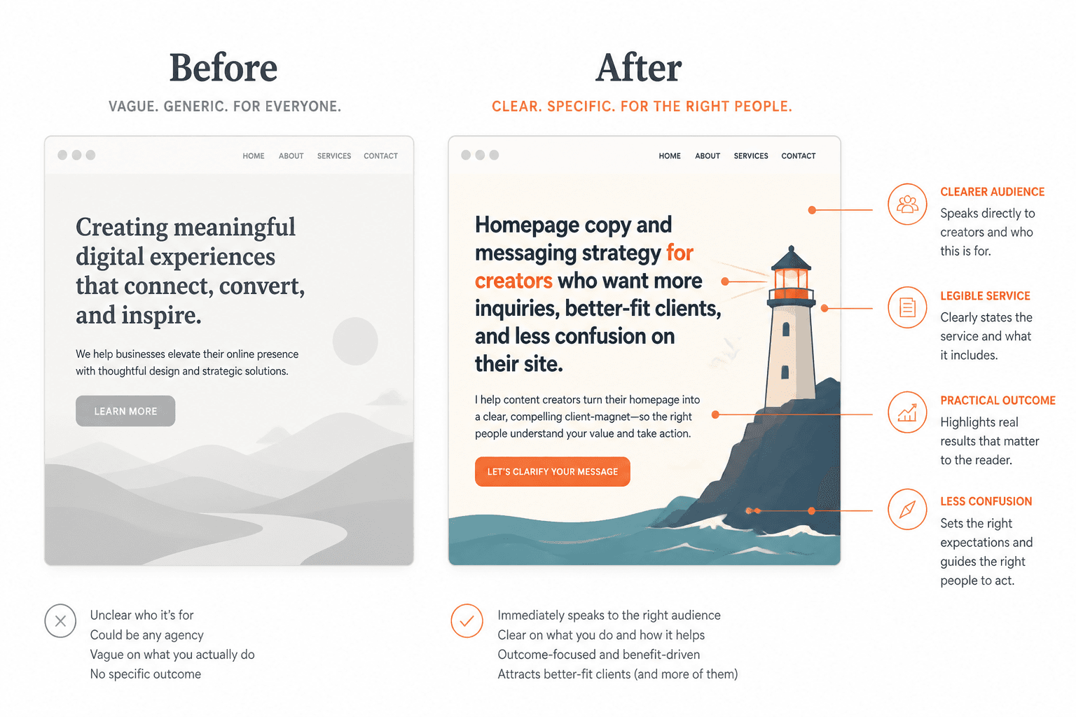
Before and after: a quick homepage rewrite
Here is what this often looks like in practice.
Before:
I help visionary entrepreneurs build aligned brands through authentic messaging and soulful strategy so they can scale with ease.
Sounds polished. Says very little.
After:
I help coaches and personal brands clarify their message so their homepage, content, and offers are easier to understand and easier to buy from.
What changed?
- The audience became clearer
- The service became legible
- The outcome became practical
- The fog got politely escorted out
Another one:
Before:
Creating meaningful digital experiences that connect, convert, and inspire.
After:
Homepage copy and messaging strategy for creators who want more inquiries, better-fit clients, and less confusion on their site.
No fireworks. Just clarity. That is often enough to improve results.
How long should homepage copy be?
Long enough to do the job. Short enough not to become a swamp.
That means homepage length depends on things like:
- How expensive or complex your offer is
- How much trust the audience needs before acting
- Whether people are cold or warm traffic
- How specific your niche is
- How many offers you need to explain
A creator selling a simple template pack probably needs less homepage copy than a consultant selling four-figure strategy projects. Obvious, but easy to ignore when people start copying sites that were built for very different businesses.
As a rule, do not obsess over total word count first. Obsess over whether each section earns its place.
Quick homepage copy checklist
- Can a stranger tell who the site is for within a few seconds?
- Does the headline say something specific?
- Is the main offer easy to find?
- Is there at least one strong trust signal?
- Do the value props sound concrete, not floaty?
- Is the primary CTA obvious?
- Are there any sections trying to impress instead of explain?
- Could you cut 20 percent without losing meaning?
- Does the page guide visitors toward a next step that matches their intent?
FAQ
What should the headline on a homepage do?
It should quickly tell the right person what you help with and why they should keep reading.
Should homepage copy be clever or clear?
Clear first. Clever only if it does not reduce understanding.
Do creators need testimonials on a homepage?
If you have them, yes. Even one strong testimonial can reduce hesitation.
How many CTAs should a homepage have?
Usually one primary CTA, with a few supporting paths for visitors who need more context.
What if I serve more than one audience?
Lead with the audience most tied to your main offer, or unify them around one shared problem or outcome.
Final thought
The best homepage copy is not the most poetic, the most branded, or the most “elevated.” It is the copy that makes the right visitor think, yes, this is for me, this feels credible, and I know what to do next.
If your current site is not doing that, do not start by redesigning everything. Start by tightening the message, clarifying the offer, and removing the fluff that keeps your homepage polite but ineffective.
That is how a Homepage Copy Guide for Creators Who Want Better Results should end, honestly: with a reminder that better results usually come from better clarity, not louder branding.