
People love arguing about sales page length like there is one correct answer and everyone else is committing copy malpractice.
There is not.
Sometimes a long sales page does the heavy lifting beautifully. Sometimes it is just a bloated scroll-fest stuffed with repeated promises, vague testimonials, and six different versions of “this is for you if…” because nobody had the nerve to edit it.
When Short Sales Pages Beat Long Ones comes down to one thing: how much page your buyer actually needs before they are ready to act.
If trust is already warm, the offer is simple, the stakes are low enough, and the audience gets it fast, shorter often wins. Not because short is trendy. Because friction kills momentum, and unnecessary copy is friction wearing a “strategy” nametag.
This article will help you figure out when a shorter sales page is the smarter move, what needs to stay on the page, what can go, and how to avoid chopping your conversion copy down into a minimalist little pancake with no persuasion left in it.
If you also need the broader sales page context, see sales pages and this guide for creators who want better results. If your bigger question is timing and page length in general, this breakdown on how long sales pages should be will help.
Want the broader roadmap? Start with the parent guide.
Short sales pages win when the decision is already close
The main job of a sales page is not to impress people with effort. It is to move the reader from interest to action with enough clarity and confidence that buying feels sensible.
That means short pages tend to work best when the page is closing more than it is educating. The buyer is not starting from cold. They already know who you are, what the problem is, and why your offer might help.
In that situation, a long page can actually make things worse. It gives the reader more chances to hesitate, overthink, or drift off to check messages and never come back. You had momentum. Then you buried it under four screens of copy trying to prove how serious you are.
Short pages are especially strong when your audience arrives pre-sold by your content, email list, referral network, webinar, community, or direct conversation. They do not need a 3,000-word emotional journey. They need the offer, the fit, the outcome, the price, the next step, and enough proof to feel safe.
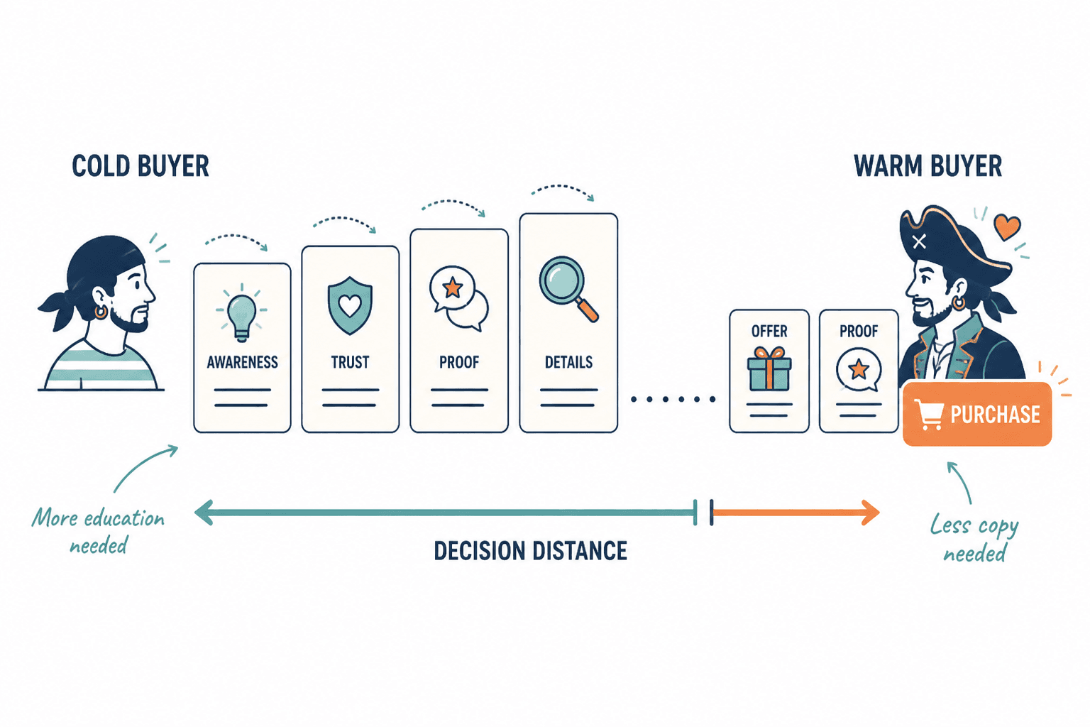
When short sales pages beat long ones
Here are the clearest cases where short usually has the edge.
1. The audience already trusts you
If the page is being sent to subscribers, followers who know your work, past buyers, warm leads, or referred prospects, you do not need to spend half the page proving you are a legitimate life form.
Trust has already been built elsewhere. Your page can cash in on that trust instead of rebuilding it from scratch.
2. The offer is simple to understand
A focused workshop, a low-ticket template bundle, a single consulting session, a mini-course, a paid newsletter, a diagnostic audit, or a straightforward service package often does not need endless explanation.
If the offer can be understood in one sentence, the page usually should not read like a legal thriller.
3. The price is relatively low or moderate
In general, lower-cost offers require less persuasion on-page. Not no persuasion. Less.
People still need clarity, confidence, and a reason to care. But they usually do not need a full manifesto before buying a $29 guide or a $150 workshop seat.
4. The buyer already knows the problem hurts
If your market is problem-aware, you do not need ten paragraphs dramatizing the pain. In fact, doing that can feel manipulative or tedious.
Good example: a consultant buying a lead generation template pack already knows weak lead flow is a problem. You do not need to write a mini tragedy about inconsistent pipeline and Sunday scaries.
5. The traffic source does some of the selling before the click
If the person clicked through from an email sequence, launch post, webinar, podcast interview, direct message conversation, or detailed article, then part of the sales process has already happened.
The page does not need to carry the full load alone. It just needs to convert the intent already created upstream.
6. The next step is small and specific
Short pages are also great when the CTA is simple:
- Book a call
- Buy the workshop
- Download the paid resource
- Join the cohort
- Reserve a spot
- Apply for the program
The less cognitive load involved in the next step, the less page you usually need.
Signs your sales page is too long for the offer
A lot of pages are not “long-form.” They are just repetitive.
Here are some reliable signs the page is dragging around more copy than it deserves:
- You repeat the same claim three different ways because the page feels thin without it.
- The offer could be explained in 30 seconds, but the page takes seven minutes to read.
- You have long sections that are really just reassurance loops with no new information.
- The testimonials all say basically the same thing.
- The FAQ is doing the real selling because the rest of the page is fluffy.
- You keep adding copy because conversions feel scary, not because the buyer needs more clarity.
- The CTA appears late because you are trying to “earn” it through volume.
That last one matters. A lot of creators write like they need to apologize for charging. So the page turns into a giant preamble before finally whispering the actual offer. Not ideal.
If your page has weak flow as well as weak restraint, read these sales page flow mistakes that hurt performance. Length is often less the issue than poor sequence.
What a short sales page still needs
Short does not mean skeletal.
A short page still has to answer the buyer’s basic questions fast. If it does not, you are not being concise. You are making the reader do extra work, which is a lovely way to lose the sale.
The essential pieces
- A clear headline: what the offer is and why it matters
- A sharp subhead: who it is for or what result it helps create
- A short explanation: what they get, how it works, what changes
- Offer details: format, timing, deliverables, access, price
- Proof: testimonial, result, credibility marker, or useful specificity
- Objection handling: just enough to reduce hesitation
- A visible CTA: obvious, direct, easy to act on
That is the spine. You can arrange it a few different ways, but if those pieces are missing, your short page is not elegant. It is undercooked.
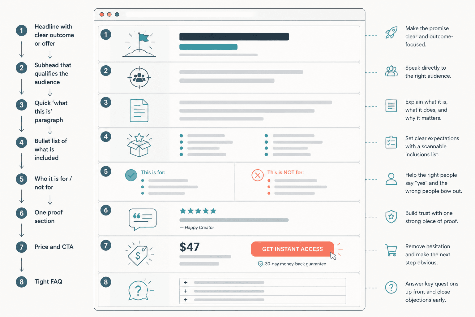
A simple short-page structure
- Headline with clear outcome or offer
- Subhead that qualifies the audience
- Quick “what this is” paragraph
- Bullet list of what is included
- Who it is for and who it is not for
- One proof section
- Price and CTA
- Tight FAQ
That structure covers a lot of ground without drowning the reader. It is especially useful for creators, coaches, consultants, and service businesses selling focused offers.
Short page vs long page: the real deciding factors
Instead of asking “Should this be short or long?” ask these questions instead.
| Factor | Short page fits better when… | Long page fits better when… |
|---|---|---|
| Audience awareness | They already know the problem and likely know you | They are colder and need more context |
| Offer complexity | The offer is easy to grasp quickly | The offer needs explanation, comparison, or education |
| Price point | The financial risk feels manageable | The price is high enough to trigger more scrutiny |
| Traffic source | The click came from warm content or conversation | The page has to do most of the selling itself |
| Decision friction | The next step is clear and small | The commitment is bigger or more uncertain |
| Proof needed | A little proof goes a long way | The buyer needs deeper validation |
None of these are strict laws. They are judgment calls. But they are much more useful than copying whatever page format some big-name marketer uses for a very different audience and offer.
Offers that often do well with shorter sales pages
- Low-ticket digital products
- Single-session consulting or audits
- Workshops and masterclasses
- Waitlists for upcoming offers
- Simple service packages
- Mini-courses
- Template packs and toolkits
- Paid communities with a very clear angle
- Application pages for warm traffic
That said, “often” is doing important work here. A workshop sold to cold traffic may still need a longer page. A high-trust audience may buy a premium offer from a short page because they are already convinced by your body of work. Context matters more than category.
How to shorten a sales page without wrecking conversions
If your current page feels too long, do not just start deleting random paragraphs and calling it optimization. Cut with intent.
1. Keep only sections that answer real buyer questions
Read through the page and ask, “What question is this section answering?” If the answer is vague, or if three sections answer the same question, there is your editing target.
2. Cut repeated emotional framing
You usually do not need multiple sections re-explaining why the problem is frustrating. Name the pain clearly, then move on. Readers are not goldfish.
3. Compress proof
Instead of stacking eight weak testimonials, use two or three stronger ones with specific outcomes, decisions, or objections they overcame.
4. Replace fluffy subheads with useful ones
Bad subhead: “A better way forward.”
Better subhead: “What you get in the 90-minute messaging audit.”
One sounds poetic. One helps people buy.
5. Move detail into bullets
Bullets are excellent for short sales pages because they let readers scan the substance fast. Deliverables, outcomes, inclusions, logistics, and fit criteria all get cleaner in bullet form.
6. Bring the CTA up sooner
If a warm reader is ready by section two, do not make them hike through the copy wilderness to find the button.
7. Tighten the FAQ instead of expanding the body
A neat FAQ can handle final objections without inflating the main page. Keep it practical and brief. If the FAQ becomes the longest part of the page, you probably have an offer clarity problem, not an FAQ problem.
Before and after: long for no reason vs short with purpose
Too long
“If you have ever felt overwhelmed by the demands of content creation in a noisy digital world, and you have struggled to communicate your authentic message in a way that aligns with your true purpose and helps you stand out, this workshop may be the breakthrough you have been waiting for…”
Shorter and better
“This 90-minute workshop will help you turn scattered ideas into clear content angles you can actually post, pitch, and sell from.”
The shorter version does not just save words. It reduces fog. It tells the reader what the offer is for.
Too long
“Inside this program, we will walk together through a transformational framework designed to support you at every stage of your client attraction journey…”
Shorter and better
“You’ll leave with a clearer offer, sharper positioning, and a simple client acquisition plan you can use this month.”
Again, less floaty language. More buying language.
If you want more examples of what strong pages look like in practice, these sales page ideas and examples for creators are worth a look.
What short pages should not try to do
- They should not explain a complicated methodology from scratch.
- They should not sell a high-friction premium offer to cold traffic with almost no proof.
- They should not rely on cleverness instead of clarity.
- They should not hide key details in the name of elegance.
- They should not sound abrupt, bare, or suspiciously vague.
There is a version of “minimalist” copy that just makes people feel under-informed. That is not premium. That is annoying.
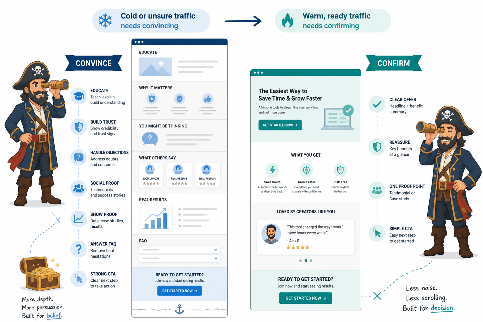
A practical test: does the page need to convince or confirm?
Here is the simplest way to decide page length.
If the page needs to convince, it will usually need more depth. If it mostly needs to confirm, shorter often works better.
Convince means the reader still needs education, trust-building, objection handling, and proof.
Confirm means the reader is already leaning yes and wants clean reassurance that this is the right offer, at the right time, from the right person.
This is why short sales pages often work so well for creators and service businesses with good content ecosystems. The selling did not start on the page. The page is just where the decision gets finalized.
Quick FAQ
Can a short sales page work for high-ticket offers?
Yes, if the traffic is very warm and trust is already strong. No, if the page is doing all the persuasion alone.
The bigger point is simple: clearer structure and clearer writing make the piece more useful. That is usually what makes the ending land better too.