
Most sales pages do not fail because the writer forgot some mystical persuasion trick.
They fail because the page is vague, self-important, badly structured, and weirdly afraid to just say what the offer is, who it is for, and why it is worth paying for.
That problem gets even worse for coaches, consultants, and personal brands. The product often is your expertise, your process, your thinking, and your ability to help someone get a result. Which means if the page sounds fluffy, generic, or overhyped, trust drops fast.
This guide gives you practical sales page examples for coaches, consultants, and personal brands, but more importantly, it shows you why those examples work. So instead of copying some bro-funnel mutant from 2021, you can build a page that sounds like you, earns trust, and sells the offer without performing a full infomercial seizure.
If you need broader strategy after this, start with the sales pages hub or the more complete sales pages guide for creators who want better results.
For the main guide behind this topic, visit the parent guide.
What good sales pages for personal brands actually do
A strong sales page is not just a prettier brochure. It does a few very specific jobs in a very specific order.
- It makes the offer clear fast
- It helps the right person recognize themselves
- It turns a vague desire into a concrete outcome
- It reduces obvious objections
- It proves you can help
- It explains the process without making it sound like corporate soup
- It gives the reader a clean next step
That is the core job. Not sounding profound. Not impressing your old agency friends. Not using “transformational” fifteen times and hoping money appears.
For coaches and consultants especially, the page has to balance authority and clarity. Too soft, and it sounds unserious. Too polished, and it sounds fake. Too abstract, and people cannot tell if you solve a real problem or just host expensive Zoom calls with a Notion template.
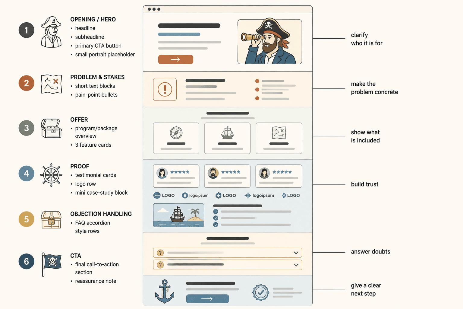
The core sections behind most strong sales page examples
Before we get into examples, here is the basic structure most good pages use in some form.
- Opening: who it is for, what it helps with, and why this matters now
- Problem and stakes: what is frustrating, costly, slow, or broken right now
- Offer: what they get, how it works, and what is included
- Proof: results, case studies, testimonials, examples, authority markers
- Objection handling: timing, fit, complexity, trust, readiness, price
- CTA: apply, book, buy, join, schedule, or inquire
If your page skips one of those, the reader has to fill in the blank themselves. Most will not bother. They will leave, half-interested, vaguely unconvinced, and probably go buy from somebody whose writing is less pretty but more obvious.
If your opening is weak, this companion piece will help: better sales page openings for personal brands.
Sales page example 1: 1:1 coaching offer
Let’s start with a common one: a coach selling a premium one-on-one offer.
Weak version
Step into your next level with personalized transformational coaching designed to help ambitious leaders break through limitations, align with their purpose, and create success from the inside out.
This sounds expensive and unclear. It might mean anything. Which is the problem.
Stronger version
Private coaching for experienced consultants who are fully booked, slightly fried, and tired of being the bottleneck in their own business. We’ll tighten your offer, simplify your sales process, and build a business that grows without needing your nervous system as the main operating system.
Why this works:
- It names a specific audience
- It signals a clear pain point
- It hints at the outcome without nonsense
- It sounds like a human wrote it
Now let’s build out a cleaner structure for that page.
Example structure
Headline:
Private coaching for consultants who want a simpler business, stronger positioning, and more sales without acting like a full-time content goblin.
Subhead:
This is a 12-week coaching offer for established service providers who know they are good at the work but need sharper messaging, a cleaner offer, and a more reliable path from attention to clients.
Problem section:
You do good work. But your business still depends on too much custom explaining, too many almost-clients, and too much content that “does well” without clearly leading to revenue.
What we work on:
- Your positioning and offer clarity
- Your sales page and core messaging
- Your content-to-client path
- Your sales process and objections
- Your delivery model and scope control
CTA:
Apply for private coaching
Notice what is missing: fake soul-language, broad “success” promises, and ten paragraphs about mindset before we even know what the offer does. If mindset support is part of the work, fine. But make the business case legible first.
Sales page example 2: consultant strategy package
Consultants often make the opposite mistake. Their pages are full of capable-sounding words but feel like they were written by a procurement form.
Weak version
I provide strategic advisory services for brands seeking scalable messaging frameworks, go-to-market alignment, and cross-channel optimization.
This might be accurate, but it is not helping much. It tells us the category, not the actual value.
Stronger version
A messaging strategy package for founder-led brands that have outgrown scattered marketing. You’ll leave with a sharper core message, clearer page copy priorities, and a practical plan your team can actually use.
That works better because it links the service to an obvious before-and-after. The reader can picture life before the engagement and after it.
Example consultant sales page sections
- Who this is for: founder-led brands with traction but muddy messaging
- What is broken: website, pitch, sales deck, and content all say slightly different things
- What you get: audit, interviews, positioning doc, page recommendations, messaging guide, handoff session
- Why this matters: unclear messaging slows sales, weakens campaigns, and makes every launch harder than it should be
- What happens next: book a fit call or submit an inquiry form
A consultant page does not need to be dry just because the offer is strategic. In fact, dry can hurt you. If your own sales page cannot make strategy sound concrete, why would anyone trust you to clarify theirs?
Sales page example 3: personal brand digital product or program
Personal brands often sell lower-ticket offers too: workshops, async programs, templates, mini-courses, or resource packs. These pages need less hand-holding than a high-ticket consulting page, but they still need a spine.
Weak version
The ultimate content system for creators who want to grow faster, stay consistent, and build a thriving personal brand online.
We have all seen this sentence wearing different wigs. It says “internet product” and not much else.
Stronger version
A practical content planning system for solo creators who are tired of guessing what to post. Use it to turn your expertise into sharper ideas, cleaner hooks, and a repeatable weekly workflow without spending your life inside a content calendar.
That version gives us audience, frustration, and payoff. Already better.
Example page flow
Opening: what the product is and who it helps
Pain points: inconsistent posting, blank-page problem, weak hooks, no system, too much time spent deciding
What is inside:
- Idea bank template
- Post structure cheatsheets
- Hook prompts
- Weekly planning workflow
- Examples and swipe references
Proof: screenshots, testimonials, sample outcomes, product preview
CTA: get instant access
For this kind of offer, showing what is inside matters a lot. Not every page needs to reveal every module and bonus in obsessive detail, but readers should not have to guess what they are buying. If your offer stack needs work, read sales pages offer stacks examples creators can adapt fast.

What these sales page examples have in common
Good sales page examples for coaches, consultants, and personal brands usually share the same few traits, even when the offers are different.
- Specific audience: not “everyone who wants growth”
- Clear outcome: not “unlock potential”
- Visible problem: not vague dissatisfaction
- Concrete deliverables: what happens, what is included, how it works
- Natural voice: polished, but not embalmed
- Proof: enough evidence to lower skepticism
- Clean CTA: one obvious next step
That sounds simple because it is simple. Not easy, but simple. Most underperforming sales pages are not missing complexity. They are missing nerve. The nerve to be specific. The nerve to choose an audience. The nerve to say what the offer really does in normal language.
Before-and-after rewrites you can steal the logic from
Example 1: vague promise to practical result
Before:
Helping entrepreneurs step into aligned visibility and magnetic growth.
After:
I help service-based founders fix unclear messaging so their website, content, and sales pages do a better job turning attention into inquiries.
The second version may sound less mystical, but that is exactly why it sells better. Buyers are not usually looking for magnetic growth. They are looking for fewer confused leads and more qualified ones.
Example 2: generic authority to relevant proof
Before:
With years of experience and a passion for empowering others, I guide clients toward their highest goals.
After:
Over the last three years, I’ve helped independent consultants tighten their positioning, rebuild underperforming service pages, and simplify the path from audience growth to booked calls.
“Years of experience” is filler unless tied to something useful. “Passion” is nice. It is not proof.
Example 3: soft CTA to clear action
Before:
If this resonates, feel free to reach out and connect.
After:
If you want help tightening your sales page before your next launch, book a fit call and I’ll walk you through whether this package makes sense.
“Feel free to reach out” is the copy equivalent of shrugging. A CTA should point somewhere.
How to make your sales page sound more trustworthy fast
If your page feels weak but you cannot tell why, run this check.
- Can a stranger tell who the offer is for in under 10 seconds?
- Can they explain the core result in one sentence?
- Can they see what is included without hunting for it?
- Can they find proof that does not sound staged?
- Can they understand the next step immediately?
If the answer is no to two or more of those, your page probably is not underperforming because of traffic. It is underperforming because it is making people work too hard to trust you.
This is also where a lot of personal-brand pages get tangled. The writer tries to sound premium by becoming less clear. That is backwards. Expensive offers do not earn trust by becoming more abstract. They earn trust by being more precise about the problem, the method, the fit, and the payoff.
A simple sales page template you can adapt
Here is a stripped-down structure that works well for many coaches, consultants, and personal brands.
- Headline: what the offer is and who it is for
- Subhead: what result it helps create
- Problem section: what is currently frustrating, costly, or stuck
- Offer section: what happens, what is included, how long it takes
- Why this works: process, method, or strategic angle
- Proof: testimonials, outcomes, examples, screenshots, mini case studies
- Fit section: who this is and is not for
- FAQ: timing, access, support, customization, logistics
- CTA: apply, book, buy, join
You can make that page short or long depending on the offer. A $49 product probably does not need a life story. A $5,000 consulting package usually needs more evidence and objection handling. But the bones stay similar.
For more inspiration, see best sales pages ideas and examples for creators. And if you want the broader category paths, you can also browse