Most creator landing pages do not fail because the design is ugly.
They fail because the page asks for a yes before it has earned one.
You land on the page and get hit with vague promises, soft proof, a stock-photo smile, and a button that says something like “Get Started” as if that means anything on its own. It is polished, technically. It also converts like a cardboard door.
This Landing Pages Guide for Creators is for people who sell expertise, services, digital products, coaching, consulting, memberships, newsletters, or offers attached to a personal brand. If you want better results, your page needs more than decent design. It needs a clear promise, believable proof, good structure, and less fluff pretending to be strategy.
Here is how to build landing pages that make more sense, create more trust, and give people a much better reason to click, subscribe, book, or buy.
If you want the broader category hub first, you can also browse the main landing pages resource collection and the wider conversion copy section.
For the broader learning path, visit our parent guide.
What a landing page is actually supposed to do
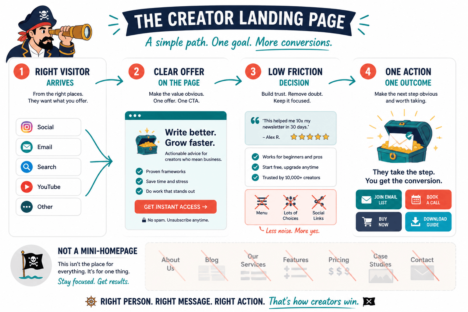
A landing page has one job: move the right person toward one specific action.
That action might be:
- Join your email list
- Book a call
- Buy a product
- Apply for your program
- Download a lead magnet
- Register for a workshop
- Watch a webinar
What it is not supposed to do is explain every detail about your business, show off every service you have ever offered, and function as a confused mini-homepage with commitment issues.
The best landing pages reduce friction. They make the offer clear, the audience obvious, the next step easy, and the payoff believable. That sounds simple because it is simple. It is just not always easy to write.
Start with the one thing you want the page to do
Before you write a headline, pick a layout, or fuss over button color, answer this:
What is the single action this page exists to get?
If the answer is “well, sort of book a call but also maybe read my blog and maybe browse my services,” your problem is not copy. Your problem is that the page has no spine.
One page. One audience. One primary action.
That does not mean the page has to be simplistic. It means everything on it should support the main conversion goal rather than competing with it.
Common creator landing page goals
- Lead capture: get the email in exchange for a useful free resource
- Sales: sell a low-ticket or mid-ticket offer directly
- Applications: pre-qualify and invite stronger-fit leads
- Booking: get consultations or discovery calls
- Waitlist: collect interest before launch
The more specific your goal, the easier the page becomes to write.
Know which kind of creator landing page you are building
Not all landing pages should sound the same because not all asks are equally risky.
If you are asking for an email, the page can be shorter. If you are asking someone to spend $1,500, book a call, or trust you with a business problem, you need more proof and more clarity. This is where a lot of creators go wrong. They copy a short template that worked for a freebie and use it for a serious offer. Then they wonder why the page feels thin.
| Page type | Main goal | What it needs most |
|---|---|---|
| Lead magnet page | Email signup | Fast clarity, clear benefit, low friction |
| Sales page | Purchase | Strong promise, proof, objections handled, CTA repetition |
| Booking page | Call or consultation | Fit, credibility, outcomes, process clarity |
| Application page | Qualified leads | Positioning, expectations, who it is for and not for |
| Waitlist page | Interest capture | Reason to care now, who it is for, what is coming |
If you need inspiration for different page setups, these landing page ideas and examples for creators will help.
The core parts of a landing page that actually converts
You do not need fifty sections. You need the right sections in the right order.
For most creator pages, these are the essentials:
- Headline
- Supporting subhead
- Primary call to action
- Audience/fit section
- Benefits or outcomes
- Proof
- Offer details
- Objection handling
- Final CTA
Some pages also need FAQs, process steps, guarantee language, testimonials, case studies, pricing context, or a founder note. But the basics above carry most of the weight.
1. Headline: make the promise clear, not clever
Your headline is not the place to audition for a copywriting awards panel.
A good landing page headline usually does one of these things:
- Promises a specific result
- Names a painful problem
- Calls out a clear audience
- Frames the offer in plain English
Weak: Build a Business That Feels Like You
Better: Get a clear creator offer, sharper messaging, and a landing page that turns attention into leads
Weak: Your Next Chapter Starts Here
Better: Book a strategy session to fix the messaging gaps costing you clients
Clarity beats vibe-heavy fog. Repeatedly.
2. Subhead: add context and reduce confusion
The subhead should answer the questions the headline opens up. Who is this for? What exactly do they get? Why now? What outcome can they expect?
Think of it as the line that stops the right visitor from bouncing.
Example: For coaches, consultants, and solo experts who are tired of sending traffic to pages that look fine but do very little. Learn the messaging, structure, and proof elements that help your offer convert.
3. CTA: say what happens next
“Submit” is lazy. “Learn More” is vague. “Get Started” often hides too much.
Your CTA should make the next step feel concrete.
- Download the checklist
- Book your strategy call
- Join the waitlist
- Get the free template
- Apply for coaching
- Buy the workshop
Specific CTAs reduce uncertainty. And uncertainty is expensive.
4. Audience fit: show people they are in the right place
A fast “this is for you if…” section can do a lot of work. So can a “not for you if…” section, when used well.
This helps filter casual curiosity from actual fit, which is useful for both conversions and lead quality.
- You are a creator with a real offer but a weak conversion path
- You get traffic from content, referrals, or social but too little action
- You want a page that sounds like you, not a funnel bro in loafers
5. Benefits: translate features into outcomes
People do not buy “six video modules” or “three worksheets” because those are technically included. They buy what those things help them do.
Features matter, but only after the outcomes make sense.
| Feature | What the reader actually cares about |
|---|---|
| Landing page template pack | Write faster without starting from a blank page |
| Messaging framework | Explain your offer clearly so people stop getting confused |
| Call review | See what is hurting conversions before wasting more traffic |
| Email follow-up sequence | Turn more leads into conversations without awkward chasing |
If your page is loaded with features and light on outcomes, it will feel informative but oddly unconvincing.
6. Proof: this is where trust gets real
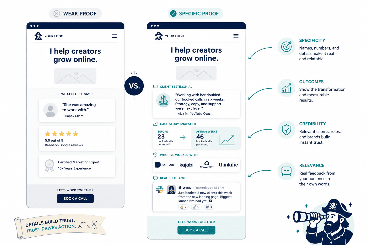
Proof is not decorative. It is one of the main reasons a page converts.
And no, “trusted by ambitious founders” is not proof. That is scented candle copy.
Good proof can include:
- Testimonials with specific outcomes
- Client results
- Short case studies
- Past roles or credentials that matter
- Audience size, if relevant and credible
- Notable work samples
- Screenshots of real feedback
- Examples of transformation before and after
The key is specificity. “She was amazing to work with” is polite, but weak. “We rewrote the landing page, cut the fluff, and doubled booked calls in six weeks” is much more useful.
If proof is the part you keep avoiding, this will help: simple landing page proof section templates for busy creators.
7. Objection handling: answer the doubts before they leave
People hesitate for reasons that are pretty predictable.
- Is this for someone like me?
- Will this actually help?
- Why this offer and not another one?
- Do I have time for this?
- What happens after I click?
- Is this worth the money?
Your page should handle these without sounding defensive. A good landing page does not pressure people past objections. It reduces the uncertainty causing them.
How to structure a creator landing page from top to bottom
If you are staring at a blank page and need a working order, use this.
- Headline
- Subhead
- Primary CTA
- Quick credibility cue or proof strip
- Who this is for
- Main benefits or outcomes
- How it works or what is included
- Testimonials or case study proof
- Objection handling / FAQ
- Final CTA
That sequence works because it follows the natural path of decision-making. First attention. Then relevance. Then trust. Then action.
Some creators front-load too much explanation before saying what the offer actually is. Others go the opposite direction and throw a CTA in someone’s face before any trust has been built. Both approaches create friction, just from different directions.
What creators keep getting wrong on landing pages
There are a few mistakes that show up over and over again.
Talking about yourself too early
Your visitor cares about one thing first: “Is this relevant to me?”
A founder story can help later. It should not be the first heavy section unless your story is directly tied to the offer and the page already established the value.
Using vague promises
“Grow your business with confidence” means almost nothing. It sounds nice. It also says very little.
Specific beats broad. Especially on pages where money or trust is involved.
Making every section sound polished but empty
This is the strange trap of modern AI-assisted copy. Everything sounds smooth. Nothing feels grounded. The result is a page that reads like it passed quality control and failed persuasion.
If a sentence could be used by a business coach, a web designer, a course creator, and a freelance photographer without changing a word, it is probably too generic.
Forgetting the traffic source
A landing page should match the intent of the person arriving there.
If someone clicked from a post about fixing low-converting offers, and your landing page opens with broad life-coach language, the disconnect will hurt trust fast. Message match matters. The page should feel like the next logical step from the post, ad, email, bio link, or referral that sent the person there.
Burying the CTA
Yes, people need context before they act. No, that does not mean you hide the main button until the bottom like it is a shy woodland creature.
Include an early CTA for ready visitors, then repeat it naturally as the page builds conviction.
How long should a landing page be?
There is no sacred number. The right length depends on the risk and complexity of the action.
Short pages work well when:
- The ask is small
- The offer is easy to understand
- The audience already trusts you
- The traffic is warm
Longer pages work better when:
- The offer is expensive
- The audience is cold
- The problem is nuanced
- You need more proof
- The reader has reasonable objections
Do not aim for short because short seems elegant. Aim for complete enough to convert. A short page with missing trust signals is not clean. It is unfinished.
If your audience is still small, read this guide to landing pages for creators with small audiences. Smaller audiences usually need stronger specificity and trust, not louder claims.
A simple landing page formula creators can actually use
If you want a practical draft structure, try this:
- Headline: what the offer helps the right person do
- Subhead: who it is for and why it matters
- CTA: clear next step
- Problem: name what is frustrating or broken now
- Solution: explain your approach or offer simply
- Benefits: what improves after saying yes
- Proof: results, testimonials, examples
- Details: what is included, how it works, what happens next
- Objections: answer likely hesitations
- CTA again: repeat the action with confidence
That is enough for a lot of creator pages. You can expand it, but you do not need to reinvent the anatomy every time.
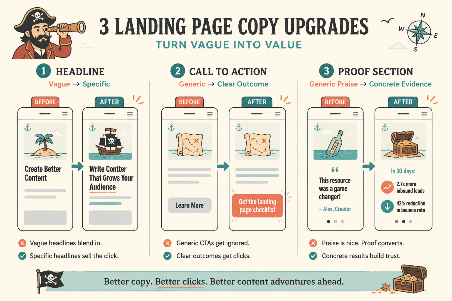
Before and after: how to make weak landing page copy stronger
Here is where this gets more concrete.
Example 1: weak hero section
Before:
Helping purpose-driven entrepreneurs scale with authenticity and alignment.
Why it struggles: It is broad, abstract, and full of words people nod at without understanding. Scale what? Alignment with what? How?
After:
Build a clearer offer and sharper landing page so more of your content turns into leads, calls, and sales.
This version is not poetic. Good. It tells the visitor what improves.
Example 2: weak CTA
Before:
Learn More
After:
Get the landing page checklist
The second one tells people what happens after the click. Tiny change, better clarity.
Example 3: weak proof section
Before:
My clients love working with me and get amazing results.
After:
After rewriting her offer page, one consultant went from “mostly referral inquiries” to consistent inbound leads from content and profile traffic. Another cut bounce from the hero section by making the headline less clever and much more specific.
Notice what changed. Not louder praise. Better evidence.
How to write landing pages that still sound like you
A lot of creators worry that conversion copy means sounding stiff, manipulative, or weirdly dramatic. Fair concern. A lot of landing pages do sound like they were assembled from old webinar scraps and mild panic.
But persuasive does not have to mean pushy. You can be clear, direct, and human at the same time.
To keep your voice intact:
- Use the words your audience already uses
- Keep sentences plain unless complexity adds value
- Cut hype language you would never say out loud
- Be specific instead of “powerful”
- Use personality in phrasing, not confusion in structure
This matters more for creators than faceless brands because your page is often part of a larger trust system. People came from your content, your profile, your newsletter, your podcast, or your social posts. If the page suddenly sounds like a completely different species of marketer, trust slips.
That does not mean the page should read like a casual caption. It means your voice should survive contact with strategy.
How to improve a landing page without redesigning the whole thing
You do not always need a full rebuild. Sometimes better results come from fixing a few high-impact areas first.
- Rewrite the headline so the value is obvious in seconds.
- Strengthen the CTA so the next action is specific.
- Add better proof with concrete testimonials or examples.
- Clarify who it is for so the right visitor feels recognized.
- Trim vague filler that adds length without adding trust.
- Check message match between traffic source and page.
- Repeat the CTA at logical points in the page.
That kind of cleanup often improves performance faster than fiddling with colors for three hours and calling it optimization.
If you want help tightening the actual writing, go to how to write better landing pages.
A practical checklist before you publish
- Is the audience clear in the first screen?
- Does the headline promise something concrete?
- Does the page ask for one primary action?
- Is the CTA specific about what happens next?
- Have you translated features into outcomes?
- Is there real proof, not just praise-shaped fog?
- Have you answered the most obvious objections?
- Does the page sound like you, just sharper?
- Does it match the post, ad, email, or link that sends traffic there?
- Can someone understand the offer quickly without scrolling forever?
FAQ
Do creators need separate landing pages for different offers?
Usually, yes. Different offers need different messaging, proof, and CTAs. One general page often waters everything down.
Should a landing page include navigation?
Often less is better. If the goal is one action, too many exits can dilute attention.
How much proof is enough?
Enough to make the offer feel believable. Higher-stakes offers need more proof than low-friction freebies.
Can a simple landing page still convert well?
Absolutely. Simple is fine. Vague is not. A clean page with strong copy can beat a fancy page with weak messaging.
What matters more: design or copy?
Both matter, but weak copy can sink a good design faster than decent copy gets hurt by a basic layout.
Final thought
The best landing pages for creators are not the prettiest, loudest, or most aggressively optimized-looking.
They are clear. They are relevant. They make a believable promise, back it up, and make the next step easy.
If you want better results, stop trying to make your page sound more impressive. Make it easier to understand, easier to trust, and easier to act on. That is the real point of a Landing Pages Guide for Creators, and it is usually where the gains are hiding.
The bigger point is simple: clearer structure and clearer writing make the piece more useful. That is usually what makes the ending land better too.