Most people do not need a more “high-converting” sales page template.
They need a sales page that does not sound vague, bloated, pushy, or stitched together from six bad swipe files and one panic attack.
That is the real issue behind the hunt for the best templates and tools for sales pages. Templates can help. Tools can save time. But neither will rescue a weak offer, muddy positioning, or copy that keeps talking at people instead of helping them make a clear buying decision.
So this guide is built for the useful version of that search. Not “what magic software writes millions.” More: what templates actually give your page structure, what tools genuinely speed up the work, and how to use both without ending up with a sales page that feels suspiciously like everyone else’s.
If you are building, rewriting, or tightening a page, this should help you choose better tools, steal smarter structure, and avoid the usual mess. If you need more broad guidance on page strategy, start with sales pages as your core foundation.
Want the broader roadmap? Start with the parent guide.
What the best sales page templates actually do
A good template is not a script you obey like it came down from a mountain.
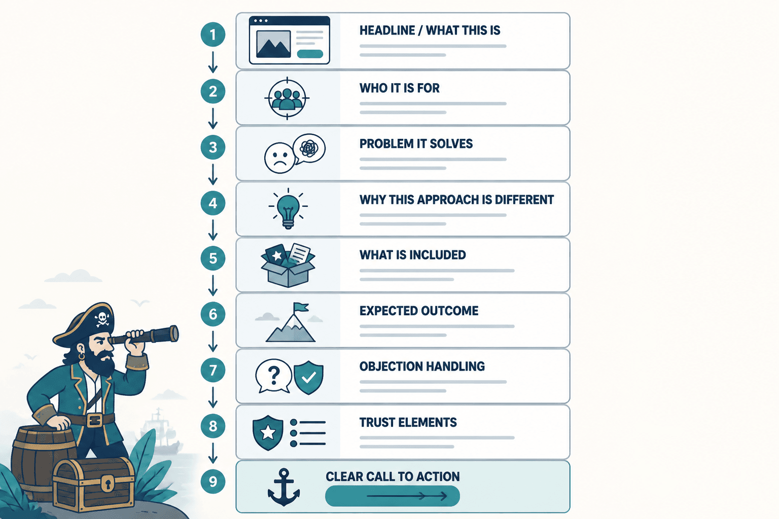
It is a decision-making shortcut. It helps you organize the argument, not fake one. The best sales page templates make sure the page answers the questions buyers already have, in roughly the order they need them answered.
That usually means the template helps you cover:
- What this is
- Who it is for
- What problem it solves
- Why this approach is different or better
- What is included
- What outcome the buyer can reasonably expect
- What objections need handling
- Why they should trust you
- What to do next
Notice what is not on that list: manipulative countdown nonsense, 47 testimonials from people who say nothing, and ten paragraphs of “imagine waking up…” copy. A lot of sales pages collapse because they try to manufacture intensity instead of making the decision easier.
Templates are at their best when they reduce blank-page syndrome and force clear sequencing. They are at their worst when they make every creator sound like a low-rent funnel clone.
The best templates and tools for sales pages depend on the kind of page you are building
Not every sales page needs the same structure, and pretending otherwise is how you get 4,000-word pages trying to sell a $29 product like it is enterprise software.
Before picking a template or tool, match it to the page type.
1. Short-form sales pages
Best for lower-ticket offers, simple digital products, workshops, templates, mini-courses, and straightforward services.
These pages usually need:
- A sharp headline
- A clear problem and promise
- A brief explanation of what is included
- A few proof points
- Basic objection handling
- A direct CTA
2. Medium-length sales pages
Best for higher-ticket courses, coaching packages, retainers, signature services, and more considered offers.
These need more room for explanation, trust-building, process, outcomes, and buyer concerns.
3. Long-form sales pages
Best for complex offers, expensive programs, strong objection-heavy markets, and buyers who need more proof before they move.
Long-form only works when there is actually more to say. If the offer is simple and the page is long because you panicked and kept typing, that is not strategy. That is page inflation.
4. Application-focused sales pages
Best for coaching, consulting, done-for-you services, fractional work, and premium offers where the CTA is an application or call booking rather than immediate payment.
These pages need less hard-selling and more qualification, credibility, fit, and next-step clarity.
Five sales page templates worth using
You do not need dozens. You need a few structures that work and enough judgment to adapt them.
Template 1: The simple creator product page
Use this for templates, mini-products, swipe files, workshops, or low-friction digital offers.
- Headline with clear outcome or use case
- Subheadline explaining who it is for
- What the buyer gets
- Why it helps now
- Preview or examples
- Quick proof or credibility
- Price and CTA
- Short FAQ
Why it works: It respects the buyer’s time. It gives enough detail to remove doubt without performing an entire launch monologue.
Template 2: The problem-solution-offer page
Use this when the audience knows the pain, but needs help connecting that pain to your specific offer.
- Headline naming the outcome
- Problem section showing the cost of staying stuck
- Why common fixes fail
- Your approach
- What is included
- Results, proof, or examples
- CTA
- Objection handling
- CTA again
Why it works: It creates contrast. That matters because buyers often are not deciding between “buy” and “do not buy.” They are deciding between your offer and doing what they have already been doing.
Template 3: The authority-first service page
Use this for consulting, copywriting, strategy, design, or done-for-you services.
- Headline with specific business result
- Who this is for and who it is not for
- Your process or method
- What you deliver
- Why clients hire you instead of cheaper alternatives
- Case studies or proof
- FAQ on scope, fit, timeline, pricing style
- Application or inquiry CTA
Why it works: Service buyers want confidence, not poetry. They need to know you understand the problem, have a process, and are not going to disappear into “bespoke solutions” fog.
Template 4: The objection-handling sales page
Use this for offers where buyers are interested but hesitant. Think premium programs, higher-ticket education, or services where trust is the whole game.
- Big promise, stated responsibly
- What the offer is
- Who it is built for
- What makes it different
- Proof
- Common objections answered one by one
- What they get
- CTA
- Risk-reduction details or reassurance
If this is the kind of page you need, pair this article with simple sales pages objection handling templates for busy creators. That will help you tighten the part most people either avoid or absolutely butcher.
Template 5: The sales page for a warm audience
Use this if the buyer already knows you from content, your newsletter, your audience, or previous launches.
- Direct headline
- Quick context
- What is new or different
- What is included
- Who should join or buy
- Short proof
- CTA
Why it works: Warm audiences do not need the same level of education. Overexplaining to them can actually drag the page down.
What to look for in a sales page tool
A sales page tool should make the work easier to publish, test, edit, or improve. It should not trap you inside ugly templates, clunky layouts, and fake flexibility.
At minimum, a good tool should help with one or more of these:
- Page building and layout
- Copy drafting and rewriting
- Wireframing and structure planning
- Checkout and funnel flow
- Proof collection and organization
- Analytics or behavior insights
- Collaboration and approvals
- Versioning and testing
The trick is not cramming all of that into one mega-platform. The trick is using a small stack where each tool has a job.
Best tool categories for sales pages
Specific tools come and go. Categories are more durable, and honestly more useful if you do not want your process wrecked every time a new platform starts calling itself revolutionary.
Page builder tools
These are for designing and publishing the actual page.
Good page builders should give you:
- Easy section-based editing
- Mobile responsiveness
- Simple CTA placement
- Fast loading
- Flexible layout without design chaos
- Easy editing after launch
What they should not force on you:
- Templates packed with useless visual clutter
- Headline styles no normal person would read
- Thirty optional blocks you do not need
- Design choices that distract from the offer
If your page builder makes every sales page look like an overcaffeinated course launch from 2019, maybe it is not helping.
Copy drafting and AI support tools
These help you brainstorm headlines, rewrite sections, tighten bullets, generate variations, and speed up rough drafts.
Useful? Yes. Magic? No.
These tools are best for:
- Getting a first draft out of your head
- Turning messy notes into cleaner sections
- Generating alternate headlines or CTA wording
- Condensing bloated copy
- Finding weak spots in clarity
They are bad at:
- Understanding your buyer better than you do
- Creating original positioning from thin air
- Writing convincing proof when none exists
- Building trust without real substance
If you want help choosing these, read best AI tools for sales pages. It pairs nicely with this guide because AI is useful for speed, but only if the structure underneath is solid.
Wireframing and outline tools
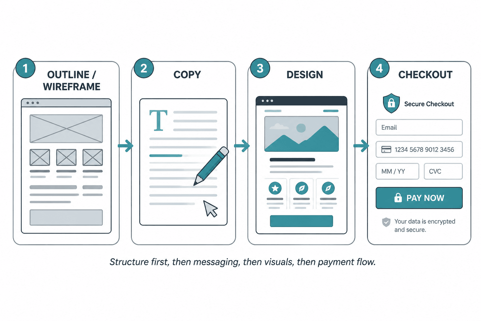
These are underrated. Before you design anything, it helps to map the page in plain language first.
A wireframing or outlining tool lets you decide:
- What sections you actually need
- What order they should appear in
- Where proof belongs
- Where readers may drop off
- How many CTAs the page really needs
This matters because good sales pages are arguments in sequence. Layout should support the logic, not replace it.
Checkout and funnel tools
Your sales page does not end at the button. If the checkout is clunky, confusing, or weirdly stressful, all your nice copy just handed the sale to friction.
Good checkout tools should make it easy to:
- Complete the purchase quickly
- Handle order bumps or upsells cleanly
- Match the feel of the page
- Reduce drop-off
- Deliver the product or next step immediately
For that side of things, read best checkout tools and funnel builders for sales pages. Because yes, your page can be good and your funnel can still quietly ruin it.
Proof and testimonial management tools
Not glamorous, but extremely useful if you are tired of digging through old DMs, emails, screenshots, and half-remembered client comments.
These tools help you collect and organize:
- Testimonials
- Case studies
- Results snapshots
- Before-and-after wins
- Permissioned quotes
A lot of sales pages feel weak because the proof section is weak. Not because the creator has no results, but because they have no system for capturing them.
A simple tool stack that covers most creators
You probably do not need a Frankenstein stack held together by fourteen subscriptions and optimism.
For most creators, consultants, and solo businesses, this is enough:
| Need | What the tool should do |
|---|---|
| Outline | Help you map sections and page flow before writing |
| Drafting | Support writing, rewriting, and variations |
| Page building | Publish a clean, editable, mobile-friendly page |
| Checkout | Make purchase or booking friction low |
| Proof storage | Keep testimonials and case studies organized |
| Analytics | Show where people click, scroll, or drop off |
That is usually enough to build a page, improve it, and keep your process sane.
How to choose the right template without making your page bland
The danger with templates is not that they exist. It is that people stop thinking the second they find one.
Use this filter before adopting any structure.
- Does it fit the offer?
Do not use a huge dramatic launch page for a tiny, obvious offer. - Does it match the audience’s awareness level?
If they already know the problem, stop over-educating them. - Does it give room for proof?
If not, you may end up with pretty sections and no trust. - Does it handle objections naturally?
If the page avoids buyer concerns, they do not disappear. They just move into the checkout hesitation zone. - Can you actually maintain it?
A template that is painful to update becomes stale fast.
There is also a style issue here. The more “plug and play” a template feels, the more likely it is to flatten your voice. So after choosing the structure, rewrite the page like a person who knows the offer, not a page assembled by committee.
How to use templates and tools together without creating beige sludge
Here is a practical workflow that keeps the useful parts and avoids the generic parts.
- Start with buyer questions.
List what they need to know before saying yes. - Choose a template based on offer type.
Pick the lightest structure that still covers the decision. - Outline the page in plain English.
No polishing yet. Just logic. - Draft manually first.
Even rough notes are fine. You need your real thinking on the page before tools start smoothing it into oatmeal. - Use AI or rewriting tools selectively.
Tighten headlines, sharpen bullets, improve transitions, generate alternate CTAs. - Build the page.
Keep the design simple enough that the copy does the work. - Add proof and objection handling.
This is where many pages become believable or stay decorative. - Fix the CTA path.
Button copy, checkout flow, booking page, next-step clarity. - Review for sameness.
Cut anything that sounds borrowed, inflated, or weirdly formal.
This is the part many people skip: after using a template and a tool, you still need editorial judgment. Otherwise the page may be technically “complete” and still feel dead.
Common mistakes when using sales page templates and tools
Most of these are painfully common, and none of them are fixed by buying another app.
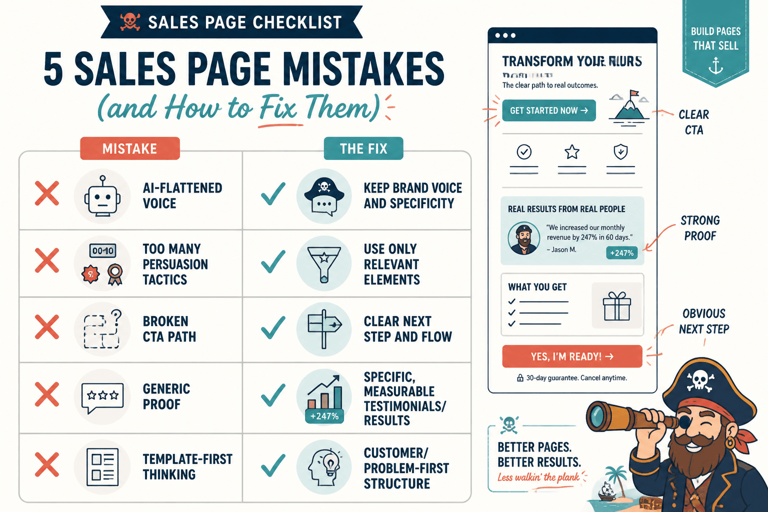
- Using too long a template for too small an offer.
More copy is not automatically more convincing. - Starting with design before message.
Pretty sections cannot rescue a fuzzy offer. - Letting AI flatten the voice.
If every sentence sounds polished but no sentence sounds true, that is a problem. - Stuffing in every persuasion tactic you know.
Urgency, bonuses, testimonials, founder story, FAQ, guarantee, scarcity. Calm down. Use what the page actually needs. - Forgetting the CTA path.
The sales page is part of a system, not a decorative island. - Using generic proof.
“This was amazing” is not proof. It is a compliment.
If you want inspiration for what stronger pages look like in practice, see best sales pages ideas and examples for creators. Sometimes the easiest way to improve your page is to notice what sharper examples are doing differently.
A quick before-and-after mindset shift
Bad template thinking sounds like this:
I need the perfect sales page format so I can finally write this thing correctly.
Better thinking sounds like this:
The bigger point is simple: clearer structure and clearer writing make the piece more useful. That is usually what makes the ending land better too.