
Most creators do not have a landing page problem. They have a trust problem, a clarity problem, or a “why would I do this right now?” problem.
That matters even more when your audience is small. If 87 people click through and your page is vague, overdesigned, or trying way too hard, you do not have enough traffic to hide the mistake. Big audiences can brute-force mediocre pages. Small audiences cannot.
That is why Landing Pages for Creators With Small Audiences should not be built like startup homepages or bro-marketer funnel pages. You do not need more hype. You need a page that makes a relevant person think, “Yep, this is for me, this sounds credible, and this next step feels easy.”
Here’s how to build a landing page that does that without turning your personality into beige corporate paste or your CTA into a needy little performance.
If you want the bigger picture, start with the parent guide.
Why small audiences need better landing pages, not fancier ones
When you have a small audience, every click matters more. You do not have unlimited chances. You probably are pulling visitors from a post, an email, a bio link, a DM conversation, or a handful of warm referrals. In other words, these people are not random. They are usually at least a little interested already.
So your job is not to “capture attention” with fireworks. It is to reduce friction, sharpen relevance, and make the next step feel obvious.
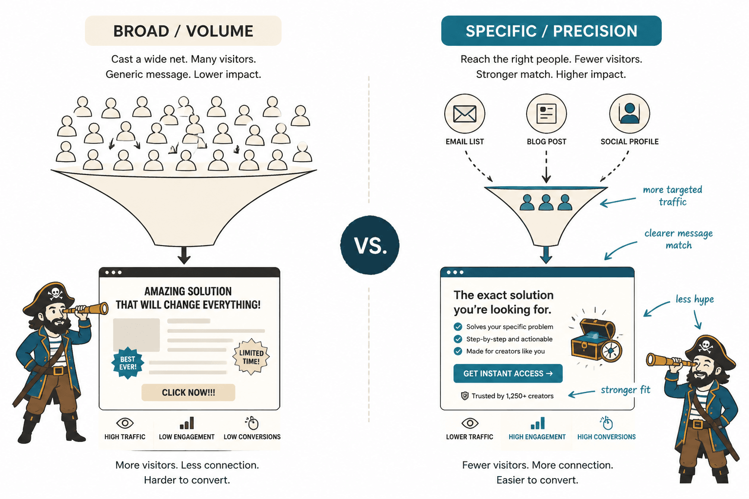
Small-audience creators often mess this up in two predictable ways:
- They make the page too broad because they want it to work for everyone.
- They overcompensate with dramatic copy because they think the page needs to sound more “salesy” to convert.
Both moves usually make the page worse. Broad pages feel slippery. Overcooked pages feel suspicious.
If your audience is small, your landing page should feel more specific, more grounded, and more human. Not louder.
If you want broader context on page structure first, it helps to read this guide to landing pages for creators who want better results and the broader landing pages hub.
What a landing page for a small creator actually needs to do
A good landing page for a creator with a small audience usually needs to do four things well:
- Match the click. The page should feel like a natural continuation of the post, email, or profile that sent them there.
- Clarify the offer fast. What is this, who is it for, and why should they care?
- Build enough trust. Not “I would hand you my firstborn” trust. Just enough trust to take the next step.
- Make action easy. One clear CTA. Minimal confusion. No wandering maze of options.
That is it. You do not need twelve sections explaining your philosophy of impact. You do not need a cinematic hero image of you thinking near a window. You definitely do not need six different offers elbowing each other for attention.
Start with a narrow promise, not a giant one
Small audiences respond better to pages that solve a specific problem for a specific kind of person. That does not mean your offer has to be tiny. It means the promise should be clear enough that someone can recognize themselves immediately.
Weak landing pages often lead with something like this:
I help purpose-driven entrepreneurs grow online with authentic strategy, systems, and content.
It sounds fine until you realize it says almost nothing. What kind of growth? Which entrepreneurs? What kind of content? What outcome? Why this offer?
Now compare it to something with actual edges:
Get a clear landing page that turns your profile traffic into email subscribers, consult calls, or buyers, without sounding like a funnel goblin.
That one is not perfect for every brand voice, but it does the job. It names the thing, hints at outcomes, and signals a tone. People know where they are.
A simple promise formula
Try this:
- I help [specific audience]
- get [specific result]
- through [specific offer or mechanism]
- without [common frustration or objection]
Example:
I help coaches with small audiences turn profile clicks into booked consults through clearer landing pages, without bloated funnel nonsense.
Your hero section should answer the big three in seconds
If someone lands on your page and has to scroll to understand what you are offering, the hero section is underperforming.
Your opening section should answer three basic questions quickly:
- What is this?
- Who is it for?
- What should I do next?
That sounds obvious, but plenty of creator pages still open with a vague headline, a moody photo, and a button that says “Learn More.” Learn more about what, exactly?
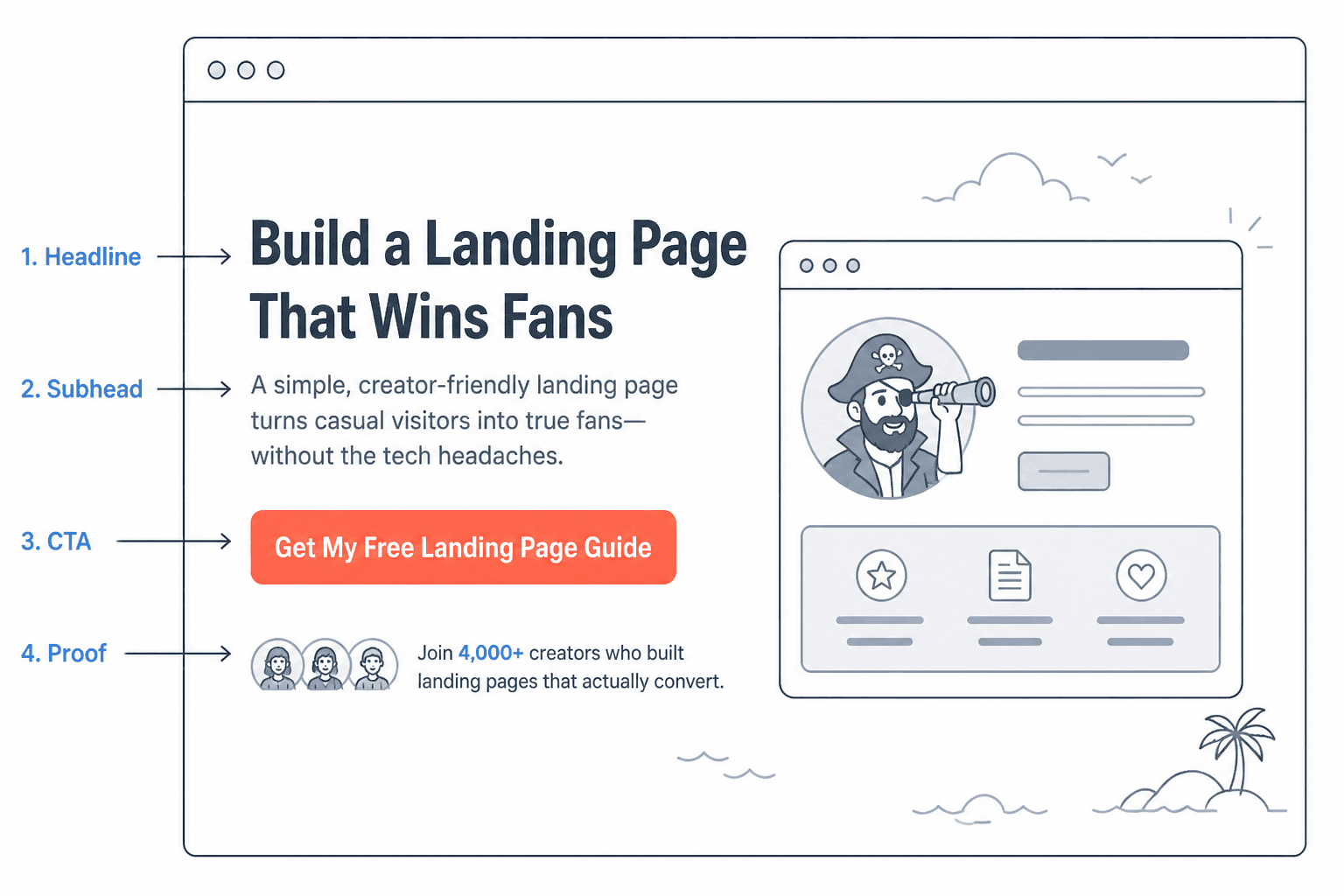
A practical hero structure
- Headline: clear result or clear offer
- Subhead: who it is for, what makes it useful, why it matters now
- CTA: one primary next step
- Optional credibility line: a quick proof marker
Example:
Headline: Landing pages that help small creators turn attention into action
Subhead: For writers, coaches, consultants, and solo founders who are getting clicks but not enough subscribers, leads, or inquiries. Clear messaging, stronger proof, less conversion mush.
CTA: Book a landing page review
Credibility line: Used by creators selling services, offers, and newsletters without giant audiences.
The point is not literary beauty. The point is clarity with enough personality to feel alive.
Do not drown a small audience in choices
One of the fastest ways to tank a landing page is to ask visitors to make too many decisions.
If your page offers a call, a free guide, a newsletter, three packages, a workshop, a “start here” tab, and a link back to your blog, you are not being helpful. You are creating polite confusion.
Small audiences tend to convert better when the page has one main goal. Pick the primary action:
- Join the email list
- Book a call
- Apply for a service
- Buy a low-ticket offer
- Download a lead magnet
Then build the page around that action.
If you need a secondary option, keep it genuinely secondary. Not another giant button fighting for custody of the visitor.
Small audiences need stronger relevance, not longer pages
A longer page is not automatically better for a smaller audience. Sometimes it helps, especially for services, applications, or higher-trust offers. But length only works when each section earns its keep.
If the page is long because you kept restating the same claim in slightly different inspirational dialects, that is not persuasive. That is copy bloat.
Use more length when the offer needs more trust, more explanation, or more objection handling. Use less when the offer is simple and the audience already knows you.
A better way to decide page length
- Shorter page: warm audience, low-friction action, simple offer
- Medium page: service inquiry, lead magnet, clearer persuasion needed
- Longer page: application, higher-ticket service, sales page, cold-ish traffic, stronger objections
The useful question is not “How long should my landing page be?” It is “How much information does this person need before this next step feels safe and worth it?”
Proof matters more when your audience is small
A small audience usually means you cannot lean on popularity signals alone. You probably do not have 50,000 followers or a carousel of giant logos. Fine. Most people do not care as much as creators think they do anyway.
What they do care about is whether there is believable evidence that your offer works or that you know what you are doing.
Your proof can be small and still effective:
- Short testimonials with specific outcomes
- Before-and-after examples
- Mini case studies
- Relevant experience
- Audience-specific wins
- A clear explanation of your process
- Examples of your thinking or work
The key is specificity. “She was amazing to work with” is nice but thin. “She rewrote my landing page and my consult bookings doubled over the next month” is doing actual labor.
If you need help structuring this well, these landing page proof section templates will save you from writing mush.
What to do if you do not have many testimonials yet
This is where newer creators either panic or start inventing confidence theatre. Do neither.
If you do not have many testimonials, use what you do have:
- Show your method clearly
- Share a sample teardown or example
- Use a founder note explaining who the offer is for and how you work
- Include relevant background or niche expertise
- Offer a lower-friction first step
People can forgive limited proof. They are less forgiving of fake polish and suspicious vagueness.
Write like a person, not a conversion template having a flare-up
A lot of landing page advice was written for marketers selling to strangers at scale. That is not always your situation.
Creators with small audiences often convert better when the copy feels direct, grounded, and sane. Not stiff. Not over-clever. Not dripping with manipulative urgency.
That means:
- Use plain language
- Say what the offer is
- Name the right audience
- Explain the benefit without inflating it
- Handle objections calmly
- Use CTAs that sound normal
Weak copy vs better copy
| Weak | Better |
|---|---|
| Transform your online presence | Turn profile clicks into email signups or inquiries |
| Designed to help you scale with ease | Built for creators who want clearer pages without a bloated funnel |
| Unlock your next level | Get a landing page that makes the next step obvious |
| Book your free discovery call today | Book a quick consult |
You are not trying to sound less professional. You are trying to sound more believable.
A simple landing page structure that works for small creators
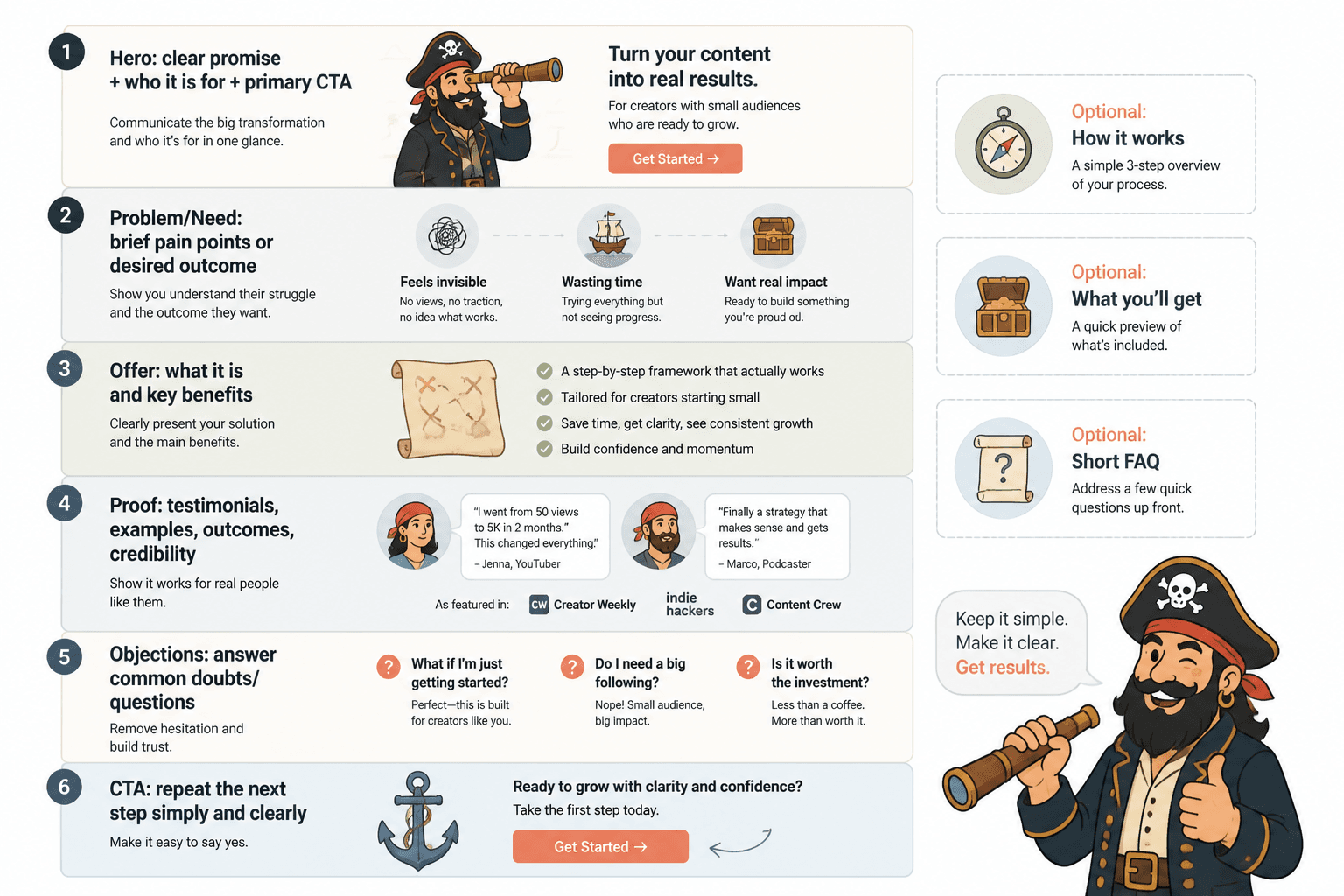
If you want a clean starting point, use this structure:
- Hero section
Clear headline, who it is for, CTA - Problem section
Name the issue your audience is dealing with - Offer section
Explain what you provide and how it helps - Proof section
Testimonials, examples, outcomes, relevant credibility - Objection section
Answer the obvious doubts or questions - CTA section
Repeat the next step simply and clearly
That is enough for a lot of creator offers.
If you are selling a service, you may also want a quick “how it works” section. If you are offering a lead magnet, you may want a “what you’ll get” section. If you are selling a low-ticket product, a short FAQ may help.
You can also get inspiration from these landing page ideas and examples for creators, especially if your current page feels structurally fine but weirdly flat.
Match the page to the traffic source
This is one of the most overlooked parts of creator landing pages.
A page linked from your Instagram bio should not always sound the same as a page linked from a detailed email or a warm LinkedIn post. The traffic arrives with different context, different trust, and different expectations.
Quick examples
- From a social post: restate the problem and promise fast, because people may only half remember why they clicked.
- From an email: you can usually move faster into offer details, because the context was already built.
- From a DM or referral: emphasize credibility and next-step simplicity, because the visitor is likely warm but cautious.
- From a profile link: make the page highly skimmable and obvious, because intent may be mixed.
Matching the click sounds minor, but it can quietly improve conversions because the page feels coherent rather than disconnected.
Objection handling is where many small creators leave money on the table
People rarely bounce because your button color lacked spiritual alignment. They bounce because they are unsure.
Good landing pages reduce uncertainty. They answer the silent questions people are already asking:
- Is this really for someone like me?
- What exactly happens next?
- How much time will this take?
- What makes this different from the other options?
- Can I trust this person to deliver?
- Is this worth it?
The bigger point is simple: clearer structure and clearer writing make the piece more useful. That is usually what makes the ending land better too.