
Muddled homepage copy costs more than pride. It costs attention, and attention is usually the first thing that leaks before leads or sales ever show up. When the message is vague, the visitor has to do the work of figuring out what you do, who it is for, and why they should trust you. Most of them will not.
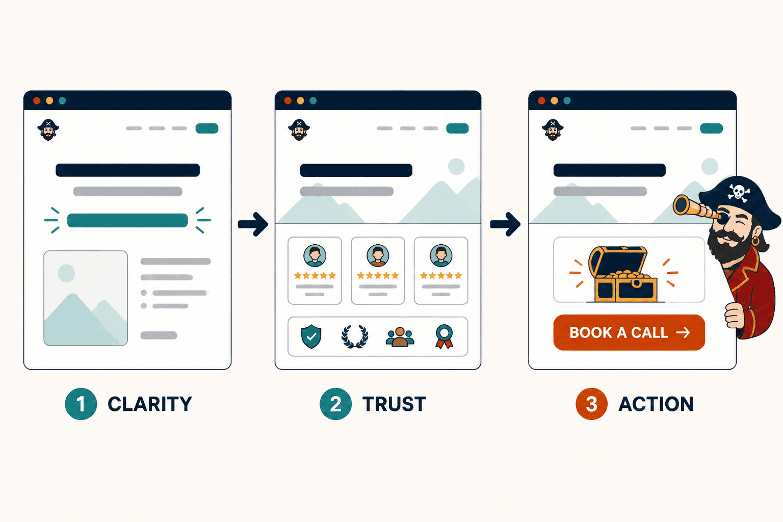
The fix is not more hype. It is better structure: clearer positioning, a tighter value proposition, a CTA that matches intent, and a homepage flow that moves from clarity to trust to action. For the larger framework, see the homepage copy guide. If you want examples of the same principles in practice, the homepage copy examples page is the useful sibling, not the ceremonial one.
What homepage copy is actually supposed to do
A homepage is not a résumé, a brand mood board, and a storage unit for every nice thing you have ever said about your business. Its job is to help the right visitor take the next sensible step.
- Confirm they are in the right place.
- Explain what you help with and for whom.
- Build enough trust to keep them reading.
- Point them toward one clear next action.
If the page does all of that, it can support leads, sales, inquiries, booked calls, newsletter signups, or a lower-friction next step. If it does none of that cleanly, the CTA is just a button-shaped wish.
Start with positioning before persuasion
Conversion gets easier when the visitor does not have to decode the page. Positioning is the short version of what you do, who it is for, and why it matters now. Without that, every other paragraph has to work overtime.
Good homepage copy usually answers three questions fast:
- What is this?
- Who is it for?
- Why should I care?
That is why the hero area matters so much. A clear headline and subheadline do more for conversion than another layer of brand poetry. Poetry is fine. Ambiguity is expensive.
Use a section order that earns trust
Most homepages underperform because the sections are in the wrong order. They lead with claims, wander into biography, drift through process, and end with a CTA that arrives before the page has earned the click.
A cleaner structure usually looks like this:
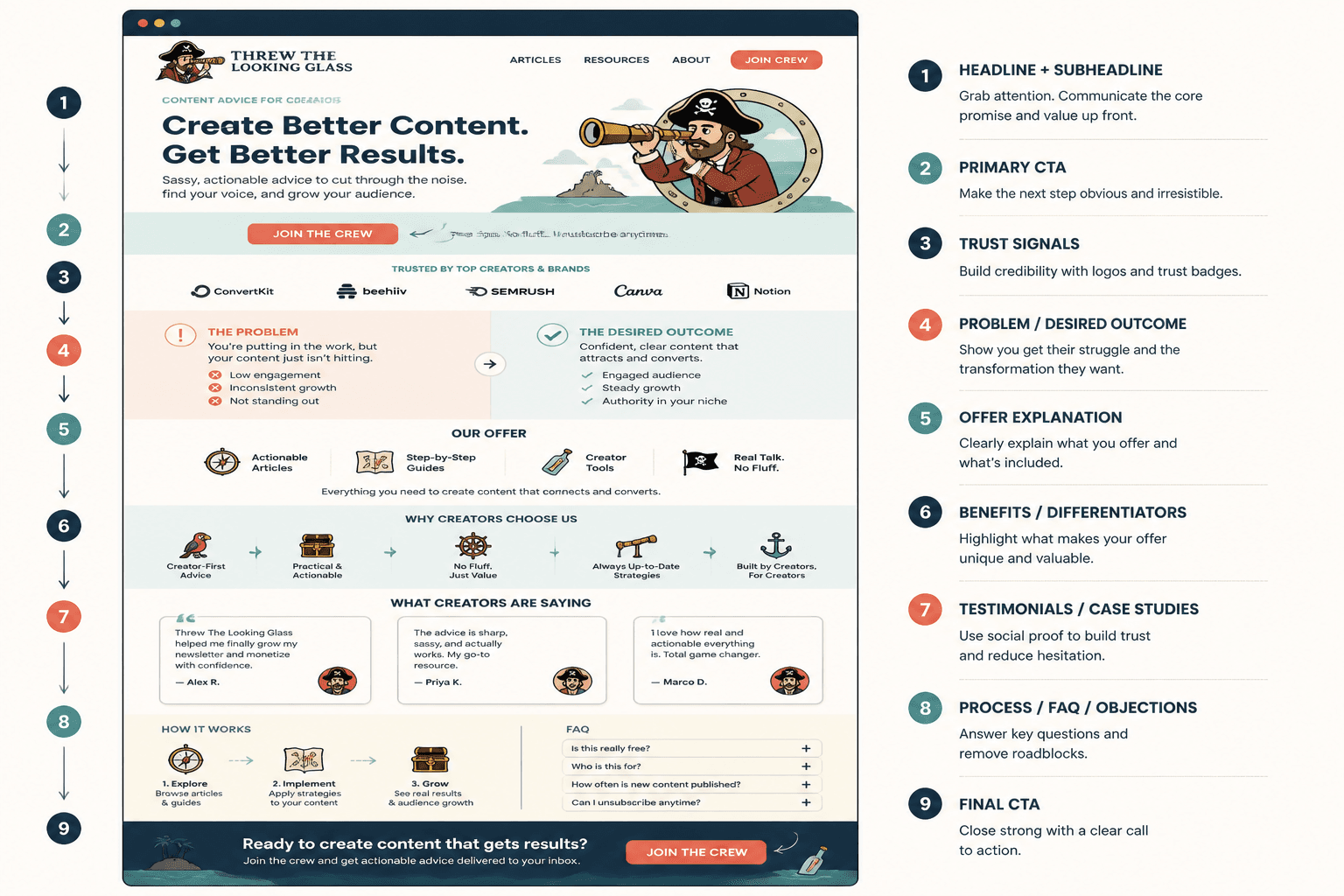
- Headline and subheadline: state the promise and the audience.
- Proof or credibility: show why the promise is believable.
- Problem and relevance: reflect the visitor’s situation back to them.
- How you help: make the next step obvious.
- Supportive proof: testimonials, case studies, metrics, or examples.
- CTA: one clear action, repeated where it makes sense.
You do not need every section on every page. You do need the page to move like it knows where it is going.
What to say in the hero
The hero section should do the heavy lifting without sounding like a billboard that got into copywriting. Aim for clarity first, then specificity, then a believable outcome.
A simple hero formula:
- Headline: who you help and what changes.
- Subheadline: how you do it or what makes your approach different.
- CTA: the next step, phrased in plain language.
For example, a service business might say:
Homepage copy that helps visitors understand your offer faster and decide with less hesitation.
That is not flashy. It is functional. Functional pages tend to convert better than pages trying to win a design award in copy form.
How to write CTAs that get clicked
Most homepage CTAs fail for one of five reasons: they are too generic, they ask for too much, they do not match the offer, they are clear to the business but not to the visitor, or they have no supporting copy around them.
A CTA should feel like the next step, not a loyalty test.
1. The CTA is too generic
“Learn more” and “Get started” are not inherently bad, but they are often too thin to do real work. If the page is already doing the explaining, the button should finish the thought.
Better:
- See pricing
- Book a discovery call
- View services
- Download the guide
2. The CTA asks too much, too soon
A brand-new visitor may not be ready to book a call. That does not mean they are not interested; it means the ask is out of sequence. Match the CTA to the level of trust the page has actually earned.
3. The CTA does not match the offer
If the homepage is introducing a high-touch service, a low-friction inquiry may make sense. If the homepage is supporting a product or lead magnet, the CTA should reflect that. One page, one main job.
4. The CTA is clear to you, not to the visitor
Internal shorthand is a trap. “Let’s chat” may feel friendly, but it can also feel vague. Visitors are not mind readers, and they are usually in a hurry.
5. The CTA has no supporting copy
Button labels work better when the nearby copy reduces uncertainty. A short line about what happens next can make a CTA feel safer and more concrete.
For a deeper pass on button language and intent matching, see the homepage copy guide and the sibling piece on best AI tools for homepage copy if you are using tools to speed up the draft stage without letting them run the whole show.
Match homepage copy to the right funnel
Your homepage should not invent a funnel just because it has a button. The CTA has to fit how people actually buy from you.
Common paths include:
- Homepage → lead magnet → emails → offer for slower trust-building.
- Homepage → service page → inquiry form for direct service-based conversion.
- Homepage → case study or proof page → consultation when credibility needs more room.
- Homepage → newsletter → nurture when the sale is not immediate.
- Homepage → low-ticket offer → upsell when a smaller first yes makes sense.
If you want a clearer way to think about the next step, the homepage copy guide covers the broader structure, and the funnel-focused sibling article on best AI tools for homepage copy can help when you are drafting several versions quickly.
Use trust-building sections without turning the page into an ad
Trust and persuasion are not opposites. The problem is when the page starts sounding like it is trying to close a deal before the visitor knows what is on offer.
Trust-building sections can do two jobs at once:
- Reduce doubt.
- Move the visitor closer to a decision.
That usually means including sections like these:
A specific problem section
Reflect the real frustration the visitor is dealing with. Specificity signals understanding.
A “how I help” section
Make your method or process legible. Visitors are more likely to convert when they understand what happens after the click.
Proof that belongs near the claim
Put testimonials, results, or examples close to the statements they support. Do not bury proof in a footer and hope for the best.
Homepage copy examples by conversion job
Different businesses need different kinds of homepage persuasion. A few composite examples make the pattern easier to see:
- Service business: clarify the service, show the outcome, and route to an inquiry or booking step.
- Personal brand: explain the point of view, establish authority, and offer one obvious next move.
- Product-led brand: show the product in context, reduce friction, and point to the trial, demo, or pricing page.
- Content-led brand: use the homepage to frame the value of the content ecosystem and guide visitors to the best next piece.
That is why one-size-fits-all homepage copy gets weird fast. The page is not just saying “hello.” It is setting the terms of the relationship.
A quick edit checklist
Before publishing, check the page against this list:
- Can a visitor tell what you do within a few seconds?
- Does the headline point to a real outcome or outcome-adjacent fluff?
- Is there one main CTA, or at least one clear primary path?
- Does the CTA match the visitor’s likely readiness?
- Does the page include proof near the claims it supports?
- Does each section earn the next one?
- Could you remove any sentence that exists only to sound impressive?
If the answer to that last one is yes, remove it. The homepage is not the place to audition for “most decorative sentence.”
The practical takeaway
Homepage copy converts better when it is easier to understand than to ignore. Start with positioning, build trust in a sensible order, and give the visitor a CTA that fits where they are actually standing. That is the work.
If you want the broader system around this page, return to the parent guide. If you want to see how this logic looks when it is applied to actual page structures, the homepage copy examples page is the next stop.