
Most tool reviews do not fail because the writer picked a bad tool. They fail because the proof is flimsy.
A review says the app is fast, clean, useful, beginner-friendly, worth the money, great for workflows, and somehow perfect for everyone with a laptop. Then you scroll down and get three screenshots: the homepage, the pricing page, and a dashboard so cropped and polished it could be stock photography. Very moving. Very useless.
If you want people to trust a tool review, your screenshots need to help them decide. That is the job. Not to make the product look pretty. Not to prove you can log in. To help a buyer see how the thing actually works, where it helps, where it gets annoying, and whether it fits their workflow.
This guide on What to Screenshot in Tool Reviews will show you exactly what to capture, how to make screenshots more persuasive without turning them into affiliate fluff, and which screenshots people keep including that add almost nothing.
For the main guide behind this topic, visit the parent guide.
What screenshots are supposed to do in a tool review
A good screenshot reduces uncertainty.
That is it. That is the whole game.
People reading tool reviews are usually asking some version of the same questions:
- What does this actually look like when used by a normal person?
- Is it simple or annoying?
- What happens after setup?
- Can I do the thing I care about without a side quest?
- Are there weird limitations hiding behind the marketing copy?
- Is the result good enough to justify the price or switch?
Your screenshots should answer those questions visually.
If they only make the product look polished, they are doing branding work for the company, not decision-making work for the reader. Different job.
For a broader look at quality review structure, this piece pairs well with Tool Reviews Guide for Creators Who Care About Quality and How to Write Tool Reviews Without Sounding Like Affiliate Fluff.
What to Screenshot in Tool Reviews if you want buyers to trust you
You do not need 27 screenshots. You need the right ones.
Think in stages. A buyer wants to see the tool before use, during use, and after use. That creates a much more honest picture than dumping a gallery of random interface images in the middle of your article and hoping they do emotional labor.
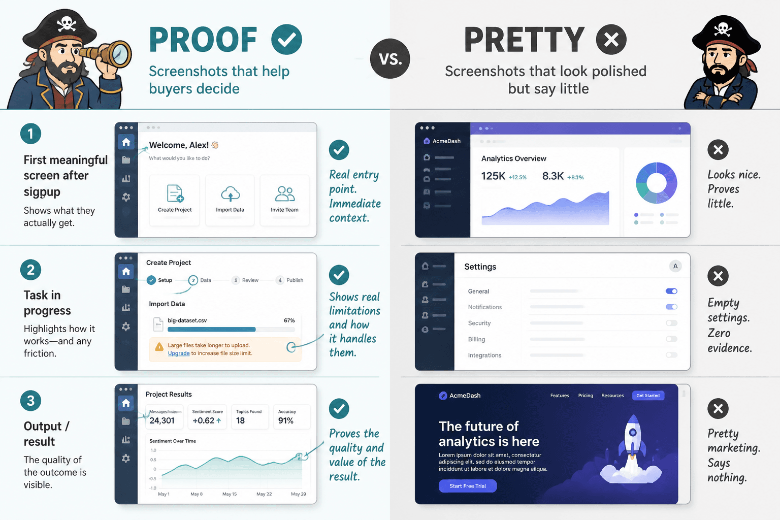
1. The first meaningful screen after signup
Do not just screenshot the landing page. Readers can find that themselves. What they cannot see from the marketing site is what happens once they actually enter the product.
Show the first meaningful screen after signup or login. That tells readers a few important things fast:
- How clean or cluttered the interface feels
- How much setup friction exists
- Whether the product feels intuitive or immediately tiring
- What the tool seems designed to prioritize
If onboarding is a major part of the experience, include that too. Especially if the company claims setup takes two minutes. Claims like that deserve receipts.
2. The setup process for the core use case
Every tool has a main promise. Your screenshot should show the path to that promise.
If it is an email tool, show campaign setup. If it is a scheduling tool, show the calendar and publishing flow. If it is a writing tool, show the drafting or editing environment. If it is a funnel or CRM tool, show how a lead actually enters the system.
This matters because buyers are not purchasing software in the abstract. They are buying a workflow outcome.
One of the best things you can do in a review is show the exact moment where the user says, “Okay, this is where I do the thing I came here to do.” That screenshot carries far more weight than a generic overview screen.
3. The feature in action, not just the feature tab
A lot of reviewers screenshot menus like they are evidence. They are not.
Do not just show that the tool has templates, analytics, automations, AI prompts, integrations, or dashboards. Show one of those things actually being used.
Bad screenshot: the sidebar with “Templates” highlighted.
Better screenshot: a real template library with filtering options, preview quality, and enough visible detail that a buyer can judge whether the templates are genuinely useful or just decorative filler.
Show function, not labels. Labels are cheap.
4. The output
This is one of the most skipped screenshot categories, which is strange because it is often the whole point.
If a tool creates, edits, analyzes, designs, schedules, or organizes something, show the result. Readers need to see what they get at the end of the process.
- For AI writing tools, show draft quality
- For design tools, show export quality or final asset preview
- For analytics tools, show reporting clarity
- For website tools, show published page output
- For course or funnel tools, show the user-facing page
- For scheduling tools, show how the published post looks
This is where trust goes up fast. Not because the output is always perfect, but because readers can finally judge it for themselves.
5. The annoying part
Yes, screenshot the friction.
If a workflow takes too many clicks, if a key setting is buried, if the editor feels cramped, if the mobile view is rough, if a feature is locked behind a higher plan, show that. You do not need to be petty about it. Just be honest.
This is one of the easiest ways to separate a real review from a dressed-up referral page. People trust reviews that include mild disappointment. Weird but true.
The screenshot does not need to scream “Look how terrible this is.” It just needs enough context for the reader to understand the tradeoff.
6. The pricing moment that affects actual use
Screenshoting the pricing page can be useful, but only if you connect it to decision-making.
What matters is not the existence of a pricing table. It is the point where pricing changes the experience. That could be:
- A feature marked as paid-only inside the product
- A usage cap you hit during testing
- An upgrade prompt triggered by a normal workflow
- A plan comparison that reveals the practical difference between tiers
That kind of screenshot helps the buyer understand not just cost, but limitation.
7. The results screen, dashboard, or proof point
If the tool measures performance, show the results screen that matters most to the buyer.
Not every dashboard is useful. Many are just colorful wallpaper for founders who enjoy charts a bit too much. Screenshot the metrics view that would actually influence a decision: performance trends, conversion stats, time saved, workflow completion, publishing status, response rates, or campaign results.
And please annotate or explain what the reader is looking at. A naked dashboard screenshot with nineteen tiny boxes is not clarity. It is punishment.
For practical examples of screenshots that support the buying decision, see Simple Tool Reviews Proof Screenshots Framework for Creators and Tool Reviews Examples That Actually Help a Buyer Decide.
The 7 screenshot types that usually make a tool review stronger
| Screenshot type | Why it matters | What it helps the reader judge |
|---|---|---|
| Post-login home screen | Shows first real impression | Complexity, clarity, onboarding friction |
| Core setup workflow | Shows how the tool actually gets used | Ease of use, workflow fit, learning curve |
| Feature in action | Proves the feature works beyond marketing claims | Usefulness, depth, quality |
| Output or result | Shows what the user gets | Quality, polish, practical value |
| Friction or limitation | Adds honesty and context | Tradeoffs, hidden annoyances, plan limits |
| Pricing-impact moment | Connects cost to real usage | Value, upgrade pressure, tier differences |
| Results or analytics view | Shows measurable payoff | ROI, visibility, performance usefulness |
What not to screenshot unless it serves a real point
Some screenshots are not wrong exactly. They are just lazy.
The marketing homepage
Use it only if you are analyzing positioning, promises, pricing claims, or mismatch between the marketing and the product. Otherwise, it adds almost nothing.
The blank dashboard
A pristine empty dashboard tells the reader very little. It often looks clean because there is no data in it yet. That is not the same thing as good UX.
The logo, login page, or app icon
Unless your review is somehow about security, access flow, or branding consistency, skip it.
Tiny screenshots with no readable detail
If readers cannot read the screenshot, it becomes decorative. Decorative is fine for design. It is not enough for proof.
Over-annotated screenshots that look like a crime board
Callouts help. Fifteen arrows do not. Highlight the part that matters, then explain the takeaway in the paragraph below. You are writing a review, not solving a cold case.
How to choose screenshots based on the kind of tool
Different tools need different proof.
This sounds obvious, yet a lot of reviews use the same screenshot formula for everything, as if a design tool, CRM, AI writer, and scheduler should all be evaluated with the exact same visual evidence. They should not.
For AI writing or content tools
- Prompt input screen
- Output quality
- Editing controls
- Tone or format options
- Places where the tool gets generic or repetitive
For scheduling or publishing tools
- Content calendar
- Composer interface
- Platform preview
- Approval workflow if relevant
- Analytics tied to published posts
For CRM, funnels, or lead tools
- Lead capture flow
- Contact view
- Pipeline stages
- Automation setup
- The point where plan limits affect real usage
For design or website tools
- Builder interface
- Template selection
- Editing controls
- Published output
- Mobile preview if mobile matters
If you cover tools regularly, it helps to build your own repeatable review system. The category hub at tool reviews is a useful place to map related content and create a more consistent standard.
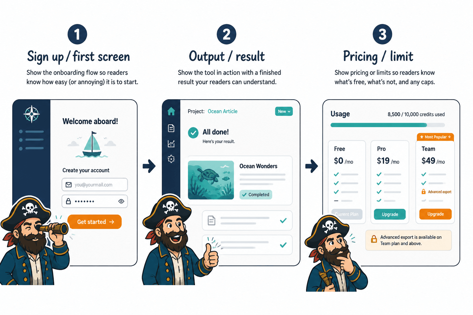
A simple screenshot flow you can use in every review
If you want a practical rule, use this sequence:
- Entry: show what the product feels like once inside
- Action: show the core task being set up or performed
- Output: show the result
- Constraint: show a limitation, friction point, or pricing gate
- Decision screen: show the metric, view, or outcome that helps the reader decide
That flow works because it follows the buyer’s mental process. What is this like? Can I use it? What do I get? What is the catch? Is it worth it?
When your screenshots line up with those questions, the review feels grounded. When they do not, it starts to smell like somebody wanted the commission link to do all the heavy lifting.
How to make screenshots more credible
The screenshot itself is only part of the trust equation. Context matters just as much.
If you show a screen without explaining what the reader should notice, the image may be technically relevant but still weak. Good review screenshots work best when paired with a short note that answers one of these:
- What is happening here?
- Why does this matter?
- What is better or worse than expected?
- What should the buyer notice?
- What kind of user would care about this most?
That extra sentence or two often does more than a pile of extra images. And it makes the review feel like guidance, not just evidence dumped on the floor.
The bigger point is simple: clearer structure and clearer writing make the piece more useful. That is usually what makes the ending land better too.